
Isotype is a highly refined picture language designed for educating people with as few words as possible. Created by Otto Neurathin 1925, the International System of Typographic Picture Education (ISOTYPE) evolved over the next two decades with the collaboration of Marie Neurath and Gerd Arntz. The trio developed their distinct approach to data visualization iteratively, and very collaboratively. Otto provided the overall direction, Marie “transformed” the data to present the story, and Gerd designed the pictogram units and highly-refined designs.
The Isotype Institute was a prototypical design studio, founded by Otto and Marie after the couple escaped the Netherlands directly before the invasion by the Nazis. Their innovations in the field of visual communication worked to inform ordinary citizens, and students, about their place in the world.Their books were very popular throughout Europe at the time. The Isotype began with Otto in 1925 in Vienna and ended in 1971 in England when Marie retired. During a 46-year span, the group created a massive number of Isotypes — but it’s hard to know where to start, so I thought I’d take one particularly amazing Isotype example and really dig into it.

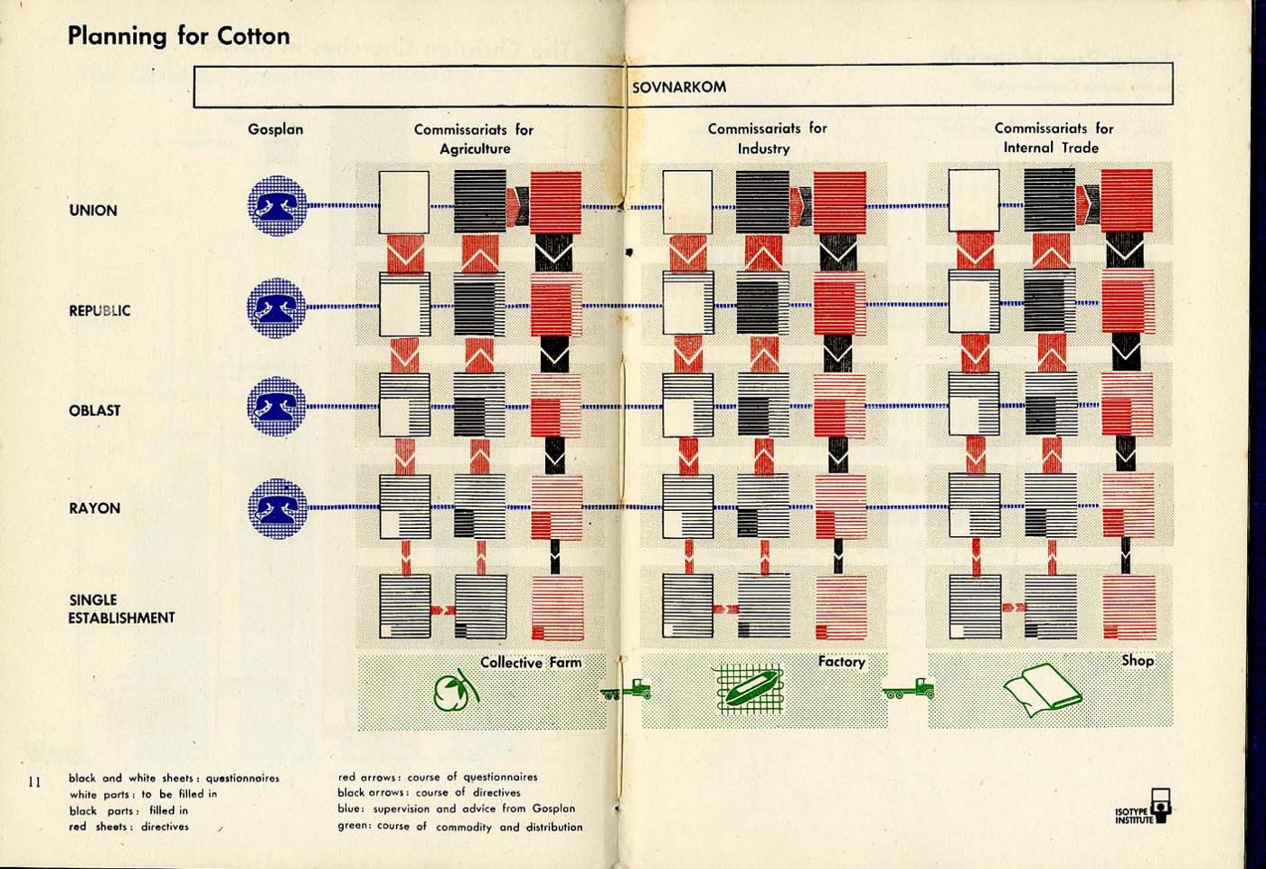
The Isotype we’ll study, Planning for Cotton, comes from a series of books called Two Commonwealths and was written by Christopher Hill; an influential British writer and leading Marxist historian. Writing as K.E. Holme (the name being a transliteration of ‘hill’ in Russian), he wrote the book seeking to boost Anglo-Soviet friendship in the aftermath of World War II.
Otto and Marie Neurath were already working with several British publishers when this series of books were presented to them. Since the couple had worked in Moscow to set up a branch of their practice (more on this later in the series), it’s easy to see why they agreed to the project.

Planning for Cotton is one of 14 isotypes in the book but they are not actually integrated into the book’s content. Rather, they are collected in a center spread and included as additional information. There is no direct text in the book specifically about the economics of the Soviet Union, nor its planning structures, so this isotope can legitimately be considered to be additional educational content that stands on its own.
Unlike most of the Neuraths’ work, Planning for Cotton is an Isotype example that does not have an immediately recognizable design. It is an abstraction that tells the story of how decisions are made in the Soviet Union. By focusing on the supply chain of the cotton industry, it creates an equivalency to the type of crops and processes that would be commonly understood in British culture. By displaying the process for planning for cotton on a national level, it explains the Russian governmental structure, economic planning, industrial supply chain, and communications plan — all in one image.
A Matrix of Questions and Communications
The design is organized under a bar labeled SOVNARKOM, which is the acronym for the Council of People’s Commissars and was essentially the “name” of the Soviet government. This political and administrative body was split into committees (commissariats) that held authority over all aspects of the government, including agriculture, industry, and internal trade. Planning for an entire economy is complex, so in order to find the core of the information being displayed, this Isotype example abstracts the system to create a structure for understanding. The supply chain is organized around the processes of decision-making and communication.
Below is a diagram I made that shows the matrix structure of the design. Decision-making is split equally between the verticals (in orange), communication channels (blue) runs across the horizontal and the last bottom panel assembles the elements into an overall story (green).

Decision-making: A Series of Questions and Answers
As you can see in the legend at the bottom of Planning for Cotton, the colors and direction of each aspect of the chart are mapped to different governmental functions:

Each of the three verticals shows the sequence for decision-making. An open questionnaire begins at the highest level of the Soviet Union which travels down the various layers of government. In each sub-committee, the answers are filled in until it gets to the actual farmer, factory, or store where the competed answers are then sent back up the chain. After the completed questionnaire arrives back to the highest level, decisions are made and directives are passed back down the chain.

At the same time as the questionnaires are going through the subcommittees, the equivalent levels of government are communicating across the verticals. The government is split into four levels: the (Soviet) Union, the 14 Republics (such as Russia, Ukraine, Armenia, etc), the 46 Oblasts (a.k.a. Regions), the roughly 1,800 Rayons (a.k.a. Districts), and then the millions of collective farms, factories, and stores. I’ve included the rough quantity of each so you can understand how distributed this system really is.

The matrix of decisions and communications are then collected into a story at the bottom of the design. It’s a simple sentence told in pictures. The green area below Agriculture, and located below the row for a Single Establishment, is labeled more plainly as a Collective Farm. This gives specificity to the vertical. A truck connects the Farm to the Factory, then to the shop.

Planning for Cotton becomes a diagram that’s larger than the sum of its parts to tell a story on a grand scale. By showing the system, then imaging that system at scale on each governmental level, the quantity of questions, answers, and waves of communication play out over millions of farms, factories, and shops.
The system, as diagrammed, is very granular. To many, it could represent the worst aspects of a bureaucracy with excessive layers of oversight and multiple opportunities for communications failure. But this form of Communism was new at the time, and it could also be considered a study in extensible decision-making — with a direct line linking leadership to the individual on a massive scale.
Reading Visual Language
Reading Isotype is more akin to reading written language than simply studying an image. Each carefully-composed element represents the complex features of a massive system distilled to its essence. The carefully-considered icons, layout, and color mappings are easily discoverable.

Since icons are used to describe most of the entities, the few words that are used only narrow the context of how the icons are understood. The telephone is a proxy for communication, attached to blue lines that intersect each subcommittee. The details of “phone” fall away leaving only its “communication” essence. Similarly, paper-shaped white rectangles are filled with lines representing text; empty forms full of questions get visually answered. Learning turns into decisions and ultimately takes the form of directives in red.
One can consider the same sort of contextual mapping to be applied to the prominently featured Isotype Institute logo itself, seen not as designers in this case, but rather as authors. It was a distinction that was important for the Neuraths and they regularly fought for an elevated status that was more aligned with educational authors than designers.
Why this matters
With so much visual information in our data-driven age, how we communicate complex information matters more now than ever. Exploring this example of Isotype depicting a system that seems so simple, but in reality, was so incredibly complicated, helps us understand how we can apply their lessons of simplification to our own work.
About the series Lessons in Isotype
I’ll be regularly writing about Isotype from a few vantage points over the coming months. I think it’s very important to tell the story of Marie Neurath, as I fear her place in history as a gifted data storyteller has not been established. I plan on exploring how Isotype evolved, and how the core team worked as a Lean, Agile group 45 years before the birth of the computer industry. Lastly, I also want to explore the joy inside this remarkable body of work!

Jason Forrest is a data visualization designer and writer living in New York City. He is the director of the Data Visualization Lab for McKinsey and Company. In addition to being on the board of directors of the Data Visualization Society, he is also the editor-in-chief of Nightingale: The Journal of the Data Visualization Society. He writes about the intersection of culture and information design and is currently working on a book about pictorial statistics.
- Jason Forrest

- Jason Forrest

- Jason Forrest

- Jason Forrest


