
Hi, my name is Victor, and I want to share my experience using data art to overcome my social anxiety and make connections at the Bansko Nomad Fest.
A year ago, I left my home country to pursue a new career in information design. During this time, I have immersed myself in different cultures, learned from other designers, and participated in various volunteer projects. I have also started living a nomadic lifestyle and sharing my experiences on this journey.
While traveling and learning might sound like a dream, the savings supporting my pursuit of this new career path are running out. I feel ready to work, but despite applying to numerous projects and reaching out to companies, I’m struggling with the acquisition process and securing a consistent source of income. And here I am! Instead of sending out more proposals, I am reflecting on my situation and sharing some of my lessons. Oh, the joys of job hunting!
My networking dilemma
After looking for some advice, I found a common factor: networking is the best way to find freelance work. Even though I’ve met many people during my trips, the truth is that I struggle with social interactions. Building new connections usually takes me time. Some of the reasons are that I often get nervous and worry about awkward situations, rejection, and embarrassment. I constantly stress making a good impression and tend to be reserved and shy, especially in new environments.
Recently, I came across an unexpected opportunity to face this challenge. Last month, I arrived in Bansko, Bulgaria, and to my surprise, they were organizing a Nomad Fest — a week-long celebration of the nomad lifestyle, full of conferences and activities. I saw this as an opportunity to learn from experienced nomads about their careers, experiences, and various dimensions of well-being. But most importantly, this was a chance to overcome my fear of social interactions, step out of my comfort zone, and practice making business connections.

My main challenge is initiating conversations and making the first move. Once I overcome that, I often struggle to keep the interaction going; however, for this occasion, since I work with data, I started asking people about datasets related to nomads. I wanted to learn about the demographics and backgrounds of nomads attending the festival. To my surprise, there was little information available. That made me think: what if I gather information and create a data visualization?
Using data art to connect
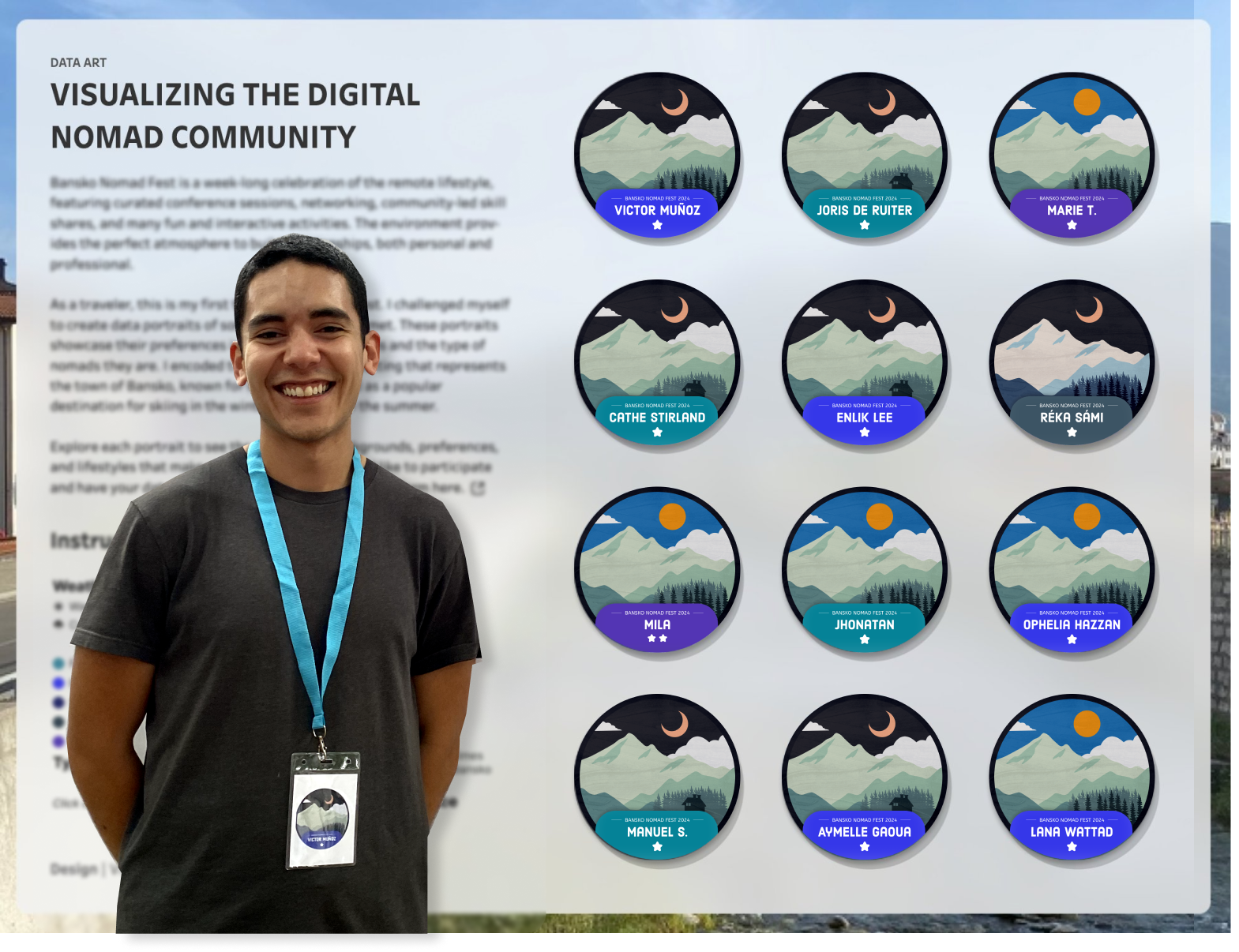
I had the idea to create data portraits of digital nomads! This is a creative way to incorporate aspects of people into data visualization and to open the conversation. I first read about data portraits in “Questions in DataViz” by Neil Richards. And I remembered how he described the experience as a way to “get to know each other in a fun, data-driven, visual way.” I was confident I had the necessary knowledge and skills to pull this off.
I started by defining the concepts I wanted to highlight, such as nomads’ destination preferences, their types of work, and the frequency of their attendance at the nomad fest. I decided to set the scene to represent the city of Bansko, a popular winter ski resort, known for its mountains, and excellent hiking routes during summer. I began with sketches, then moved to Figma to create different layers. Finally, I developed a visualization in Tableau Public to showcase all the data I would collect.

After finishing the data visualization structure, I shared a Google form with the questions and my introduction on the event’s Telegram, turned off my computer, and sat down to watch a movie. The next day, I was shocked to receive 123 responses, 23 LinkedIn connections, and five job offers! I never thought the power of data art was going to… I am kidding! I only received two answers and a few LinkedIn connections. What was I even thinking?
I was a little disappointed, but the experience helped me realize that I was so focused on the “how” to talk to people and make a good impression that I completely missed the real purpose of networking. I needed clarity, so I looked back at my notes from Michelle Maree’s talk at one of the conferences and asked myself: “What am I doing? What am I working on? And who or what do I need to achieve this?” I realized I didn’t have to talk to everyone at the event. Instead, I needed to be more strategic and find connections that align with my goals. And most importantly, I needed to go out there and communicate.
I decided to look for people with my interests and found something interesting. During the afternoon, the festival had something called the creative corner. I had the opportunity to meet Piera Mattioli, who is an independent service designer, social innovator, and graphic facilitator. To my surprise, she took visual notes of the conferences and posted them on a giant board. It was the first time in my life that I saw something like that, and I felt so related to it because it reminded me of my note-taking style. That’s how I usually understand concepts, and reading through her notes was… amazing!

The power of community
This conversation felt different. It was more natural. We discussed and compared our note-taking styles at conferences, the logos we have adapted in our visual language, and the differences between the digital and analog worlds; I personally prefer digital more! At one point, I shared the data portraits I had built, and what happened next was amazing — she invited me to present my idea to the whole community on the board. At first, I felt shy and insecure, but she was kind and supportive. I ended up explaining how data portraits work and sharing some examples I had already created.

I had a fantastic experience! I had the opportunity to share my ideas with more curious people walking by the board. Some didn’t initially understand the concept, but after I explained it to them, they were amazed and willing to complete the form. I even made a sticker for some of them. And it didn’t end there. I had a great conversation with Morgan Rowe, who is doing research for a master’s degree in political science about digital nomads. Additionally, I got the attention of the content group of the fest and received an interview.
That experience encouraged me to start chatting with more people and asking more questions, even those unrelated to data visualization. I discussed co-livings in South Korea and how to create an indoor cycling community around the Balkans. On one occasion, one of the speakers, Lirone Glikman, let me introduce myself to the entire auditorium and asked if anybody wanted to connect with me! I was a little shocked, but it’s the kind of experience I will never forget.

Did the data portraits help me to connect? To some extent. They were helpful, but they weren’t the complete answer to my anxiety. Their implementation changed something inside me, and I feel more confident. I look forward to making new connections in a way that I never imagined before! I am glad to have documented this experience and to learn about my feelings. My biggest takeaway was that I need to communicate with others rather than rely on my skills to get noticed.
For anyone else struggling with shyness, I encourage you to organize your goals and use your interests or skills as a starting point. Every connection is unique, and we can’t let past experiences restrict our future interactions. Don’t be afraid to share your story. You might be surprised at how much support and understanding you will find.
After sharing the data portraits on social media, I received confirmation from Sophie Sparkes that she has used them as icebreakers in some conferences. My piece of advice: if you want to use data portraits to make connections (or to help with your anxiety), use them wisely; don’t rely entirely on them, and remember that you still need to go out there and communicate with people 🙂
If you get to this point and are interested in practicing social skills with a beginner or want to grab a virtual coffee, let’s connect. And I’d be happy to meet in person if I happen to be in your city during my travels.
Special thanks to Ophelia Hazzan for her support and connections during the fest.

Victor Muñoz
Victor is an Information Designer who creates data-driven solutions for small businesses. With a background in Information Security, he specializes in transforming complex information into clear, actionable insights and guiding clients through informed decisions. As an active volunteer with Viz For Social Good, Victor contributes to closing the analytics gap for mission-driven organizations. His interests lie in projects that promote positive social impact, ensure security and privacy, and prioritize personal well-being.
- Victor Muñoz

- Victor Muñoz

- Victor Muñoz

- Victor Muñoz


