
I want to share my experience with the “Physicalizing Data for a Better World” project promoted by Viz For Social Good in late 2023. This non-profit aims to create social change, connecting volunteers with a passion for data visualization to mission-driven organizations. And on this occasion, the goal was to represent humans’ environmental impact through physical objects.
During the process, I faced various challenges and learned valuable lessons I’d like to share. Additionally, I want to highlight my creative process. I adopted the steps described by Herbert Lui in his blog post “This Four-Stage Creative Process Shows You How to Unlock Your Creativity.” It consists of preparation, incubation, illumination, evaluation, and elaboration. I recommend reading this article, as it has been very helpful in unlocking my thoughts at various stages of my projects.
Lesson 1: Establish habits for creative inspiration.
When I first heard about the project, I had many doubts. I thought, ‘I have never done something like this before,’ ‘I am not a craftsman person,’ and, ‘There are so many possibilities when it comes to creating a visualization using physical objects.’ I also wondered how this project would help me grow in my career since my focus was then on developing my technical skills using Tableau. And more importantly, I’d like to know what I would present at the end and how to make it as creative as possible.
Having already contributed to Viz For Social Good in the past, I knew I wouldn’t regret participating in this project. I struggled with creativity and only had a month to complete the assignment. I needed to start with PREPARATION and find something I could work on until I came up with a good idea. Over the past few months, I’ve learned that developing certain habits can help to inspire creativity. So, I compiled and added all of Viz For Social Good’s data and inspirational resources to a list. I set a daily alarm and started adding one resource every day on a board in Figma, taking a screenshot and adding notes about what I found interesting.
At the same time, I started collecting visualizations related to climate change, which was related to the subject of the project. By doing this, I gained more confidence in data physicalization and began making connections for my project without realizing it.
Lesson 2: Remember to leave some room for incubation.
During this project, I was staying in Istanbul, Turkey, and one day, I needed to travel to the capital city, Ankara, to visit the Colombian embassy. I spent eight hours on the train (four going and four coming back). So, I decided to have a day off, free from work and projects. I made a rigorous schedule for the trip that looked something like this:
- 7 am – 11 am: Train to Ankara
- 11 am – 12 pm: Take a taxi to the spinning studio
- 12 am – 1 pm: Spinning class
- 2 pm – 3 pm: Take lunch and walk to the embassy
- 3 pm – 4 pm: Appointment in the embassy
- 4 pm – 5 pm: Find a cafe and read
- 5 pm – 6 pm: Walk to the train station
- 6 pm – 10 pm: Train to Istanbul
As you can see, I wasn’t even thinking about physicalization that day — or so I thought. It turned out, this day ended up serving as my INCUBATION stage. It was not deliberate, but certainly fortuitous. How did it happen? Coming from an equatorial country, it was my first time in a four-season country during the autumn. The day was so beautiful; the blue sky was very sunny. I had an excellent spinning class, and I was listening to my favorite songs. On my way back to the train station, I was amazed by all the colors of the leaves, from green to orange, yellow, and sometimes red. Then, ILLUMINATION struck! What if I use all of these colors to make a visualization? Yes, I could use the leaves as the colors in a heatmap! I was coincidentally in the right place, in the right season, with the right weather and mood, and was working on the right project. Why did I not play the lottery that day?

I truly appreciated the preparation process while writing this article, and it made me pay more attention to the stage I usually overlook — the incubation. I find the incubation to be the most challenging part of the creative process since it’s not logical for me. I’ve often heard that you must “not consciously think about the problem to find the solution.” It seems contradictory, but that’s how our brains work. Since I usually focus on my work all the time, this experience made me consider scheduling more space to rest my mind and let the unconscious do its work.
Lesson 3: Embrace the unconventional.
With this idea, I could move to the EVALUATION stage. After four hours on the train, I arrived home that night and got the global land and ocean temperature data from the NOAA National Centers for Environmental Information. I quickly made a draft of my visualization without thinking much about it. Later, I realized that this idea is quite wild and unusual.
With that concern, the following day, I approached one of the project organizers, Aida Horaniet from Viz For Social Good, to get her opinion on my idea. I asked her if it was too crazy to pursue. She gave me the best response: “Nothing is too crazy in this project!” Her encouraging words gave me the confidence to proceed with my idea. She is remarkable, and we need more people like her in our social circles!

I only had one minor issue to resolve. In all my adult life (even when I was a kid), going to a park and collecting leaves never crossed my mind. I am too shy to do that. I was afraid of what people might think of me, but please notice I couldn’t understand what others were saying about me because I don’t speak Turkish. Then, I realized that sometimes, we limit our creativity based on what others say about us. It was also amusing to see how my fears changed when I realized that I couldn’t understand the language spoken around me.
I also remember one of the goals of this project was to connect with your inner child. I decided to take this project as an opportunity to “leave” my comfort zone. I couldn’t remember the last time I did it, and these are the experiences we will never forget.
Lesson 4: Stay open to uncertainty.
I decided to go ahead with my idea, and as a meticulous planner, I began to carefully plan every detail for collecting leaves for my project. I chose to visit Atatürk Arboretum, one of Istanbul’s largest parks, on a day with perfect weather and researched the best way to get there. I was excited to find out that I could use the same train I used every day and only needed to go to the final station. Everything was set, and I was ready!
So the day came, and I was very excited. I got to the last station, Hacıosman. I have to admit that I am always very impressed by the tile panels with Iznik patterns in the Istanbul stations—giant murals inspired by the city’s story with an ancient and characteristic style of this region. I usually stop to admire them, and that day, I was amazed to see one with a giant fig tree, my favorite fruit!
I continued my adventure to the park, and from the outside, I was confident that I would collect all the leaves I needed for the project. But there was a minor detail that I didn’t expect. When I received my ticket to enter the park, there were some rules, and one of them stated that it was forbidden to collect seeds, flowers, leaves, mushrooms, etc., even if they had fallen to the ground.
Despite my disappointment, I took the opportunity to enjoy the park and connect with nature. It was a calm and relaxing experience away from all the noise in Istanbul. It was also a time to reflect on the challenges in data physicalization. I had planned almost everything and needed to change my plans. When working with data physicalization, preparing and having workarounds or backup plans is essential. If you have a workshop or a collaboration, be aware that something may fail; that is when you must become more creative.

Later, during the final presentation of this project, Aida from Viz For Social Good mentioned something that caught my attention regarding digital visualizations. She said, “We lose attention to the details because everything is always there, and you just refresh. But when you build it with your hands, you have to adapt to every error, every mistake, and that makes you somehow very close to the data.” I couldn’t agree more!
The following day, I decided to visit a public park close to where I was staying. And being in a historical city, there were many landmarks around me, and this wasn’t the exception. I visited the Aqueduct of Valens, which the Eastern Roman Empire used to supply water to the capital in the 4th century AD. I don’t think the ancient Romans would have imagined that, one day, the leaves of the trees surrounding the aqueduct would be used to create a data physicalization project!
Lesson 5: Data physicalization adds another layer of engagement
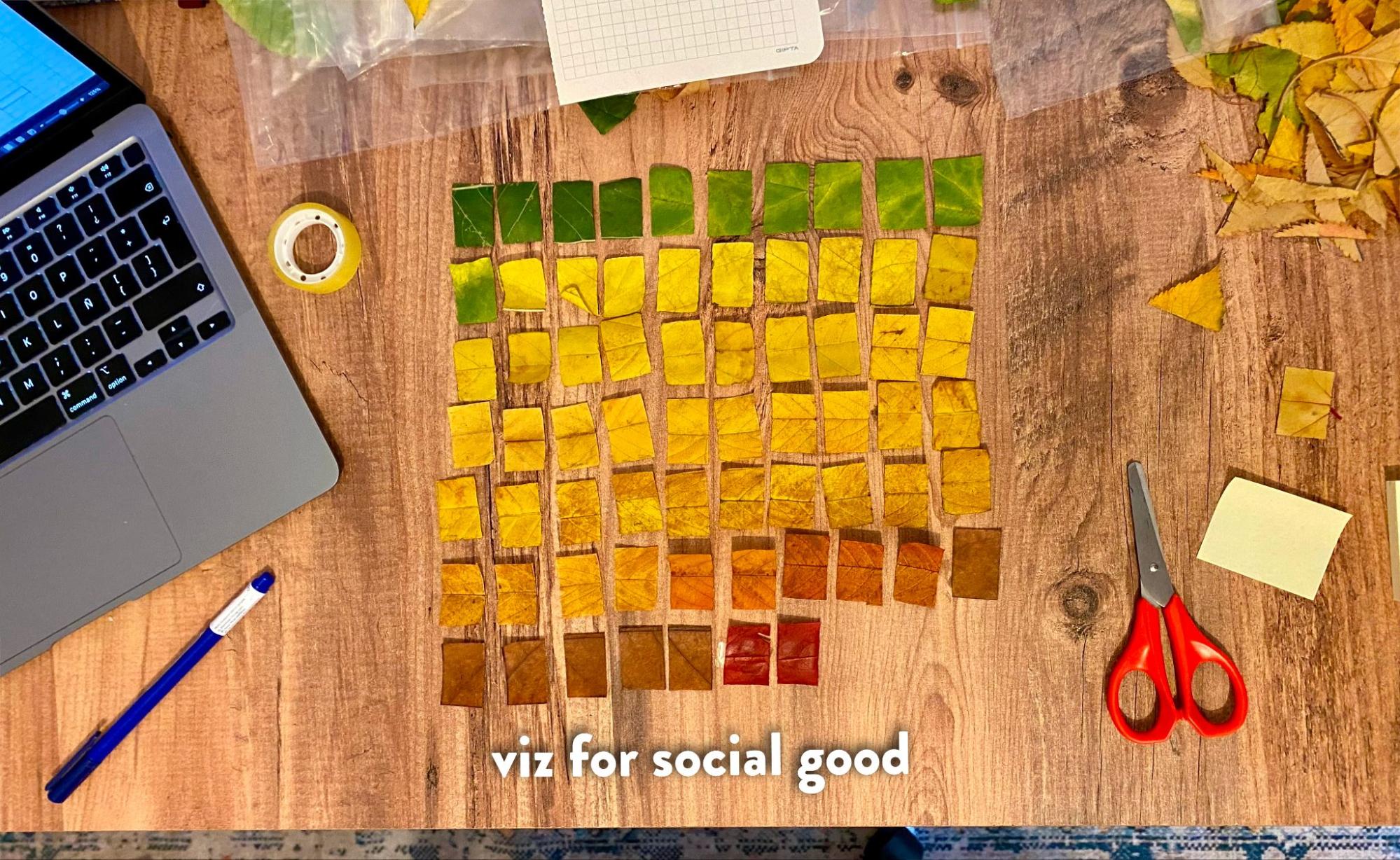
With all the leaves, I could proceed with the ELABORATION. I started by sorting them into different bags according to color. Then, I created a grid on a notebook page and used it to cut the leaves into the pieces I needed for a visualization. At that point, my question was the number of leaves I would need for each color.
To determine this, I used a histogram to group all the temperatures and assigned different colors to each bar. I then numbered the leaves from green to red. I also used a table of temperatures from the years and months, organizing them from lowest to highest. Finally, I assembled the visualization by fitting the pieces together like a puzzle. The materials I used in this project were a computer, tape, glue, a marker, a ruler, scissors, two pages of a notebook, and, of course, the leaves.

What I liked most about this project was exploring a physical, tangible dimension of data. Instead of waiting for a machine to show you the colors in the heat map, I needed to add each color myself. Each color represents a temperature for each year and each month, so the time it took me to stick each leaf to the page gave me a little time for reflection and questioning.

When it comes to attracting the attention of our final user, data physicalization offers another level of engagement. When I finished the visualization, I shared it with the host where I was staying. Before knowing the information I had coded, he was intrigued by the arrangement and textures. With his attention on the visualization, it was easy for me to explain that the columns represent a month, the rows represent years from 2013 to 2023, and each color represents a global temperature. Would he have been equally interested if I had shown him a heat map on my computer? I suspect not, and I also would expect that this experience will stay with him for a longer time. It certainly will stay with me — the ideation and creative processes, and, of course, the final piece!
I was also curious about the data. Despite having many leaves, I only used three red squares representing the highest temperatures. After some research, I found that the strong El Niño conditions in 2016 significantly impacted two months during that year. Additionally, even though the weather we experienced in September 2023 was also influenced by the strong Niño conditions that had begun in June, it is clear that temperatures have been increasing over the past ten years.

A picture speaks a thousand words.
I couldn’t resist taking a picture with my visualization. I took it outside the city of Istanbul on November 1st, 2023. Usually, the weather would be rainy on this date, and I should have worn a coat or sweater. However, the temperature was so pleasant that I didn’t need them.

Conclusion
Participating in the “Physicalizing Data for a Better World” project has been an unexpected and enriching journey. Reflecting on this article, I find new motivation to continue contributing to projects that aim to create positive social impact through platforms like Viz For Social Good. I am pleased with all the lessons I have learned throughout this experience, and I can’t wait to continue practicing them in my future work: establish habits for inspiration, allow space for incubation, embrace the unconventional, stay open to uncertainty, and realize the added layer of engagement in data physicalization.
This project has opened my perspective on the potential impact of data visualization and reinforced the importance of hands-on, unconventional approaches. I am very grateful to Viz For Social Good for helping others find new ways to be creative and to the team for allowing me to share my experience at the last summit.
Special thanks to Marian Eerens for encouraging me to share this story in Nightingale.

Victor Muñoz
Victor is an Information Designer who creates data-driven solutions for small businesses. With a background in Information Security, he specializes in transforming complex information into clear, actionable insights and guiding clients through informed decisions. As an active volunteer with Viz For Social Good, Victor contributes to closing the analytics gap for mission-driven organizations. His interests lie in projects that promote positive social impact, ensure security and privacy, and prioritize personal well-being.
- Victor Muñoz

- Victor Muñoz

- Victor Muñoz

- Victor Muñoz


