
Democracy in the United States is under threat. Are we, humble data visualization designers, to blame for this?
Not exactly… But we’re not as innocent as you might think.
Data stories have a unique role to play in a well-informed democracy. Unscrambling messy social issues requires data. Informing policy discussions requires a quantitative, analytical approach. So political data journalism can be a powerful tool for encouraging an enlightened electorate.
But in practice, political data stories are dominated by infotainment like election polling. Polling in the news is like reality TV for people who like spreadsheets. It’s fun to see how crazy other people can be; polls simply offer this voyeuristic thrill through charts instead of on-camera confessionals. However, despite being a popular guilty pleasure, polling coverage isn’t particularly enlightening. It’s also more than a little toxic, with real-life social costs. (For a primer on the psychology of partisanship and how dataviz plays a roll, read my Nightingale story, “Through a Partisan Lens: How Politics Overrides Information.”)
Three recent research projects demonstrate these costs, highlighting unintended social consequences of political dataviz.
These findings are anxiety-inducing, especially as we approach an election season with so much at stake. But political dataviz doesn’t have to be toxic. When it’s focused on enriching information, rather than engaging headlines, it can be a powerful tool for civic enlightenment.
“Red States vs Blue States”
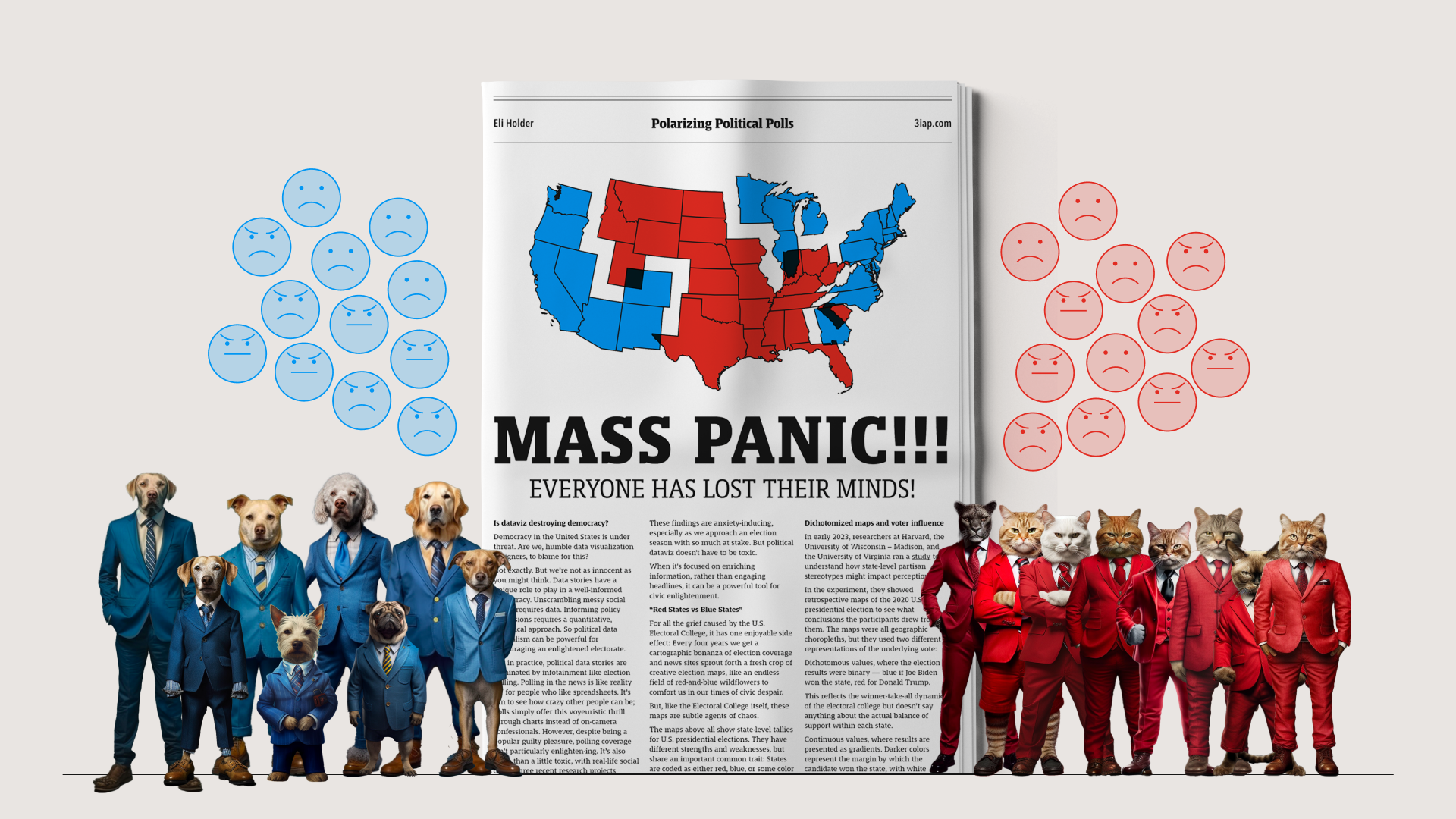
For all the grief caused by the U.S. Electoral College, it has one enjoyable side effect: Every four years we get a cartographic bonanza of election coverage and news sites sprout forth a fresh crop of creative election maps, like an endless field of red-and-blue wildflowers to comfort us in our times of civic despair.
But, like the Electoral College itself, these maps are subtle agents of chaos.

The maps above all show state-level tallies for U.S. presidential elections. They have different strengths and weaknesses, but share an important common trait: States are coded as either red, blue, or some color suggesting “soon to be red or blue.”
But there’s no such thing as a “red state” or a “blue state.”
Consider Texas, which is often called a “red” state. In the 2020 presidential election, more Texans voted for Joe Biden (5.26 million) than every other “blue” state, except for California. Even New York, a Democratic stronghold, had roughly 20,000 fewer Biden voters than Texas.
In reality, large numbers of Democrats and Republicans live in all 50 states, even the ones that consistently lean red or blue. So states are all varying shades of purple (at least in terms of presidential preferences).
While popular election maps accurately reflect the “winner-take-all” dynamic of the electoral college, they create the misimpression that state electorates are monolithic blocks of only-Republicans or only-Democrats.
Experiment: Dichotomized maps and perceived voter influence
In early 2023, researchers at Harvard, the University of Wisconsin – Madison, and the University of Virginia ran a study to understand how state-level partisan stereotypes might impact voting perceptions.

In the experiment, they showed retrospective maps of the 2020 U.S. presidential election to see what conclusions the participants drew from them. The maps were all geographic choropleths, but they used two different representations of the underlying vote:
- Dichotomous values, where the election results were binary — blue if Joe Biden won the state, red for Donald Trump. This reflects the winner-take-all dynamic of the electoral college but doesn’t say anything about the actual balance of support within each state.
- Continuous values, where results are presented as gradients. Darker colors represent the margin by which the candidate won the state, with white representing very close races. This paints a more nuanced picture, highlighting that some states are more evenly balanced in terms of party compositions.
Findings
The dichotomous maps caused some trouble.
- The dichotomous map led to increased geographic stereotyping. Relative to the continuous condition, people who saw the dichotomous maps tended to overestimate the winning candidate’s margin of victory. That is, they assume red states were made up of mostly Republicans and blue states were mostly Democrats, even if the win margins were slim.
- The dichotomous maps also made people think their votes mattered less. This is actually a reasonable jump from the previous finding. If voters think that a state is dominated by one party or the other, then the election outcomes are a foregone conclusion regardless of how they vote. In reality, this is not a safe assumption. We should all vote regardless of the expected outcome.
The first finding confirms our earlier research showing that, when visualizing social outcomes, hiding variability can increase stereotypes about the people being visualized. In general, if charts don’t show variability, people tend to assume it’s not there.
The second finding is more important, though, because it impacts downstream beliefs and actions (like not voting). A prominent theory on voter turnout suggests that people are more motivated to vote when they think their votes will make a difference. For example, one U.K. study suggests that turnout decreases in districts that have been historically less competitive. That is, like the map study, viewers’ beliefs about how a district is likely to vote can impact turnout.
Interpretations
There are two important takeaways here.
- Social outcome charts have social risks. The dichotomous electoral maps are a super common convention for showing presidential election outcomes. At first glance, they don’t seem obviously sketchy. But unlike other topics we might analyze with data, when charts show outcomes about people, especially when they’re split by some social identity (like political party), we should be aware of unexpected side effects.
- People are not monoliths. People are weird, diverse, and complex, especially in their attitudes. Given any big group of people, even if they have one thing in common (e.g. the state they live in, their race, their profession, etc.), their attitudes and other outcomes will still vary widely within the group. If you don’t show variability in a chart or map, viewers will assume it’s not there and stereotype them, often to toxic effect.
Election forecasting
The maps in the last study showed votes from previous elections. However, most campaign coverage is forward looking, attempting to predict the results of an upcoming election.

The chart above is from the July, 2023 Times / Siena election poll, looking at U.S. Republican primary voters’ candidate preferences. This poll made the front page of the Times’ website on four separate days last summer. Their October, 2023 election poll enjoyed similar front-page treatment. Same for this latest poll from December, 2023.
Election polling often gets the top spot because it’s compelling content. As renowned American (data) journalist Philip Meyer explained, “The most interesting fact about an election is who wins. The most interesting thing about a campaign at any given moment is who is ahead.”
Despite their popularity, election polls can be quite sketchy. So sketchy, in fact, that since 2016, Pew and Gallup walked away from the process entirely. Some countries like France, Spain and Canada have even banned polling results from the media in the days before an election.
Most criticism of polling focuses on accuracy. This misses the bigger picture though. Even if forecasts were oracularly accurate, they’d still be sketchy.
- Election polls aren’t particularly useful. For the same reason “all your friends are jumping off a bridge” isn’t a good reason to jump off of a bridge, a candidate’s popularity isn’t intrinsically revealing of how their governance might align with constituents’ values.
- Election polls can distort election outcomes. For example, researchers suggest Hillary Clinton’s lead in the 2016 polls made her supporters complacent and may have suppressed turnout enough to tip the election toward Trump.
- Election polls fuel the flames of the media’s “horse race” coverage. Researchers associate this type of coverage with a number of negative, downstream effects like 1) distrust in political leaders, 2) distrust in the media itself, and 3) an uninformed electorate.
Experiment: Can dataviz help manage election expectations?
In explaining the drama with election polling, a popular argument is “blame the audience!” If only people knew “how to read the polls” and could better incorporate error and uncertainty into their judgements, perhaps a lot of this fuss would blow over?!
If the problem were purely about judging uncertainty, then we might be able to solve it with dataviz. So what would happen if we let leading researchers on visualizing uncertainty design election forecasts?
- They would use Matthew Kay’s Quantile Dot Plots.
- Election polling would still be sketchy.
This year, Fumeng Yang and others at Northwestern won a VIS Best Paper award for their epic study of how even well-designed election charts can impact viewers during an election.

Above are four possible ways to visualize election forecasts for the 2022 Georgia governor elections between Stacy Abrams and Brian Kemp. Each of these charts shows the vote share for each party and the probability that either candidate would win.
Notably, charts A and D are closely related “quantile dot plots.” The only difference is that D has a related animation showing the dots filling in like plinko balls, giving it a more direct physical metaphor. Chart C is a gradient interval, where the darker parts of the band correspond to the areas with the highest probability.
These charts have different strengths, but they’re all backed by prior research suggesting they’d be effective ways to communicate uncertainty.
Findings
These charts did more than simply relay election forecasts. This research project is one glimpse into a very complex social process, so we’d need more evidence to say conclusively how participants’ responses might translate into effects on a real life election. But among a pile of interesting findings, the results show a few different non-informational influences on the study’s participants:
- Voting intent. Participants, across all conditions, typically reported that the forecasts increased their intent to vote. At face value, this seems like a good thing. However, there were “slight” differences between the chart conditions (e.g. the trusty quantile dot plot led to the lowest reported intent to vote). And in some cases, the same chart seemed to have different impacts depending on the participant’s party (e.g. for participants who saw the interval condition, Republicans were more confident than Democrats that their fellow partisans would be positively influenced by the chart).
- Viewers felt feelings. The charts sparked a range of emotional responses. When Republican candidates were predicted to win, Republicans felt good about it and Democrats felt bad. When Democrats were predicted to win, people from both parties felt surprised.
- Trust in forecasts shifted. Finally, the way the charts were designed impacted viewers’ trust in the forecasts themselves. Some mistrust extended to the forecasters themselves: 10% of participants griped that the researchers’ election forecasting website was “immoral.” These trust effects were largely driven by whether or not participants’ prior attitudes agreed with the forecasted results.
The impact on voting intent stands out because it potentially speaks to voter turnout. We have to be careful here though. Jessica Hullman, one of the paper’s authors, urges caution in linking their voting intent results to real-life voter turnout. Their paper shows this is possible but we’d need more evidence to say for sure. Prior political science research separately suggests that election forecasts can decrease turnout, but this is a hot topic among election experts. Having said that, experimental distortions in intent may still imply a risk of distortions in election turnout. If solving for these distortions were simply a matter of better visualizations of uncertainty, then we might reasonably expect one of the four chart conditions to either a) neutralize intent-related influences (on reported intent and emotions) or b) make sure intent-related outcomes are improved uniformly across parties and elections. This is a fairly impossible task though, so it’s not surprising that each of the four conditions showed that, even in an experimental setting, the story is more complicated. This implies that better visualizations of uncertainty aren’t an easy silver bullet for mitigating the potential distortions of election forecast data.
The impact on trust is also noteworthy given increasing distrust in established media. Political journalists’ horse-race habits don’t help build trust, but this study shows that trust partially depends on whether or not participants’ own parties were expected to win (particularly for Republicans). Other studies show similar results, suggesting that the best way for election polling to seem credible is just showing people what they want to see. But this strategy of audience pandering hasn’t been very successful for some news organizations.
Also, in case it’s unclear, these results absolutely don’t absolve designers of the need to show uncertainty. The four charts they tested might have vastly superior outcomes to the status quo bar chart, but we don’t yet have the evidence to say either way.
Setting aside media incentives, these charts are meant to simply inform viewers about likely election outcomes. Instead, they show multiple potential pathways for shaping the outcomes they attempt to predict.
Interpretations:
- Good dataviz can’t always save sketchy data. Good dataviz isn’t just about good charts. Good analysis and good data stories start with asking good questions. For election polls, the side effects might not stem from how the results are visualized, it might be that “Who is going to win?” is a sketchy question to highlight in the first place.
- Data shouldn’t always be visualized. The AP Stylebook on polling suggests that “the mere existence of a poll is not enough to make news.” Election polling isn’t intrinsically valuable information. It also risks a number of unintended consequences. By visualizing this data, we give it more weight, amplify its reach, and increase the risk of harm. So if the results don’t tell an exceedingly important story, they may not be worth the risk.
- Trust vs truth. In a variety of tasks, quantile dot plots are effective ways to communicate uncertainty. In this study however, participants perceived them as being the least trustworthy and least accurate of the four chart conditions. Other studies suggest similar tradeoffs between perceived trust and accurate judgements. Participants also had trust issues when they disagreed with the predictions shown in the charts, another effect common to election polling data. This suggests, of course, that it’s hard to tell people things they don’t want to hear. But it’s also a reminder that the most effective designs won’t necessarily be the most popular.
Issue Polling
So far we’ve talked about ‘election polling,’ which asks “who’s gonna win this next election?” On the other hand, there’s ‘issue polling,’ which covers people’s attitudes toward specific topics like gun control policy, emerging technology, data privacy, and the social safety net, among many others.
Issue polling reveals a powerful way that dataviz can influence our political attitudes.
This study started with a personal hunch. As a designer, I’m interested in ways that dataviz can help people understand each other. At the same time, as a researcher, one of my overarching theories is that, since people can be weird and judgy toward other people, charts showing social-identity comparisons have an intrinsic risk of triggering sketchy side effects (like victim blaming).
Issue polls illustrate this tension perfectly. They’re, of course, good-faith attempts to help us understand other people through their opinions. At the same time, there’s nothing pollsters love more than charts with social-identity splits, particularly between Democrats and Republicans, which implies potential political chaos.
Even though reputable pollsters like Pew and Gallup are out of the election forecasting game, they still play by the same rules of the attention economy. Pollsters, like most researchers, want their work to be seen and to be “part of the conversation.” They also know that political drama is a reliable path to exposure. Also, similar to U.S. news publishers, pollsters assume their credibility rests on being seen as non-partisan, so they’re similarly incentivized towards both-sidesing.

Given these incentives, issue polling charts in the U.S. often look like the example above, highlighting wide divisions between Democrats and Republicans. This fictional-ish chart, for example, shows polarization between Democrats, who tend to favor restrictions for arming household pets with assault lasers, and Republicans, who tend to oppose such policies.
Charts like these can cause chaos when you consider that our political attitudes are inherently social.
Our political judgments are driven by our people, not necessarily our ideals.
In one clever study, BYU researchers took advantage of Donald Trump’s ideological fluidity to show that his supporters’ policy opinions were also malleable. The researchers prompted study participants with a set of policy ideas (e.g. enforcing “penalties on women who obtain abortions”), as well as an indication of whether Trump himself had endorsed the particular policy. The trick: Because Trump has taken both sides of most issues, the researchers could vary which of Trump’s positions they showed to participants without raising any suspicions. For example, some participants saw that Trump favored abortion penalties while another cohort saw that he opposed these penalties. The study found that, regardless of the issue itself, self-identified conservatives rallied to Trump’s position. That is, the substance of the policy made very little difference; the Trump supporters adopted his stated positions regardless.
This illustrates a “social conformity” effect for political judgments, where people change their attitudes to match the perceived norms of their social groups. The BYU study picks on conservatives, but liberals shouldn’t get too confident: left-leaners are also susceptible to these effects.
For our study, our main hunch was that these same social conformity effects could actually be triggered through a chart. This would imply that issue polling charts could actually influence the phenomenon they’re meant to represent. What’s more, if people conform their attitudes toward the polarized attitudes they see in issue polling charts, they might become more polarized themselves.
Experiment: Can public opinion charts influence public opinion? Can they drive polarization?
This study was another collaboration with Georgia Tech’s Cindy Xiong Bearfield, a fellow collector of unexpected quirks in data psychology. We ran three full-scale experiments, testing nine different ways to visualize political attitudes, looking at six different topics of public policy, with a pool of thousands of research participants. The paper passed peer review and was accepted for publication through this year’s IEEE VIS conference. Details on the experiments are here, as well as links to the paper and our VIS talk.

The charts we tested fell into three buckets:
- Partisan charts (left column): Charts showing attitudes split by political party, emphasizing either party’s typical attitudes toward a particular policy like estate taxes. When people saw these charts, we expected them to identify with their own political party.
- Consensus charts (middle column): Charts showing the overall national attitude toward a party, emphasizing a national consensus which is, by definition, more middle ground. When people saw these charts, we expected them to identify as adults in the United States.
- Control charts (right column): We used these for baseline comparisons. For example the true control just showed a vaguely related stock photo, which presumably shouldn’t affect their attitudes toward any political issues.
We used dynamically generated versions of these charts so each participant saw a slightly different distribution of attitudes for each party and issue. This lets us compare the strength of attitudes shown on the chart to the strength of attitudes reported by participants.
Findings

First, we found that attitudes are contagious, even when they’re shown in charts.
In the study, participants shifted their attitudes to match the attitudes we showed them in the issue polling charts. For the consensus chart, people shifted toward the national consensus. For the partisan charts, people shifted toward their political parties. As a comparison, the trendlines above would be completely flat if this effect didn’t exist. You can see an explainer for these results here.

The image above shows results for one of our experiments, where the gap for partisan-split opinion charts was 69% wider than the control ( 11.7 vs 19.8 points wide). These shifts were significant and meaningfully large. We also replicated these results in a followup experiment, where the gap was 68% wider than the control (18.9 vs 31.8 points).
As participants’ attitudes moved toward the polarized attitudes shown in the partisan charts, the parties’ average attitudes diverged away from each other. After viewing the charts showing more polarized partisan attitudes, participants became more polarized themselves.
Interpretations:
- Showing that an idea is popular can make it more popular. This can be positive. For example, given a chart showing that more people believe in anthropogenic climate change, we’d expect the chart to nudge viewers toward the scientific consensus. On the other hand, charts showing increased vaccine hesitancy within specific political or social groups might actually further entrench those ideas for people who identify with those groups.
- Visualizing polarization can increase polarization. Showing divided support for an idea can lead to increased divisions. Even if polarization isn’t the root cause of political strife, charts showing partisan disagreement have an implicit social cost. That social cost might be acceptable if the underlying story is important enough, but we can’t assume charts like these are risk free. When deciding if polarization stories are newsworthy, these social costs need to be weighed against the social good of the information they provide.
The Bigger Picture
The stakes of the 2024 election couldn’t be higher. There are legitimate reasons to fear for the future of U.S. democracy. But polling results, as they’re presented in the news, shouldn’t be one of those reasons. For most of us, the only thing we can do is vote and volunteer. Polling results shouldn’t impact that. Whether our candidates are up or down, we still should vote and volunteer.
If the deluge of data starts to feel overwhelming, try to give yourself some space. Take a few deep breaths. Count to ten. Remember that this content is meant to suck you in. It’s meant to rile you up. The business of polling, from its earliest days, is driven by making headlines and capturing audience attention. This is still true today. But you have no patriotic duty to follow along. It doesn’t make you a more informed citizen. It shouldn’t affect how you vote and volunteer. In fact, as we’ve seen, you’re probably better off avoiding this data entirely, as it can undermine your ability to make well-justified political judgments.
News publishers should do their part and dial down the political-data-hype machine. Drawing attention to the horse-race and polarization narratives is, at best, ethically questionable. At worst, it undermines the democratic process, including the norms that make independent journalism possible in the first place (not to mention publishers’ long-term prospects as a business). As news consumers, we shouldn’t be afraid to call them out on these shenanigans and hold them to their lofty mission statements. The Washington Post reminds us that “democracy dies in darkness.” But we shouldn’t mistake election polls for political sunshine.
Does this mean no one should ever visualize political polling results ever again? Of course not. But it requires us to acknowledge that information has risks. It’s usually a force for good, but not always. And, as we’ve seen, political data may be more intrinsically risky than other topics.
Acknowledging these risks doesn’t require accepting censorship. No one suggests turning off the sun because it causes sunburn. Information, like the sun, illuminates our world. But also like the sun, information can burn.
So if dataviz heats up what it lights up, we have to be careful how we use it. We’re responsible for the stories we choose to tell and how we tell them.
- Learn the risks. Taking responsibility means educating ourselves on the downstream outcomes of data communication, beyond just the clarity of our charts and graphs. In particular when we’re visualizing data about groups of people, we need to consider how it affects the people being visualized. For example, as our issue-polling study showed, visualizing party attitudes can influence the people within those same parties.
- Manage the risks. Taking responsibility also means attempting to minimize the harm. If two different chart designs tell the same story, we should choose the one with fewer side effects. As the choropleth study showed, sometimes simple design changes can make a meaningful difference in minimizing harm, without sacrificing the overall story. The tradeoffs might not always be so clear cut, but that doesn’t mean we shouldn’t try.
- Balance the risks. Finally, taking responsibility means consciously balancing risk and reward. If we acknowledge that information has risks, then we have to ask, what are we getting in return? If we’re going to risk viewers’ trust in democracy, are we highlighting something more profound than “people think Joe Biden is old” or “Democrats and Republicans disagree on even more stuff?”
If we look past the horse-race and polarization tropes, dataviz can be a uniquely powerful tool for civic enlightenment. This starts with data stories that ask more ambitious questions. Instead of fixating on “Who’s going to win?” we should prioritize questions like “What happens if they do?” Or, as New York University’s Jay Rosen puts it, focus on “not the odds, but the stakes.”
Resources and next steps
- Sign up for a workshop: Learn how to visualize social issues without making them worse. 3iap workshops cover not only our recent research, but also the underlying psychology and alternative design approaches to conventional (harmful) visualizations of social outcome disparities.
- Dive deeper into 3iap’s political dataviz research: You can find a detailed explainer for our “Polarizing Political Polls” study here, including the published paper, methodology, links to the data, and our IEEE VIS talk.
- Dive deeper into 3iap’s equity dataviz research: There’s also a detailed explainer of our “Dispersion vs Disparity” study here, showing how visualizing uncertainty can help alleviate harmful stereotypes when visualizing inequality, including the published paper, methodology, links to the data, and our IEEE VIS talk.
This story was updated to clarify that more research is needed to understand how different uncertainty visualizations might influence voter turnout in a real election.

Eli Holder is the founder of 3iap. 3iap (3 is a pattern) is a data, design and analytics consulting firm, specializing in data visualization, product design and custom data product development.
- Eli Holder

- Eli Holder

- Eli Holder

- Eli Holder


