
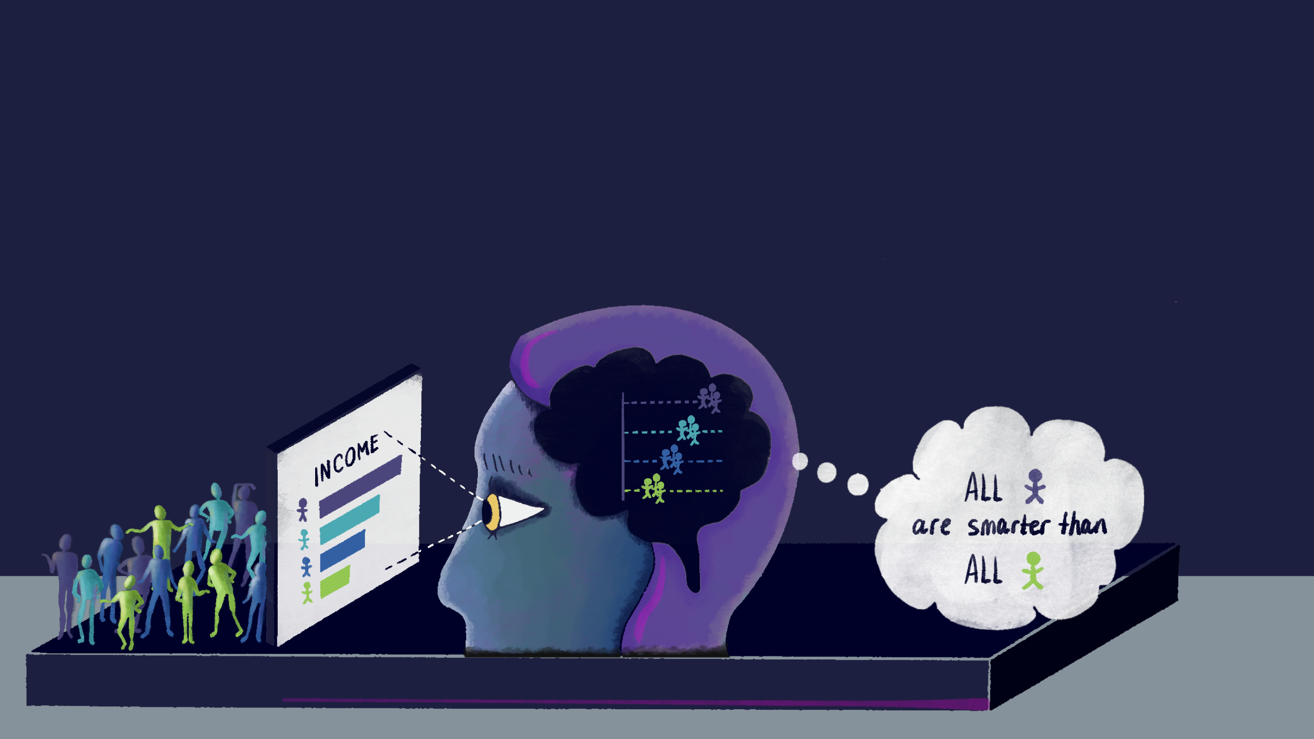
Our new research shows how popular chart choices can trigger unconscious social biases and reinforce systemic racism.
At first glance, the charts below seem harmless. They were published by reputable sources. They highlight important issues (disparities in health, wealth, incarceration, etc). They’re relatively clean and comprehensible. They’re clearly well-intentioned and, at least, not purposefully misleading.

But, as it turns out, instead of just raising awareness about inequality, charts like these can play an active role in making inequality worse. The way they’re framed can mislead audiences towards harmful stereotypes about the people being visualized.
Cindy Xiong and I explored this framing effect in a new paper that we presented at this year’s IEEE VIS conference. In our research, we show how visualizing social outcome disparities can create a deficit framing effect and that some of the most popular chart choices can make the effect significantly worse.
(If you’d like to get into the guts of it, the paper is here, you can watch the pre-recorded presentation here, or I’ve posted a deeper dive here.)
While it’s moderately depressing to spend a year of your life confirming (yet another way) that people can be judge-y and unfair towards each other, we’re eager to share this work with the DVS community. These deficit-framed charts are everywhere and we’d love y’alls help in raising awareness and nudging the wider dataviz community toward more equitable design choices.
Toward that goal, I’d like to share a few key aspects of our research that I think are most relevant for data designers:
- What is “deficit framing?”
- What are the implications for dataviz?
- How does it work? How could a simple chart possibly lead to stereotyping?
- What did we find in our research?
- What should data designers do differently?
But first, some background…
Some personal backstory…
Last summer, a post from Pieta Blakely turned my world upside down. She suggested that one of my beloved chart types (multi-series line charts) could, in fact, be subtly racist.

She points out that charts emphasizing outcome differences between racial groups could actually make the disparities worse by encouraging harmful stereotypes about the people being visualized (through a bias called deficit thinking, which we’ll cover shortly).
I was shocked! A jumble of reactions followed:
- The chart above seems so innocent?!
- I like the chart above! I used similar charts all the time.
- Comparisons are a fundamental building block of data storytelling! Actionable dataviz relies on the contrast between a measurement and a meaningful benchmark. This is a concept I’m heavily invested in!
- If this were true, how could I have made it this far and not know about it?! (I’ve been a dataviz nerd for quite a while now…)
- Even bigger: If this were true, it implies that information can backfire… even when it’s accurate, well-intentioned, and cleanly presented.
It was that last point that really stuck with me, because it has such big implications for dataviz, especially for data journalism and advocacy. It implies that a lot of great work for raising awareness of inequality… might actually make it worse.
Others in the data and viz communities weighed in: Alice Feng and Jon Schwabish rallied around Blakely in their comprehensive Do No Harm Guide. Catherine D’Ignazio and Lauren F. Klein allude to similar issues in Data Feminism. On the other hand, Jack Dougherty and Ilya Ilyankou cited the discussion in O’Reilly’s recent Hands-On Data Visualization, but ultimately dismissed the concern.
But, as it turns out, the idea that raising awareness can backfire isn’t new at all. Education and equity researchers have been thinking about “deficit thinking” for, literally, a hundred years. It was just me, in my white guy design / technology bubble, who was late to the party.
What is “deficit thinking?” What does it mean for dataviz?

Deficit thinking — the surprisingly pervasive bias that the people who suffer inequalities are somehow personally to blame for them — is well studied. Equity researchers Martha Menchaca and Lori Patton Davis and Samuel D. Museus date the concept back to 100+ years ago.
Pieta’s insight, though, was that deficit thinking could be triggered from a “neutral” chart like the ones above, and that our design choices might make this better or worse. She pointed out that emphasizing direct comparisons between minoritized and dominant groups encourages audiences to see the groups with the worst outcomes (often marginalized groups) as deficient, relative to the groups with the best outcomes (often majority groups).
Deficit thinking is harmful because it encourages victim blaming. It implies that outcome differences are caused by group members’ personal characteristics (e.g., “It’s because of who they are”) as opposed to external causes (e.g., “It’s because of systemic racism”).
Victim blaming leads to two further harms: Distraction and Self-Fulfilling Stereotypes.
- A Distraction Effect: Since personal blame is a cognitively easier explanation (src), and people tend to stop seeking explanations when they find one that plausibly fits their pre-existing beliefs (src), victim blaming obscures external causes, leaving widespread, systemic problems unconsidered and unaddressed (src).
- Self-Fulfilling Stereotypes: Victim blaming also reinforces harmful stereotypes, setting lower expectations for people that become self-fulfilling prophecies, further entrenching the disparities in question (src).
Pieta and I go into more depth on the impacts of deficit framing here: What can go wrong? Exploring racial equity dataviz and deficit thinking, with Pieta Blakely.
Why are effects like deficit thinking a concern for the dataviz community?
Deficit thinking has immediate implications for visualizing people and outcome disparities, but the existence of an effect like this has even broader implications. It demonstrates that that information can backfire and be harmful, even when it’s accurate, well-intentioned, and cleanly presented. This dramatically raises the stakes for making responsible design choices.
Typically we only think of “good dataviz” along a few dimensions:
- Comprehension: Do most people read it correctly?
- Approachability: Is the time-investment proportionate to the value of information?
- Affect / Aesthetics: Does it create the right emotion? Is it nice to look at?
Framing effects like deficit thinking imply that there’s at least one more dimension to “good” dataviz, which is something like this:
- Second-Order Attitudes: Do viewers read the chart correctly, but still consistently arrive at incorrect or harmful beliefs?
Previously-fine advice to revisit
Consider “Cotgreave’s law: “The longer an innovative visualization exists, the probability someone says it should have been a line/bar chart approaches.”
This captures an instinct a lot of us share, that often, “simpler,” workhorse charts like bars and lines get the job done and there’s probably not a strong reason for anything fancier. Or to put it another way: “99 times out of 100, use a bar chart.”
In a world where the worst-case effect of a suboptimal chart is a loss of clarity or slower comprehension, this is fine advice. Bars may not be the optimal chart choice, but they’re probably second- or third-best and the stakes generally aren’t that high.
However, what the deficit-framing effect shows is that, in contexts like inequality, the stakes are high and the “worst case” of an incorrect chart choice is considerably worse than lost clarity. So previously reasonable assumptions like these need to be revisited.
Other implications
A deficit framing effect has a couple other implications for dataviz.
- These potentially harmful charts are everywhere (e.g., see NYTimes, the Bureau of Labor Statistics, Pew Research, Wikipedia). We’ve got some charts to redesign.
- The most popular ways to show this type of data are probably the worst. So we’ve got some deeply ingrained habits to break.
- We can no longer assume that charts are passive. By choosing to visualize something like inequality, our charts take an active role in shaping it.
Not only do we have some deeply ingrained design instincts to reconsider, we have a lot of historic charts to revisit. Given the uphill battle, I hope to equip you with the conviction and the means to adopt more equitable design practices within your own work and in the wider community. To do that, let’s dive deeper into how this effect actually works.
How could a chart cause stereotyping?
First, we’ll look at stereotypes in general, then consider how two different types of charts could create similar misperceptions.
Stereotypes

To understand how a chart might nudge someone toward stereotyping, let’s look at stereotypes in general. For example, let’s consider a stereotype that people in this Purple Group A are especially high earners.
In reality, the distributions for outcomes like income will look like the chart on the left. Even if average earnings for people in the Purple group are higher than average earnings for everyone else, you’ll still see that earnings are widely distributed within both groups, and between the groups there’s a lot of overlap.
The “Purple people are high earners” stereotype is a distortion of reality. Stereotypes assume that, within a group, people are more similar than they really are, and between groups, people are more different than they really are. The stereotype implies a distribution like the chart on the right, where it seems that, not only do people in the Purple group earn more, their earnings are very similar, and therefore all Purple people earn more than all other people.
Could certain charts create similar misperceptions?
How could charts perpetuate stereotypes?

Bar charts like the above represent groups as monoliths. Instead of showing the diversity of outcomes within a group, they only show group averages. Because people naturally discount variability (src), especially when viewing bar charts (src) or confidence intervals (src), this chart creates a false impression of within-group similarity and exaggerates the differences between groups. Wilmer and Kerns refer to this as the “dichotomization fallacy.”

Discounting variability is a cognitive error that supports a further error about people. If you (incorrectly) believe that every person from Group A earns more than every person from Group B, it’s much easier to conclude that earnings are caused by something intrinsic to the people in each group. And, because the most apparent “cause” in this graph are the groups, there’s a very slippery cognitive slope toward blaming the outcome differences on the people being visualized–rather than more complex, cognitively taxing, external explanations like systemic racism.
Ignoring or deemphasizing variability in charts can create illusions of similarity. If stereotypes stem from these illusions of similarity, then the way visualizations represent variability (or choose to ignore it) can exaggerate these perceptions and mislead viewers toward stereotyping.
Let’s walk through an example…

When viewing a bar chart, a viewer’s thought process might go something like this:
- “Purple people, on average, earn the most, followed by Teal, then Blue, then Green.” (This is a basic, accurate read.)
- “Every Purple person earns more than every Teal person. Every Teal person earns more than every Blue person. Every Blue person earns more than every Green person.” (This is the dichotomization fallacy, overlooking within-group variability.)
- “The only apparent difference between earning levels seems to be a person’s group color, so a person’s group color must be the cause.” (This is an illusion of causality and personal attribution error.)
- “Since Purpleness leads to higher earnings, Purple people must be the smartest or hardest workers. Green people just need to work harder.” (This is correspondence bias or a representativeness heuristic.)
- “If it’s true for the people on the chart, it’s probably true for every Purple, Teal, Blue, and Green person in the universe. So all Purple people must be the smartest, hardest workers and Green people the least.” (This is a group attribution error and harmful stereotype.)
Variability

On the other hand, charts like jitter plots make outcome variability unignorable. They show between-group differences and within-group differences. Seeing the wide variation of individual outcomes within a group disrupts our tendencies to monolith, making it clear that inter-group differences only play a small role in individual outcomes. A viewer’s impressions might go like this:
- “Purple people, on average, earn the most, followed by Teal, then Blue, then Green.” (This is a basic, accurate read.)
- “A lot of Purple people earn more than the other groups, but not every Purple person earns more. Teal people also have high earnings, but they’re also all over the place. Blue and Green earnings are generally lower than others, but they also have some high earners.”
- “Group color isn’t a great predictor of income. There must be some other factors involved.”
- “This seems complicated. There are differences, but I need more information to understand why.”
This last line might seem like a bad thing, but in the context of visualizing people and social issues, “it’s complicated” is often an accurate read. The complexity is the point and is easy to overlook. And when the stakes are this high, it’s certainly better to leave viewers with unanswered questions than give them a false sense of confidence in the wrong conclusions.
The general hunch:

We’ve walked through two examples of how viewers might perceive two very different charts: jitter plots versus bar charts. In our research, we included other chart types that are more apples-to-apples comparisons. But these two chart types are great for illustrating our main hunches:
- Charts that hide variability leave room for a cascade of biases and misperception that ultimately lead to harmful stereotypes.
- Charts that emphasize variability make it clear that simplistic explanations like blaming and stereotyping can’t possibly be the cause of outcome disparities..
We’ve made a few other testable assertions in the stories we outlined above. In the next section we’ll see how these played out in the research.
“Dispersion vs Disparity” research project
If the theories above hold up, then when visualizing social outcome disparities, we’d expect charts like bar charts (that hide within-group variability) to encourage stereotyping and charts like jitter plots (that emphasize within-group variability) to discourage it. To restate the hypotheses a bit more precisely:
- Deficit framing happens: Given any chart showing social outcome differences (and no other causal explanations for why the differences occur), some viewers will misread the charts as evidence for a stereotype about the groups being visualized (e.g., “Group A earns more than Group B because Group A works harder than Group B”).
- Our design choices matter: Charts that downplay outcome variability (e.g., bar charts, dot plots, confidence intervals) will lead to more stereotyping than charts emphasizing outcome variability (e.g., jitter plots, prediction intervals).
- Error bars don’t help: Visualizing uncertainty won’t solve the problem, viewers need to see variability. Even charts that imply variability (e.g., confidence intervals) will lead to more stereotyping than charts that explicitly show variability (e.g., prediction intervals).

Experiment design
To test our hypotheses we ran four different combinations of chart types with more than a thousand people on Mechanical Turk. Participants each saw one of the 19 charts above. The charts showed (fictional) outcome differences between different groups, for one of four different topics (restaurant worker pay, life expectancy, test scores, household income).
To test the effect of showing variability in visualization designs, participants saw two different categories of charts:
- Low / No variability charts: These were bar charts, dot plots, and confidence intervals. They only show the average outcome for each group and hide the variability of the underlying data. This includes confidence intervals, which show uncertainty for the average, but not variability in outcomes.
- High variability charts: These were jitter plots and prediction intervals. Like the low/no variability charts, these show the average outcome for each group, but they also show the wider range of outcomes possible for individuals within each group.

We asked participants whether or not they agreed with various explanations for the outcome differences in the graph. The questions were evenly split between two question types:
- Personal attribution (blame) agreement: How strongly the participant attributes outcome differences to the personal characteristics of the people within each group (e.g., “Based on the graph, Group A likely works harder than Group D.”)
- External attribution agreement: How strongly the participant attributes outcome differences to external factors that affect the people within each group (e.g., “Based on the graph, Group A likely works in a more expensive restaurant than Group D.”)
The “personal attribution” questions were the important measure. Given that the charts provided no evidence for the causes of the outcome differences, agreement with personal attributions implies a personal stereotype about the people within the group. The “external attribution” questions were included as a baseline for comparison.
You can read more about the experiment setup here.
Results
Hunch #1: Deficit framing is real. Many people misread “neutral” charts as evidence for personal stereotypes.

These are partial results from our first experiment, where we tested different charts labeled with explicitly racial groups, like Asian, Black, Hispanic, White. We found that when viewing a chart about explicitly-racial outcome differences, 34 percent of participants agreed with personal attributions like “These outcome differences are because [Group] works harder than [Other Group],” despite the charts giving no evidence to support claims like that.
Self-reported attitudes about race / racism are notoriously hard to capture because of things like social-desirability biases, so we suspected that “real” results might be more extreme.

To control for social-desirability biases, we also tested charts where the groups were more abstract and not explicitly defined, like “Group A,” “Group B,” “Group C,” and “Group D.”
The abstract letters actually increased the effect. In these conditions, the majority of participants (53 percent) were willing to agree with personal attributions about the people being visualized.
This shows that the effect isn’t just limited to race. And optimistically, it implies that even if people are willing to be judgey about others in ambiguous groups… fewer of them were willing to be consciously judgey about race. But, again, we suspect the condition with abstract letter groups is closer to reality.

In any case, both of these tests show that deficit framing (or correspondence bias) can affect substantial portions of audiences. That is, given a “neutral” chart, viewers will often mistake evidence for outcome differences as evidence for personal differences between the people being visualized.
Hunch #2: Design choices matter. Charts that hide variability lead to more stereotyping.

In the three experiments where we tested low versus high variability charts, low variability charts consistently led to more stereotyping.
- In Experiment #1, we tested jitter plots versus bar charts. Bar charts significantly increased stereotype agreement by seven points.
- In Experiment #2, we tested jitter plots versus prediction intervals versus dot plots. Dot plots significantly increased stereotype agreement relative to prediction intervals, by seven points. Dot plots showed five points more agreement than jitter plots, but the difference wasn’t significant for that pair.
- In Experiment #3, we tested prediction intervals versus confidence intervals. Confidence intervals significantly increased stereotype agreement by five points.
Across the three experiments, the high variability chart types (jitter plots, prediction intervals) significantly reduced stereotyping compared with the low variability chart types (bar charts, dot plots, confidence intervals), by five-to-seven points on the 100-point scale.
The differences are modest, but meaningful. Obviously no chart will erase all harmful beliefs, but this study does show that data visualization design can interact with our social cognitive biases in some unexpected and potentially harmful ways. It also shows there’s room for improvement over the status quo.
(To put the differences in perspective, we can compare them to other well-known factors that affect attribution biases: political beliefs. Attribution biases, like deficit thinking or correspondence bias, usually have a stronger effect given certain cultural beliefs. For example, people from western, individualistic cultures, conservative political ideologies, or believers in the “just world hypothesis” often show stronger attribution biases. We found consistent results in our study: Self-reported republicans showed significantly more agreement with personal attributions than democrats (~six points). So the chart types in our experiment had a similar effect size as politics, a well-known factor influencing attribution biases. That is, using high-variability charts has a similar effect size as waving a wand and turning a typical republican into a democrat.)
Hunch #3: Confidence intervals aren’t enough. Show variability.

Experiment #3 is worth a closer look. Since confidence intervals are a best practice for showing uncertainty, we wanted to see if just showing any kind of uncertainty was enough to influence stereotyping, or if seeing variability (and the full overlapping ranges of outcomes) would have different effects. A super interesting study from Jake Hofman & friends suggests that confidence intervals encourage a similar “dichotomization fallacy” as bar charts, where people assume that individual outcomes are tightly clustered within the very short error bars.
So we tested confidence intervals (based on standard error around the group mean, which would show shorter bars with little overlap), versus prediction intervals (based on standard deviation of the outcomes, which would show as long overlapping bars for the same data). We found that prediction intervals reduced personal attributions by five points, relative to confidence intervals. This suggests that just seeing uncertainty isn’t enough to impact stereotyping, instead it’s about seeing variability and the overlapping outcome ranges.
Experiment conclusions
The results confirm that deficit thinking (or correspondence bias) effect can be triggered from ‘neutral’ charts and graphs. We show that, regardless of how the data is presented, many people will misinterpret data on social outcome disparities as evidence for blaming those differences on the characteristics of the people being visualized.

Fortunately, there’s significant room to improve over conventional chart types like bars or confidence intervals that present people (and their outcomes) as monolithic averages. These findings validate the argument that deficit-framed dataviz can unnecessarily perpetuate harmful beliefs like victim blaming and stereotyping. They also show that data designers have some degree of control over this phenomenon (and therefore some degree of responsibility).
Finally, we reveal another way that accurate information can backfire. This finding is particularly relevant for equity-focused advocacy groups. Simply visualizing outcome disparities is not enough to solve them, and if not done carefully, raising awareness of inequality can actually make it worse.
What this study does NOT show:
Bar charts aren’t inherently racist. Jitter plots won’t erase pre-existing harmful beliefs. Jitter plots aren’t even the best way to visualize outcome disparities (prediction intervals did slightly better in our experiments). But they seem to be a step in the right direction.
Data design implications
What do these results mean for dataviz design practice? While the experiment was inspired by use cases related to DEI and racial equity, these findings also apply to any visualizations depicting inter-group outcome disparities (e.g. gender, wealth, age, etc). The human capacity to be judgy towards other people is limitless, so unfortunately these results are widely applicable.

Equity-focused considerations for data designers…
- Accurate, well-intentioned dataviz can still backfire. Our duty of care towards audiences (and the people we visualize) means expanding our definition of “good dataviz.” Clarity, approachability, and aesthetics are important, but insufficient. To avoid backfire effects, we also need to consider and minimize the ways that even accurate reads of data can still contribute to inaccurate, harmful beliefs about the people we visualize.
- Review your social psychology! Dataviz research shows us all the cognitive quirks that come from reading charts and graphs. Social psychology shows us all the quirks that come from thinking about other people. Visualizing people requires understanding a bit of both. This textbook is free and very approachable.
- Means mislead, show variability. Monolithing people behind summary statistics makes it easier to stereotype them. In the same way that exposure to people from other communities helps us appreciate the rich diversity within those communities, exposure to the data behind the summary statistics helps us appreciate outcome diversity within the groups being visualized. This prevents viewers from jumping to easy, but harmful, personal attributions and therefore minimizes stereotyping.
- Resist the trap of false simplicity. For problems as big and messy as inequality and structural racism, if “it’s complicated” isn’t one of viewers’ main takeaways, then the chart is doing something wrong. A chart that only shows “Group X’s outcomes are 123 percent better than Group Y” might make a compelling sound bite, but it tells such an incomplete story that it’s arguably dishonest. And, as we’ve shown, it’s likely harmful.
Resources and next steps
- Sign up for a workshop. Learn how to visualize inequality, without making it worse. If you’re part of a team of data designers, journalists, analysts, or advocates, I’d love to help your team quickly catch up on this important topic. The workshops cover not only our recent research, but also the underlying psychology and alternative design approaches to conventional (harmful) visualizations of social outcome disparities.
- Dive deeper into our research project: The paper is here, the pre-recorded version of our VIS talk is here, I’ve posted a deeper dive on the experiment here, and all the data / code / materials from the experiment are here. Pieta and I unpack what’s at stake here and on the PolicyViz podcast here.
- Dive deeper into data equity: This is a ~4,000 word post, but it only scratches the surface on data equity. In the Do No Harm Guide, Jon Schwabish and Alice Feng at the Urban Institute interviewed 20+ experts on other considerations like language, color, iconography, and ordering. Heather Krause highlights all the subtle ways that analysis and data science can stray from any notions of neutrality. In Data Feminism, Catherine D’Ignazio and Lauren F. Klein cover an even wider range of data equity issues, looking at data science through the lens of intersectional feminism. In Algorithms of Oppression, Safiya Umoja Noble shows the scale of the problem, by highlighting how oppressive structures translate to oppressive technical infrastructure that we all rely on and take for granted.
- Learn How To create Jitter Plots using Google Sheets, a tutorial on visualizing regional disparities in PrEP coverage using spreadsheet charts.
Huge thank yous to Alli Torban for illustrations, Pieta Blakely for advice, and Cindy Xiong for co-conspiring. I’m also very grateful for early advice and inspiration from Jon Schwabish, Alice Feng, Steve Franconeri, Steve Haroz, Robert Kosara, Melissa Kovacs, David Napoli, Kevin Ford, Ken Choi, and Mary Aviles.

Eli Holder is the founder of 3iap. 3iap (3 is a pattern) is a data, design and analytics consulting firm, specializing in data visualization, product design and custom data product development.
- Eli Holder

- Eli Holder

- Eli Holder

- Eli Holder


