
T’was the weekend before Thanksgiving, and I started to stress:
Can I pull off this menu, or will it turn out a mess?
Examining my spreadsheet and all the meals listed there,
I realized I need dataviz to help me prepare.
For our first Thanksgiving as a married couple, my husband and I took on hosting duties. Armed with a spreadsheet outlining the menu and everyone’s contributions, I sat down to plan the meal prep and cooking.
But pressure mounted as I reviewed the items I’d assigned myself: multiple desserts, breads, and dishes that ranged from simple to labor intensive. The looming to-do list seemed overwhelming, and I struggled to organize cook times, appliances, and oven temperatures into a solid game plan.
Doubts crept in: was this culinary undertaking even possible, or would I have to scale back?
Uncharted territory
I realized a table wouldn’t cut it; I would have to pivot (pun intended) to something more visual. Enter the Gantt chart – an old friend that’s stepped in on past personal projects, from visualizing my reading habits to comparing flight options. This time around, I aimed to craft a timeline that would help me:
- Work smarter: Identify tasks that can be done in parallel and use pockets of hands-off time (like when dough is rising or ingredients are simmering) to work on other things.
- Use my oven wisely: Find the ideal order for preparing and baking items to cut down on oven usage time. When one item comes out, the next should be ready to go in.
- Separate gluten from gluten-free: Cooking for someone with Celiac’s means taking care to avoid contamination. This involves making gluten-free items first or baking in time to clean tools and work surfaces.
- Be realistic: Above all, ensure that everything can be done at a comfortable pace. I had no desire to fly around the kitchen like a bat out of hell.
Recipe roadmap
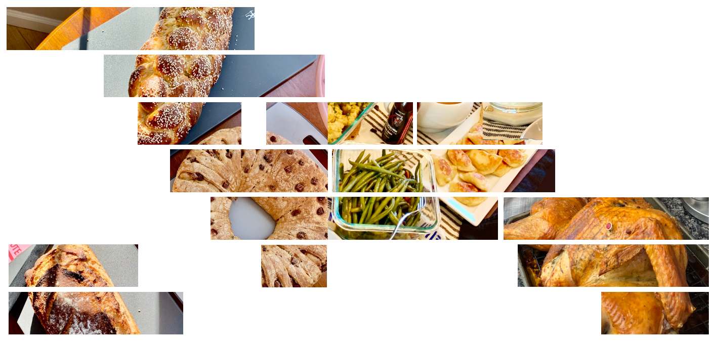
I started by gathering all the recipes and entering key details – timings, temperatures, appliances – into my spreadsheet. Budgeting enough time for each step here was crucial to feeding my chart realistic data. I bucketed tasks by day, saving the easier (making cookies), more fun (braiding challah), or necessary (roasting the turkey) work for Thanksgiving day.

Next, I sketched out chart ideas, experimenting with different swim lanes – would it be better to group by task type (prep, oven, stovetop) or by recipe? I found the latter to be much more intuitive; sorting by start time painted a clear picture of what I needed to do and when.

With that, I was ready to code! In Observable, I set up the scaffolding for two basic Gantt charts (for the day before and the day of Thanksgiving) to visualize a .csv of tasks.
Here’s where the magic happened: Working backwards from dinner time, I assigned time slots and added dependencies. For example, browning butter had to be done before starting on cookies or pie. Frying onions was necessary for both the pierogi and dum aloo. Sourdough had to be baked after challah, and both breads had to be done by noon to allow enough time to cool. The chart helped me connect the dots, creating a seamless flow from dish to dish.
Colors played a pivotal role, too. Once I colored the bars by task category, spotting hiccups and pockets of downtime became easy as pumpkin pie. I saw that once the turkey and sourdough were baking, there would be time for other hosting chores like tidying up the kitchen and setting the table.

Since my menu was fairly oven-heavy, I added a mini Gantt for oven temperatures above each chart. This provided me with a rough idea of when to start preheating my oven and roaster.
Last but not least came the visual design. Just kidding – time was a luxury I didn’t have. I couldn’t afford my usual rounds of revisions and design tweaks, essential for creating something intuitive and visually appealing.
In a perfect world, the color palette would direct attention to hands-on tasks and deprioritize the rest. Labels would be more legible, start and end times would be clearer, and each bar would have a hover state providing more information… The list goes on.
But in this world, my chart sufficed. I was designing for an audience of one, and that audience’s needs were met: I knew my menu was doable and I had a solid plan leading up to dinnertime.


Smooth as gravy
Wednesday morning before Thanksgiving, I stepped into the kitchen … and immediately went off-script. Although my official schedule didn’t start until noon, my early wake-up inspired me to get a jump on things. There were other unexpected twists, like realizing the turkey hadn’t thawed and dealing with sourdough (or should I say sourd’oh?) that refused to shape. On Thanksgiving day, our turkey cooked faster than expected, but dinnertime happened later than we’d planned – just a taste of the surprises.
But this roadmap still guided me through those twists and turns. Having a clear outline helped me stay organized and tackle obstacles, even though I didn’t follow the plan to the letter. The result was a chart-topping feast, served with a generous side of adaptability.


Baste Thanksgiving ever
I tried to take notes as I was cooking and baking to better understand timing for future reference. After the holiday, I used these notes to create new Gantt visuals, comparing expectations to reality.


One vital lesson stood out: A big Thanksgiving dinner is project management – efficiently handling and combining multiple tasks is crucial. Plus, I learned the value of having a backup plan for when things inevitably go wrong.
Equipped with these takeaways, I’ll be using this chart as a template for my next overly ambitious dinner party. Because when it comes to personal dataviz adventures, I’m not one to quit cold turkey.
As I charted my way to a plan crystal clear,
I was ready for hosting without any fear.
So in this festive season, I encourage you,
To try planning your holidays with dataviz, too.

Monika Tuchowska is a designer at McKinsey and Company's Data Visualization Lab, where she combines love for UX, coding, and numbers to turn complex data into engaging visual stories. When she isn’t contemplating charts, you can find Monika drawing, reading, taking long walks, or cooking up a storm.
- Monika Tuchowska


