
Patterns of Lines
Information designers and dataviz practitioners today face a daily challenge: what technique, method, software, or code library to use for their next project. Practitioners look both forward and backward, trying to keep up with the latest software tools and at the same time find more examples from the past — “classic” examples that can teach us something today.
I was invited to give a talk on Information Design History to a scientific research institute, where I presented visualization examples from many time periods and many cultures. I received a critique of my talk from a colleague. His message was “fewer examples, more commentary on why a specific design is successful.” He had a good point. To emphasize the breadth of information design, I spent more time showing examples than I did singling out why and how each example succeeded. Then he added “I wanted to learn more about the wooden navigation device! It really reminded me of the train schedule visualization” and he attached the image above.

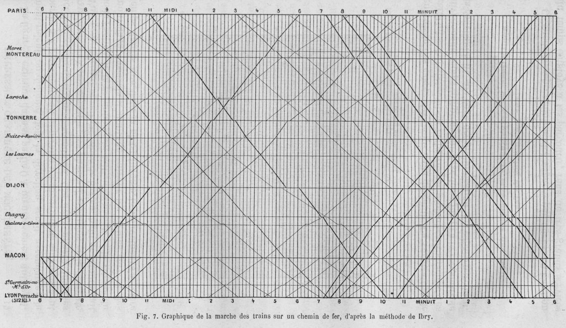
“The train schedule visualization” is an illustration from an article and later the book La Méthode Graphique dans les Sciences Expérimentales et Principalement en Physiologie et en Médicine (The Graphical Method in Experimental Sciences and Mainly in Physiology and Medicine) by Étienne-Jules Marey, (1885) [1]. Some people may recognize this two-color composition of crossing lines without legends of the X or Y axis as the cover image of Edward Tufte’s The Visual Display of Quantitative Information [2].
The slightly irregular and sloping lines made me think of another diagram of train lines, the first card folder edition of the London Underground map by Harry Beck [3].

And the slopes of the lines on that diagram brought to mind the very image from the Rebbelib type stick chart from the Marshall Islands [4] that had struck my colleague during the talk and prompted him to send me “the train schedule visualization.”

And I thought, how striking that this loop of three examples are similar in their use of lines to create visual patterns, yet the information in the patterns are to be found in very different relationships.
Three Ways of Seeing Time and Space
Marey’s diagram is an underlying grid of time and space. The information is to be found in the slope of the lines and their intersection with the background. It is an exercise in visual representation of motion. In fact, its first appearance is in “A Study in Locomotion” [5], which appeared in English in both the United Kingdom (Nature) and the United States (Popular Science Monthly). In all these publications, Marey explains the figure as a visual method to represent the speed of a train traveling between Paris and Lyon. He explains “[a]n engineer named Ibry has devised [this] method”, but there is no indication it was used as a public train schedule. The background grid represents the intersections of time along the X and stations in space along the Y-axis. Twenty-four hours are marked by vertical lines and the horizontal lines for each station are spaced proportional to their distance. The location of a train at any moment can be expressed by a point on this grid. If we follow this mental algorithm, the continued motion of the train becomes a series of points, which form a line. “At successive instants the train will occupy points on the table always different; the series of these points will give rise to a line which will be descending and oblique from left to right for trains coming from Paris, while it will be ascending and oblique in the same direction for trains going to Paris.” [5]
Information about the speed of the train is found in the slope of the line, the faster the train the greater the slope, a side effect of this method. We can also see when the train idles in the station by observing that the position of the point remains on the station’s horizontal. Marey darkens the lines that represent the through trains to distinguish them from the locals. This makes it easier to see their relative speed compared to the trains they parallel or cross.

It is worth noting that Marey was less interested in proposing this figure as a superior train schedule, than using it to promote one of his inventions the odograph, though he notes that looking at it “gives a genuine interest to a journey”. The odograph was an apparatus for recording on a revolving drum the speed and distance covered by a moving carriage, a precursor to the odometer that eventually appeared in automobiles. His odograph table compares the pattern created by the rapid railway coach stopping with some station stops with three other examples: a slow overland coach, a meter measuring the flow of gas, and the inner workings of a clock-work flywheel. Both the “graphic of the progress of trains upon a railway” and the pattern traced on the odograph are examples of what we now refer to as data visualization. [5]

It is worth noting that, while the train schedule was directly compared to the tracings of the odograph when Marey published this research in 1879, by the time La Méthode Graphique was published six years later the train schedule as in the first chapter on graphical representation of phenomenon while the odograph appeared a hundred of pages later in the chapter describing the many devices that he and others had invented in those years to make traces of motion. Sandra Rendgen has recently published examples of train schedules following Irby’s method that date from the 1840s in France, along with a description of the tracing device used to make the lines on the grid. As she explains, these diagrams were made to set the speed and schedule of the trains for the employees, not to communicate to passengers.[6]
In Beck’s diagram, the background represents London north and south of the River Thames. The colored lines represent subway lines rather than individual trains. The text along each line represents station stops. The stops with diamond symbols mark where transfer between lines can occur. The position of the lines is constrained to an invisible grid that represents time and distance only indirectly. Stations are located relative to their cardinal direction and their position north or south of the river. The actual distance between stations on the same line is distorted and entirely ignored when the stations are on different lines. Despite its visual similarity to Marey’s figure, the slope of the lines in Beck’s diagram carries no information at all. The information about how to move between any two stations is represented by a combination of line color, station names and transfer marks. Beck’s graphic method proved to be an enormously successful solution to a growing problem: how to represent the interconnection of multi-line urban transportation systems in a compact space. It is an information design that presents a field of possibilities by visualizing all specific paths.
In the rebblib sailing chart, the dark background is a cloth set up by a photographer to provide high contrast with the color of the sticks and shells fastened together with thread. The background is the ocean surrounding the Marshall Islands. According to the catalog record this object “Indicates sailing directions for atolls and islands in both the Ratak (eastern) and Ralik (western) chains of the Marshall Islands. Seashells depict the atoll and island locations. Atoll and island names are typed on strips of paper which are glued onto the wooden sticks [not visible in the photograph]. Each straight stick represents regular currents or waves around the low-lying atolls while the curved sticks depict ocean swells.” [4]

The lines themselves are neither traces of motion nor transportation pathways. Instead, they are observable states of the ocean surface. The information about how to move between islands is represented by the number of the lines that will be crossed in a boat. The line’s slope represents the direction of the current or swell to be crossed. Rebblibs are collected in libraries and museums as cultural artifacts, examples of material culture produced by a non-Western society.

These three examples look alike, yet they use the elements of line, slope, intersection, and color for dissimilar purposes. Their patterns of differences are designed to connect a viewer to the solution of a problem, whether their intended audience was 19th-century European scientists, 20th-century urban commuters, or Micronesian sailors from the second millennium. All three of these line pattern arrangements share a common functional theme: they are all elegant solutions to the communication problems we face when designing transportation diagrams.
The Three Frames We Use Today
How can we talk about these three examples in a way that does not run into the barrier of different frames of reference? Data Visualization. Graphic Design. Information Design. These terms describe overlapping practices of visual communication. Their respective traditions and professions have created three distinct frames used to contextualize and value not only the work we create today but just as importantly the past we must learn from.
Frame One is built from quantitative data, statistical data transformed into visual images. It has been the leading frame for data visualization examples, influencing and being influenced by work in psychology, computer science and human-computer interaction. It has been constructed by a series of scientists, engineers, mathematicians, and statisticians.

This history really should begin with Marey’s La Méthode Graphique [1], though the fact that this book has never been translated into English makes it unknown to most practitioners today. Marey starts with reflections on previous graphic examples that inspired his methods to record and visualize data for scientific experiments. The first two chapters are the primary source of oft-cited examples such as William Playfair and Charles Joseph Minard.

Willard C. Brinton’s Graphic Methods for Presenting Facts (1914) [7] is the next book that reflects on and collects examples of visualization of quantitative data, which Brinton, an engineering consultant, purposely calls “facts”. This was a how-to book about graphic applications in business and engineering. Brinton’s examples are limited to 20th century America and Britain.

The next source is Historical Development of the Graphical Representation of Statistical Data(1937) [8] by Howard Gray Funkhouser. This repeats examples from Marey’s book, adds some “Medieval” sources and reproduces statistical examples including the often-reproduced rose diagram by Florence Nightingale. Funkhouser was an educator and mathematician focused on statistical applications. This was not a popular book, but it was in the library for later statisticians to use as a source.

Brinton published his second self-published book, Graphic Presentation, in 1939 [9]. He dedicates this book to Playfair, whom he discovered sometime in the intervening decades. This book followed the same format as Graphic Methods, adding another two decades of contemporary American examples from business and engineering topics.
Jacques Bertin’s Sémiologie Graphique. Les diagrammes, les réseaux, les cartes (1967) [10] brought a theory of signs to the practice of cartography and by extension to any form of diagrammatic representation of data. His work introduced the concept of visual variables into the current practice of data visualization with particular emphasis on cartography. It was fifteen years before the English translation appeared as Semiology of Graphics (1983) [11]. This book is the source of all later references to Charles Louis de Fourcoy’s Tableau poléometrique [12], one of the very few historical examples Bertin reproduced.
The visual display of quantitative information (1983) [13] by Edward Tufte brought this frame of data visualization from a statisticians point of view to a larger audience. While Tufte’s books are primarily a critique of best practice, they also present a history of past examples. He reproduces images from Marey’s work and the people Marey and Funkhouser cite. He quotes Bertin. He extols representations of multivariate data. He collaborates with the graphic designer Inge Druckrey and produces Envisioning Information(1990) [14]. This publication adds John Snow’s cholera map to what becomes a canon of data visualizations.
This data visualization canon is expanded by Michael Friendly’s “A Brief History of Data Visualization” (2006) [15], written as part of the Handbook of Computational Statistics, along with his extensive Milestones website [16]. Friendly, a psychologist and statistician, adds some pre-modern examples, notably the “unknown astronomer” in Macrobius’ commentaries on Cicero, which comes from an article by Funkhouser [17]. He recounts Playfair, Minard, additional cholera maps and Joseph Priestley’s timeline. He cites Marey, Funkhouser, Tufte. Nobody cites the non-academic Brinton.
Frame Two is built by graphic design historians. It is far less concerned with algorithms, reproducible graphs or data management. Graphic design is largely a 20th-century Euro-American invention, so this history focuses on the 20th-century graphic designers who developed the visual language for presenting information in books, magazines, and exhibitions. Itincludes cartography as thematic maps, styles for visualizing quantitative data and various forms of scientific explanation. It treats information design as a sub-specialty within the broader frame of graphic communication.

Major figures such as Herbert Bayer, Will Burton, Ladislav Sutnar and Massimo Vignelli were first and foremost designers — typographers and art directors — whose style, taste and design rigor produced great examples.
Frame Three is built around an information design profession that employs graphic design as needed. This profession is based on the theory and practice of visualizing complex information in a simple form to support information transfer. Joel Katz’ heads-up signage for Walk! Philadelphia, always oriented to match the pedestrian’s viewing direction, is a good example of this [18, pp. 154–155].

Otto Neurath’s work to communicate economic and public health information embodies this concept [19]. Neurath studio employed several talented designers, whose work served to make social statistics understandable with a minimum of language. Richard Saul Wurman’s many visual solutions to support what he branded as “understanding” [20] are also an important contemporary example valued within this frame.
These frames overlap while offering very different interpretations of what is important. Frame One focuses on how to make images from quantities — if it can’t be computed, it’s not really data. Frame Two emphasizes aesthetics and style. Graphic innovation and stylistic purity are given greater value than usability. Frame Three tends to treat graphic design as a technique, a means to an end, to be applied to a set of tasks such as wayfinding and document design. Frame Three seeks to distinguish itself as a “practices in which the main purpose is to inform, in contrast to the persuasive approaches more commonly used in practices such as advertising.” [21]
Paul Stiff’s “Some documents for a history of information design” (2005) [22] traces the struggle that characterizes how Frame Two and Three overlap. His essay starts with two contrasting premises. One is that information design derives from “Bauhaus plus Bell Labs equals HfG Ulm” — functional modernism combined with signal theory becoming functional post-modernism. Stiff presents the sequence of the “new typography” issue of Typographische Mitteilungen (1925), Shannon and Weaver’s Mathematical Theory of Communication (1949) and the first HfG Ulm course catalog (1958) followed by examples from a combination of 20th-century graphic designers, social scientists, and industrial designers. Stiff also notes that information design derives from the needs of the American military-industrial complex, as embodied in Brinton’s books. In “Some dates for an etymology of information design”, Stiff traces the origins of “information design” from business printing, information printing and information publishing, all of which were phrases for the visual presentation of commercial information.
Though an occasional example of a Sumerian tablet, a medieval European map, an Aztec calendar stone or tracing from a Chinese table from the British Museum collection creep in to give chronological depth to a discussion, Frames One, Two and Three have no place for examples from non-Western cultures.
A Fourth Frame
We can use functional themes to construct a frame large enough to contain information design examples that are currently scattered among many disciplines. We need a new frame to record and examine a history that can accept images from archaeology equally with those invented by graphic designers and software engineers, that includes the visual production of Western and non-Western cultures. This should be the largest possible frame within which we can examine common features that apply to both past and current visual communication practice, methods that have been used to express qualitative as well as quantitative information.
When we look at the three examples we started with, we are looking at compositions that have a very different value depending on which frame we put them in. “The train schedule visualization” as seen through Frame One is an icon of data visualization. Seen through Frame One, Beck’s Underground diagram is imperfect — many have criticized how it distorts “real” distances between above-ground locations. When we look at the same example through Frame Two, it looks like the work of an autodidact — Beck was an electrical engineer, not a graphic designer — which inspired great designers such as Massimo Vignelli and Erik Spiekermann to create design masterpieces for the New York and Berlin subways, respectively. But looking at the same example through Frame Three we can see a masterpiece of information design that became the template for all urban transportation maps that followed. Our third example, the rebblib, is outside these frames, a curiosity from a non-Western culture that seems to serve a purpose similar to a Western navigation chart. It is made from unfamiliar materials — sticks and shells rather than ink and paper. We are aware of it only because is classified and valued as an example of ethnographic craft or a work of Oceanic art.
I propose that we rethink these examples within a Fourth Frame, as instances of global information design. Global information design includes, but is not limited to, visualizing numbers or drawing pictures to represent “facts”. It embraces visualizations of qualitative data such as expressions of social hierarchy, cultural beliefs, and values. Frame Four is meant to kick information design history out of this Venn diagram of overlapping restrictions and into a global context, where we can appreciate and learn from examples that are currently segregated into further restricted frames such as art history, archaeology, ethnography, and the Western study of non-Western culture. In the context of Frame Four, we can see our collective strategies of visual logic, the many ways we have found to transfer a chosen signal, across time and space, from sender to receiver.
It has been convenient to weave back and forth between the terms data visualization and information design up to this point, as both terms are used to describe the examples I have and will discuss. To conclude this introduction and for the rest of this series I will use the term information design. It is the breadth and depth of information design that I want to describe
Information we notice with any of our senses and retain in our consciousness is a difference which makes a difference, to paraphrase Bateson [23]. Inconsequential differences we perceive as “noise”. The visual designer intent on communicating information seeks strategies to shape the differences his audience will see. To become legible, information must be organized into patterns, which become the pathways for visual access. Frame Four allows us to study the history of information design — a practice that applies to qualitative as well as quantitative data –through the lens of its cultural purpose. We can put aside the use of the formal technique — lines, bars, and circles — and broaden our view of information design by following the pathways of its intended use. Studying examples of information design from many time periods and many cultures helps us understand how we shape patterns of difference into hierarchies and network to create that chart, story, that graphic from the patterns that connect.
Information design can be understood as any combination of visual and verbal communication that combines two steps: selection and encoding.
Step One is the selection of information to present. Information design composition is selective. The functions we will explore first and foremost shape their visual form through selection. No human culture communicates information by reproducing everything. The reproduction of the territory is not a map, to invert Alfred Korzybski’s famous statement [24].
Step Two is transforming selected information into a visually perceptible code. The documenting of the code may be part of the design. Or the meaning of the code may be so culturally transparent that no legend is required. The designer must understand the intended audience and that the audience must understand the code. This presents a major challenge when we examine examples where the cultural context is remote in time, space and cultural context. But even in those cases where we have no way to decode the content details, we can learn something from the visual form.
Next: The Nine Themes for Frame Four
Reviewing the nine themes of Global Information Design — Cosmology, Maps, Transportation, Lineage, Timelines, Scientific Explanation, Economic Trends, Mechanical Controls, and Engineering and Business Process — we dive into an examination of Cosmology in the design of buildings and environments.
Global Information Design: an overview of the series
Global information design embraces the visualizations of both qualitative data such as expressions of social hierarchy, cultural beliefs, and values, and quantitative data, such as economic trends and scientific explanation. We can broaden our view of information design by following the pathways of its intended use. Exploring the history of how we visualize cosmology and timelines, transportation networks and family lineage, is as informative for current data visualization practice as the mastery of programming libraries and cognitive science. Studying examples of information design from many time periods and many cultures helps us understand how we shape patterns of difference into hierarchies and networks to create that chart, story, or graphic from the patterns that connect.
Bibliography
[1] É.-J. Marey, La Méthode Graphique dans les Sciences Expérimentales et Principalment en Physiologie et en Médicine. Paris: G. Masson, 1885.
[2] E. R. Tufte, The visual display of quantitative information, 2nd ed. Cheshire, Conn: Graphics Press, 2001.
[3] K. Garland, Mr Beck’s underground map. Harrow Weald: Capital Transport, 1994.
[4] Majuro, Marshall Islands, “Marshall Islands stick chart, Rebbelib type.,” Library of Congress, Washington, D.C. 20540 USA, 1920. [Online]. Available: https://www.loc.gov/item/2010586182/. [Accessed: 02-Feb-2019].
[5] É.-J. Marey, “A Study in Locomotion,” Nature, pp. 438–443, Mar. 1879.
[6] Sandra Rendgen, “History: From Paris with Love (ca. 1845),” SANDRA RENDGEN, 15-Mar-2019.
[7] W. C. Brinton, Graphic methods for presenting facts. New York: The Engineering Magazine Company, 1914.
[8] H. G. Funkhouser, “Historical Development of the Graphical Representation of Statistical Data,” Osiris, vol. 3, pp. 269–404, 1937.
[9] W. C. Brinton, Graphic presentation. New York city, Brinton associates, 1939.
[10] J. Bertin, Semiologie graphique. 1967.
[11] J. Bertin and W. J. Berg, Semiology of graphics: diagrams, networks, maps, 1st ed. Redlands, Calif: ESRI Press : Distributed by Ingram Publisher Services, 2010.
[12] C. L. de Fourcroy, Essai d’une table poléométrique, ou Amusement d’un amateur de plans sur les grandeurs de quelques villes… publié par M. Dupain-Triel père,… 1782.
[13] E. R. Tufte, Visual explanations: images and quantities, evidence and narrative. Cheshire, Conn: Graphics Press, 1997.
[14] E. R. Tufte, Envisioning information, Fourteenth printing. Cheshire, Connecticut: Graphics Press, 2013.
[15] M. Friendly, “A Brief History of Data Visualization,” in Handbook of Computational Statistics, C.-C. Chen, W. K. Härdle, and A. Unwin, Eds. Springer Verlag, 2008.
[16] M. Friendly and D. Denis, “Milestones in the History of Thematic Cartography, Statistical Graphics, and Data Visualization,” 2001. [Online]. Available: http://www.datavis.ca/milestones/. [Accessed: 17-Mar-2019].
[17] H. G. Funkhouser, “A Note on a Tenth Century Graph,” Osiris, vol. 1, pp. 260–262, 1936.
[18] J. Katz, Designing information: human factors and common sense in information design. Hoboken, New Jersey: Wiley, 2012.
[19] N. Vossoughian and D. Camp, Otto Neurath: the language of the global polis. Rotterdam : London: NAi Publishers ; Art Data [distributor], 2008.
[20] R. S. Wurman and P. Bradford, Eds., Information architects. Zürich: Graphis Press, 1996.
[21] I. Meirelles, Design for information: an introduction to the histories, theories, and best practices behind effective information visualizations. Beverly, Mass: Rockport, 2013.
[22] P. Stiff, “Some documents for a history of information design,” in Information design: research and practice, A. Black, P. Luna, O. Lund, and S. Walker, Eds. Routledge, 2017, pp. 147–159.
[23] G. Bateson, “Form, Substance, and Difference,” in Steps to an ecology of mind: collected essays in anthropology, psychiatry, evolution, and epistemology., San Francisco: Chandler PubCo, 1972.
[24] A. Korzybski, “A Non-Aristotelian System and its Necessity for Rigour in Mathematics and Physics,” in Science and sanity: an introduction to non-Aristotelian systems and general semantics, Fort Worth, Tx.: Institute of General Semantics, 2005.
Thanks to Jason Forrest.

Paul Kahn’s engagement with visualization of large knowledge structures began with hypertext research projects in the 1980s and continued with the development of diagram techniques for describing information architecture. He taught Information Design History for 7 years at Northeastern University’s Information Design & Data Visualization program. He created Kahn+Assoc., the first agency in France focused on information architecture, preceded by a decade leading Dynamic Diagrams in Providence RI. He served as Experience Design Director at Mad*Pow and now devotes himself to teaching and writing in France. In 2020 he led Covid-19 Online Visualization Collection (COVIC), and has written about insights from the thousands of visualizations created during the pandemic.
- Paul Kahn

- Paul Kahn

- Paul Kahn

- Paul Kahn


