
The Mystery Job or “Why do I need half an hour and puppets to explain what I do for a living?”
It was the dreaded question, the one that stopped all the forks and knives and the hubbub of conversations until all uncles, aunts, cousins, grandparents, and even parents had their eyes on me:
“And you, Julie, remind us, what is that you do again exactly?“
I tried to brush off the answer, very casually, not even raising my eyes from my plate: “You know, I’m a datadesigner, I design data.”
Polite smiles and little coughs.
You would think that after going through this kind of awkward silence dozens of times, I would have memorized a little pitch by now but nothing came. Before I could even start to compose myself for a more elaborate answer, my uncle sighed and stated:
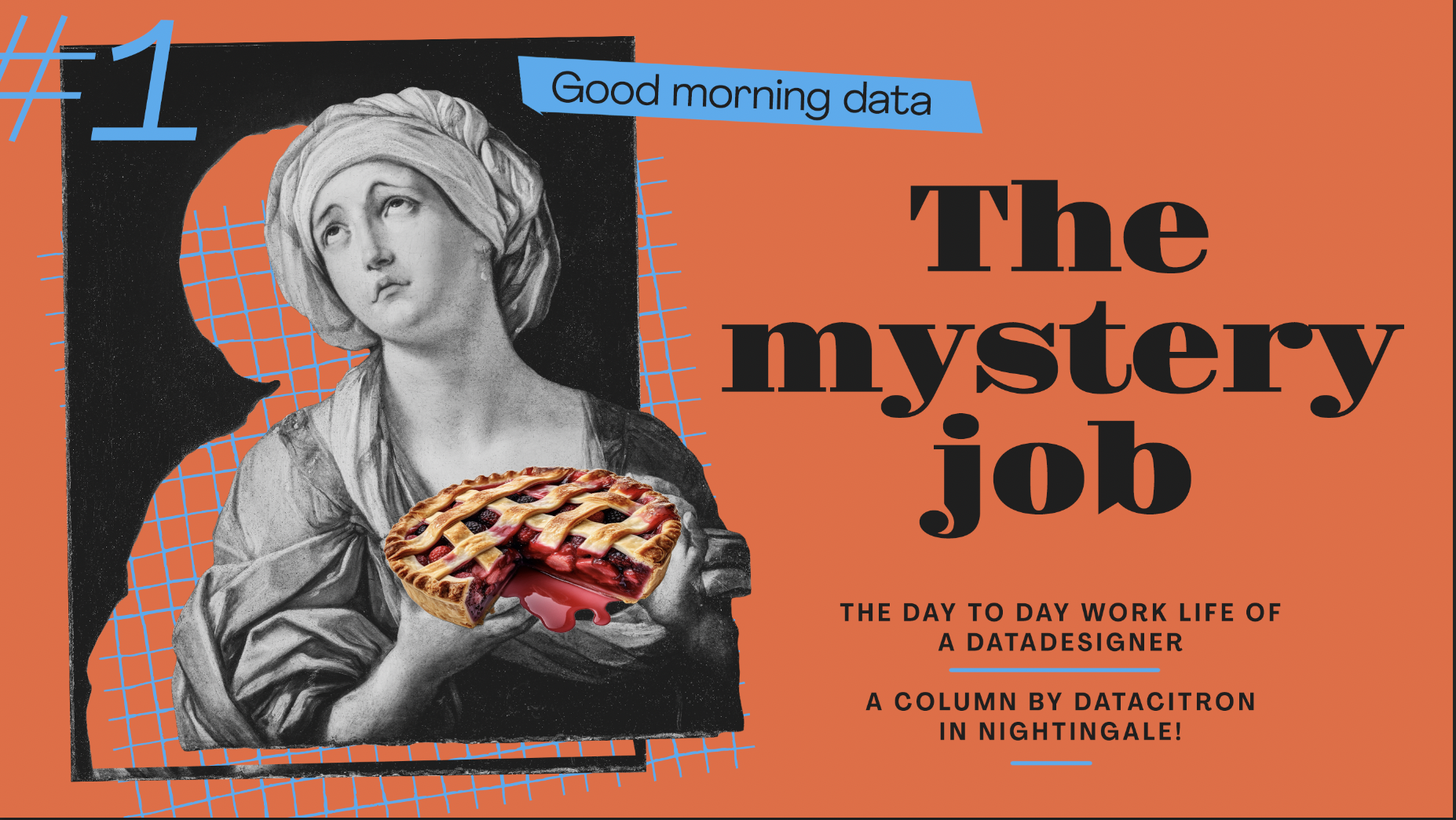
“She makes pie charts.”
“Why didn’t you bring dessert then?”
“Not those kinds of pies, grandma…”
“She makes charts, graphs, you know. Like pie charts. You know pie charts, the circle thingy with the numbers on it,” elaborated my uncle.
“Well, it’s a bit more than that…,” I timidly protested to the general audience “ugh.”
“Actually, she doesn’t make pie charts,” corrected my father.
“Thanks, dad.”
“Her software does. Right, honey?”
“…!”
“So if she doesn’t make it, what does she make?” continued my aunt, who was becoming a little annoyed.
“The software?” My dad frowned, either searching really hard in his memory or his imagination.
“What, no!”
“Oh yeah, the data then!” He was gleaming with satisfaction.
“Dad, no! Is that what you say when people ask you what I do?!”
“No, of course not, sweety. Nobody asks.”
“If you don’t make the data and you don’t make the software, what is it that you do?” Interrupted my uncle, getting grumpier by the minute.
“I make the visualizations with the data I’m given by using dedicated softwares,” I stated very slowly, unsure of my formulation but probably looking unsure of my job.
“So… it’s like people give you the paper to put on a printer and you’re the one pressing on the button,” ironized my older cousin, that perfect one we all have.
“Oooh, I did that a lot during my last trainee, stepped in her son of 17. It’s not as easy as it seems.” He leaned toward me with the whisper of a connaisseur: “The secret is to put enough paper so you don’t run out mid printing but not too much that you create a paper jam.”
I was not to be intimidated by my cousin who already had far too many pictures of her and her children on the mantle of my grandparents :
“Well, it’s more like people bring me raw paper pulp and I make the right paper with it, to put it in the right printer so in the end, it prints accordingly to the people we want to print for and with the effect we want to have on them.”
I was not unproud of this improvised metaphor, though to be fair, I usually do more digital stuff.
“I don’t think you can print on made up paper, it’s gonna jam…” protested my nephew with a worried look.
“Sure, that was just an image.”
“Regardless of printing just an image or text, you really need to use standardized paper.”
“Martha printed etiquettes on sticky paper the other day, it worked just fine,” commented my grand aunt while passing the peas.
“Yeah, but that was standard transfer paper, right? She didn’t make it herself,” insisted my nephew.
“No, she bought it at the supermarket and let me tell you, this thing was NOT cheap.”
While the conversation drifted to the unreasonable expectations to access high quality goods at low prices, regardless of social-economic or ecological consequences, I was left wondering what was wrong with me or with my job. Why is it so hard to explain it?
It wasn’t the first time it happened to me and certainly not the last. Recently, I failed at it again at the bank, during an interview for a loan. The kind of place and time you probably shouldn’t ask for a glass of water in the middle of explaining your source of income.
But talking with other data designers, I realize that I wasn’t alone in this miscommunication conundrum. It seems we actually all struggle, to various degrees, to explain our jobs to the data muggles of this world. But why is that?
They say “What is well conceived is clearly stated.” Do we conceive poorly our own jobs? Or is it on them for not being able to conceive it? Weirdly enough, if very few people have heard of datavisualization or datadesign, everybody has seen a chart, maybe even created one in their life.
Photographers certainly struggled to explain at first what they did, shortly after the invention of the camera. Could it be that, by the time everyone could take a photo with their phone, it’s probably even harder for them to explain what they do differently to make it their actual job?
I’m wondering: are we pioneers, doing jobs few people know of yet? Or is it that seeing questionable charts on almost every PowerPoint presentation makes us look like bad digital factory workers, clicking on some button? Is datadesign too niche to only be known by the elite or is it too spread, too mainstream now, that everyone can create the worst 3D pie chart using any spreadsheet tool?
And if so, are we to blame for failing to advocate to the broader audience about the importance of our job as data designers? How do we make them aware of the crucial role we have in a society shaped more and more by its data? How do we explain the importance of data literacy and the responsibility we have, almost the oath we took, to make data accessible and understandable to all, including them, through design and storytelling?
By the time I was left with my unanswered questions, dessert was already on the table.
As we were saying our goodbyes, my grandma caught my arm and pulled me closer to her:
“Don’t worry, love. Whatever you do, I know you’re doing it well and that’s what really matters…”
A wave of warmth enveloped me as I gently squeezed her arm in my hand in return. She continued: “…but next month is you grandpa birthday and you know… raspberry pies are his favorites.”
Loved this column? Rendez-vous here on Nightingale every 15th of the month for a new one!

Datacitron (aka Julie Brunet) is an independent data & information designer as well as the Creative Director of Nightingale, the journal of Datavisualization Society. She believes in the accessibility of information through design and storytelling, and the virtuous role data designers can play in our society
- datacitron

- datacitron

- datacitron

- datacitron


