
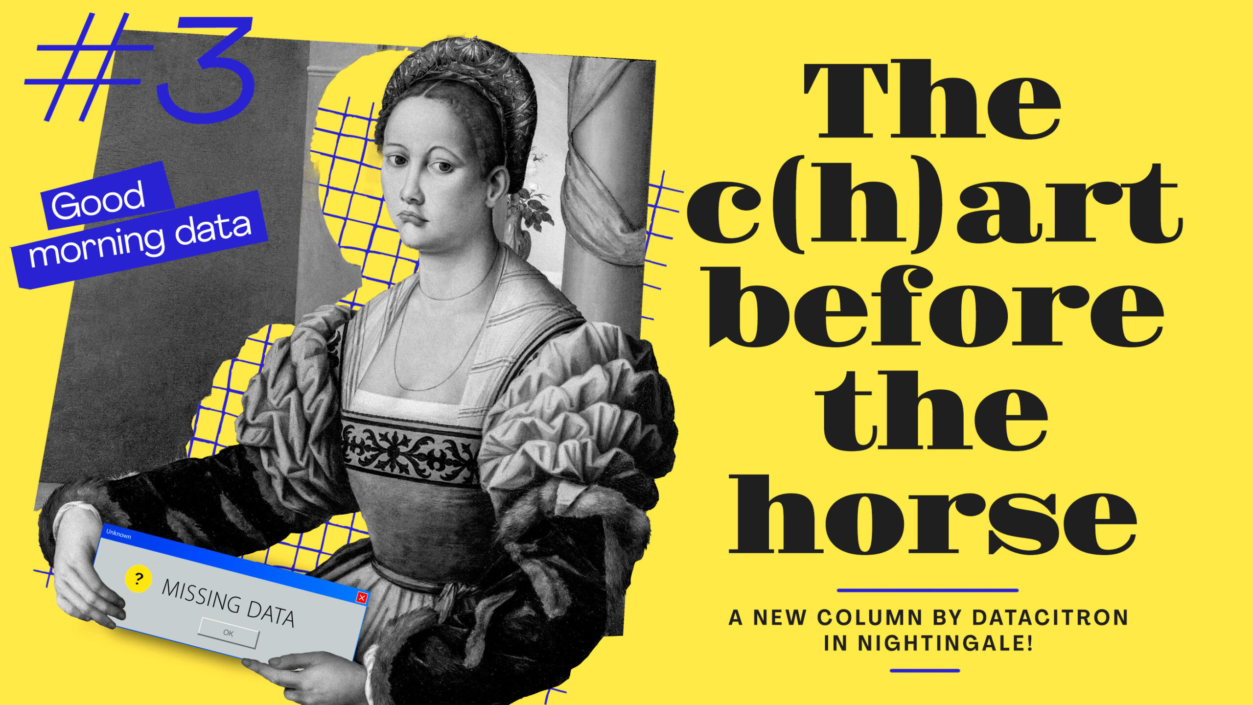
The C(h)art Before the Horse or “Do we really need data in dataviz?”
The color palette was set, three complementary hues of blue, green, and pink—very saturated and RGB inspired to contrast with the more classical serif font. Simple geometric shapes, size determined by proportion, clashing against collage elements from archive pictures, playing with different levels, background or foreground, to create a space where visualizations bearing the information and graphic elements conveying the story could discuss and exchange. It was like I could see the entire project built right in front of me, trying to capture every detail because we all know too well that translating a mental image into a real life project is still a struggle, however perfectly focused it appeared in your brain once.
But as I was frantically adding notes, color swatches and visual inspiration to this new personal dataviz project, I couldn’t help but feel I was missing something, something big, something important.
Side note here, if you experience such a feeling as a parent, I’d recommend you make a quick headcount to check if the youngest in the family is still around. My mother forgot me once in a fitting room when I was a baby and had to take this very specific walk of shame of retrieving her discarded child in a store after she realized her oversight. She would tell you it only needs to happen once to be labeled a “bad” parent, so…
Anyway, I have no child to misplace in the first place and this nagging feeling was getting worse to the point I had to interrupt my visual frenzy to think hard: what was it that I was forgetting? And then, it hit me: the data! I was forgetting the data, for I had none for this dataviz project. I felt kind of silly.
Truth is, it happened to me several times: to be carried away by a spur of inspiration to the point of building an entire dataviz project in my mind, in my notebook, to even start to sketch it, before realizing I was missing this quite important piece of the puzzle: the data related to it.
They say a good dataviz project must find the right balance between data, story, and design, but they never say in which order such elements should be acquired. So why is it that starting by a design inspiration goes with a pinch of guilt, even of shame? I would easily imagine that a data journalist starts by finding a good story and a data analyst by building a good dataset but when it comes to a data designer starting by creating a good design, something sounds off. Like buying the wallpaper before the house (something I never did of course). Like putting the cart before the horse, the chart before the horse, or even the chart before the data, if you allow me!
I believe it actually says a lot about how we still regard data design in the great scheme of data life. To talk in analogy, we seem to consider the data as the foundation of the house, the story as its walls and global structures and the design as indoor decoration. Not only are we used to seeing them appear in this order but we tend to give them the same hierarchy of importance as well. Are data scientists and data journalists the real architects doing the hard job, while we, data designers, are only fussing around with our brushes and colors, painting walls we haven’t built, plugging trendy lamps into sockets we haven’t installed? (Can you tell I’m currently in the process of renovating my house?)
I’d like to believe we are more, that our role comes prior to the finishing touches and is more essential to the core of the final project. I can’t believe data design to only be the elegantly sculpted tip of the iceberg, while most of the work is hidden underneath. I’m convinced the design, though it seems to be the last exterior layer to be added, should take its roots deeper and appear much sooner in a project than it sometimes did. Yet, by starting a project with the design, quite a natural thing to do for a designer after all, I still carry this guilty impression of treating data as an excuse for some visual display.
And maybe that’s a good thing. Maybe it reminds me to be a careful cook while applying this recipe of data, story, and design and, though their order of incorporation may not be crucial, it is still important to respect each of them—to weigh them carefully and incorporate them without favoritism. (Can you tell I’m starting to feel hungry?)
We all need to start somewhere, usually from a familiar spot, and mine is obviously design. I find it not always easy to embrace but I try to see it as a valid starting point, as long as I don’t forget the rest. And when it happens, well, I do the sneaky move of discreetly retrieving the data baby I forgot for a moment in a corner as my mother usefully taught me. I guess some habits just run in the family.
Loved this column? Rendez-vous here on Nightingale every 15th of the month for a new one!

Datacitron (aka Julie Brunet) is an independent data & information designer as well as the Creative Director of Nightingale, the journal of Datavisualization Society. She believes in the accessibility of information through design and storytelling, and the virtuous role data designers can play in our society
- datacitron

- datacitron

- datacitron

- datacitron


