
A minimal, metaphor-driven approach to visualizing global access to safe drinking water — and why simplicity may be the most powerful storytelling tool in data design.
When data informs, but doesn’t connect
What does it actually mean when a country has 60% access to safe drinking water?
It sounds informative. Even precise. But it’s also strangely abstract. For most people, percentages like this don’t translate into lived reality. They don’t tell us what it feels like, what it looks like, or how uneven that access really is. They inform, but they don’t connect. This gap between understanding data and feeling its impact is what led me to build “The Empty Glass Project.”
Global water access is one of the most widely reported development indicators, often visualized through maps, dashboards, and charts using trusted datasets from the World Health Organization and UNICEF. But despite the volume of information available, the issue still feels distant.
A choropleth map might show which countries are doing better or worse. A bar chart might show percentages. But both require interpretation. They ask the viewer to translate numbers into meaning — most people don’t. This isn’t a failure of data. It’s a limitation of how we present it. While many visualizations focus on accuracy and comparison, fewer explore how to make global inequality felt instantly.
Designing for intuition, not just accuracy
Instead of asking, “How do we show this data?” I asked a different question: “What does this data feel like in real life?” The answer was surprisingly simple: A glass of water.
A glass is universal. It’s familiar. It’s something we interact with every day without thinking. And most importantly, it creates an immediate visual and emotional reference point.
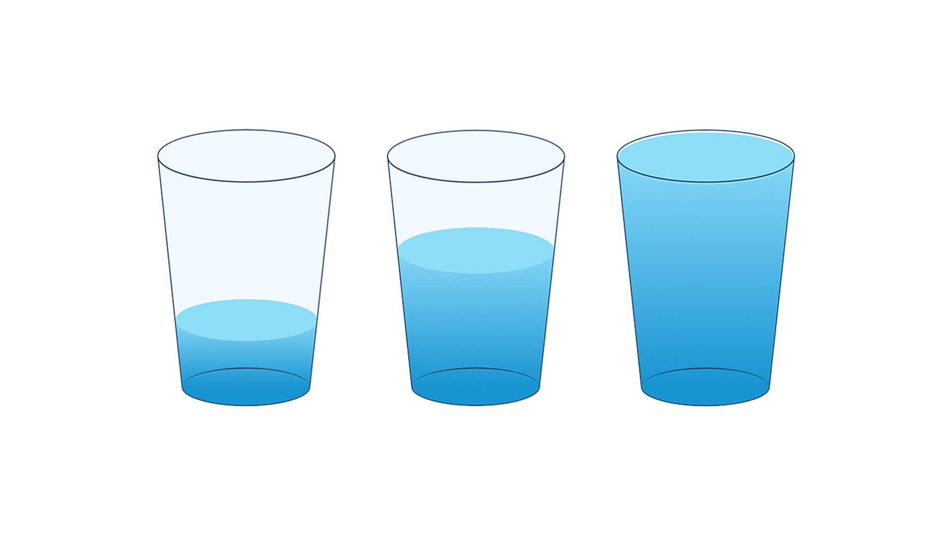
In “The Empty Glass Project,” each country’s access to safe drinking water is represented as a single glass:
- A full glass represents near-universal access
- A partially filled glass reflects limited access
- An almost empty glass reveals severe scarcity
No axes. No legends. No decoding required. Just a glass.

The starting state of the interface — a neutral, empty glass awaiting user interaction.
This approach intentionally removes complexity. Traditional data visualizations often prioritize completeness, multiple variables, layers of context, and precise scales. But in doing so, they can lose immediacy. The glass metaphor does the opposite. It compresses complexity into something instantly readable. You don’t need to interpret a percentage to understand that a nearly empty glass is a problem.
This is where minimalism becomes powerful:
- It reduces cognitive load
- It increases speed of understanding
- It creates space for emotional response
One of the key tensions in this project was balancing accuracy with clarity. Percentages are precise. A glass is interpretive. But the goal wasn’t to replace data — it was to translate it. Every visual state is grounded in real data, but expressed through a format that prioritizes human intuition. Instead of asking users to calculate meaning, the visualization delivers it instantly.

A nearly full glass representing widespread availability of safe drinking water.
The experience is intentionally simple. Users select a country, and the glass fills accordingly. This interaction creates a moment of discovery. Instead of passively viewing a chart, users actively explore disparities. They begin to compare. They notice patterns. They ask questions. Why is one glass full and another nearly empty? What explains the difference? What does this mean for people living there? The visualization becomes less about presenting answers, and more about prompting reflection.

A nearly empty glass revealing severe scarcity.
From information to empathy
Data visualization is often treated as a tool for clarity and it is. But it can also be a tool for empathy. When information is presented in a way that people can immediately relate to, it becomes harder to ignore. A number can be dismissed. A chart can be skimmed. But a nearly empty glass is harder to forget.
“The Empty Glass Project” is not a replacement for traditional data visualization. Maps, charts, and dashboards remain essential. But it is an exploration of an alternative approach:
What happens when we design for emotional clarity, not just analytical precision?
As designers, we often focus on accuracy, detail, and completeness. But in doing so, we may overlook something equally important — accessibility of understanding. If people don’t engage with the data, the accuracy doesn’t matter.
At its core, this project is built on a simple premise: The way we visualize data shapes how people understand, and whether they care. By reducing global water access to a single, familiar object, the goal is not to simplify the issue, but to make it impossible to overlook. Because sometimes, the most effective way to communicate something complex… is to make it feel simple.

Inumimo Idowu
Inumimo Idowu is a multidisciplinary designer and creative strategist based in Canada. His work explores the intersection of data, design, and storytelling, with a focus on making complex information more intuitive and emotionally engaging. He is the creator of The Empty Glass Project, a minimalist data visualization highlighting global inequalities in access to safe drinking water.
- Inumimo Idowu


