
We’ve all made embarrassing dataviz mistakes, whether we’re beginners or superstars. This series of Horror Stories aims to normalize “failure” as part of professional development. This story comes from Jacque Schrag, a visual journalist at Axios.
A version of this article appeared in Nightingale Magazine Issue 2.
Most of my horror stories aren’t about bad charts or unreasonable expectations. Instead, they’ve often happened because I was learning how to create a process that worked for me and overcoming gaps in my own self-taught knowledge. While these experiences were absolutely horrific in the moment, I can laugh about them now and be grateful for the learning opportunity in a supportive environment. I have two I think about often that I’d like to share.
In May 2022, Axios launched its “Midterm elections 2022” dashboard, which uses data provided by Google Trends to show how interest in select topics has changed in each congressional district in the lead-up to the midterms. I’m incredibly proud of this piece and the level of work that went into it, but here’s the thing—it was originally supposed to launch in March.
What led to a two-month delay? Two big things:
- Answering questions from editors and stakeholders about the takeaways made us realize that we had misunderstood how parts of the dataset related to one another—a fundamental requirement when designing any data visual
- Our map + barcode visual was using a threshold scale (binning interest in buckets of 20), which “broke” the visual when there were extreme outliers


After many, many calls and emails with the Google data team, we were able to rework the visual to solve both problems. We corrected our analysis to utilize what we termed “absolute” and “relative” interest, which allowed us to more accurately analyze the takeaways of the dataset. We also switched to using a quantile scale for the map and barcode visual, which provides a much more representative comparison between districts.
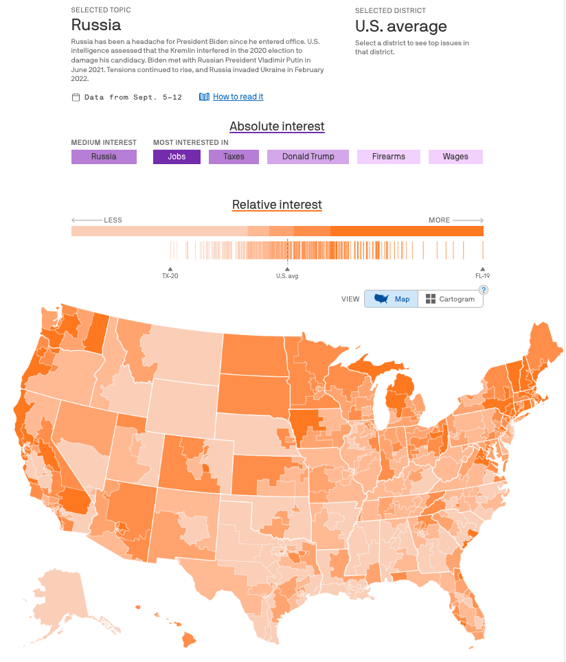
The updated, current visual that separates absolute and relative interest, and uses a quantile scale for binning the interest in a term among districts.
It was painful to cancel the initial publication of this piece, and I’d be lying if I said I wasn’t a little embarrassed. But it would have been much worse to launch a visual that was inaccurate and misleading, and I’m ultimately thankful that we had the opportunity and support to keep working on the project until we got it right. I learned a lot from this project, but the lesson that will stick with me is the reminder to not get tunnel vision while working on a visual and to get feedback early and often—better to catch the mistake early than the week before launch!
The second horror story comes from a project I worked on with the CSIS ChinaPower Project, a research program that I worked closely with on more than 50 data visualizations over a five-year period. I loved working with them because they gave me nearly infinite creative freedom to push the boundaries of how to tell a story with the data they provided. Because we worked together so much, our working relationship, process, and expectations for the final product were already established, and in theory, this project should have been smooth sailing.
So what went wrong? Pretty much everything.
This project was about water security and how China’s management of its water resources impacts hundreds of millions of people. After getting the brief on what the story was about and access to the data (a breakdown of how many people had access to safely managed water for every country, over time), I did what I always do when I’m conceptualizing a visual for the first time—turn to my whiteboard and start drawing.
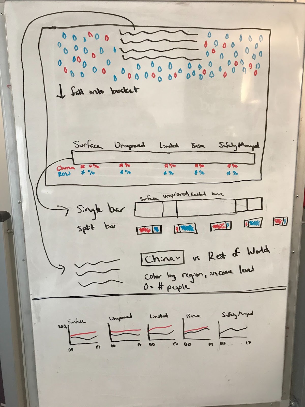
I got stuck on this idea that “water flows” and obsessed with the idea of using animation to have water droplets fall on the screen into buckets (an idea shamelessly inspired by the Upshot’s piece on “Extensive Data Shows Punishing Reach of Racism for Black Boys”).
To say I overestimated my confidence in building such a complicated visual using technology I had never used before was an understatement—I went way over budget on hours in developing just the prototype. But, even worse, once we put a working prototype in front of colleagues to see what they thought, the concept fell flat. We had created an exploratory visual for something that needed to be explained, and it was just too much all at once for anyone to understand.
Already past the deadline to launch, we started over from scratch. We had several more setbacks after that (anyone who has ever implemented a scrollytelling piece knows the pain of trying to get it to work just right on all the phone sizes!), but we ultimately put together a story-driven piece that walks the user through a complex, multi-layered dataset in a clear manner. The last “section” brings back the ability to explore the dataset, but the bulk of the visual is explanatory and emphasizes why the reader should care about this data.
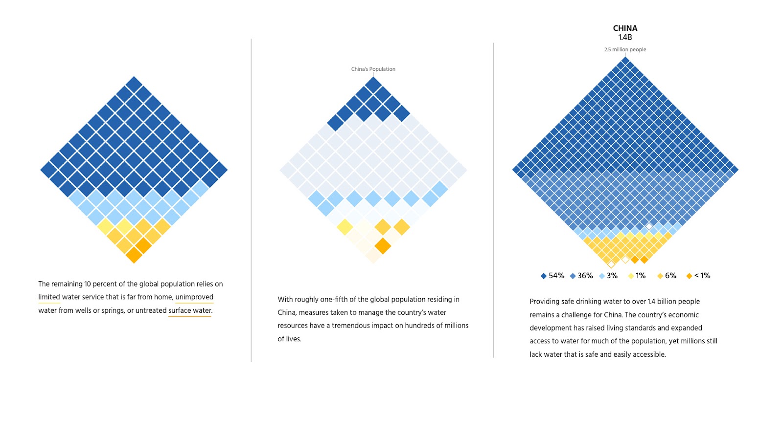
Three sections of the final scrollytelling piece, starting with the global perspective before focusing on China.
The development of this project was brutal, but it ultimately paid off. It is one of my favorite pieces I’ve ever done, and was even shortlisted in the 2022 IIB Awards. And the lessons learned have been invaluable to my career:
- Exploring new visual concepts, technologies, or tooling can be really exciting—but it takes time. Be realistic with what new things you can try when working under tight deadlines.
- Again, getting feedback early and often would have saved us a lot of time going down the wrong path.
- Learn to let go. Sometimes we fall so in love with a visual concept that we will do anything to make it work, but sometimes it just doesn’t. Figure out a process that lets you quickly test out ideas and learn to be okay with letting go if it doesn’t work out.
These – and all my horror stories – have stuck with me over the years, and I think about the lessons learned any time I start a new project. Running into problem after problem working on a project can feel terrible in the moment, but being able to reflect on the process (not just the product) has been a key and necessary part of my growth—and I wouldn’t change that even if I could.

Jacque Schrag
Jacque Schrag is an associate editor of visual journalism at Axios, specializing in data visualization and web development. She works closely with newsroom colleagues to create visuals to explain complex datasets to a broad audience. She previously led web development and data visualization at the Center for Strategic and International Studies award-winning iDeas Lab. Her work has been featured in the Information is Beautiful Awards, Nightingale, and more.
- Jacque Schrag


