
Have you ever made an embarrassing mistake in a data visualization? Did you utterly fail to meet your client’s or boss’s vision? Did you proudly share a visualization only to be overwhelmed by critical feedback? Of course you have! We all have, whether we’re beginners or superstars. In this series, we encourage dataviz practitioners to share their own Horror Stories as a way of normalizing “failure” as part of professional development. Brave enough to share your personal tale of woe? Email us!
Most dataviz horror stories, I imagine, are about how the graphs were ugly, went mislabeled, missed essential points, just got screwed up, or similar visual or aesthetic issues.
In my case, the graphs I made looked just fine—it’s just that I didn’t understand how copy/pasting graphs between Excel and Word worked (at the time). This was in the mid-2000s, when memory wasn’t quite so plentiful, so many corporate email accounts had memory quotas. If you hit that quota, you would be locked out of your email account. You had to call IT and actually talk to a person!
I was a lowly entry-level person at a financial services company and had done some Monte Carlo modeling involving 1,000,000 scenarios. We were developing a new mutual fund project, based on changing allocations over time as people moved towards retirement, and the company wanted me to model outcomes for different allocation trajectories. After a “full” model run of one million scenarios, I made diagnostic graphs showing the distribution of key metrics (such as the annual accumulation of the fund, how many times the fund decreased while the owner was in retirement, and whether – and when – the money in the fund ran out) so that we could analyze different potential fund strategies. The graphs themselves were fairly simple.
I may have been a low-level employee with only a few years of experience at the company, but I had an academic background with several years of numerical programming experience. When I was in academia, I would have done the Monte Carlo modeling in C or Matlab . Then I would have created some not-very-pretty graphs exported to PNG format, to be embedded in reports in LaTeX.
However, in the financial corporate world, I had to use Microsoft Office, as that’s what everyone else used. I had to create reports in Word for executives to review during the financial product design process. As well, I needed to use Excel in case others wanted to make adjustments to my models.
So, after finishing the model runs, I put together my reports, blithely copy/pasting eight graphs from Excel into Word. I didn’t realize that every time I did that, a full copy of my spreadsheet was embedded into the Word document. (What I should have been doing: copy/paste as picture.) I was creating a document with eight copies of the spreadsheet underneath.
I did not notice the size of the Word document I had emailed to the top executives.
Luckily, somebody told me that the file I had sent had locked up all their accounts, so I was the person who got to call IT to ask them to delete my email.
I didn’t actually figure out what I had done wrong until about a year later. My kludged fix at the time was to break up the Word document into four separate documents, each one with two graphs. I did understand there was something about the graphs that made the documents huge.
But once I figured it out, months later, I told EVERYBODY what I did wrong, so they didn’t do it, too. Even though memory quotas have increased tremendously over the past two decades, file size still matters. People may be trying to view a document on a smartphone now, instead of a wired desktop – being the reason someone has to clear memory is never considerate.
Be careful in how you copy/paste your graphs!

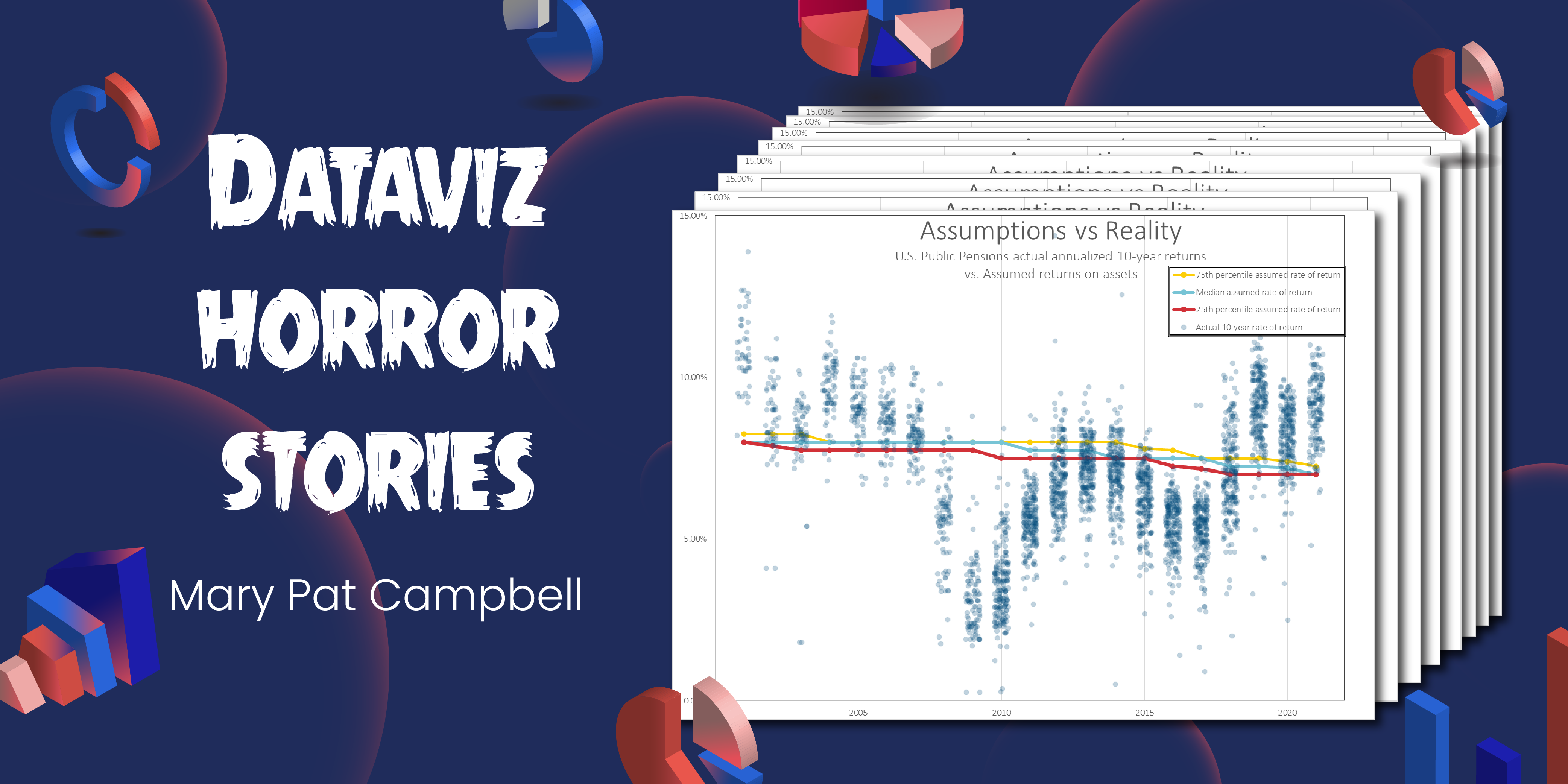
This is not one of the graphs that crashed those executives’ email accounts almost 20 years ago, and the spreadsheet that created it is far smaller than that fatal spreadsheet duplicated so many times. However, it is similarly investment- and retirement-related, like that earlier project.
The spreadsheet this graph came from is 13 MB in size, with data from the Public Pensions Database. I created the graph on August 12, 2022, for my Substack post One Bad Year? Comparing the Long-Term Public Pension Fund Returns Against Assumptions. I made this and some other jitter charts to look at investment returns of U.S. public pension funds for 2001-2021 over investment horizons of one, five, and ten years. The graph you see is the ten-year investment horizon actual average performance for about 200 different funds compared against the assumed long-term return for the funds.
If you visit the post, you can download the spreadsheet underlying the graphs…. But only if you want to!

Mary Pat Campbell
Mary Pat Campbell is a life actuary living in New York and working in Hartford, CT, in insurance research. She has been blogging on public finance and mortality trends at STUMP.
- Mary Pat Campbell


