
The US Centers for Disease Control and Prevention has had its hands full for the last year and a half. It’s an agency full of talented, dedicated professionals doing their best to protect the country from what we all hope is a once-in-a-lifetime pandemic. That said, there’s always room for improvement and the graphic below is a great example. What follows is an uninvited design critique, but is shared with the best of intentions and full respect for the courage and integrity it took to put the original work out there. My effort to improve on the original is also imperfect, and I hope you’ll share the spots where you think I could do better.

On July 27th, 2021, the CDC posted a Health Advisory which raised the possibility of COVID-19 hospitalizations overwhelming existing healthcare capacity and advised healthcare professionals of the “urgent need to increase Covid-19 vaccination coverage” as well as the fact that the majority of hospitalizations and deaths are happening among the unvaccinated. This message was meant to convey that we could reach a situation in which patients needing lifesaving care would be turned away by hospitals that would not have the capacity to care for them. This is a very significant threat to public health.
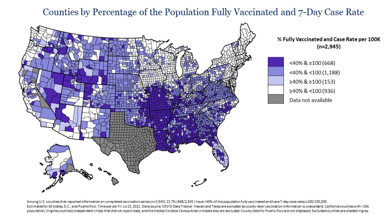
With that in mind, take a minute to review the original visualization, which was the lead graphic in a health advisory. I’m going to spend the rest of this article exploring ways to communicate the same message with greater clarity and urgency. In the end, I hope you’ll agree that a graphic presenting fewer variables per map with a simplified color scale and a more explicit message is a clearer form of explanatory communication for the intended audience of non-datavis-professionals.
What message is the map trying to get across?
The first step of iterating on a design like this involves establishing a sense of the original designer’s intended message and inventorying the informational elements presented in support of that message. This message was posted by the CDC under its emergency response page and designed to “notify public health practitioners and clinicians about the urgent need to increase COVID-19 vaccination coverage“ as the nation approached 650,000 Covid-19 fatalities. I used the CDC’s Crisis & Emergency Risk Communication (CERC) manual to evaluate where this message falls on the spectrum of emergency risk communication and inform my redesign.
For the rest of this article, I’ll accept the designer’s thresholds of 40% vaccination and 100 cases per 100,000 population as the thresholds between “low” and “high” in each variable and refer to the groupings that way. There are some challenging elements in deciphering the message of the original graphic which I’ll cover in the next section. For now, with the five color encodings that counties are broken into and the level of hazard described in the health advisory text, my take on the designer’s intended message is:
“Counties with low vaccination rates are experiencing a wave of high Covid-19 infection rates. That wave is less pronounced in counties with high vaccination rates”
With that core message in mind, breaking down the rest of the information presented becomes an exercise in inventorying the questions that can be answered with the original graphic. The first answerable question that stands out is:
- Where are the low vaccination rate counties with high case rates?
Some might argue that this is the only thing the designer wanted to communicate. If that were the designer’s intent, the graphic could be completed with only the darkest purple:

Because the designer also chose to include a color for counties with low vaccination rates and low case counts, I think that information is meant to add context for the audience:

The addition of the low vaccination and low case rate counties lets the reader answer an additional question:
2. What proportion of low vaccination rate counties have high case rates?
Because the original graphic presents counties with high vaccination rates and low case rates in white, one could argue that the designer’s intent did not go further than the above questions. Since the original graphic did include a color for counties with high vaccination rates and high case rates, I think the designer intended for the audience to be able to answer the same questions about high vaccination rate counties.
These additional questions lead to an important comparative question that can also be answered with the information presented in the original graphic:
3. How do high vaccination rate regions compare to low vaccination rate regions in terms of case rates?
If presented clearly, the information lets the audience draw insights about the relatively high proportion of low vaccination counties experiencing high case rates when compared with high vaccine rate counties. This drives home the health advisory’s message of the “urgent need to increase Covid-19 vaccination coverage.” Ultimately, given the threat of overwhelming hospitals with infected patients, the information presented should be a source of significant concern.
The audience should walk away from the final design thinking:
“There are a LOT of counties with low vaccination rates, and a LOT of those counties are experiencing high case rates!”
The converse is also important:
“Counties with high vaccination rates seem a lot safer. Look at New England!”
Let’s audit what’s confusing:
After you take a minute to read through the legend and wrap your head around what it’s communicating, can you tell how many counties have high vaccination rates (40 percent and above) and high seven-day case rates (100 or more cases per 100k population)? It’s not easy to understand because the chart combines multiple variables converted into threshold-divided categories encoded by a single color scale. This is a LOT of information in a tight space. The lightest purple is not easily distinguished, particularly in smaller counties. As an experiment, look at the same visualization after Photoshop was used to swap out the light purple (counties >=40 percent vaccinated and 100 or more cases per 100k) with light green.
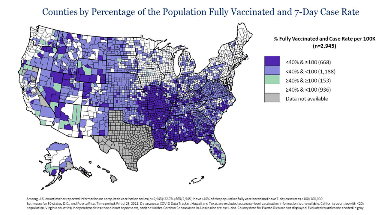
With the re-encoding, you can see that high vaccination / high case rate counties are quite rare, they’re often close to low vaccination / high case rate counties, and there are almost none of them in the Northeast. The audience has a cleaner feel for the geography of low vaccination rate counties and a better sense of the large cluster of high case rates in Missouri, Arkansas, Louisiana, Mississippi, Alabama, and Georgia with this re-encoding. It’s interesting to note that Florida is experiencing high case rates in counties both above and below 40 percent vaccination rate. A quick Photoshop color replacement has exposed interesting insights.
Can the legend be easier to digest? What if we break out the legend along the 40 percent vaccination rate division?

This is slightly better, but it’s still challenging to decipher the two categories of counties. More on that later.
Why is Texas (which isn’t reporting vaccination rate data) so visually prominent? It may be useful to bring this to peoples’ attention, but that doesn’t feel like the central message of this visualization. The unreported data could be added to a footnote or encoded in a lighter and less attention-grabbing color.
Can you tell the date of the data on the map? It’s hard to find, but deep in the fine print underneath, the date is Fri Jul 23, 2021, which was four days prior to the publication of the Health Advisory and three days older than the most recent available data on that day. When information is changing rapidly, it’s possible to have the methodology for making a graphic pre-approved so that it can be updated immediately prior to publication.
Now it’s time to get the data and start to draft a new visualization.
The day that the CDC published the original graphic, I was able to download the most recent update of their source data which covered up to 26 July. Current data can be downloaded from the CDC here. With the data in hand, a redesign is possible. This is an area where having many fresh sets of eyes and friends who are willing to give blunt feedback comes in handy. I got a lot of blank stares when I asked people to interpret the original graphic, so I started by prototyping ways to simplify the presentation. I typically sketch out concepts by hand before getting too into the weeds with code. The original graphic lists the thresholds “40” and “100” four different times and presents each category in a way that invites comparison. With that in mind, I wanted to reduce the repetitive text while highlighting comparisons between groups.
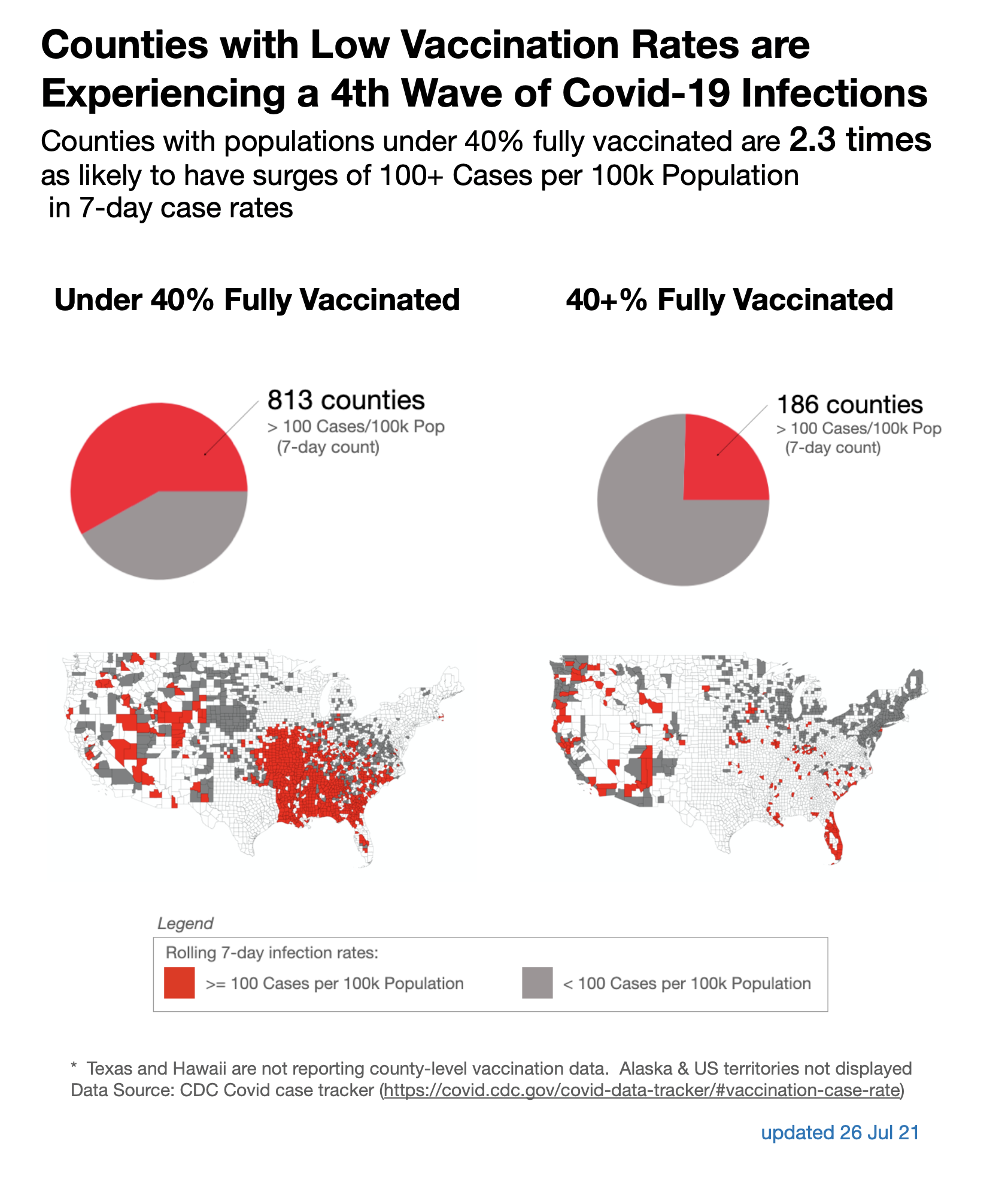
To draw attention to the proportion of each vaccination rate group, I could use either bar charts or pie charts. Bar charts offer the ability to compare raw counts across the two vaccination rate groups. Pie charts offer a more intuitive communication of proportions for a lay audience as long as the proportions are relatively large. Separate choropleth maps for each vaccination rate group can partially make up for the loss of total-count comparisons in abandoning bar charts. Splitting the data into separate visualizations for each group also enables common color encoding and the potential to use column-oriented plots to convey grouping with fewer titles and explanations.
Below is a rough draft of how this visualization might work. Individual elements were made in a Jupyter notebook using the Pandas and Geopandas Python libraries. With this draft, I adhered to the CDC’s original graphic in not highlighting state boundaries, which both keeps the graphic as apolitical as possible and keeps the focus on county vaccination rate as a differentiating factor.

Breaking out the data into two separate maps does highlight the Southeast, but that was where the Health Advisory’s most pressing concern was centered at the time. User testing on friends with fresh eyes indicated that they were more comfortable with fewer variables on each map, taking much less time to decode what they were being shown. Each quickly expressed concern about counties in the southeast with low vaccination rates and high case rates. The column orientation also seemed intuitive to them.
Finally, the title can be tightened up.
The original title, “Counties by Percentage of Population Fully Vaccinated and 7-Day Case Rate” is perhaps a good science-y title for communication that is not part of an urgent public health advisory. There is, however, room to be more direct here. The CDC’s Crisis & Emergency Risk Communication (CERC) manual is an excellent reference for crafting this kind of messaging. Even when directed at an audience of clinical professionals, figure titles in a Health Advisory expressing the “urgent need to increase Covid-19 vaccination coverage” should convey urgency. According to the CERC manual, an advisory like this is designed to “explain, persuade, and empower decision-making.” A headline highlighting the bottom line message can be useful in framing the information presented in a visualization. It can also be useful to physicians working to persuade patients to get vaccinated. With that in mind, something like “Counties with Low Vaccination Rates are Experiencing a Fourth Wave of Covid-19 Infections” might be appropriate. If “fourth wave” is too alarmist, another option might be “Surging Case Rates in Counties Under 40 Percent Vaccinated Pose Significant Threat to Public Health.” Additionally, some sense of the relative risk between high vaccination rate and low vaccination rate counties might be an appropriate subtitle. In this case, a relative risk calculation reveals that counties with “under 40% fully vaccinated” are 2.3 times as likely to have case rates of 100 per hundred thousand population or higher. This is a memorable sound bite that could help spread the core message of the visualization.
What’s potentially wrong with this redesign?
Every visualization has limitations; this one is no exception. In selecting pie charts over bar charts, I removed the reader’s ability to judge relative volume of counties in each vaccination group. I’m also relying on judgment of radial area to convey the proportions of each group with high case rates, which can be problematic with smaller proportions but is ok with the proportions in this data set here. I made up for some of these drawbacks by including the choropleths, but it is important to recognize that county sizes and population densities vary significantly. Garfield County in Montana has about 0.25 residents per square mile while New York City has over 69,0000. The choice to map population-based rates still makes some sacrifices. This approach also fails to communicate the proximity of high-vaccination-rate/high-case-rate counties to low-vaccination-rate/high-case-rate counties. This makes it harder to see that most of Florida has surging case rates and there may be some interplay between low-vaccination-rate counties and high-vaccination-rate counties there. In the end, it’s a judgement call. Alaska, Hawaii, and US territories should be incorporated into the final product. They were omitted in rapid prototyping.
What else can you see that might need improvement?
In closing, let’s review the changes.
First, I established a sense of what message readers should take away from the visualization. Then I inventoried the information being presented. Next, I audited the original visualization for points of confusion that might throw the audience off track. I repackaged the key informational elements in different ways, iterating with paper and pencil and gathering feedback along the way. Ultimately, I broke the original multivariable, single-color-scale choropleth into two separate choropleths, one for each vaccination group. I added pie charts to drive home information about the proportions of high infection rates among each group. Then I updated the data and added a prominent date label to the final draft. I also took the focus off of Texas, where county vaccination data isn’t reported, and moved that information to a footnote. Finally, I gave the reader a bottom-line-up-front title that’s explicit about the hazard and more aligned with the “explain, persuade, and empower” purpose outlined in the CDC’s CERC manual for urgent communications like this Health Advisory.
This kind of clear, intuitive visual presentation of data is important when managing a public health crisis. Even when the intended audience is sophisticated, I think driving home key information with simplicity and directness helps spread the message further and faster. When carefully designed, this graphic can convince health professionals of the urgent hazard the health advisory is trying to communicate and empower them in making decisions to improve vaccination rates in their communities. At the end of the day, we’re talking about potentially heading off a situation in which someone who has a heart attack or is in a car accident does not survive because there are no available resources to care for them. That’s a great mission. Taking the extra steps required to iterate and improve visual communication like this can be both rewarding and fun and should become a standard element of public health educational programs around the country. The same concepts apply to data visualization in a wide variety of other applications.
Alex Rich is a health informatics PhD candidate at UNC Chapel Hill studying visual analysis and communication. He has a decade of experience as an Air Force special operations pilot and crash investigator and holds a Masters in Public Health from Yale University.


