
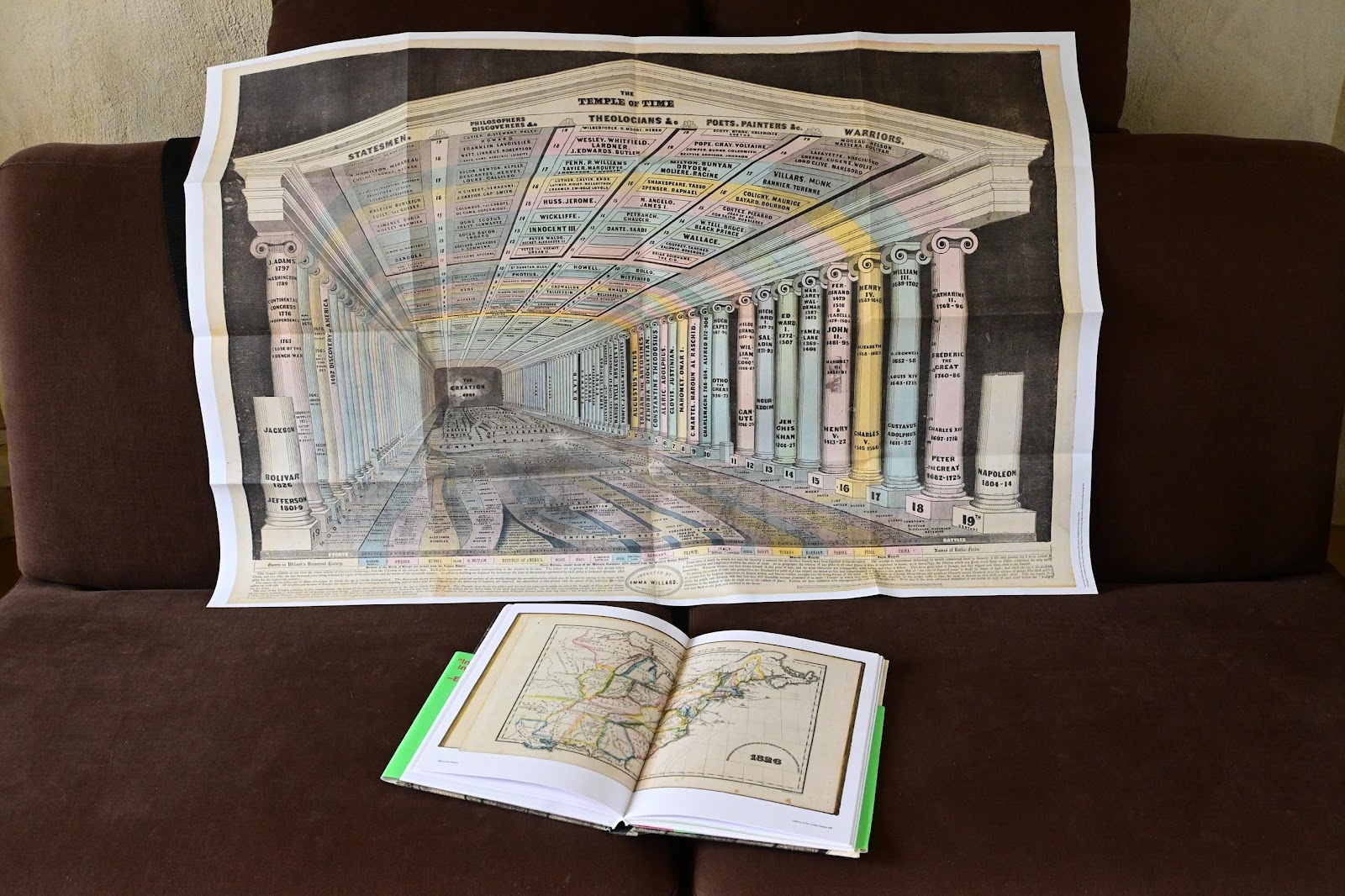
When you break the seal and open Emma Willard, Maps of History (Visionary Press, 2022), you will find a folded copy of The Temple of Time. This architectural metaphor expands to a one-meter poster, a size suitable for mounting on a classroom wall. The print is a reproduction of the copy in the David Rumsey Historical Map collection, complete with a poorly registered warning to would-be copyists in the lower right corner: “Entered according to Act of Congress, in the year 1846, by EMMA WILLARD, in the Clerk’s Office of the District Court of the United States for the Northern District of New York.”
Unfold it to drape across your couch like a blanket or examine it on a table like a road map. The Temple operates as a self-documenting system to understand and memorize a world history narrative. It is a perspective rendering of a vast hall, in which time is the distance from the back wall of Creation. The wall pillars are centuries holding up time bands of ceiling labeled with categories of famous people arranged. The pillars on the right display the names of famous rulers. At the foot of the pillars world events flow towards our eye on the left while the names of battles flow forward on the right.
When Richard Saul Wurman proposed five ways to organize information, he described Time as “an easily understandable framework from which changes can be observed and comparisons made.” (Information Anxiety 2, 41). While Wurman was trained as an architect, he was not suggesting that time would be a good principle for designing a building. He had something more linear and singular in mind, a chronological chart of events, the now familiar one-dimensional timeline.
Emma Willard had something much more ambitious in mind when she published her first perspective time chart, “Pictures of Nations or Perspective Sketch of the Course of Empire” in Atlas to Accompany a System of Universal History In 1836. The Picture of Nations is reproduced in this beautifully designed book along with the other technique Willard excelled at, the chronological series of maps. The selection is edited with extensive commentary by the historian Susan Schulten. There are pages where Willard speaks for herself, as in this quote:
Mere straight lines not wrought into a picture, and presenting no form of comeliness to the eye, are unattractive. The young (and the old too) do not feel any wish to look at them, and thus they carry away no distinct impression. They are like a succession of monotonous sounds, which no one remembers; while the arrangement of sounds in tunes, or lines in pictures, are attended to with pleasure, and easily remembered. (70)
To which Schulten adds, “Willard distinguished ‘pictures’ of information from ‘mere’ timelines in that the former added up to something greater than just the display of data.” Anyone involved in information design will agree. We can be drawn into the narrative of history as a building, of events distant in time and in space flowing towards us, of pillars and ceilings engraved with the names of famous men and a few queens, an arrangement of events we should memorize to understand the past. Willard’s work is among the Information Graphic Visionaries series because she made that leap towards the memorable. Without these innovative diagrams and history maps, her textbooks would be as invisible today as those of her more conventional male contemporaries.
Inventing a nation in timelines
Schulten and others have written eloquently about Willard as a pioneer of women’s education. She is a representative of the first born-American generation, a unique place in the American history she chose to represent in her maps and timelines. A child of a colonial-era New England farming family—she, her students, and the readers of her textbooks were not in England anymore. They were the first citizens to define their new country’s territory and history.
One pillar of Willard’s Temple, already a cornerstone of this new identity, was the adoption of Columbus as the starting point of American history. The first public celebration of Columbus Day was organized in 1792 by a New York political club. They embraced the 300th anniversary of an event that took place in the Caribbean, honoring a man who never touched or acknowledged the existence of North America as the start of a national identity. This group called themselves the Society of St. Tammany, the Sons of St. Tammany, or the Columbian Order. Tammany Societies were nativist political clubs created during the Revolutionary War to support the new republic, and Columbia became a favored term for the new nation. Tammany was a reference to Tamamend, a mythical leader of the Delaware (Lenni Lenape), and society members appropriated indigenous titles to support their sense of ‘nativeness’. From Willard’s generation onwards, American history began by counting 300 years backwards from 1792.
While Willard’s Temple design is entirely original, it is also a mashup of previous authors’ timeline techniques and metaphors. Schulten’s essay does an excellent job of explaining these predecessors and influences. I will add a few more examples and place Willard’s work conceptually along two axes: as a timeline that synchronizes sacred and profane historical ideas and as an expression of American nationalist narrative. With that in mind, let us look at what Willard built her temple from, and what she chose to include and exclude from its floor, ceiling, and pillars, as well as from her maps.
Rosenberg and Grafton begin Cartographies of Time with the questions “What does history look like? How do you draw time?” This is the wrong question to ask. Designing a timeline does not revolve around the question of what time looks like. A timeline is a narrative constructed from visual signposts. Any narrative has a beginning, middle and end. The designer must address three questions: where does time begin, what does it include and where does it end? Once these questions are answered, the appearance of time can have any form that supports the visual logic of sequence.
For the students of Willard’s Troy Female Seminary, the beginning of time had to be the date proposed by Bishop Ussher’s 17th century analysis of the Book of Genesis, four thousand and four years before the birth of Christ. Time starts with the names of people and events in the Bible, and continues to ancient Greek and Roman texts, concluding with events remembered by modern European nations. Willard embraced this scheme and steadfastly stuck with it throughout her work. Her end of time took the shape of twenty-one modern nations grouped into four categories: Northern Europe outside the Roman Empire, Europe formed from the Roman Empire, Mahometan (Islamic), and Pagan Nations. The exception in these categories were “those of the Western Continent” included in the Roman Empire nations, the parting of the English and Iberian colonial rivers to reveal the Republic of America, Mexico and South American Republics. Given pride of place, these new creations were at the center of history.

Detail from Temple of Time poster, present time (1846) showing the Americas, Emma Willard, Maps of History, Susan Schulten, 2022
Châtelain’s 18th century method
There were other approaches to representing time that did not combine Biblical, Classical and Modern sources. Henri Abraham Châtelain made a different choice with similar material a hundred years earlier. His Atlas historique, which went through several editions in the early 1700s, was a multi-volume book of maps, lineage diagrams, and essays summarizing the European understanding of the world. Châtelain’s timeline of human history was a presentation of Church and State History side by side rather than combining them or suppressing one view for the other. His solution was simultaneity rather than synthesis. The two-page spread of the Chaine de l’histoire sacrée (Chain of sacred history) and Chaine de l’histoire prophane (Chain of profane history) share a similar time scale. Time begins using Ussher’s date for the creation of the world, though dates are labeled forwards to 4000 (our conventional Year 0) rather than backwards, then continue to 1713 (the present). The facing pages describe parallel lineages of Church history, visualizes Old Testament patriarchs and kings flowing into dead branches of Roman Jerusalem, then on to the Western and Eastern church. State history begins with Assyrian, Egyptian and Italian monarchs, along with a reference to, the Chinese empire..

Chaine de L’Histoire Sacrée : Chain De L’Histoire Prophane, Atlas historique, Tom I. No. 3. Henri Abraham Châtelain, 1718 (David Rumsey Historical Map Collection)
Châtelain was a French Huguenot minister who preached in London and Amsterdam; an artist-engraver who designed and drew many of the plates and maps included in the books he published, and essentially a person who combined sacred and profane practice in his own life. He may have had business and political reasons for omitting any reference to the Reformation in his visualization of sacred time.
Châtelain’s publications described the world by combining maps, timelines, and text. The atlas documented an interconnected world defined by European international trade and travel. While most of the globe is represented in the maps and texts, a notable exception is the interior and western coast of North America. It is worthwhile having a close look at the map that covers the same area that Willard will include in her historical map series.
Map of Canada or New France, and the Discoveries Made There (Carte du Canada ou de la Nouvelle France, & des Découvertes qui y ont été faites) was based on the work of the cartographer Guillaume De L’Isle. It presents a view of North America gazing northwest. embracing the entire Great Lakes and upper Mississippi basin. Most of the map is covered with the names of the indigenous nations that made up the population of Canada ou Nouvelle France.

Detail of Carte du Canada ou de la Nouvelle France, & des Découvertes qui y ont été faites, Atlas historique, Tom VI. No. 20. Henri Abraham Châtelain, 1718 (David Rumsey Historical Map Collection)
This map of New France is not the map of a nation. De L’isle has drawn a territory in which French and English settlements were coexisting and trading with indigenous populations. In his most recent re-evaluation of North America during this period, Pekka Hämäläinen makes the argument that New France was an alliance among French settlers and indigenous nations to support extractive trade in exchange for useful technologies. “In a striking contrast to most English colonies,” he writes, “New France was built on close collaboration with the Indians, who became trading partners, military allies, and kin over the course of the seventeenth century.” (Indigenous Continent, 209) He makes a convincing case that it was the competition among the indigenous nations, fueled by intentional or unintentional European trade, rather than European imperial policies, that determined where settlements could survive. The region south of Lake Ontario in the De L’Isle map is labeled Iroquois, a label I will come back to when discussing Willard’s 1828 textbook below. The many groups and settlements shown on this French map demonstrate just how not empty North America was. Reading Hämäläinen’s historical narrative alongside Maps of History reveals how American Federalist nationalism shaped the way Willard represented European and indigenous people.
By the time Willard is making her maps and timelines, North America is not just a place in a World Atlas, it is the place where the American nation enters world history. How did this first-generation information visionary integrate her view of American history with the history of the world? Glancing back at the Temple of Time, we can see that the five pillars closest to the present on the left represent the New World. Going further back in time, these pillars are blank. “King Philip 1675” inscribed on the pillar for the 17th century is the only trace of indigenous American culture. The inscription urges the students of Troy Female Academy to remember Metacomet, the Wampanoag military leader, renamed King Philip by the English, a reference to the son of Alexander the Great. Willard made a place for her proto-nation’s first serious military enemy, the leader who tried but failed to drive the European settlers out of New England.

Detail from Temple of Time poster, showing significant dates on the century pillars for the Americas, Emma Willard, Maps of History, Susan Schulten, 2022
North America in charts, streams, and pillars
Willard’s representation of North America is a series of choices. We can appreciate the choices she makes by looking at similar materials in timelines by Joseph Priestley and Friedrich Strass. Priestley starts time at 1200 B.C. based on textual evidence from the Shepherd Kings, Egyptians, and Israelites. His sense of historical time is based on written texts rather than religious faith. Empires rise and fall without reference to the light of a messiah. His Unitarian theology counts down to zero at the birth of Christ marked only by a symbol – – and up again to 1800. All modern nations (Italy) or regions (Africa) are given a horizontal band to label their transition from one empire or kingdom to the next. In his row of empires that become the American continents, Priestley finds a place for the 13th century founding of the Kingdom of Peru and the Empire of Mexico, so they can transition to SPANISH in the 16th century. The other labels that make up this row are European names and nationalities.

Detail of the Americas from A new chart of history, Joseph Priestley, 1769 (David Rumsey Historical Map Collection)
Friedrich Strass’ Der Strom der Zeiten (Streams of Time) begins time the same way Willard does. The world emerges from the clouds in 4004 and a series of cultural streams begin to flow downward to the present. The only reference to the Americas are small colonial side channels flowing into and out of the rivers of French, Spanish, Portuguese, and English history near the bottom of the chart.

Detail of present time (1803) for the streams of Spain, Portugal, England, Der Strom der Zeiten/Streams of Time, Friedrich Strass, 1803 (David Rumsey Historical Map Collection)
The Americanness of the Temple of Time can also be seen in how Willard absorbed and modified another feature of Priestley’s system, categories of famous people. Priestley’s Chart of Biography grouped famous individuals into six categories and included 2000 names. Statesmen and Warriors were one category. Both theological and political philosophers were grouped in Divines and Metaphysicians. He had the agenda of religious dissent and social reform behind his selection and categorization of historical figures.
Willard was set on establishing historical conventions rather than challenging them. She uses a simplified approach, with five categories and about 300 names. Europeans who claimed American territory (Columbus, Cabot, De Gama, Gilbert, Verazani [sic], Smith) are in Philosophers, Discoverers &c. Religious leaders who founded English colonies (Penn, R. Williams) are Theologians. The Spanish who took over in Central and South American nations (Cortez and Pizarro) are in Warriors.
Schulten notes that the floor of Willard’s Temple evolved from her earlier Picture of Nations, and both can be compared to Priestley’s and Strass’ timelines. It is not surprising that these European and American timelines were Eurocentric. It is more surprising to note the non-European people and events they chose to include or omit. There is far more non-European history in Priestley’s 18th century chart than Willard includes sixty years later. While it starts with entirely Mediterranean sources, the top third of present time in Priestley’s chart resolves into America, Africa, China, and India. He uses color to show how the Mongolian Empire included China, Persia, Turkey and Russia.
The metaphor of streams and the downward (vertical) flow of Strass’ design suggests that the present world flows from the people that emerged from Creation, a world that included the Chinese. Modern history flows from these original streams, though Strass has to add a few examples of later creation to account for German and Nordic origins.
Willard starts with a similar set of Mediterranean sources emerging from Creation. She recognizes India and China much later than her predecessors. Their streams only appear after the light that represents the birth of Christ. The part of the floor that will become the Pagan Nations has no content until “Degama [sic] discovers India” and European trade begins. She makes chronological mistakes in Asian history, placing Jenghis Khan and Tamerlaine in the correct century on the pillars but reversing their position on the floor.
Priestley’s Africa shows six hundred years of history leading to the 18th century North African kingdoms of Morocco, Algiers, Tunis, and Tripoli.

Detail of showing the nations of North Africa from A new chart of history, Joseph Priestley, 1769 (David Rumsey Historical Map Collection)
Willard’s American version has no Africa per se. The Temple of Time does show Egypt and adds Barbary between Turkey and Persia. A stream emerges on the floor from the Moguls that reads, “The Two Brothers Barbarosso Found the Piratical States of Barbary”. It ends with the text, “First brought to terms by the Americans”. This is a reference to the Barbary Wars, also remembered as “the shores of Tripoli” in the American Marine’s Hymn. It also illustrates that one criteria for inclusion in history is warfare.

Detail from the Temple of Time showing the place of Barbary between Turkey and Persia, with text referring to the Barbary Wars.
Native Americans as barbarians that vanish and reappear
The wars between indigenous nations and the English colonies and the new United States are given more attention in her historical maps than in her timelines. She sets the stage with a map that presents the area that would become the United States before European settlements: Locations and Wanderings of the Aboriginal Tribes.
What was this image based on and what purpose did it serve? Willard was an educator and a writer of history books, not a proto-ethnographer. Schulten’s essay, “A Graphic Mind”, provides an answer. Before creating her History of the United States, Willard published her Ancient Atlas, a book of maps to support the teaching of Mediterranean/European history. “The most interesting of these was the map of barbarian invasions, which collapsed centuries of migration across Europe onto a single image,” Schulten writes. She points out that the map, titled Migrations, Settlements &c. of Barbarous Tribes, was adapted from the 1820 American edition of the Lesage Atlas. That map, titled Invasion of the Barbarians their origin, settlements, dispersion, &c., illustrates a text that summarizes the movement of tribes invading the Western Roman Empire from the 4th century. The map shows groups from Scandinavia, Central Asia, and North Africa tracing colorful lines across Europe.

Left: Detail of Iberia from Geographical and Historical Map of the Incursions of the Barbarians, Incursion of the Barbarians, their origin, settlements, dispersion, &c., A Complete Genealogical, Historical, Chronological, And Geographical Atlas; Being A General Guide To History, Both Ancient And Modern … According To The Plan Of Le Sage, Greatly Improved. The Whole Forming A Complete System Of History And Geography. 1820 (David Rumsey Historical Map Collection). Right: Detail of Ibera from Map No, VI, Migrations, Settlements &c. of barbarous Tribes illustrating the account which is given of them in Willard’s Ancient Geography, Ancient Atlas to Accompany Universal Geography, Emma Willard, 1827. (David Rumsey Historical Map Collection).
A look at migrations across the Iberian peninsula in both of these maps shows how Willard simplified the visual language introduced in Lesage. She removes much of the geographic detail and adds directional arrows. She employed the same visual language in her Locations and Wanderings map to suggest the changing location of indigenous groups before and during the English colonial period. In the context of Ancient History, the movement of these tribes was a disruption of the Roman Imperial order, until ultimately Burgundians founded Burgundy, Lombards settled Lombardy, and Normans built up the same sites they had looted and burned in Normandy.

Detail of Introductory Map To Accompany Willard’s History Of The United States, Locations and Wanderings of the Aboriginal Tribes, A Series of Maps to Willard’s History of the United States, Or, Republic Of America. 1829. (David Rumsey Historical Map Collection)
For the historical atlas of America, she starts with a chapter describing theories of how people arrived in the Americas (across the Bering Strait, up the Mississippi river network) and another that enumerates “the Principal Indian Confederacies as found by European Discoverers.” The visualization for this section is analogous to the wanderings of Old World barbarians. Surrounded by oval labels that claim no territory, these tribes are neither kingdoms or states. The invading arrows of Iroquois or Five Nations project southwards into Irocoisia Proper. The Tuscaroras move from south to north while the Lenni Lenape move from east to west, and the Shawanese wander from upper Florida to the Ohio River network. The movement of the confederacies introduces their anticipated transient role in American history.
In the maps accompanying Part 1 of her four-part chronology, all indigenous nations vanish from the interior. Her maps focus on the thin strips of coastline and rivers that made up the English colonial world. Indigenous people reappear as insets labeled Places Mentioned in the History of the Pequod War in the Third Map of 1643 and Places Mentioned in the History of King Philip’s War in the Fourth Map of 1692. The educational value is memorizing the names of the combatants and locations of the wars that traumatized the English colonies. The Fifth Map of 1755 shows the names of the indigenous people who controlled the interior of the southern colonies—Tuscarora, Cawataba, Congaree, Yamasee, Cherokee, and Apalachee—but the area west of the coastal rivers remains empty. It is only in the Sixth Map of 1765 that she actually includes an indigenous nation with territory, the Country of the Six Nations. Here she acknowledges that before the American Revolution the Iroquois Confederacy controlled all of what is now New York State west of the Hudson Valley.

Detail of Sixth Map or Map Of 1763 showing Iroquois territory before the American Revolution. (David Rumsey Historical Map Collection)
The Appearance of the American Far West
In the Ninth Map of 1826, referred to in the History as the Map of the Present Day, many of the previously excluded nations represented in the De L’Isle map of New France reappear. Her introductory map showed the unwandering people of the southeast—Chickasaw, Choctaw, Creek. In 1826 they were still in their towns, but the Indian Removal Act of 1830 is about to expel them from the newly created states of Mississippi and Alabama. The other prehistoric wandering tribes are gone, replaced by people who have been engaged with French and British colonial trade for generations, now framed inside recently created American states. Illinois is land “ceded by the Kaskaskias” and Arkansas is “part of the tract ceded by the Quapaws”.

Ninth Map or Map of 1826, A Series of Maps to Willard’s History of the United States, Or, Republic Of America. 1829. (David Rumsey Historical Map Collection)
But the most interesting detail of the Map of 1826 is the depiction of the Far West in the upper left. The North West Territory is labeled, Those lands possessed in common by the Sioux, Chippewas, Winnebago, and Sauks, an assertion that would have been news to the people who lived there. The western boundary of this territory is the upper Mississippi.
Beyond that is a space with no boundaries labeled Sioux Indians or Naudowessies. It was into that blank space that George Catlin went to seek his fortune in 1830. Catlin, born in 1796, was twelve years younger than Emma Willard, but it is still fair to describe him as being of that same born-American generation. His family background was similar to Willard’s, with farm family roots in Connecticut. When the young Catlin was sent by his father to study and practice law in Litchfield, Connecticut, Willard was already married and establishing schools for girls in Middlebury, Vermont. By the time Willard moved her school operations to New York state, Catlin had abandoned law to become a painter in Philadelphia. They crossed patrons when Catlin was commissioned to paint a portrait of DeWitt Clinton, the governor whose policies and support attracted Willard to settle in New York.
Catlin spent six years traveling back and forth to areas west of America’s borders. He completed the first part of his project to paint hundreds of oil paintings of indigenous people and gather a huge collection of material objects. The second part of his plan was to become rich and famous by presenting his work as a public spectacle. Before opening his Indian Gallery in New York City in 1837, he staged a preview exhibit of paintings in Albany and Troy where Willard was a successful textbook author and pioneer of women’s education. There is no indication that she took this opportunity to see Catlin’s show.
I bring up Catlin because of another map, the Outline Map of Indian Localities in 1833. Catlin drew this for his most famous book, Letters and Notes on the Manners, Customs and Conditions of the North American Indian. That book was illustrated with engravings from his paintings and published in England after he packed up his collection to tour Europe in the 1840s, the same period when Willard was creating her timelines. Catlin drew this map from his travel notes and stories he collected. Here we finally see North America, undivided by northern and southern boundaries. We see the Great Plains, the Great Basin, and the Pacific Coast not yet separated into territories or states. We can see the buffalo ranges tracking the river networks and the names of the people who lived there.

Outline Map of Indian Localities in 1833, Letters and Notes on the Manners, Customs, and Conditions of the North American Indians, George Catlin, 1842 (North Carolina Digital Collections)
If we place this map of our continent—and not the entire continent, of course, but merely that part we think of as southern Canada, the United States, and a bit of Mexico, omitting the inconvenience of Florida and the Caribbean—beside Willard’s world of 1826, we see how little of the continent was included in that early 19th century version of American History.
The visual power of one chart and one map
My comparisons touch on only a select few of the maps and diagrams reproduced in Maps of History. The book includes maps that depict world history, including a series that are adapted from the original work by Edward Quin. It was Quin who created the metaphor of parting clouds to reveal the parts of the globe included in world history. Willard copied this visualization of world history expanding from the Middle East to include Mediterranean Europe, Asia and Africa, and finally the globe including the Americas, adapting Quin’s design into a simpler series of maps.
The book also reproduces two more ‘chronographer’ diagrams, a name meant to convey a combination of chronology (time) and geography (location). Following the initial Temple or Map of Time (1846), she designed Willard’s English Chronographer (1849), a building with far more detail on its walls, ceiling, and floor than the original temple, with a ceiling that included a new category of Memorable Women. The Chronographer of Ancient History (1851) was the last of these diagrams. It provided more detail for the period between creation and the birth of Christ. All are beautifully reproduced with helpful commentary.
Schulten’s essay and commentary emphasizes how Willard’s designs were meant to communicate the relationships between time and space. She quotes Willard as proudly claiming to have designed diagrams where “time is measured by space, and all time since creation of the world is indicated at once to the eye.”
The timelines and maps clearly show how Willard was an inventive organizer and educator. Yet her building metaphor, a memory palace in which she selected and placed details for her students to remember, was as divorced from representations of geographic space as Priestley’s parallel rows or Strass’ parallel streams. It was memorable, it was orderly, but it could not simultaneously convey chronology and the relative geography of the Barbary Coast, Persia, and China.
Châtelain and Priestley shared with Willard the same goal of communicating and educating through the strength of our visual channel. In his preface to the Atlas historique, Châtelain wrote:
La Carte est un secours que l’on fournit par les yeux à l’imagination, sauf à l’entendement après cela d’en faire son profit. (The map is assistance provided by the eye to the imagination, so that our understanding can profit by it.)
Priestley also had enormous faith in his diagram’s power of communication. Though he wrote many books, he was convinced that visualization was superior to the text for transferring knowledge. In the booklet that accompanied his New Chart of History, he wrote:
If a person carries his eyes horizontally, he sees, in very short time, all the revolutions that have taken place in any particular country, and under whose power it is at present; and this is done with more exactness, and in much less time, than it could have been done by reading.
Willard clearly inherits this faith in visual communication. The essays and reproductions in Maps of History help the reader appreciate her invention, the breadth of her adaptation, and the ways she viewed history and geography as a single subject. We can also see the choices she made to shape and populate her diagrams and maps.
The last map Schulten reproduces is a map of an America we are more familiar with today than the New France of 1700 or the twenty-three American states of the 1820s. The United States of America, Historically and Chronologically Divided into Eight Parts is from Last Leaves of American History, a later textbook published in 1853. It shows America from sea to shining sea, covering the same continent that Catlin drew.

United States of America Historically and Chronologically divided into Eight Parts, Last leaves of American history: comprising a separate history of California, Emma Willard, 1853. (Library of Congress)
Schulten’s commentary on this map provides an important point about Willard’s legacy as an information graphic visionary.
Today, the map appears ordinary, for it has been adapted as one of the central maps of American history textbooks even down to our own day. Indeed, that it has become a fixture of our national history demonstrates its symbolic power. Willard’s lasting contribution was to offer a graphic vision of Manifest Destiny that normalized the nation’s growth and gave it an almost natural, inevitable quality. The continental map includes very little information beyond the sequential parcels across the continent, even erasing any detail from neighboring nations and setting the United States apart in space. American schoolchildren have for generations seen their national expansion as relatively devoid of division or violence. Yet, ironically, it was these far western acquisitions that provoked the sectional animosity of the 1850s, which devolved into the Civil War in 1861. (220-221)
Willard saw the value in images that are simple and easy to remember. The nation is complete, with a top and a bottom, a left and a right, made of parts assembled by charter, treaty, purchase, and decree. This map includes the details we should remember and excludes the complications we don’t need to discuss.
The decision of what to include and exclude in maps and diagrams is the responsibility of the information designer. The responsibility of the viewer is to recognize that every diagram, every map, is designed from a specific point of view. Maps of History make it possible to admire Willard’s accomplishments and take a critical look at her depiction of American history and America’s place in the history of the world. The contemporary reader can note how many of her choices are still with us in the way we view our present space and time.

Paul Kahn’s engagement with visualization of large knowledge structures began with hypertext research projects in the 1980s and continued with the development of diagram techniques for describing information architecture. He taught Information Design History for 7 years at Northeastern University’s Information Design & Data Visualization program. He created Kahn+Assoc., the first agency in France focused on information architecture, preceded by a decade leading Dynamic Diagrams in Providence RI. He served as Experience Design Director at Mad*Pow and now devotes himself to teaching and writing in France. In 2020 he led Covid-19 Online Visualization Collection (COVIC), and has written about insights from the thousands of visualizations created during the pandemic.
- Paul Kahn

- Paul Kahn

- Paul Kahn

- Paul Kahn


