
A map is a diagram of a place. It shows us the physical relationships among the details. A map locates things we can touch and see — man-made structures, rivers, roads, lakes — in relation to one another. A map can be an effective representation of a place whether or not it applies a consistent mathematical “projection.” A map can be based on any number of visual rules, independent from the rules of contemporary cartography.
While a map is structured around things we can touch and see, the representations on the map are not meant to be the things themselves. The mind of the mapper is always one degree more abstract than the phenomena it attends to.

The information designer constructs marks on the page to create a world in the mind of the viewer. The visual strategy on the page serves as an appeal to the viewer’s imagination, as Henri Abraham Châtelain states in the introduction to his Atlas Historique, published in 1718 [1].
The map is a help which is provided by the eyes to the imagination, but we must use our comprehension after that to profit by it. By the lines engraved on a map of the world we create a mental arrangement in our head of the four parts of the Earth, and by means of this arrangement a single brain can contain in its small space all the vast capacity of the Globe.
In our own time, Christian Jacob identifies the two fundamental traits of a map as materialization and communication. In his words, the map is:
A materialization and construction of an image of space: above all in the minds of the cartographer and of the society to which he or she belongs. […] The map is an instrument of communication. … There is always an enunciator and a receiver — the informed individual who is in possession of knowledge about space, about itineraries, about the wealth of a remote country, and the user who needs this information. [2, pp. 98–100]
In this sense, maps materialize geography to communicate a message, which for many themes, but they are also a theme themselves. We will look at maps here that describe the entire world.
2A. World Maps
Every culture has or had its “known world” and a way of representing its place within that world. Here are six maps that demonstrate a variety of ways information has been arranged to place “all the vast capacity of the Globe” into a single image.
The World from Sicily
We have in our mind a pattern of outlines we know as “the world” and this pattern includes our expectation that “up” is north. The first glance at the circular world map that appears at the beginning of Al-Sharif Al-Idrisi’s Nuzhat al-mushtāq fi’khtirāq al-āfāq (The book of pleasant journeys into faraway lands) produces a lack of recognition. Al-Idrisi created an image of the known world by synthesizing a thousand years of Greek, Arabic, and Latin sources along with extensive interviews with contemporary travelers. His world map followed by 70 regional maps and texts visualize and describe the world known to the cultures around the Mediterranean Sea.

Al-Idrisi was a cultural synthesizer during a period of Islamic and Christian co-existence [3]. Born and educated in Islamic Morocco, he created maps for King Roger II of Sicily, a Christian of Norman (Viking) descent. The map’s pattern is difficult for us to read because it is centered on Mecca and oriented with the south at the top. When I rotate the circle 180 degrees, I immediately recognize the familiar pattern of Europe, Africa, and Asia. I see the outlines of the areas of great commercial and cultural interchange: the Mediterranean, Adriatic and Black Seas in the center; the Red Sea, Persian Gulf and the Indian Ocean in the south; rivers flow from mountain ranges, climate zones marked by red lines based on Ptolemy’s Geography. The world’s margins are the least distinct. Sub-Saharan Africa extends to the edge of the world ocean. Northern Europe ends in small islands.

Classified as Islamic, the thoroughness of al-Idrisi’s 12th-century work went largely unappreciated until the German cartographer Konrad Miller constructed a single image from the detail in the regional maps in the 1920s [4]. Miller’s version helps us to see the remarkable detail al-Idrisi was able to manage by aligning the world’s parts into a systematic grid.
A Gift for a King
The Catalan Atlas is, quite literally, a gift from one king to another. According to surviving documentation Cresque Abraham, a master of maps and compasses from the Jewish community in Majorca, was commissioned by King John I of Aragon to create a world map, and this map was then sent as a gift to King Charles V of France [5]. The map entered the Royal Library in 1380. I encountered it for the first time at the start of the Circa 1492 exhibition at Washington’s National Gallery, where it represented the information that encouraged Columbus’ ambition to sail west to reach the riches of East Asia [6].

It is called an atlas because it begins with two pages of text and cosmology diagrams. The world map is drawn on four connected vellum pages, each about two feet tall and over six feet wide when joined together. The sheer size may explain the multiple orientations of the figures and text, which faces up from the bottom and down from the top. The design suggesting that a reader would place the map on a table and walk around it to look in towards the center at its detail.

Cresque’s genius is the rhythm and style with which he combined many layers of information into a dazzling composition. He balances geographic location of ports and cities, political and religious allegiance marked by flags in the Mediterranean region, with figures from recent history, narratives, and legends that largely fill the parts of Africa and Asia where he has the least number of locations to represent. Though this elaborate portrait of the known world would never be used for sailing, it includes the earliest compass rose off Spain’s Atlantic coast, showing cardinal direction and degrees. In the style of portolan sailing charts, the seas are lined with port names connected by rhumb lines.
The two pages devoted to Asia are also crisscrossed with rhumb lines and the names of cities along the coasts and interior. Below the Atlas Mountains, Mansa Musa, who ruled over the sub-Saharan gold mines of the Malian Empire, appears holding a gold coin. The Three Magi ride westward from India toward Jerusalem while Kublai Khan displays his wealth holding two trees of gold coins on the coast of China. Among the colorful islands of the Indian Ocean, we also find the two-tailed mermaid prototype for the 20th-century Starbucks logo.

The World from Korea
The Map of Integrated Lands and Regions of Historical Countries and Capitals (known as the Kangnido map) was created by Yi Hoe and Kwon Kun in 1402, during the early years of the Korean Chosŏn Dynasty. We know the authors and the date from Kwon’s preface written on the map. Later copies of the map survive, though the original is lost.
I first encountered the Honkōji copy of the Kangnido map in Germany, at an exhibition about the Mongolian Empire Dschingis Khan und seine Erben (Genghis Khan and His Legacy) [7]. I had become accustomed to looking at Western visions of the mysterious East populated by legends and conjecture. But this map turned that cliché around: I was looking at how Asia misunderstood and imagined the peripheral lands of the Far West. Though it is displayed behind glass today, it was designed to hang as a banner in the Chosŏn palace in the Korean capital [8]. The map was meant to impress any foreign visitor at the palace with an image of Korea looming large off the east coast of China, surrounded by circles that represent fortifications, with much-diminished Japanese islands displaced to the south.

In his preface, Kwon identifies the various Chinese, Japanese, and Korean sources that were consulted to create this comprehensive image of a world. After describing the work of synthesizing diverse details into a single image, he embraces the sense of wonder a world map instills in the viewer, then adds a Confucian note on its practical application.
One can indeed know the world without going out of his door! By looking at maps one can know terrestrial distances and get help in the work of government. [9, p. 245]
During the century before this map was drawn, when Kublai Khan and his descendants ruled China and Korea as the Yuan Dynasty, geographic knowledge from all parts of the Islamic world were available in China. Kwon lists his Chinese sources, which like the Kangnido have not survived, but we can look at the Da Ming Hun Yi Tu (Composite Map of the Ming Empire) for clues. The surviving copy of this Chinese map is difficult to date, but it is probably based on the 14th-century map used to create this image of the world east of Korea.
China takes up the center of the world and other parts of Central and South Asia are greatly diminished; Africa and Europe are on the western edge of the world. While north is at the top, the eastern coast rotates to the southeast merging China and India “like a monstrous cell that has not yet divided, [making] up a dominating mass that overfills the center of the map” [9, p. 248]. As our eye sweeps around this rotated Indian coast, the Persian Gulf and Africa suddenly appear in their north-south orientation. The Da Ming and the Kangnido maps include the names and locations of Chinese administrative centers, with the Kangnido providing detailed information about Korea [10].

The Kangnido map is evidence that East Asian cultures had their own form of awareness of the West at this time before Europeans began their transoceanic expansions. The western side of the map shows the entire African continent with a large interior lake. Mediterranean Europe includes Iberia, Italy and the Balkans. While all other bodies of water are colored blue, there is no explanation as to why the inland Mediterranean Sea is white. Locations are written in Chinese characters that combine Arabic and older Chinese transliterations of Sicily, Genoa, Grenada, and Gibraltar, to name a few examples [11]. What this image lacks in accuracy, it makes up for by stirring our imagination. Kwon’s preface begins:
The world is very wide. We do not know how many tens of millions of li are from China in the center to the four seas at the outer limits, … [9] [li is an ancient Chinese unit of distance =.5 km]
And on that outer western limit, the Koreans record a few names from a distant Islamic and European world.
The Ten Thousand Countries of the Earth
The Map of the Ten Thousand Countries of the Earth has been characterized as “a fascinating amalgam of Western and Chinese cartographic sources that began as a Chinese translation of a contemporaneous European world map.” [12] Its principal author, Matteo Ricci, S.J., trained to be the vanguard of the Catholic church in China. When he arrived in 1583, he brought with him a few books, a world map, and a mind filled with libraries of European learning. He patiently and methodically worked his way into Chinese culture, mastering the language, befriending and influencing local officials, and building a reputation for his wealth of foreign knowledge with one goal in mind: to be permitted to travel to Beijing and convert the Chinese emperor to Christianity [14].
Ricci put a world map on the wall of his apartment, knowing full well that it shows parts of the globe that were at the time unknown in China. In his journal he wrote: “The more learned among the Chinese admired it very much and, when they were told that it was both a view and a description of the entire world, they became greatly interested in seeing the same thing done in Chinese.” [14] The image on the wall was probably a map by the Flemish cartographer Gerardus Mercator, who created the Mercator projection still used today, a mathematical system for transferring the spherical world onto a flat surface. His method was able to represent as straight lines sailing routes that follow the curvature of the earth across the recently charted Atlantic, Pacific, and Indian oceans. His projection clearly had great relevance to the Portuguese, Spanish, English, and French navies who were sailing the globe, carrying church missionaries from Europe to all the places their ships could reach. Mercator accomplished this by maintaining a constant distance around the equatorial regions while elongating the distances of the polar regions.

As Ricci would learn, Chinese maps were not based on the assumption that the world was a sphere. In Chinese tradition, the earth was a square, circumscribed by the circle of the sky. There was no need for polar distortion when the distances and direction could be scaled down and transferred directly from the real world to the flat map. China was the center, surrounded by nations that offered tribute, and these were surrounded by nations whose civilization decrease with their distance from the center [15].
By 1600 Ricci had accomplished one of his main goals: he was permitted to leave the coastal town where foreigners were quarantined and present his foreign knowledge to the Wanli Emperor in Beijing. From the capital, he and his Chinese collaborators — Zhong Wentao, a court official; Li Zhizao, an intellectual and Christian convert; and Zhang Wentao, an engraver, and printer — produced the Map of the Ten Thousand Countries of the Earth (Kunyu Wanguo Quantu). It was enormous, five feet high and twelve feet wide, printed from six wood blocks like the panels of a folding screen.

The result was an arranged marriage of the European and Chinese worlds. Ricci brought to the collaboration news of previously unheard-of continents, the vastness of the oceans, and a depiction of the spherical world. Li brought his mathematical, astronomical and Chinese geographic knowledge, helping Ricci to shape his European information into Chinese terms. Like Chinese maps, text and image were treated equally, with much of the surface of the oceans, the great southern continent and the margins covered with geographical essays and astronomical tables. Unlike Chinese maps, the surface of the world is covered with a value only foreign knowledge had to offer: the names of countries that did not recognize the Ming court and that the Ming court had never heard of.
This map’s central meridian was in the Pacific Ocean, unlike the 16th-century European maps it was based on that put the prime meridian west of Europe. This conveniently separated the geography familiar to Chinese — Asia, Africa, and Europe — on the left and the unfamiliar Americas on the right panels. The two forms of knowledge valued in both Europe and China, mathematics, and astronomy, fill illustrations and tables in the map’s four corners [12].

Ricci listed the map’s three purposes in his journal: “[F]irst, as an exotic gift to important officials; second, as a means of demonstrating the skills and knowledge (and ultimately usefulness) of the Jesuits; and third, for explaining in a succinct and compelling way who the Jesuits were, where they were from, and why they were worthy of attention and reverence.”
The map’s purpose was less to share new “scientific” knowledge than to spread the influence of the Jesuits in the Chinese court. And to help Ricci explain to anyone who asked where he was from — while it is not visually prominent, the map identifies Portugal, the country that sponsored the Jesuit mission, as well as adding his home village of Macerata in Italy.
Printed copies of the map did spread, and the Wanli Emperor requested his own hand-painted copies on silk. But none of the Ming nor later Qing Emperors were converted, and in the centuries that followed the new information Ricci’s map introduced did not change Chinese attitudes towards other parts of the now-known world.
The Island of Ordinary Existence
Printed copies of Ricci’s map reached Korea and Japan within a few years of its publication, but the world view was not generally accepted. The Japanese response to this foreign influence campaign was more than two centuries of strict isolationism. Jesuits missionaries and foreign traders were expelled, and anything containing foreign ideas was censored.
The Outline Map of All Countries in the Universe (Nansenbushu bankoku shoka no zu) is an image of a world where the future had arrived but had not been evenly distributed. This was the first Japanese printed world map, compiled by Zuda Rokashi, also known as Priest Hotan [16]. It appeared the same year that Châtelain’s Atlas Historique was being published in Amsterdam.

Rokashi, a Buddhist priest and the founder of a temple in Kyoto, integrated information about distant parts of the world with his knowledge of Indian, Chinese, and Japanese geography. In a table in the upper left corner, he lists 102 references to Buddhist texts and Chinese annals as his sources. Hismap is a synthesis of information about Edo Japan, Qing China, a vision of India from a thousand years ago, and minor European influence. In the same way that Marco Polo’s Travels informed Cresque’s description of China in the Catalan Atlas, Rokashi’s depiction of India was influenced by a recent translation of travels of Xuan Zang, the famous Buddhist priest who walked from China to India and carried religious texts back to China in the seventh century.
India dominates the map, with the provinces of China and Japan detailed in the upper right. The overall impression is an island world, which corresponds in theological terms to Jambu dvīpa (blackberry island), the Island of Ordinary Existence in Hindu, Jain and Buddhist cosmology. The center of this world, Mount Meru (Sumeru), is north of India and west of China. At its center is Lake Anavatapta (lake without heat) which appears as a vortex flowing from the mouths of four animal signs.

In Rokashi’s portrait of the world, a country’s surface is scaled by importance to Buddhism. India, the original home of Buddha, is enormous. Japan, Buddhism’s new home, is nearly as large as China, the source of its religious transmission. Europe, Africa, and the Americas are of no importance and are found around the borders [17]. On the left, Africa is an island to the west of Asia, divided by rivers flowing from a large central lake, reminiscent of the Africa from Chinese maps made 300 years before. Europe is a series of islands north of Africa. On the lower right south of Japan, South America is an island divided by large rivers. To Japan’s north, a land bridge appears to connect Siberia to a North America located outside of the map.

Another Floating World
Mercator’s 16th-century projection method has dominated our images of the known world, so much so that it has become our mental map. We see north as up on any page, South America always to the left of Africa and a gigantic Greenland beside the Canadian arctic. There were a number of alternative projection systems proposed in the 20th century, motivated by the social and political implications of this situation. The Gall-Peters map comes to mind. This vision of the world reversed the distortions of the poles and the equator, producing a compressed Europe and a striking elongation of the equatorial regions of South America, Africa, and India. This vision of the world was rejected by many cartographers and embraced by educators focusing on pocolonial social justice issues.
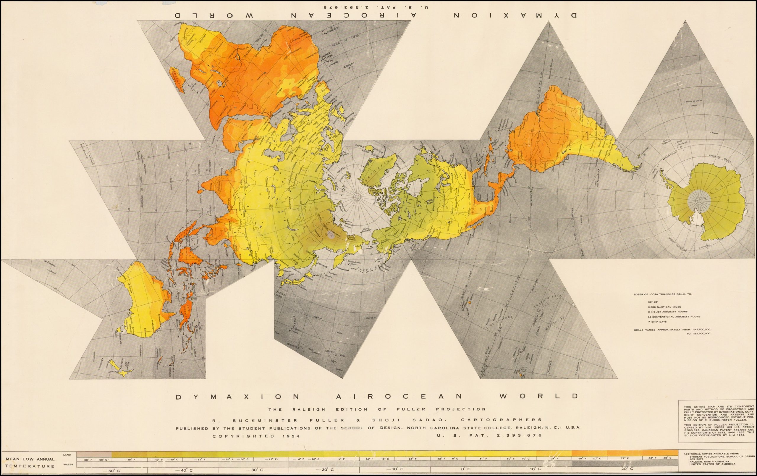
The Dymaxion World map developed by R. Buckminster Fuller is another example that redistributes distortion. Fuller was a prolific engineer and inventor. His concept of representing the earth as a polygon went through many variations and editions. It is the Dymaxion Airocean World [18], designed in collaboration with Shoji Sadao, that brings our story full circle.

The first version of Fuller’s map appeared in 1943 as colorful sheets in LIFE Magazine [19] with instructions for cutting and assembling the eight triangles and six squares into a polygon. One of the goals of Fuller’s design was to minimize the distortion of land masses on the printed surface. Ten years later, he invited Sadao, who had just completed architecture school, to collaborate on a version with twenty faces. The two men chose the division lines carefully to avoid separating continents and associated islands. Madagascar just barely sticks to Africa, while Taiwan stays with China and distances itself from Japan [20]. Sadao completed the map by adding color coding for land and sea temperatures. The flattened map has no single orientation, as both north and south poles are displayed as they would be on the surface of a globe.
There is an echo of Ricci’s two polar views here. But the most striking echo is how the Airocean design visually connects all continental landmass, making the world appear, as it did in the earliest world maps, to be a group of islands surrounded by a continuous ocean. Fuller referred to this planetary landmass as “spaceship earth”. Fuller and Sadao render the ocean that surrounded al-Idrisi’s known world and Rokashi’s island of ordinary existence with positivist mathematical precision and cartographic elegance.
Next: Kingdom Maps, the Boundary Between Us and Them
While the World Map envisions everything that is known, the Kingdom Map reports or asserts control over the territory it presents. Kingdom maps combines physical space and political influence to shows us the shape and extent of what is “ours” and what is not.
Global Information Design: an overview of the series
Global information design embraces the visualizations of both qualitative data such as expressions of social hierarchy, cultural beliefs, and values, and quantitative data, such as economic trends and scientific explanation. We can broaden our view of information design by following the pathways of its intended use. Exploring the history of how we visualize cosmology and timelines, transportation networks and family lineage, is as informative for current data visualization practice as the mastery of programming libraries and cognitive science. Studying examples of information design from many time periods and many cultures helps us understand how we shape patterns of difference into hierarchies and networks to create that chart, story, or graphic from the patterns that connect.
Bibliography
[1] H. A. Chatelain and N. Gueudeville, Atlas Historique, Ou Nouvelle Introduction A l’Histoire, à la Chronologie & à la Géographie Ancienne & Moderne: Représentée dans de Nouvelles Cartes, Où l’on remarque l’établissement des Etats & empires du Monde, leur durée, leur chûte, & leurs differens Gouvernemens. 1718.
[2] C. Jacob, The sovereign map: theoretical approaches in cartography throughout history. Chicago: University of Chicago Press, 2006.
[3] J. Brotton, “Exchange, Al-Idrisi, AD 1154,” in A History of the World in Twelve Maps, New York, New York: Viking, 2012, pp. 54–81.
[4] K. Miller and al-Idrīsī, “Weltkarte des Idrisi vom Jahr 1154 n. Ch., Charta Rogeriana | Charta Rogeriana / Explanations to the proof of the map of the world drawn by Idrisi in 1154 and restored by K. Miller in 1927,” 1928.
[5] J. Riera, “Cresques Abraham Jueu de Mallorca, Mestre de Mapamundis i de Brúixoles | Cresques Abraham, Jew of Majorca, Master of Mappaemundi and Compasses,” in L’Atlas Català Atlas, Barcelona: Diàfora, 1975.
[6] J. A. Levenson, Ed., Circa 1492: art in the age of exploration. Washington : New Haven: National Gallery of Art ; Yale University Press, 1991.
[7] C. Müller, H. Pleiger, Eds., Dschingis Khan und seine Erben: das Weltreich der Mongolen. München: Hirmer, 2005.
[8] K. R. Robinson, “Chosŏn Korea in the Ryūkoku Kangnido : Dating the Oldest Extant Korean Map of the World (15th Century),” Imago Mundi, vol. 59, no. 2, pp. 177–192, Jul. 2007.
[9] G. Ledyard, “Cartography in Korea,” in The History of Cartography, Volume 2, Book 2: Cartography in the Traditional East and Southeast Asian Societies, J. B. Harley and D. Woodward, Eds. Chicago: University of Chicago Press, 1995, pp. 235–345.
[10] J. Brotton, “Empire, Kangnido World Map, 1402,” in A History of the World in Twelve Maps, New York, New York: Viking, 2012, pp. 114–145.
[11] N. Kenzheakhmet, “The Place Names of Euro-Africa in the Kangnido,” The Silk Road, vol. 14, pp. 106–125, 2016.
[12] T. N. Foss, “Ricci’s World Map,” in China at the center: Ricci and Verbiest world maps, N. Reichle, Ed. San Francisco, CA: Asian Art Museum, 2016.
[13] J. D. Spence, The memory palace of Matteo Ricci. New York, N.Y.: Penguin Books, 1986.
[14] M. Ricci and N. Trigault, China in the sixteenth century: the journals of Matthew Ricci, 1583–1610; New York: Random House, 1953.
[15] C. D. K. Yee, “Traditional Chinese Cartography and the Myth of Westernization,” in The History of Cartography, Volume 2, Book 2: Cartography in the Traditional East and Southeast Asian Societies, J. B. Harley and D. Woodward, Eds. Chicago: University of Chicago Press, 1995, pp. 170–202.
[16] Z. Rokashi (Priest Hotan), “Nanzenbushu bankoku shoka no zu.,” Bundaiken Uje, Keicho (Kyoto), 1710.
[17] J. Siebold, “#441 Matteo Ricci’s Kunyu Wanguo Quantu,” Myoldmaps, 02-Mar-2019. [Online]. Available: http://www.myoldmaps.com/renaissance-maps-1490-1800/441-matteo-riccis-kunyu.html.
[18] B. Fuller and S. Sadao, “Dymaxion Airocean World The Raleigh Edition of the Fuller Projection,” Raleigh NC, 1954.
[19] Time Inc, “LIFE Presents R. Buckminster Fuller’s Dymaxion World,” LIFE, pp. 41–55, 01-Mar-1943.
[20] B. Ravenhill and S. Sadao, “In Conversation | Brendan Ravenhill and Shoji Sadao,” Area, 11-Sep-2017. [Online]. Available: http://area.areaware.com/brendan-ravenhill-in-conversation-with-shoji-sadao/. [Accessed: 28-Oct-2019].

Paul Kahn’s engagement with visualization of large knowledge structures began with hypertext research projects in the 1980s and continued with the development of diagram techniques for describing information architecture. He taught Information Design History for 7 years at Northeastern University’s Information Design & Data Visualization program. He created Kahn+Assoc., the first agency in France focused on information architecture, preceded by a decade leading Dynamic Diagrams in Providence RI. He served as Experience Design Director at Mad*Pow and now devotes himself to teaching and writing in France. In 2020 he led Covid-19 Online Visualization Collection (COVIC), and has written about insights from the thousands of visualizations created during the pandemic.
- Paul Kahn

- Paul Kahn

- Paul Kahn

- Paul Kahn


