
I’ve been an avid Wordle player for a few years now. As a daily ritual, it gives me an easy way to get my brain going in the morning and serves as a daily pulse in a few of my group chats. Over time, my interest in the game grew deeper and I became more curious about the words’ patterns and structures. Which letters tend to appear in certain positions? Which letters commonly show up together?
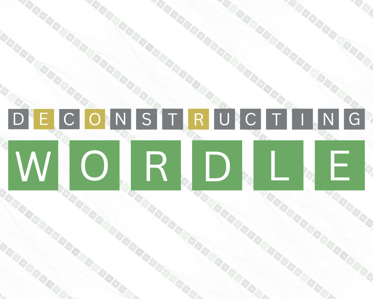
In the spring of 2023, I created a static visualization to explore these questions, eventually evolving into a dynamic interactive visualization that went viral. This is the story of the project’s transformation and the challenges I encountered.
Inspiration
When I became interested in visualizing Wordle, I found several cool examples of its popularity and difficulty. However, I couldn’t find anything that explored the relationships between letters in Wordle’s solutions. I had seen a few examples of “n-grams” before, which aim to highlight relationships between adjacent tokens–whether that’s words, syllables, or letters. I wanted to analyze Wordle through this lens. For reference, this is an example of a bigram I think is well done.
a simple way to fingerprint a language-
— Matt Henderson (@matthen2) April 3, 2024
take a bunch of text in the language, and every time one character occurs after another, connect them with a line from the left side to the right side
here is English after 70 million characters pic.twitter.com/2WQ86iWdvG
Building the first version
First, I needed to find a list of all possible Wordle solutions. I discovered I could grab the list directly from WordleBot by inspecting the browser. While the list isn’t maintained anymore, archived versions can be found with a quick Google search.
I decided to use p5.js for the visualization. While p5.js is most well-known in the creative coding and generative art community, I believe it has a lot of untapped potential for data visualization. Unlike d3.js, which uses SVG, p5.js uses the HTML5 Canvas element which would allow me to draw thousands of lines on the browser fast. After a weekend of iterating on the design, this is what I came up with.
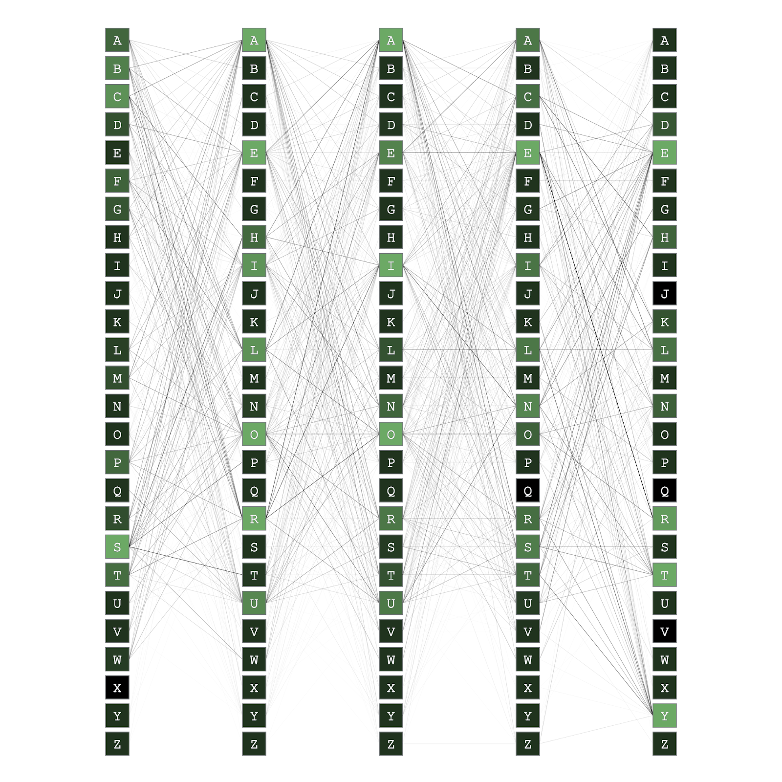
My initial plan was to just encode the connections between letters with lines. Once I built that out, I noticed an opportunity to also encode the frequency of each letter at each position with color. This would not only add more interesting information to the visualization, but it would also allow me to pull in additional color, resembling the Wordle aesthetic.
I was surprised by the complexity of the English language. When we consider 26 letters in five positions and how they connect across Wordle’s set of 2,309 possible solutions, we quickly end up with a rich dataset that reveals many patterns. For example, I wouldn’t have guessed that T frequently shows up as the fifth letter or that R is rarely the first letter.
While the static visualization was a great start, it felt incomplete. It was missing the ability to come back to it after playing Wordle each day. A customizable tool based on my daily guesses could be much more engaging. It could show how my guesses narrowed down the set of possible answers, providing feedback in a way that wasn’t possible before.
I run a data visualization website called PerThirtySix with a friend and we primarily focus on interactive pieces, so going interactive seemed like a natural transition for this project.
Designing the interactive visualization
When designing a complex interactive data visualization, it’s essential to think through exactly how the user will interact with it. After a couple of days of importing my static visualization code into the interactive framework and doing some basic prototyping, I landed on a few key goals for the project:
- It should allow users to select the basic states that a letter in a position can have in Wordle and see how the visualization changes.
- It should support both mouse and keyboard interactions.
- It should be highly responsive. If it’s not snappy, it’s not as fun to use.
Figuring out the inputs and outputs
In Wordle, there are three states a letter in a given position can be in:
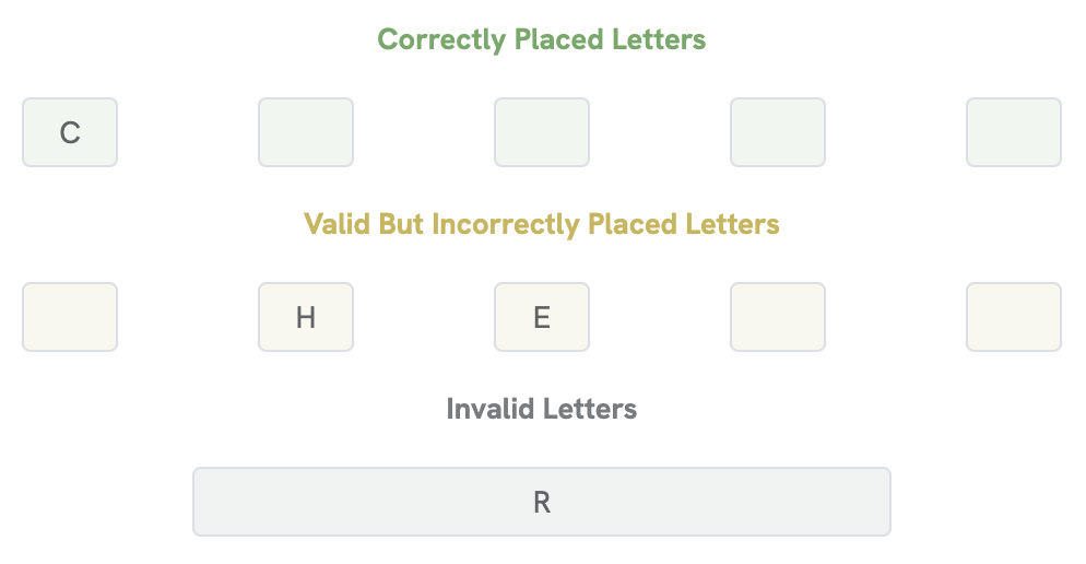
- Green: Indicates that a letter is correctly placed in a position.
- Yellow: Indicates that a letter is present in the word but not in the position the user guessed.
- Gray: Indicates that a letter is not present in the word at all.
The interactive visualization needed to allow the user to select any of these states for a letter and change the visualization accordingly. This was roughly my mental model as I thought through how this would work: the visualization would need to work for arbitrary combinations of green, yellow, and gray inputs to produce a consistent visual output.
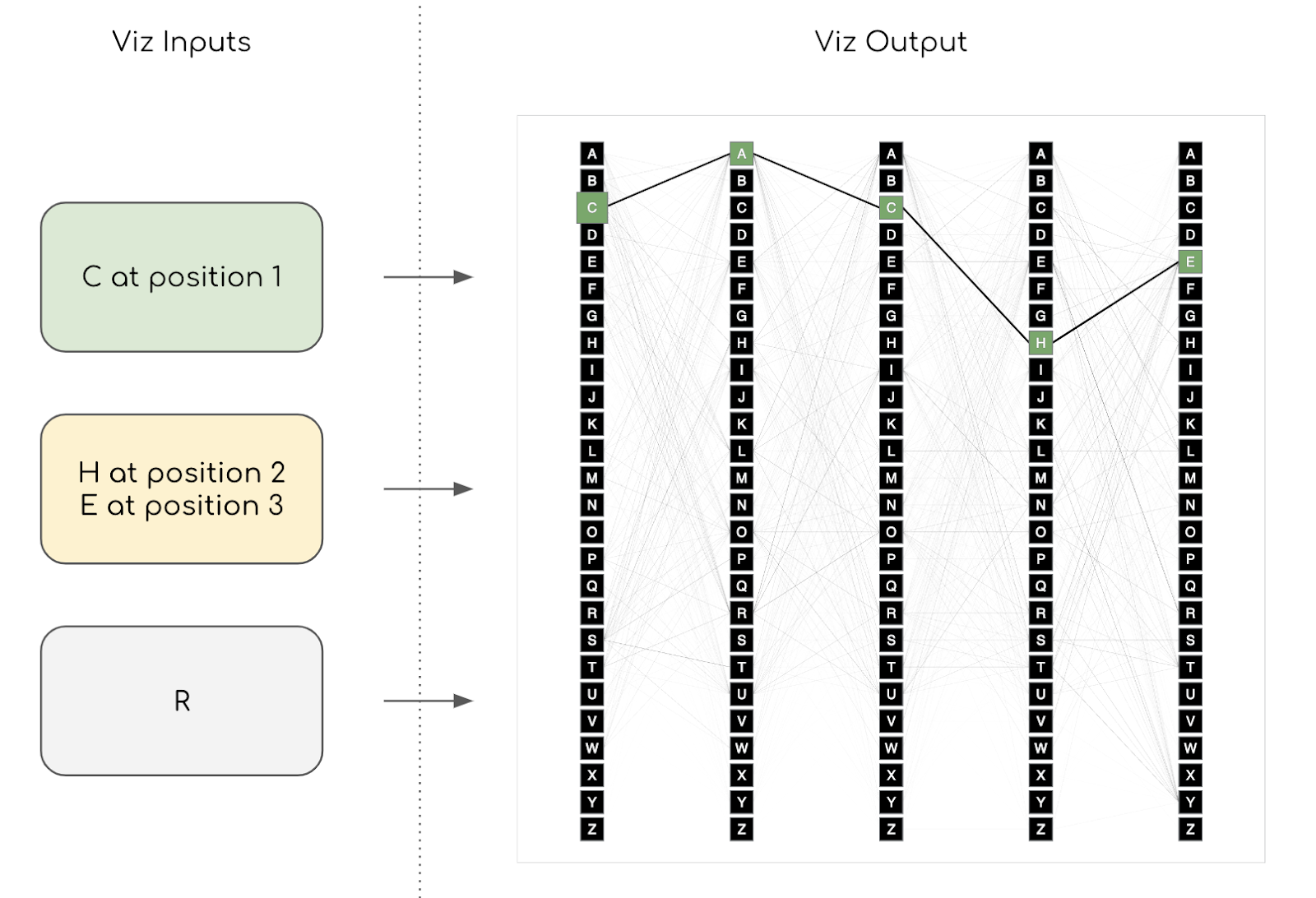
My initial plan was to have mouse-based interactions to let the user hover over a letter to preview placement and then click on a letter to lock it in place. It also seemed important to add keyboard interactions for accessibility and to let users input yellow and gray letters.
To address this, I built in a section underneath the main visualization to allow for text inputs, using colors that Wordle players would be familiar with:
Here’s the final visualization, give it a try!
Evaluating the response and what’s next
After finishing up the project, I shared it on Reddit and it eventually got picked up on Hacker News. To my surprise, it hit the Front Page on Reddit and the #1 spot on Hacker News. It remains by far the most popular visualization I’ve ever shared.
I haven’t actively worked on this project in a while, but a few ideas stand out as potential improvements:
- Adding more inputs for yellow letters, since in a game of Wordle you can have many more than just the five that the tool currently supports.
- Adding support for all ~10,000 guessable Wordle words instead of just the possible solutions.
- Adding better mobile support. It works decently on mobile, but the lines look a bit cramped.
Overall, this was an enjoyable project to work on. I learned a lot about the myriad considerations that go into adding rich interactivity to a static visualization. It was worth the work and I’m glad people continue to enjoy it.

Shri Khalpada is a full-stack software engineer and creative coder based in the DC area. He began his career in big tech and is currently the first full-time hire for a small but disruptive sports analytics company called Cleaning the Glass. Shri also enjoys working on creative coding and data visualization projects, which have collectively been viewed millions of times. Away from the keyboard, he loves strumming the guitar, trying to keep up with his cat, being in coffee shops, and playing chess poorly.
- Shri Khalpada

- Shri Khalpada


