
There is more satellite data available now than ever before, but it still takes a little bit of work to convert the raw data into imagery for humans.
In this post, I’ll describe how to open, merge, and visualize satellite data in QGIS. If you’re comfortable with the UNIX command line you can do everything I describe here with GDAL (here’s how). If you’re not, QGIS allows you to work with satellite and other geospatial data in a graphical user interface. In a later post I’ll describe how to use commercial tools—Photoshop with Avenza’s Geographic Imager—to process satellite imagery.
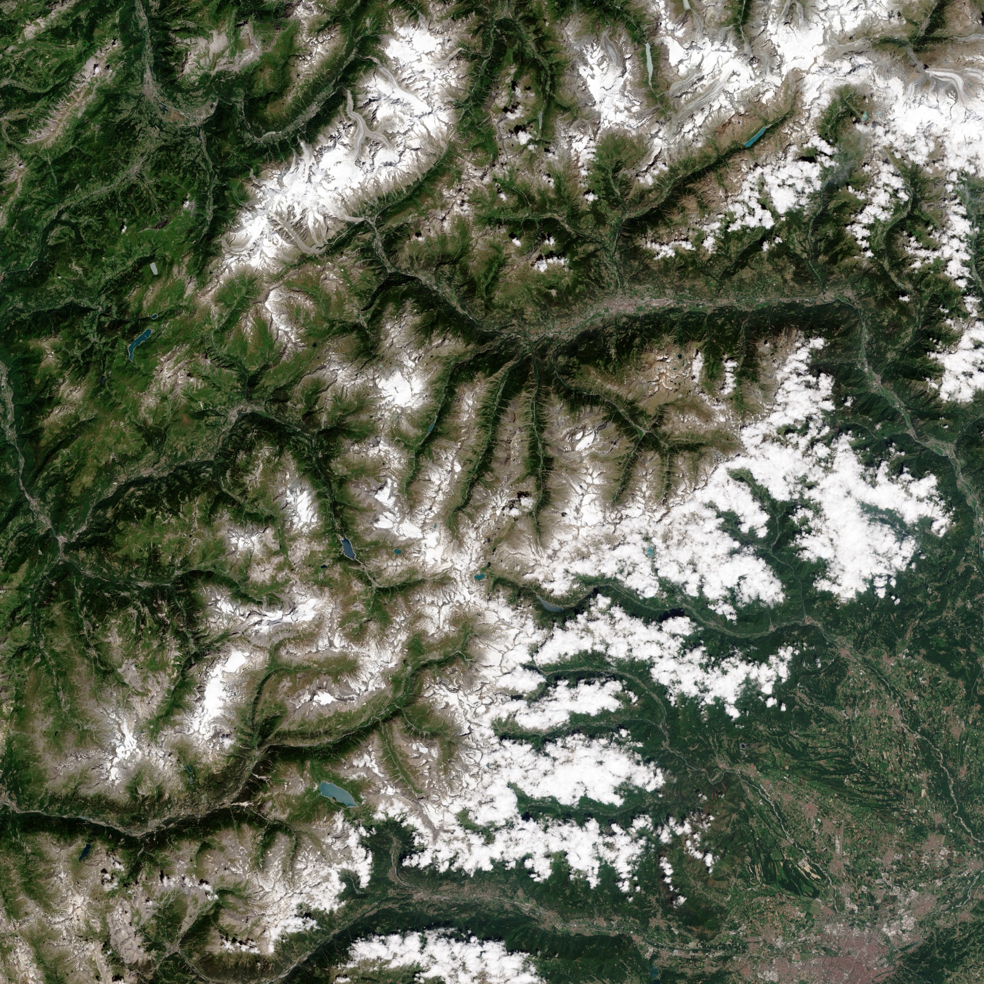
If you started with part 1 of this series, you should already have 3 bands of Sentinel 2 data to work with. If not, and you’re already familiar with how to order data, either grab your own RGB files, or just go directly to AWS and download B02.jp2, B03.jp2, & B04.jp2 from the directory—the blue, green, and red bands of a Sentinel-2 tile covering the French Alps on July 4, 2017. Landsat 8 data will work, too. Got ’em? Good. Eventually, they’ll look like the image above.
Data vs. Images
Each file is a single slice of color—what you’d get if you separated the red, green, and blue bands of a digital photograph into separate channels. You can think of each band as a grayscale image, but they’re not simply images—they’re data. Each pixel is carefully calibrated to represent a real-world quantity from a narrow slice of the color spectrum.
In the case of Sentinel-2 Level-1C data, it’s a quantity known as Top of Atmosphere Reflectance. That is, the percentage of light from the sun reflected back towards the satellite’s detectors. Since the measurement is relative to the amount of available light, data are comparable from different times of day, different times of the year, and different latitudes. This is useful if you have a dataset that covers the entire world every 5 days or so.
Another way these data files differ from images is that they’re stored as 16-bit files, with 2¹⁶ (65,536) possible values. That’s 256 times the dynamic range of the 8-bit images displayed on the web (this explains why professional photographers tend to work with the raw data from their cameras—it also has high bit depth and allows maximum flexibility for image editing).
In addition, these are geographic data, so each and every pixel is precisely located on the surface of the Earth. The JPEG2000 (.jp2) files include this information so the Sentinel-2 data can be combined with other types of satellite data or even maps. This is why we’ll use QGIS—software designed to work with geographic information—rather than an image editor to start working with the files.
Installing QGIS
Installing QGIS is beyond the scope of this post, but I had success on Mac OSX with this QGIS3 installer. The instructions are fairly straightforward with the exception of a few tricky bits:
- A specific version of Python 3.6 is required. Follow the download link given with the QGIS installer (don’t worry—it won’t interfere with your system Python).
- You’ll need to edit (or even create) a hidden file called a bash profile. To do so, navigate to your home folder (the one with Applications, Desktop, Documents, etc.) and press
shift-command-periodto show hidden files. If you see something called.bash_profileyou can add the following line with a text editor:
export PATH=/Library/Frameworks/GDAL.framework/Programs:/Library/Frameworks/PROJ.framework/Programs:/Library/Frameworks/SQLite3.framework/Programs:/Library/Frameworks/UnixImageIO.framework/Programs:$PATH
- If not, create a new file, copy and paste in the above text, and name the file
.bash_profile. You’ll likely be warned that you’re about to create a system file—correct! Just make sure you don’t overwrite an existing file. - After installing QGIS it should launch, but you’ll need to do one more thing in QGIS itself:
- Go to
Settings→Optionsfrom the menu bar. - Select
Systemfrom the options on the left. - Scroll down to
Environmentand checkUse Custom Variables. - Under the
Applyoption selectPrepend, underVariableenterPATH, and underValuecopy/paste:
/Library/Frameworks/GDAL.framework/Programs:/Library/Frameworks/Python.framework/Versions/3.6/bin:
- Click
OKand restart QGIS.
Here’s a screenshot:

If you’re on Windows try the all-in-one installer from qgis.org’s download page. If you’re on any variety of UNIX I’m gonna assume you can get it up and running faster than you could read my instructions.
Using QGIS
Here’s what we’ll do: combine the 3 bands of Sentinel-2 data into one full-color image (derived from this Stack Overflow post), then stretch the 16 bits of data into an 8-bit range to export for further processing.
- Launch QGIS, then go to
Raster → Miscellaneous → Build Virtual Rasterfrom the menu bar.

- This brings up the
Build Virtual Rasterwindow:

- Make sure
Layer Stackis checked to put each input file into its own channel (otherwise they will be merged spatially and all put into a single band). Likewise, selectOpen output file after running algorithmto import into a QGIS raster layer—otherwise the merged output won’t be imported (in other words, you won’t see anything). - Click the
…button just to the right of theInput Layersfield to select the source files. PressAdd file(s)…. This will open a system file dialog—navigate to the directory with the .jp2 files then select and open all three of them. This will add the paths to the files to the QGISMultiple selectiondialog box. In the Sentinel data linked aboveB02.jp2is blue,B03.jp2is green, andB04.jp2is red, but they need to be in reverse order: red, green, blue. Re-arrange the bands by dragging them. Then hitOK.

- The
Build Virtual Rasterwindows might disappear at this point—don’t despair! It’s just hidden behind the main QGIS window. Find it again, and hitRun in Background.

- QGIS is nothing if not verbose, so it’ll tell you exactly what it’s doing. When you see
Algorithm ‘Build Virtual Raster’ finishedclickClose. Which will return you to the main GIS window, this time with an image in it!

But, sadly, you’re not done yet—QGIS has made some guesses about how to display the data by converting from 16-bit to 8-bit, but it’s not likely to do a great job. Snow and clouds are much brighter than forested mountain slopes (or even rocky mountain summits), so most of the image looks dark. QGIS itself lacks many useful tools to enhance the imagery, so the next few steps describe how to export the data for further processing elsewhere.
To change how the data are displayed, right-click Virtual in the Layers palette (bottom-left of QGIS) and select properties. [An aside—QGIS didn’t make a new image file when it merged the three bands of data. Instead, it made a VRT—a text file that describes the merged file. QGIS is interpreting that file to display the data. If you’re curious I go into more detail of how VRTs are useful in Part 2 of A Gentle Introduction to GDAL.]
This brings up the Style dialog box—one of many options under Layer Properties. Raster styles in QGIS govern how the raw data is displayed on an 8-bit-per-pixel screen. This is already getting long, so I won’t describe every option—just how to convert the satellite scene into something to work on in an image editor.

Remember how I described Top of Atmosphere Reflectance—it’s a percentage of sunlight reflected from the Earth’s surface, as seen from a satellite. In the case of Sentinel-2, that percentage is stored as numbers from 0–10,000, rather than 0–100. [Another aside—in reality, surface reflectance can rise above 100 percent, so the data in this file has a maximum of something like 20,000. That’s because the surface isn’t always directly facing the satellite. A steep south-facing mountain slope in the Alps might be directly facing the sun, so will be brighter than a perfectly flat surface, even if both reflect the same amount of light. Neat, huh?]
Manually setting the values of Min to 0 and Max to 10,000 in the Band Rendering options creates an image that spans the full range of reflectance. If you do that on every image you work on, the only difference between images will be either on the surface or in the atmosphere—enabling more consistent visualization and image processing later. For images without anything really bright (like clouds, snow, or roofs) you’ll get better results with lower Max settings—but it’s very scene-dependent. I also like leaving the red, green, and blue settings the same, and adjusting relative balance later.

Uh-oh—this still doesn’t look like the image in the lede. The image is dark, but QGIS isn’t great at image processing, so that’s ok. If you want to visualize the image in QGIS itself, play with the Min and Max settings, or Mean +/- standard deviation x options under Min / max value settings in the Style settings. You can get usable results, but there’s no interactive way to adjust gamma or stretch the image non-linearly, so I think it’s better to do final adjustments in another tool.
To export the image, click Ok to close the Style dialog, right-click on Virtual again, then select Save As… This will bring up yet another dialog box:

Set Output mode to Rendered image (this exports the scaled image displayed in QGIS, not the original 16-bit data), Format to GeoTIFF (which should be the default), and provide a file name.
Done! Ok, not all the way done—but ready for further work. If you have Photoshop, you can try the techniques I describe in How To Make a True-Color Landsat 8 Image or A Hands-on Guide to Color Correction (for Planet data)—they work with imagery from Sentinel-2 and other sensors with a few minor tweaks.

Robert Simmon is a pioneering designer and visualizer renowned for his work in cartography and science communication. With decades of experience at Planet and the NASA Earth Observatory, he transforms satellite data into captivating imagery. Robert's work has appeared on the front page of the New York Times, the cover of National Geographic, and he crafted the iconic Blue Marble featured on the original Apple iPhone. His expertise in data visualization, remote sensing, and the use of color has left a lasting impact on the field. He is currently freelancing and open to full-time opportunities.
- Robert Simmon

- Robert Simmon

- Robert Simmon

- Robert Simmon


