
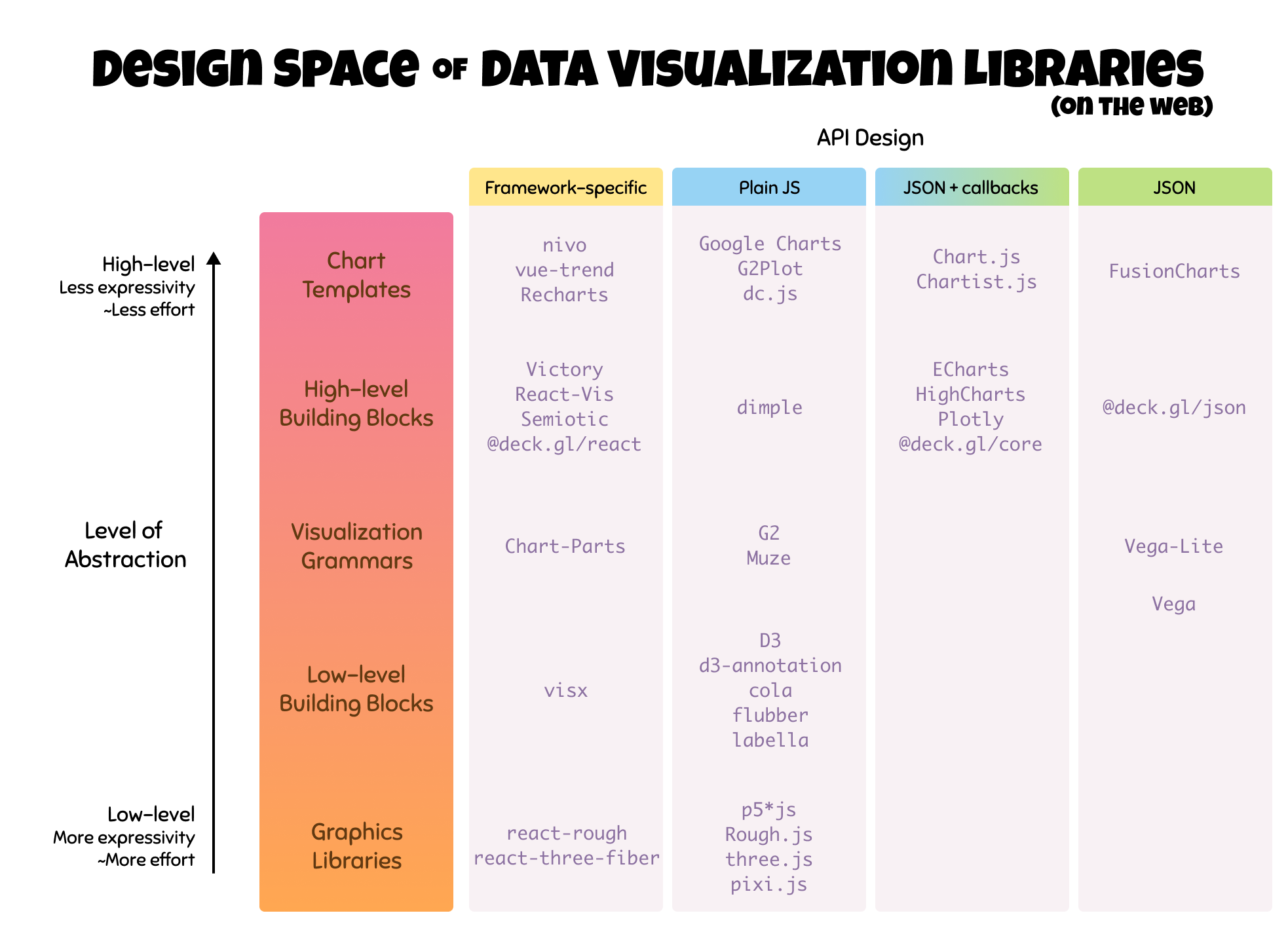
Graphics and visualization developers often get presented with a simple yet difficult question: “Which visualization library should I use?” Typically, making this decision is not about whether one library is “better” than another, but whether the specific library is more suitable for what the developer is trying to achieve.To answer this question thoroughly, we need to start by better understanding the actual design space of visualization libraries. Based on a survey of web-based libraries (i.e. javascript packages), we could conceivably map out a landscape based on two attributes:
- Level of Abstraction — which maps roughly to two aspects: The first is the effort required from the developers to create a visualization. Higher-level libraries usually require fewer lines of code and/or fewer concepts to learn compared to lower-level libraries. Another is expressivity, or how much you can customize, which is in the opposite direction. Higher-level libraries will not let you customize much while you can have a lot more freedom and flexibility with lower-level libraries.
- API Design — The choices made by the authors which control how the code should be written.
API Design
Let’s start with the API Design. As we go through each level of abstraction after this, you will get a better sense of the available varieties. Libraries that provide the same level of abstraction may offer different forms of APIs. It is important to avoid confusing API design with level of abstraction.
- A large number of libraries offer plain Javascript API. Theydo not depend on specific frameworks such as React, Vue, Angular, etc. For example, D3 does not depend on any one framework. The advantage of being framework-agnostic is flexibility; they can be used anywhere. The code, however, tends to be more imperative (closer to machine instructions) than declarative (closer to the output that humans want to see).
const chart = new Chart();
chart.addAxis(new XAxis(...));
chart.addSeries(new LineSeries(...));
- Some libraries, such as Vega, declare their entire APIs in a single JSON configuration. With the JSON constraint, they cannot accept any function or custom object as part of the arguments, avoiding imperative instructions. This constraint enforces a more declarative API. It also means the configuration can be easily serialized and stored as text files, or used with command-line tools. In return, it is more difficult to integrate with other libraries.
{ "x": "time", "y": "price", "series": [ ... ] }
- Some libraries, such as ECharts, are in between and offer the hybrid JSON with callbacks approach.Instead of plain JSON, they declare the entire API as a single configuration Javascript object which can also include functions and sometimes non-primitive values. Their simple configurations may look just like the plain JSONs though at a surface level. The added function support allows advanced customization, more flexibility and easier integration with other libraries. This flexibility is traded with the serializable text output and strict enforcement of a fully declarative API.
{ "x": d => d.time, "y": d => d.price, "series": [ ... ] }
- Other libraries yet fully embrace syntax of specific frameworks (e.g. React) and provide better integration. For example, using a React-based library in a React web application project will be more natural and provide better overall code consistency and optimization opportunities compared to adding alien blocks of D3 code. The drawback is they require prerequisite knowledge about the framework and are only appropriated to be used in a project where the main framework is also used.
<Chart>
  <XAxis />
  <LineSeries />
</Chart>
Some libraries also offer multiple forms of APIs. For instance, deck.gl has @deck.gl/core, @deck.gl/react and @deck.gl/json modules that offer plain JS API, React-based API and declarative JSON API, respectively.
Level of Abstraction
These levels map roughly to the effort required to create a visualization and expressivity. In other words, the higher level libraries usually requires fewer lines of code to produce a usable visualization but then there are fewer things you can customize. On the other hand, you can customize more and more the lower-level you choose, but have to put in more work yourself.

Composable Building Blocks (level 2–4)are fragments that can be composed to produce a visualization. If using the graphics libraries is like trying to build a house from freeform clay, using composable building blocks is like trying to do the same thing using a box of LEGOs. You can assemble these LEGOs anyway you want. The limitations are based on the kinds of LEGOs you have. You can also use multiple building block libraries together, as long as they are compatible.
The building blocks are at the sweet spot when you need more flexibility than the chart templates (level 5) and still want to stand on the shoulder of giants instead of starting from almost scratch (level 1).
1. Graphics Libraries
This group of libraries lets a developer draw visual elements directly or perform traditional computer graphics operations (scene graph, shading, etc.). They are the closest to native APIs such as Canvas or WebGL. They have the maximum level of expressivity and in return require the most effort to produce the same visualizations. If you are trying to produce a quick bar chart immediately out-of-the-box, these are probably not for you. However, these libraries let you tune for deep performance optimization or produce wild graphics that the higher-level libraries may not offer.

Examples: Processing, p5*js, Raphael, Rough.js, three.js, PhiloGL, luma.gl, two.js, PixiJS, react-rough, react-three-fiber
For instance, this is the amount of code required to setup an empty canvas and draw a single rectangle with p5.

import p5 from 'p5';

const p = new p5(function(sketch) {
  sketch.setup = () => {
    sketch.createCanvas(200, 200);
  };
  sketch.draw = () => {
    sketch.background(0);
    sketch.fill(255);
    sketch.rect(100, 100, 50, 50);
  };
});
Draw a rectangle with p5*js, which has plain JS API
Similarly, this is how to draw a single rectangle with react-rough. Some higher-level libraries may let you create an entire bar chart with the same amount of code.

<ReactRough>
  <Rectangle x={15} y={15} width={90} height={80} fill="red" />
</ReactRough>
Draw a sketch rectangle with react-rough, which has React-based API.
2. Low-level Building Blocks

The low-level Building Blocks are quite independent and flexible. Each component or utility in these libraries serves particular purpose and can be used in combination with components from the same libraries or other libraries to create a visualization. How they should be combined is roughly defined and leaves a lot up to the discretion of the developers.
The most notable of this is D3 , which evolves from the early frameworks in other languages (Prefuse, Flare). D3 completely changed the landscape of visualization authoring in the past decade. It introduced a suite of low-level components and utilities, such as selection, scales, formatting, etc. while leveraging the common standards such as DOM and SVG instead of defining all constructs by itself.
In the example below, multiple building blocks offered by D3 (scales and selection) are used in combination to create a simple bar chart.

const x = d3.scaleBand().rangeRound([0, width]);
const y = d3.scaleLinear().range([height, 0]);
const svg = d3.select("svg").attr("width", width).attr("height", height);

x.domain(data.map(d => d.date));
y.domain([0, d3.max(data, d => d.value)]);
svg.selectAll("bar")
    .data(data)
  .enter().append("rect")
    .style("fill", "steelblue")
    .attr("x", d => x(d.date))
    .attr("width", x.band())
    .attr("y", d => y(d.value))
    .attr("height", d => (height - y(d.value)));
Create a bar chart with D3
In addition to D3, many libraries offer specialized components and utilities with unique functionalities. Even though many of them have the d3-prefix in their names, not all of them really depend on D3. To name a few:
- cola and Cytoscape provide various graph layout algorithms.
- d3-annotation takes annotation to the next level.
- d3-cloud provides word cloud algorithm.
- d3-legend creates nice legends for your scales.
- flubber smoothly interpolates between 2-D shapes.
- labella helps you place label on a timeline.
- visx provides native React building blocks that wraps D3 and SVG.
3. Visualization Grammars

In the middle of the “building blocks” range are the Visualization Grammars. They have their roots in The Grammar of Graphics, which was introduced in the late 1990s and offered a new perspective on designing statistical graphics. Instead of referring to charts by their traditional “types” — bar, pie, scatter plot, bubble, etc., — the book calls out their shared structures and introduces the ideas of using these common concepts to describe any chart.
Similar to how the grammar of a language, such as English, defines part of speech (noun, verb, etc.) and gives you a structure for combining these parts into a meaningful sentence, the grammar of graphics defines it own parts and provides a structure for combining them to describe an output graphics. This rigid structure is what differentiates them from the low-level building blocks.

See the chart below and its specification in the grammar of graphics. The chart is broken down into parts and described as a composition of DATA, SCALE, COORD an ELEMENT.

The most famous implementation of the Grammar of Graphics is ggplot2, which dominates the R and data science communities. On the web, Vega let users describe visualizations in JSON, and generate interactive views using either HTML5 Canvas or SVG. Vega-Lite provides a higher-level grammar equivalent to ggplot2 level with interactions, which is compiled into Vega and rendered using the same engine.
The code block below is a specification of a bar chart in Vega-Lite. The dataset data is described separately. The mark and encoding fields are equivalent to the ELEMENT part of the Grammar of Graphics and its aesthetics.

{
  "$schema": "https://vega.github.io/schema/vega-lite/v4.json",
  "description": "A simple bar chart with embedded data.",
  "data": {
    "values": [
      {"country": "China", "population": 131744},
      {"country": "India", "population": 104970},
      {"country": "US", "population": 29034}
    ]
  },
  "mark": "bar",
  "encoding": {
    "x": {"field": "population", "type": "quantitative"},
    "y": {"field": "country", "type": "nominal"}
  }
}
Create a bar chart with Vega-Lite, which describes everything as pure JSON.
In contrast to the APIs of Vega-Lite which is JSON, G2, and Muze all provide visualization grammars with Plain JS APIs while Chart Parts was built for React. See the G2 code to create a bar chart below. Notice the different API design compared to Vega-Lite.

import { Chart } from '@antv/g2';

const data = [
  {country: "China", population: 131744},
  {country: "India", population: 104970},
  {country: "US", population: 29034},
];

const chart = new Chart({ container: 'container', autoFit: true, height: 500 });
chart.data(data);
chart.coordinate().transpose();
chart.scale('population', { nice: true });
chart.interval().position('country*population');
chart.render();
Create a bar chart with G2, which has plain JS API
4. High-level Building Blocks

If the low-level building blocks are equivalent to individual LEGO bricks, which are very flexible and can be combined in many different ways, these high-level building blocks are pre-assembled larger pieces.
Similar to the visualization grammars, each of the high-level building blocks librariesalso comes with its own set of components and predetermined way to assemble these components into a chart. However, there are a few common differences that place this group of libraries in between the visualization grammars and the chart templates levels:
- Some libraries combines axes and scales together. SCALE in the grammars is considered one part while axes are part of GUIDE
- The high-level building blocks libraries sometimes embed data in multiple places, commonly within the series along with aesthetics configurations. The grammars treat data (DATA) and transformation (TRANS) as separated parts and only reference to field names or derived variables in the ELEMENTs, .
- More commonly, they are more relaxed from the “no-chart-type” philosophy and may include convenient templates as series or layerto encapsulate special logic for more complex chart types, such as stream graph, etc. This makes them closer to the chart templates. However, they still do not refer to the entire chart by just a chart type, which is more common for the chart templates.
As an example, a candlestick chart can be described with grammars as combined layers of bar “marks” and line “marks.” For convenience, a high-level library may provide CandlestickSeries to combine the two layers into one and encapsulate logic for encoding the aesthetics. This CandlestickSeries is then composed with axes and gridlines to create a chart. On the other end, a chart template library may provide aCandlestickChart component which already includes axes and gridlines and only ask for data.

Several libraries utilize the JSON with callbacks design such as ECharts, Highcharts and Plotly. The example below is a simple one so the configuration object looks just like plain JSON.
option = {
  xAxis: {
    data: ['2017-10-24', '2017-10-25', '2017-10-26', '2017-10-27']
  },
  yAxis: {},
  series: [{
    type: 'candlestick',
    data: [
      [20, 30, 10, 35],
      [40, 35, 30, 55],
      [33, 38, 33, 40],
      [40, 40, 32, 42]
    ]
  }]
};
Create a Candlestick chart with ECharts
Many libraries were later created for React such as Victory, React-Vis or Semiotic. They provide components, such as <XYPlot/>, <LineSeries/>, or <XAxis/>, that can be composed into the desired visualizations.
<VictoryChart
  theme={VictoryTheme.material}
  domainPadding={{ x: 25 }}
  scale={{ x: "time" }}
>
  <VictoryAxis tickFormat={(t) => `${t.getDate()}/${t.getMonth()}`}/>
  <VictoryAxis dependentAxis/>
  <VictoryCandlestick
    candleColors={{ positive: "#5f5c5b", negative: "#c43a31" }}
    data={sampleDataDates}
  />
</VictoryChart>
Create a Candlestick chart with Victory, which has React-based API
Compare the ECharts code (line 7) and Victory code (line 8–11) above to Vega-Lite code (line 24–39) below. Notice how the candlestick shape is described as a single series vs. two layers of marks.
{
  "$schema": "https://vega.github.io/schema/vega-lite/v4.json",
  "width": 400,
  "data": {"url": "data/ohlc.json"},
  "encoding": {
    "x": {
      "field": "date",
      "type": "temporal",
      "title": "Date"
    },
    "y": {
      "type": "quantitative",
      "scale": {"zero": false},
      "title": "Price"
    },
    "color": {
      "condition": {
        "test": "datum.open < datum.close",
        "value": "#06982d"
      },
      "value": "#ae1325"
    }
  },
  "layer": [
    {
      "mark": "rule",
      "encoding": {
        "y": {"field": "low"},
        "y2": {"field": "high"}
      }
    },
    {
      "mark": "bar",
      "encoding": {
        "y": {"field": "open"},
        "y2": {"field": "close"}
      }
    }
  ]
}
Create a Candlestick chart with Vega-Lite
Another notable example of high-level building blocks abstraction is deck.gl and its comprehensive collection of layers that can be combined to produce map-based visualizations.

import {Deck} from '@deck.gl/core';
import {ScatterplotLayer} from '@deck.gl/layers';

const INITIAL_VIEW_STATE = {
  latitude: 37.8,
  longitude: -122.45,
  zoom: 15
};

const deckgl = new Deck({
  initialViewState: INITIAL_VIEW_STATE,
  controller: true,
  layers: [
    new ScatterplotLayer({
      data: [
        {position: [-122.45, 37.8], color: [255, 0, 0], radius: 100}
      ],
      getColor: d => d.color,
      getRadius: d => d.radius
    })
  ]
});
Create a scatter plot on the map with deck.gl using its plain JS API. A ScatterplotLayer is one of the many layers offered by deck.gl that can be composed and placed on top of a map.
5. Chart Templates

A library of this type can range from containing a single component to hundreds of components. Each component is referred to via its chart type, e.g., Bar, Pie, Area, Stacked Bar, Stacked Area, Waterfall, Bump, Calendar, Treemap, Marimekko, Sunburst, ColumnWithLine, Dual line etc.
The best thing about the chart templates is they are often ready to use, straight out of the box and require the least effort to produce a usable output. Developers can choose a chart type from its catalog, prepare data in the documented format then plug the data and component together.
Instead of trying to describe a pie chart with a grammar or learn how to implement it in D3, just check if the library provides a pie chart component. If there is such component, then use it. If not, then find another library or alternative.
Also, novel visualization types (such as a new technique that just came out of research) are often offered as a single-component library like this.
Examples:
- The generic collection that has many standard chart types: Google Charts, nivo, FusionCharts, JIT, Chart.js, or dc.js
- The specialized collection which has a single chart type: d3-horizon-chart, d3-layout-narrative, streamgraph.js.

const myRadarChart = new Chart(ctx, {
  type: 'radar',
  data: data,
  options: options
});
Create a Radar chart with Chart.js

import { Calendar } from '@nivo/calendar';

<Calendar
  data={[
    { "day": "2016-02-05", "value": 397 },
    { "day": "2015-09-17", "value": 283 },
  ]}
  from="2015-04-01"
  to="2016-12-12"
  emptyColor="#eeeeee"
  colors={[ '#61cdbb', '#97e3d5', '#e8c1a0', '#f47560' ]}
/>
Create a calendar chart with nivo, which has React-based API
The level of abstraction in a data visualization library is a continuous spectrum, not a discrete set of layers. Therefore, you may run into libraries that are somewhat borderline. What is critical is not a semantic distinction between levels, but more so the developers’ abilities to understand the offered abstraction to select a library that is appropriate for their own use cases and comfort. It is in fact not uncommon for libraries to offer features from multiple levels of abstraction. To give a few examples:
- dc.js has both chart templates and high-level building blocks.
- G2Plot is a catalog of chart templates on top of G2, which is a grammar.
- react-vis has both high-level building blocks (<XYPlot />) and chart templates (<Sankey />).
- In fact, D3 also spans multiple levels. For example, d3-scale is using the scale concept from the grammar level while d3-shape is closer to the graphics libraries.
Parting Thoughts
To recap, the goal of this article was to map the vast universe of data visualization libraries and derive an underlying framework for better understanding them, regardless of whether you are simply picking one to use or trying to develop a new one. We’ve organized a variety of libraries across a spectrum from low-level graphics manipulators to chart components that are ready to use, straight out of the box.
While there were many libraries that were mentioned, I would be remiss if I didn’t state that this listing is by no means exhaustive. I simply endeavored to describe the characteristics of each group and then selected some prominent libraries that best exemplified each category. This post also focused only on web-based libraries, and I would be interested to see such an approach extended to other languages and platforms.

When deciding which library to use, look for the appropriate abstraction level for the time you have, your own coding comfort, the tasks you are trying to accomplish, and the target developers and users. Then look at API design and other factors that might be included into the consideration, such as:
- Rendering technology: SVG, Canvas, WebGL
- Performance: Bundle size, Speed, Server-side Rendering
- Others: Type-safety, License, Theming, Animation, etc.
I hope you enjoyed the tour and learned a few things along the way! Perhaps the next time you come across a new package, you can use this framework as a lens to analyze its own offerings and how it is different from or similar to the libraries that you already know.
Acknowledgment
Thank you Kanit Ham Wong and Senthil Natarajan for their feedback.
Data Experience @airbnb / Prev: Turn data into pixels @twitter • Invent new vis @UofMaryland HCIL PhD • From @Thailand • http://kristw.yellowpigz.com
- Krist Wongsuphasawat

- Krist Wongsuphasawat


