
After a long day of meetings, projections, and rigorous data analysis there’s nothing I look forward to more in the evening than sitting down and fiddling with a Business Intelligence tool.
Really. I’m not joking.
You might think I’m getting paid to say this (I’m not), but most evenings, while my girls are falling asleep next door, I’m sitting in my office in the same chair I worked in all day, building data viz in Tableau.
For fun.
Because I’m making art.
I’m not bold enough to call myself an artist but I’ve always been into drawing. Whether it be in class, a meeting, or watching TV you’ll find a pencil in my hand and images appearing on a piece of paper. While the tools have changed over time, from a Bristol pad and Dixon Ticonderoga to iPad Pro with Magic Pencil, the art and doodling has been constant.
Let’s get back to data viz.
I’ve been actively creating data visualization on Tableau Public for about three years now and have a portfolio of over 140 visualizations. A lot of my early work was driven by public data exercises that really helped me establish a connection to the #DataFam community as well as skill up.
When you’re really trying to get traction, these exercises are PERFECT. With the same tool and dataset you see hundreds of different vizzes every week. If someone else created something better/cooler/smarter than your work, the only thing keeping you from getting there is your own skillset and creativity.
But I started to find that community exercises didn’t always produce my best work. It’s not their fault, it’s entirely mine. If I felt uninterested in a topic or dataset I tried to make myself more interested. Bold color choices, weird chart types, lots and lots of unnecessary graphics. It was counterproductive.
I wanted to learn AND make art.
Thinking back to what originally got me excited about DataViz early in my career, I remembered a visualization by Rody Zakovich analyzing the legendary rock band Queen. Rody transformed what I thought a data viz could be.
Queen’s albums, weighted by words, tapering into a single point from Freddie Mercury’s spiked fist.
(Here’s the chart, sans Mercury)

What! You can do that?
I was taken with the cleverness and elegance of the design, but what really caught my attention was the passion. Rody had taken a topic he was personally fascinated by and elevated it with data. And it wasn’t really that hard. Yes, he used trigonometric functions to bend the lines at the bottom, but we’re really looking at 4 relatively simple charts here. BANS across the top, bar charts, a colored text table, and then some bent lines.
The combination, and the passion behind it, were what captured my imagination.
So, the question is, why wasn’t I working on projects that covered MY interests?
Cards on the table, I’ve been a geek since long before it was cool. I blasted through Jurassic Park (my first novel) in a brazen 24 hour binge as an 11-year-old. I read Star Wars expanded universe novels in middle school (in class, no less), and sketched pictures of Batman and the X-Men for friends.
While my tastes have progressed, I’m still a comic reading, sci-fi loving, pop-culture junkie. And we now live in an age where that’s become mainstream.
What could I learn, what could I REALLY do, if I chose to work on things that captured my attention?
Data viz is about translating difficult to grasp concepts into easy-to-understand visuals. While bars, BANS, lines, and maps may be the bread-and-butter of the discipline, there are other ways to express these ideas.
This led me to ideas like mapping the dream worlds of Inception. Christopher Nolan’s complex dream-heist masterpiece can be complicated to wrap your mind around (believe me, I had to figure out how to make an image of it), but it was an EXCELLENT opportunity to practice Cartesian mapping of lines.

The crew executing the heist enters a series of layered dreams with one member staying behind at each level. After hitting the bottom, they wake up successively through the dreams that they’ve passed down through, ultimately (we hope) returning to the waking world.
You may ask, IS this “DataViz”?
If your sole criteria is “does it show numerical data” then the answer might be no. But, like a map, it’s expressing the relationship between locations and taking a concept that’s difficult to describe by text and giving it a visual explanation.
At this point, you’re thinking “yeah, but I’m working in reality, not dreams”.Let’s talk something more tangible, like the growth and contraction of a marketplace. In this particular case, I’d read Blake J Harris Console Wars about the early 90s marketing battles of the fledgling Sega against Nintendo.
I wanted to find a unique chart type that could show the relative sales volumes of the different console manufacturers over time, as well as illustrate the boom and bust nature of the market as a whole.

There are plenty of “safe” ways to express this idea, but embracing the idea of the vivid visual bombast of video games, a novel chart type was the perfect fit. I’m not a “Math guy,” and it took me about nine attempts, but I was able to correctly navigate the dozen or so layered mathematical calculations needed to create the lush waves of the console gaming market in this Stream Graph.
You’re not going to find this in the Big Book of Dashboards and it’s not a best practice chart. Having said that, it catches the eye and serves its purpose. The entry points for different companies into the marketplace (and some exist) are easy to recognize, and you can see the evolution and growth up until the peak in 2008 when Nintendo’s explosive Wii game sales topped out.
You can still have fun with some best-practice charts too.
Inspired by an episode of the sitcom Community which featured a class “Nicolas Cage: Good or Bad,” I decided to explore the Rotten Tomatoes scores for the actor’s films. Since RT includes % approval ratings from both Audiences AND Critics, I chose to analyze the gaps in perception.

This Diverging Bar chart shows us where the two types of viewers differ and agree most significantly. Outside of a couple of creative design flares and color choices, this is a perfect best-practice viz that made for a fun evening creating, and several interesting discoveries within the data along the way.
Life is short, though, and sometimes you just feel compelled to swing for the fences with a viz that breaks all of the rules. It COULD work, it could flop, but by pouring yourself into it, putting yourself out there, you find out what works and what doesn’t.
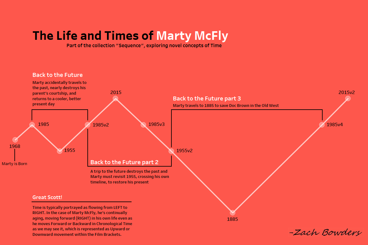
That’s the story behind my Marty McFly timeline viz, which shows a VERY unorthodox timeline. Time travel is WEIRD. Though a character physically moves to a different period in time (forward or back) they’re always aging as they continue, and thus, their own personal timeline is always moving forward.

With each of these projects I learned something new about what did (or didn’t) work, and in many cases tried new techniques I wouldn’t have had the opportunity to try at work.
Had I not been as invested and curious about the subjects as I am, I know (I have the vizzes to prove it) I wouldn’t have created something as interesting.
Self-development, even through fun topics and unorthodox charts, is a journey. You’re still going to put in hours on evenings and weekends, and results aren’t immediate. If you doubt me, feel free to look back through my Tableau Portfolio, you’ll see plenty of clunkers. However, if you treat yourself to projects that you are passionate about, you’ll find yourself picking up neat tricks, greater speed, and a new zeal that will cross over into your day job in an amazing way.Viz your passion. It’ll transform your work, boost your learning, and create a portfolio you’re proud of.
Zach Bowders is a data analyst, aspiring artist, and host of the Data+Love Podcast. His Portfolio can be viewed on Tableau Public at https://public.tableau.com/profile/zach.bowders#!/
- Zach Bowders


