
I love non-traditional data visualization and I regularly think about how we can continue to push the boundaries. There are many ways to entertain, motivate, and impassion an audience and the arts have provided a wide range of inspiration to data visualization practitioners over the years. Why not try a data performance?
It all started with a life-sized rat
During the pandemic, artist Jen Ray rolled out her own campaign to support the city: NYC BRAVE. That quickly expanded into a new unofficial mascot for the city — RATSY — who has been spotted strutting around the city since last summer, posing for free pictures and bumping elbows in Central Park.
I love non-traditional data visualization and I regularly think about how we can continue to push the boundaries. There are many ways to entertain, motivate, and impassion an audience and the arts have provided a wide range of inspiration to data visualization practitioners over the years. Why not try a data performance?

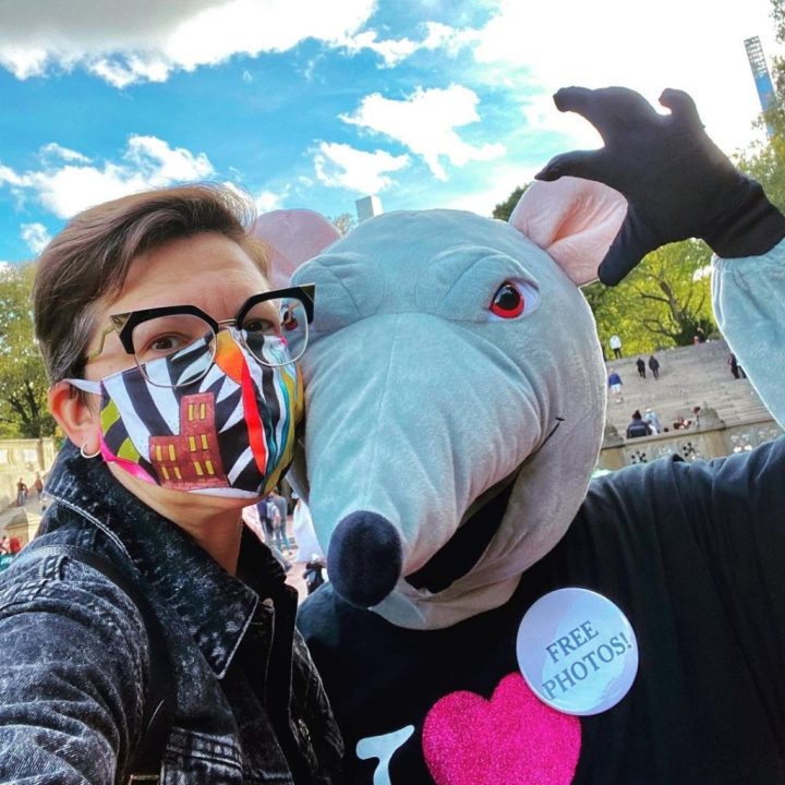
Ok, the full story is that I’ve been happily married to Jen Ray for a long time. That’s me in the Ratsy costume on the right, and we have supported each other’s artistic practices for our whole lives. Interestingly, Jen and I have never fully collaborated before, despite talking about it a few times.
As my career moved from UX design and into dataviz, my creative interests naturally followed. I’ve been considering trying my hand at data art for a while now, and I have been exploring the NYC Open Data portal to gather data for these simple experiments. Last year we went to an exhibition in downtown Manhattan organized by Data X Design (referred to as DxD) and were really impressed with the data-artworks as well as how wonderfully friendly everyone was. When we heard they had an open call for artists a few months ago, Jen and I started talking about submitting.
Because of Jen’s history with staging elaborate art performances, we started talking about a data-art performance despite not really having a lot of ideas on what we would do. We knew we wanted a flag and 10 Isotype figures, but that was all we had. So we applied to be part of the 2021 Data X Design exhibition and they picked us! Woohoo!

Inspired by the past to create something new today
In order to communicate to anyone first, you have to get their attention. There have been so many approaches to engaging with an audience, that we wanted to build on some ideas from the past. So before I get into the details of the performance, I’d like to share some of our inspirations.
Let’s start with the 1913 NYC Civic Parade as featured in Willard Cope Brinton’s Graphic Presentation. The parade was a huge city-wide procession that involved every aspect of the New York City government, but the health department’s contributions were large statistical floats explaining the reduction of certain diseases like smallpox and measles. Despite torrential rain (you can see the umbrellas in the photo below), the parade was a hit and the health floats made a big impact with the NY press as seen in the clipping below.


Another interesting data-adjacent performance was das Triadisches Ballet held at the Bauhaus as choreographed by Oskar Schlemmer in 1921. As per many of the pursuits of the Bauhaus, Schlemmer was inspired by the fundamentals of movement and geometric shapes. In this ballet, his performers donned geometric costumes combined with movements to amplify the abstract nature of their cartoonish human forms. While the Bauhaus is enshrined in high-art seriousness now, what is important to keep in mind is the deep-seated silliness designed to inspire playful creativity at the time. While not data-oriented, the performers are mathematical in their conception, their forms are bright and fun, and the work is itself an antidote to stodgy antiquity. (Watch the 1970’s remake here!)

There is one more historic precedent and regular readers will see the connection with pictorial statistics coming a mile away. Otto and Marie Neurath collaborated for years with documentary filmmaker Paul Rotha. Otto was experimenting with animation as early as 1928 in Vienna, but this series of films made with Rotha featured basic animation with a comedic flair. In World of Plenty, the narrator is offset by a British “everyman” who pokes fun of his authority. The comedic element and the motion of the Isotypes all help to engage the audience to consider the overall message. Jen and I were really inspired by the idea of Isotypes moving, of revealing themselves over time. By making the icons funny, and having them introduced to the audience over time, the icons could become the elements in a visual joke.
Performance art is an exchange of information
New York Alive! started with Jen’s ongoing effort to engage New Yorkers. We’ve been through a lot, and you can really feel that people WANT to have fun. So we started our search for fun data.

The themes are there in Jen’s sketch from the beginning: the obsessions, fears, favorites, and joys. We had a storyline, we just needed to find the data to support it. I dug into the NYC Open Data portal, but it really all started to come together when I found the Urban Park Ranger Animal Condition Response data— which Jen and I loosely translated to animal attacks.
It’s a fun dataset because each number represents a story for the person that lodged the report. How can you not giggle at each report of an attack by a chicken, bat, turtle, dolphin — or frog! In fact, the #1 vastly most reported animal — the raccoon — is kind of cute and mischievous (even though we wouldn’t want to be bitten by one). I needed to aggregate the data a few times, and to my surprise, the second-highest animal by species was the turtle! See, we’re already having fun.
But we wanted to create a personal connection between the official data and the lived experience of our audience, so Jen and I created a survey asking NY’ers to respond to hard-hitting questions like, “What is the food that makes you the happiest” and “What is the most fearsome wild animal in NYC?” This helped us make the story a bit more focused, but during the performance, it also really appealed to the curiosity of our audience, many of whom had filled out the survey. They wanted to see where they fit into the data.
Illustrating the data for and about our city
Collecting the data quickly turned into illustrations of these dastardly animals. These sketches helped us to continue to refine our vision, but they also turned into some great source material to help promote our performance as well as the exhibition. As we were working on it, a call went out by the DxD curators to show our work on the digital signs dotting the city known as LinkNYC and we jumped at the opportunity!

th heroes like Nigel Holmes, Giorgia Lupi, Art Spiegelman, and Philip Guston, and design inspirations like the Detroit Printing Co-op and old-punk flyers, we set out to make some data posters that beat up the data-to-ink ratio and left it sulking in the corner. We threw in a pie chart just for kicks.


Naughtiness is always a bit silly and inherently transgressive. While a lot of dataviz design is pretty restrained, there are so many design possibilities to make dataviz really exciting — or even just really different. We can all make pictorial statistics however we want to. While I empathize with the historic precedent of using generic icons, there isn’t a rule that says we have to. I absolutely understand that not everyone is a designer, and that incredible works of information design were created in the past — but why would the idea of Isotype only exist in that frozen, antique state? Let’s experiment and get messy! Let’s try things out! Let’s make mistakes and learn from them!? There are so many ways to engage with your audience visually. We should have fun by pushing the design boundaries. Doing so might actually help us make that connection we’re all looking for in order to communicate more effectively.
But that’s enough design agitation (for now)— it was time to get to work on the performance!
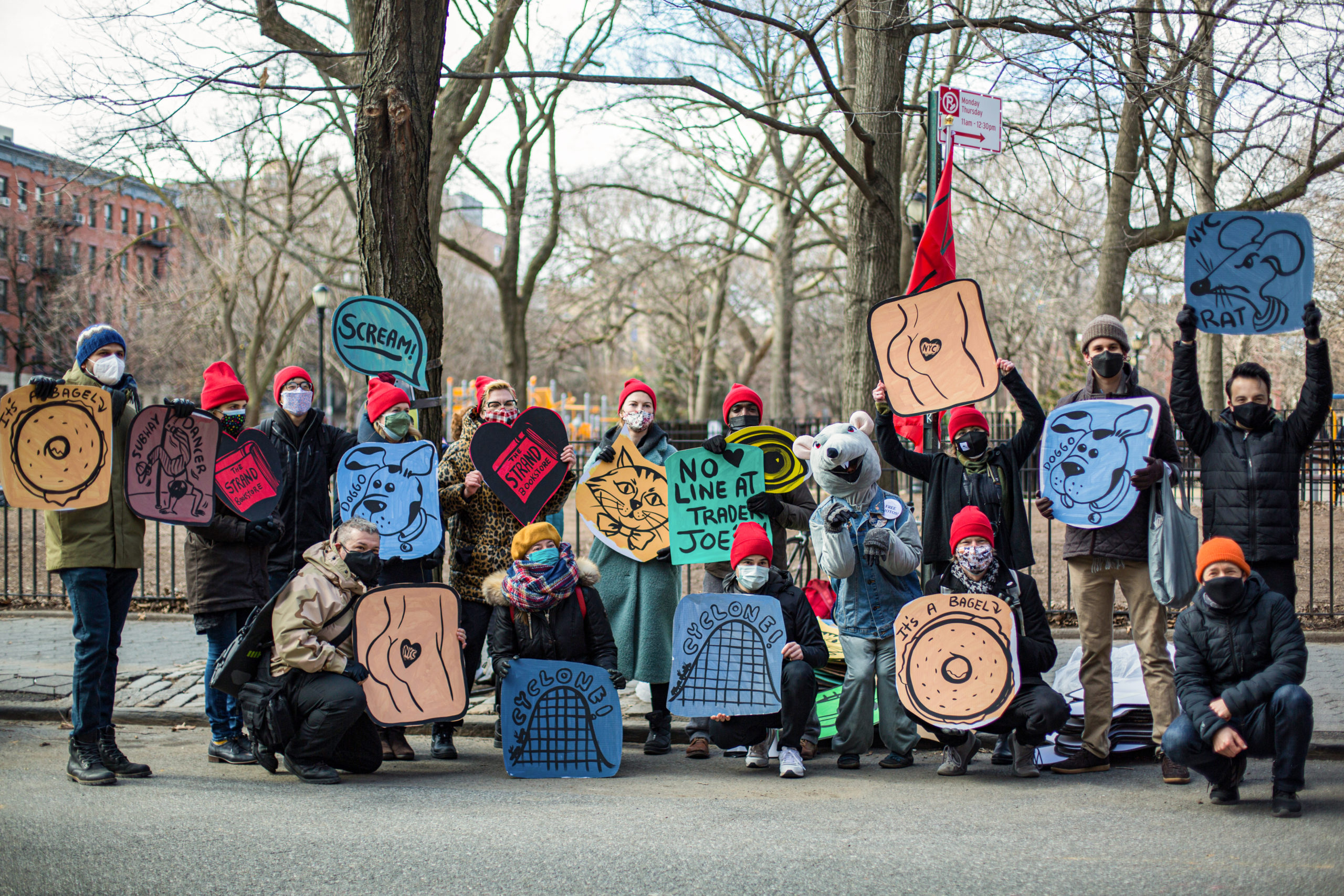
100 pieces of hand-cut and painted cardboard
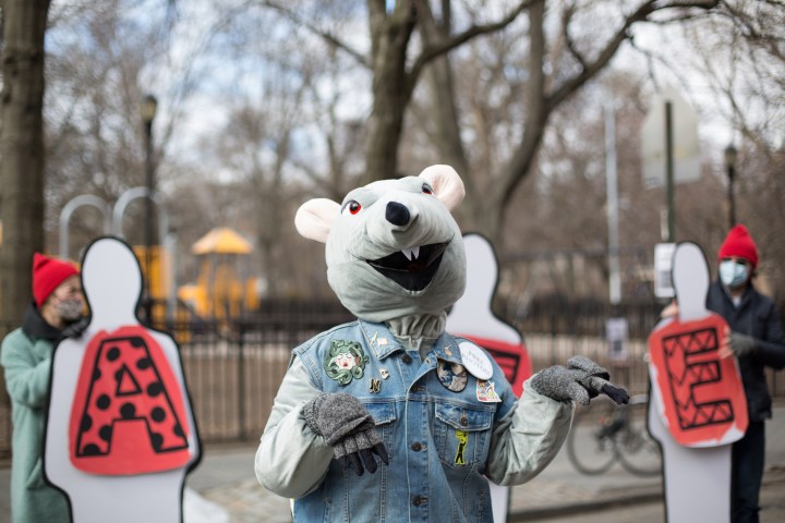
You’ll be shocked to hear that living in a small NYC apartment was not the best place to fabricate 100 cut and painted life-sized icons. We came up with an assembly line to cut the cardboard down to size, paint the background color, then Jen would come through and paint the final icon. It was a whole lot of fun actually, and as you can see, our son Max helped, too!


One of the interesting aspects of our collaboration was in the design of the icons themselves. Despite my knowledge of Isotype history and practices, I didn’t want to constrain Jen. Like I said above, I don’t think we really need to stick to the rules when we’re looking for new forms, so the “butt icon” — which was representative of NY’ers “stolen inhibitions” — is a great example of having fun and creating a visual metaphor. If you watch the video you can hear the audience get the joke, both visually and metaphorically.
While I compiled the data and counted off the number of icons, the art of our performance came entirely from Jen. Her diligence in crafting visuals shouldn’t be dismissed by the silliness. There’s a lot of expertise that is effortlessly applied when collaborating with people from outside of the data or design fields. Jen had fun working on icons for things like “city juice,” the mixed-up emotion, and the bagel. We needed to experiment with many aspects of the performance design knowing that it would be outside, socially distanced, and likely cold. Design details like the red hats for the performers, the colors of the signs, the red flag, and bullhorns — Jen conceived it all.
So how did it go?!?!?
It was great! Huge thanks to all the volunteers, the DxD curators, the Loisaida Open Streets Community Coalition, NYC Open Data,Beta NYC, and all the folks who came out or stumbled across us! While it was a chilly, windswept day, the whole thing went off pretty much to plan. Sure, we messed up a few bits, but our friends were there to jump in and make it work.
This performance was an act of community. We celebrated our city by making light of ourselves through the data. While it was early in our post-COVID reopening, it was obvious that we could collectively come back to life again.
The performance itself was a riot of dancing children, off-the-cuff quips, unexpected costumes, and in-on-the-joke audience participation. Who doesn’t want to scream out their best subway noise impression? Who doesn’t want to see a valiant Godzilla affix a garbage truck icon while wearing mittens? Oh, and let’s not forget RATSY!
But did it work as a data visualization?
And, this is the most interesting part — it DID!
Watching the video is also to be in the audience: you hear the comments, the speculation, and the anticipation. While lives were not changed, I guarantee you everyone there now understands the terrifying role of the NYC Racoon, and might even mention it casually to friends. The audience confirmed that falling air conditioners really do keep us awake at night. The slow reveal of the icons being applied to each figure (in this case by a gaggle of elementary school kids) actually worked to build anticipation in much the same way that a progress bar signals the completion of a digital task. Depending on the intended communication objective, using this kind of Isotype theater is actually incredibly effective.
Another hypothesis that was definitively proven in this performance was the ability to convey the humanity of the data. Not only was the data (literally) human, it also became personal for our audience as it spoke directly to our shared experience. Everyone had an opinion about what the data might be and that connected them (invested them) to the story of the data. We chose to focus on the humorous, but the engagement with the form was evident.
Another aspect we plan on continuing to explore is the physicalization of the icons themselves. We didn’t know the volunteers would want to swing and dance with them. While generic in design, they became almost like shields or proxies — even dancing partners. Exploring the nature and craft of these icons as “units” as well as “props” will be a lot of fun in the near future.


Will we do it again? — YOU BETCHA!
NEW YORK ALIVE! was always a prototype. Going into it, we had a lot of ideas, but no real understanding if they would work. By keeping an experimental mindset, we were able to surf the ambiguity and keep our focus on having fun and involving people.By performing data in this way, you are directly in conversation with the audience so the immediate feedback on the data is revelatory. While we were focused on telling a data story, in the future we’ll likely conduct more on-the-spot surveys and find ways to gather data, too.This kind of participatory exploration of the data was only amplified by the Isotype format. The icons were clear for the audience, and the visuals, colors, and liveliness created a lot of excitement. The focus on high-level, aggregated data also was the perfect level of granularity for such a public conversation. There are so many more aspects of Isotype — and dataviz in general — to explore in this format. The possibilities feel endless and Jen and I are excited to keep going with it.If you’re in NYC this summer and want to volunteer —

Jason Forrest is a data visualization designer and writer living in New York City. He is the director of the Data Visualization Lab for McKinsey and Company. In addition to being on the board of directors of the Data Visualization Society, he is also the editor-in-chief of Nightingale: The Journal of the Data Visualization Society. He writes about the intersection of culture and information design and is currently working on a book about pictorial statistics.
- Jason Forrest

- Jason Forrest

- Jason Forrest

- Jason Forrest


