
Karim Douïeb is a Brussels-based data scientist and co-founder of Jetpack.ai. He is also the creator of an unexpectedly-viral U.S. election map that he spoke about at Outlier 2021. He spoke with Claire Santoro from Nightingale about his recent visualization, Noisy Cities, which was also featured in the Washington Post’s How To Read This Chart newsletter.
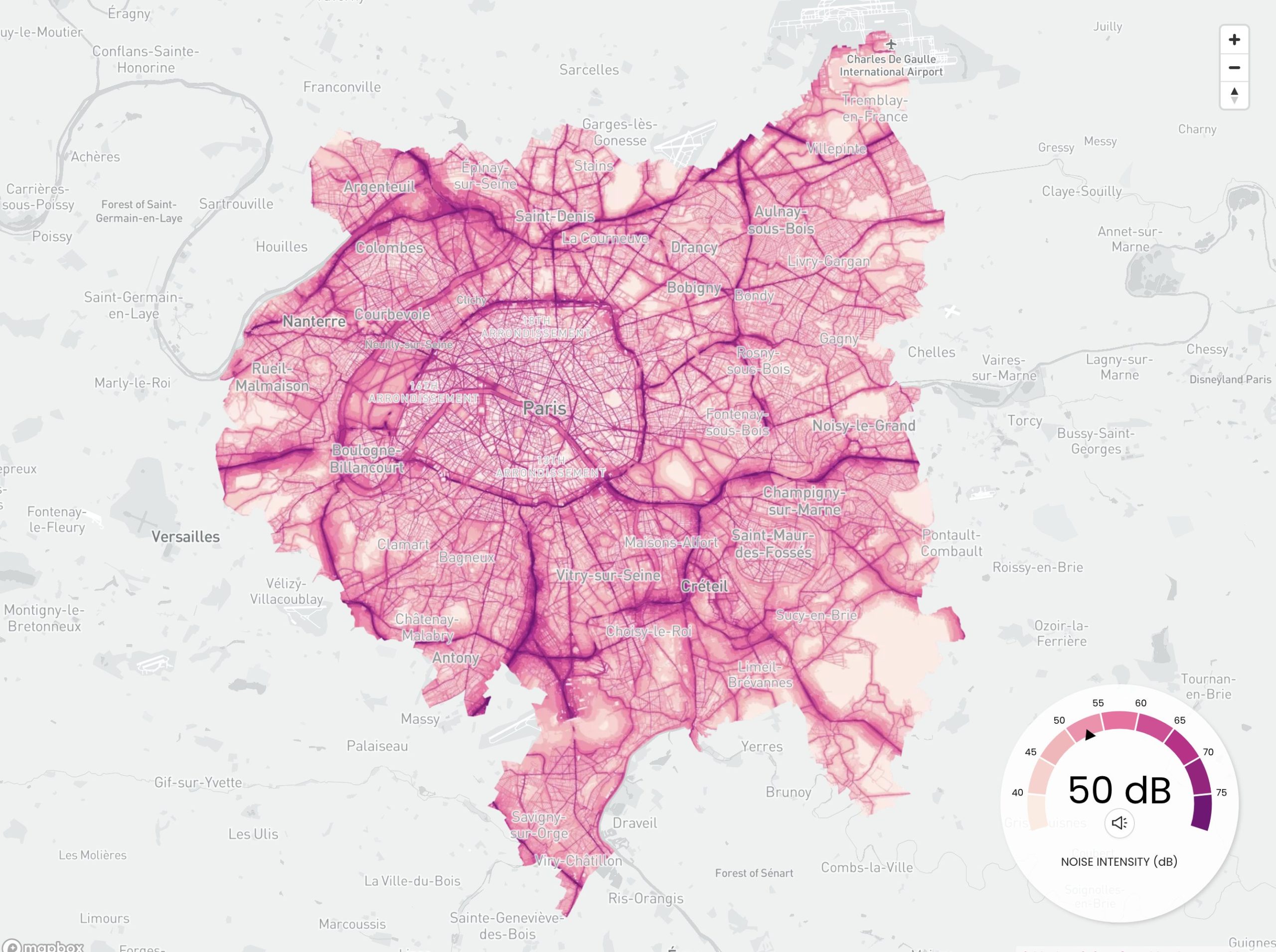
Claire Santoro: You recently created a set of maps for the organization Possible showing noise pollution in three cities, Paris, London, and New York. One of the most interesting aspects of these maps is that they don’t just visualize sound levels, but also sonify them. Can you tell us how this project came to be?
Karim Douïeb: According to the World Health Organization, noise pollution is one of the biggest threats to environmental health in Europe. And according to the European Environment Agency, noise is estimated to contribute to 48,000 new cases of heart disease and 12,000 premature deaths every year in Europe alone.
A lot of people are surprised by these facts, so I asked myself how I could bring more awareness to this health issue. Since I am always eager to design data-driven experiments, I prototyped an interactive and sonified map and posted it on Twitter. This experiment resonated well with the Car Free Cities project of Possible, a charity that enables people to take practical action on climate change. One of their members, Duncan Geere, reached out to me and asked if I was interested in adapting my map to the three main cities of their initiative. And this is how the project came to be.
CS: As you noted, the project was inspired by one of your previous visualizations mapping sound levels in Brussels. How did you originally come up with the idea of trying to map the data both visually and with sound? What makes this representation so effective?
KD: Classical colored maps don’t do enough justice to the research published in static noise reports. I wanted to make the noise data more tangible and leverage this type of research by improving its impact. I couldn’t think of a better and simpler way than using sounds to explain a situation about noise.
I wasn’t sure this sort of experiment would work for a large audience, so it was a pleasant surprise to see how well it has. I guess the reasons are many:
- Interactive visuals are generally more engaging than static images.
- Usage of city sounds at various levels of intensity make the experience straightforward. You directly understand that we are talking about noise.
- The experience is personalized. You explore the cities, find your neighborhood or places you have been in the past, and realize how noisy they are compared to other parts of the cities.
CS: What was most challenging about creating the Noisy Cities maps? What constraints did you face?
KD: The technical implementation was pretty simple; there were no major difficulties there. The main challenge was to retrieve comparable noise-level data for each of the cities of Paris, London, and New York. Unfortunately, that didn’t exist, so we had to work with what was available. For instance, London makes available only the minimum data required by the European environmental noise directive, i.e., noise levels for main roads only. Also, metrics and modeling conventions between the USA and Europe are slightly different, which makes comparison difficult. Data quality and data harmonization is often a struggle in this kind of project.
CS: From a practical perspective, how did you make the maps? What data did you start with, and how did you incorporate sound?
KD: I used QGIS (a free and open-source geographic information system software) to edit, style, and uniformize the different noise maps. These maps are then served to the application using Mapbox, which also allows the reader to interact with the map and provides the street name overlay. The web application is built with the javascript framework React. The noise comes from a looping mp3 mixing various city sound recordings. The library react-audio-player was used to programmatically control the volume based on user interactions with the map.
CS: Let’s talk more generally about your background. What types of data or data visualization projects do you typically work on? What tools do you typically use?
KD: My background lies in academia. I hold a PhD in computer science in the domain of data structure. I became interested in dataviz more than 10 years ago when I discovered Protoviz, the precursor of D3.js. Since then data visualization has always been part of my workflow and is an important aspect of the work we do at Jetpack.AI, a data science company based in Brussels that I co-founded five years ago. We conceive and design tailor-made applications that aim to improve the operational process of a wide variety of clients and industries.
My tools of choice are D3.js, Mapbox.gl, Three.js, ObservableHQ, React and Svelte.
CS: What tips would you give to aspiring data visualizers?
KD: Visualize as many things as you can. Start with small, manageable side projects. You should aim at learning one new thing for each of these projects. Don’t focus too much on perfecting the end result, and share your prototypes, experiments, and works in progress with the dataviz community. That’s probably how I gather the best tips and recommendations to improve my skills. And always cite your sources and inspirations.
Claire Santoro is an information designer with a passion for energy and sustainability. For 10 years, Claire has worked with governmental agencies, non-profit organizations, and higher education to accelerate climate action by communicating complex information in an engaging, approachable way. Claire holds an M.S. in environmental science from the University of Michigan.
- Claire Santoro

- Claire Santoro

- Claire Santoro

- Claire Santoro


