
The Lens Media Lab at Yale University’s Institute for the Preservation of Cultural Heritage has created Paperbase, an interactive platform for exploring the world’s largest collection of gelatin silver photographic papers.
For much of the twentieth century, photography was a paper-based medium, yet little research has explored how photographic papers influenced the art. Accessing and analyzing historical paper samples have been a challenge—until now.
The Lens Media Lab has cataloged more than 7,200 paper samples—dates ranging from 1890 – 2010—documenting their material, technical, and visual characteristics. This dataset, the most comprehensive of its kind, is now publicly available, offering an unprecedented resource for researchers, conservators, and photography historians.

To describe plainly, Paperbase is an incredible project about photography and its technical side—paper.
According to Paul Messier, Director of the Lens Media Lab, the paper collection “preserves the experience of a physical photograph” and through Paperbase “this experience is contextualized and made universally accessible.”
You can approach it as an analyst, dissecting the data, or as a photography enthusiast, admiring the masters of the past, or as a publisher.

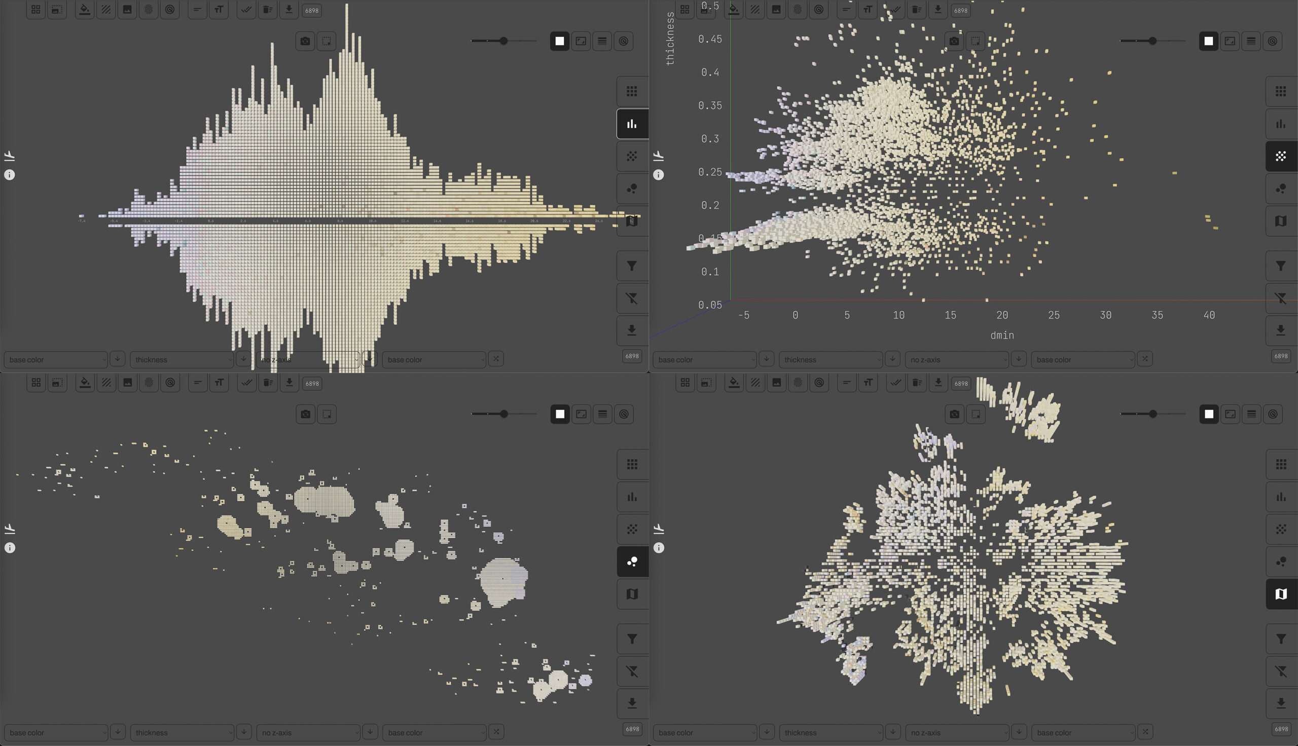
As someone passionate about data visualization, what fascinated me most was the interactive tool built for this project. It’s incredibly flexible—one moment you’re looking at a map, the next you’re working with bar charts, then diving deeper into clusters or radar charts.
“Collections viewers typically constrain your view to a narrow window. This is fine if you’re only interested in a small part of the collection, but if you want to see patterns at the collection level, you need to be able to see at that level. Paperbase was designed with this in mind.”
And through it all, you’re still surrounded by an overwhelming number of data points—every detail remains visible!

A closer look at the project
Look at these golden highlights on a deep brown background—reminiscent of antique furniture or old ornaments. They pull us into the past, revealing old photographs, inviting us to study the faces of those who lived before us. But they also ask us to explore the technical side—what kind of paper is this? What’s the thickness, texture, gloss, and whiteness?
Then, suddenly, all of it comes alive. A dataset that once seemed purely physical becomes interactive, shifting perspectives and taking on new forms. A powerful tool at the cutting edge of computational analysis.
You start with a chart, some bars, and dots—then suddenly, from those samples, faces from the past smile back at you. It’s magic.

Visual exploration of photographic history using data
Not every sample is an actual photograph—some are technical sheets or even stacks of blank photo paper. You can filter the dataset based on that too, turning each point or cube into a time capsule of an era.
For me, the most fascinating part was studying the historical trends. You can instantly see which decades favored certain types of photographic prints. The rapid rise of photography in the mid-1930s, its peak around 1950, and the gradual decline by the 1990s—it’s all there in the data.
Of course, this could reflect the specific collection methods rather than global trends, but it’s likely that this dataset also mirrors the overall history of photography, at least in the U.S.

Here’s the radar chart system—each element on the map can be visualized with a small glyph, a symbol encoding its characteristics. This adds another layer of texture to an already complex visualization.

A few clicks, and bars and squares transform into fascinating radar glyphs. Each object gets its unique symbol, allowing researchers to highlight and compare different samples up close.
Here are the parameters embedded in these radar glyphs (probably more useful to a photographic paper expert than a data viz enthusiast like me):
- Thickness
- Color
- Gloss
- Texture
When you analyze gloss dynamics over time, the chart suddenly becomes color-coded, revealing yet another layer of insights.
For serious researchers, the dataset allows filtering, analyzing, and downloading the exact data they need for further study.

On the project’s website, you’ll find a few key numbers that help grasp the sheer scale of this archive.

Another aspect I loved? The team’s storytelling about their journey of collecting, classifying, and visualizing this data. If you think this process was simple, just check out the algorithm breakdown on the homepage.

At one point, the workflow splits into two paths—it turns out evaluating stacks of paper versus photo book samples is an entirely different challenge.
Beyond diagrams and algorithms, you can read the history of the collection itself—a story filled with dedication, loss, and 25 years of continuous work.
Data insights based on the Paperbase project
The website also features analytical insights, prepared for curious visitors—like a chart showcasing the increasing whiteness of photo prints over time. Ever wondered why old photos appear more yellow? No, they haven’t aged that way. Chances are early paper production used different whitening agents, reflecting changes in manufacturing technology.

The visual style of this analysis differs from the project’s own, but it’s fascinating to see how different people approached the same data.
A few video tutorials will help you navigate the tool, spot intriguing trends, and discover unique patterns in the data. And beyond that—it’s simply stunning to look at. Highly recommended!
In the publications section, you’ll find a vast list of studies and research articles about this project. Perhaps your name could be among them one day?
I may not be able to fully appreciate the technical intricacies of photographic paper thickness and whiteness, but I can lose myself in admiring historical photos from past decades.
Step into history with Paperbase!


Natalia Kiseleva is an engineer and BI analyst, dataviz & BI trainer at the HSE, Moscow State University, MGPU, EU, IBI.
DataViz and Data Art popularizer, the comic artist and data artist.
- Natalia Kiseleva

- Natalia Kiseleva

- Natalia Kiseleva


