
For many of us, the biggest population shift in the history of the United States is just the water we swim in. We don’t have a memory of the world before the baby boom; and therefore, haven’t felt the profound changes it brought about. As boomers start to age out, so to speak, the enormous influence of that generation is beginning to fade. From an economic and political standpoint, what effect will that have? What changes should we expect to see? How would you even tell that story?
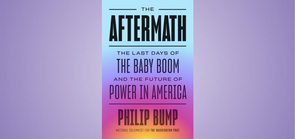
Well, if you’re a columnist and data guru for The Washington Post like Philip Bump, you tell it through data and visualizations—lots of them, as a matter of fact. Philip’s book The Aftermath: The Last Days of the Baby Boom and the Future of Power in America is loaded with charts and figures that bolster his telling of the rise and denouement of the largest cohort of births since anyone started counting such things. I got the chance to speak with Philip about dataviz, the book, and his weekly newsletter, “How to Read This Chart.” The text of our conversation follows, edited for brevity and clarity.
Kyle Dent (K.D.): I’m curious about the extent that data itself was an impetus for the book. Was there a dataset that you ran across that got you thinking about your thesis, or was there something else that made you realize you needed to explore generational data?
Philip Bump (P.B.): Not really, no, it was not data-focused initially, except that I have for a long time been interested in the idea of generational differentiation. I first wrote about it when I was back at The Atlantic in 2014. Every couple of years, there’s one of these outbursts of, “What generation am I? What generation are you?” sort of debates, which I leapt into with great eagerness and was surprised to realize that the Census Bureau recognizes the baby boom as the only demographically defined generation. So at that point, I just poked around a little bit. It was fun to have the counterintuitive take that “you don’t need to worry about your generation because it’s all made up.” But then I started to consider this odd and tenuous political and economic moment that we’re in, and how much of it actually overlapped with generational disputes. So that was the trigger for the book, which then obviously led to a lot of data analysis in order to assess the question.
K.D.: How did you decide what kinds of things had to be communicated visually?
P.B.: You’re actually asking a more fundamental question than you realize, which is, how do I ever do that? And the answer is that I just sort of generally think in terms of data and numbers as a latticework on which to hang an argument. It was very natural as I’m exploring this to first consider how many boomers are we talking about? When we talk about wealth by generation, what does that look like? What are the numbers that the Federal Reserve can give us on wealth? How does that overlap with the actual size of the population? When we look at the baby boom, we naturally think about when the baby boomers are going to die, right? When do people die? How has longevity changed over time? There are all these ways to ask questions about what the baby boom looks like, and how it has evolved that gets you into questions of the data. It is very useful then both to understand the data, but also to present it to readers, to provide a depiction of the actual numbers that underlie the generation and its unique characteristics.
K.D.: Sure, there’s lots of data analysis, but a lot of stuff can be conveyed through words. How did you think about, well, this should really be a chart, or I need to graph this because maybe the words aren’t doing the job? Is there any of that in your thought process?
P.B.: Generally, no. I tend to err on the side of, if I have data, then I’ll chart it. It’s interesting, because when we did the audiobook for the book, there was a lot of, okay, well, how do we deal with this? Because they’re not used to having books that have 127 charts in them.
When we did the audiobook for the book, there was a lot of, okay, well, how do we deal with this? Because they’re not used to having books that have 127 charts in them.
K.D.: Wow, an audiobook. I never would have thought about doing that.
P.B.: Yeah, right. So, that was the point at which I had to think, do we need this, or is the point made in the text? The audiobook ended up using maybe a third to half of the charts. Then I just had to write little descriptors for them. “In the book there’s a chart that says X, Y, and Z,” which hopefully does not break the flow too much for listeners. But yeah, that was the point at which it was like, okay, do I need this chart or not? There were certain charts that I cut out of the [print] book, in part because they weren’t necessarily compelling or conveying what I wanted to say visually, but otherwise, if I had a dataset, I usually had a chart. Then if I had a chart, it usually ended up in the book.
I’m going to invent a phrase here: They say a picture conveys 1,000 words. I just invented that, but I think that is actually a true observation. Instead of saying, well, the baby boom started in 1946, and rose to this, and what if… just show a graph of it. That was sort of my approach.
K.D.: What about balancing the complexity of those charts? You must have to keep a very clear picture in your head of who your audience is.
P.B.: Yeah, absolutely. The book is not meant to be an academic work, right? I publish a newsletter, “How to Read this Chart,” which I started after I had already done the book deal, and the book editor said, “Hey, if we’re gonna do a bunch of charts here, it would be really helpful if there’s just always a little blurb that says how to read this chart.” And I thought, you know what, that actually would be generally helpful. So every chart in the book, regardless of how simple it is, has a box underneath that says “How to Read This Chart” that also includes sourcing information with footnotes and so on and so forth. But my goal was to make charts that were interesting and then do my best to explain them. The New York Times review of the book suggested that some of the charts were hard for them to read. Totally fair, the charts are not everyone’s ballgame. But I thought it was true to myself to include the charts in the way that I did, and I think that for most casual readers, if they sit with the charts for a second, they’ll get the hang of them because I did my best to try to explain them.

K.D.: And, of course, a reader could decide, I don’t need to understand this chart completely, but I still get the idea.
P.B.: Hell, if they want to email me and ask, I’m happy to talk about it. The genesis of the newsletter—in addition to having an audience of people who might be interested in this stuff for when the book came out and pointing to my work at the Post—really was to have people just feel comfortable with data visualizations. The newsletter is not really data “visualization-y” as such. It’s not about, here’s how you do a scatterplot and mark your axes, right? But it is presenting data in a visual way, in an accessible way, in order to have people just feel like, normally I don’t pay attention to these sorts of things, but now I feel more comfortable with it because I’ve been getting this newsletter. That’s the ideal anyway.
K.D.: I’m a regular reader, by the way, of your newsletter. I think it hits that right point. It’s not instructional, but it gets people to think about, if I have this data, how can I depict it in a way that gets the idea across.
P.B.: Most of the readers aren’t data visualization geeks. Perhaps, in part, because it’s like getting a How to Drive a Car for Dummies book. Who wants to buy that book and carry it around the bookstore? If you’re a career data visualization person your first reaction is probably, I feel like I know how to read a chart. But there are times I get into the actual mechanics of making a chart just because people have asked, and so I try to answer that. It’s sort of all over the board in terms of skill level.
K.D.: Regarding the “How to Read This Chart” explanations in the book. Did writing any of those make you realize, oh, this chart’s too complicated? I have to rethink this chart completely. Or more generally, did having to write a description affect your design at all?
P.B.: Probably. I can’t think of a specific example where that happened. In part because the way I normally work is that I’ll make the chart and then write around it. So, the chart making is generally done before the actual argument I’m trying to present or story I’m trying to tell.
I’ll make the chart and then write around it. So, the chart making is generally done before the actual argument I’m trying to present or story I’m trying to tell.
There were a series of charts, actually, in the first chapter, that I really struggled to make easy to deal with. My wife is my constant guinea pig for stuff like this. She is much better at reading charts than she pretends, just as a side effect of having been married to me for an extended period of time. I can put a chart in front of her and ask, does this make sense to you? And if she’s not like, yeah, this makes sense to me, then I know I have work to do. There are some charts that I will admit are probably more complicated than they could have been. But, we do our best.
K.D.: As a book author, I’m guessing you had a lot more freedom to include charts than you do as a journalist. With normal article constraints, you probably have to limit yourself to just one or two.
P.B.: Honestly, at the Post, God bless The Washington Post, limiting the number of charts in an article has never been something that has been imposed on me. I’ve literally had 50 charts in an article before.
K.D.: No kidding.
P.B.: I mean, this isn’t for print. I write mostly for the web. When I had an online excerpt of the book, I included several charts in the excerpt, but when it actually ran in print, they excluded them. The web gives me the freedom that print does not.
K.D.: I see. I was imagining the book would be a liberating experience, that you could go hog wild.
P.B.: No, no, happily, I’m hog wild in all facets of my employment.
K.D.: Lucky you, that’s great. But what’s the experience like of writing a book as opposed to an article?
P.B.: It’s hard; it’s hard. There were times when it was definitely a drag. I’m used to writing a lot. I write several 1,000-word articles a day. Writing prolifically has never been a challenge for me. But, this is carrying a cohesive argument over the course of 120,000 words, and bracketing that into several 20,000-word chapters. It’s just hard to do that. It was an interesting challenge, and I am not eager to start another lengthy book project right now—give it another month or two. But the end product was worth it.
K.D.: In a book I imagine you’re thinking about how to build up your thesis. An article has some structure, but it doesn’t necessarily have the same need to introduce concepts that you can build on later that a book requires.
P.B.: Yeah, if you think about it hierarchically, a normal article will be a couple of tiers, the broad arguments and sub-points. This was much, much more densely layered. The book has an overarching thesis; it’s got two sections, the baby boom, and then the aftermath. It’s got sub-sections and chapters in each of those. I don’t need to tell people how a book works, but when you are actually trying to construct it, it’s much, much more intricate than it probably seems to an outsider who’s never written a book before.
CHARTING METHODS TO SHOW CULTURAL AND TECHNOLOGICAL TRENDS


K.D.: You talked to a lot of people for the book, from demographers to experts in U.S. cemeteries. Sometimes you’re getting simple facts from them or sometimes anecdotes. And other times you are working with large datasets, and all of this has to be woven into your narrative. What’s the approach to synthesizing data of various kinds and various scales?
P.B.: This was really the primary learning curve because I’ve written a lot of articles in which people are quoted or that include datasets, but again, the hierarchy is shallower and you’re slotting this into 1,000 words. A chart is either going to come at the 400-word mark or at the 800-word mark. When you’re doing that at 20,000 words, you really have to figure out a structure. I tend to write start to finish, so this book was written almost entirely from page one to the end in order. That’s how I think. So that’s how I did the chapters. Beforehand, I took all the quotes that I thought were good quotes that spoke to the subject matter at hand. Then I organized the quotes from people and those were often overlapping with datasets that I had or data that I already pulled up. I structured it where I had the quotes that were talking to the points I wanted to make, and a general sense of where the graphs would fit in. And then I connected it all with either narrative elements or normal transitions in the way you do in writing.
Because I do so much more with charts, I felt much more comfortable integrating those into the text. I’ve interviewed a lot of people but, you know, most of my stories are data-based and not quote-based. I spoke with over 100 people, and there’s people who I spoke with who were very gracious with their time but their quotes never actually got included in the book, which I feel bad about, but you know, you gotta cut something.
K.D.: In the book, you talk about some data that was inaccessible. I’m thinking of Billboard’s trove of data that hasn’t been digitized. But that was solved because of crowd ingenuity and because people seem to care about data. Was there any other data you had a particularly difficult time accessing or otherwise using?
P.B.: That’s a good question. I’ve been doing this a long time now, and it’s taken me a long time to realize I’ve been doing it a long time. But, I’ve been finding weird stuff online for decades. And that really served me well here because it allowed me to evaluate data sources. The data to which you refer about Billboard’s top rankings of music, I knew that would be useful in the chapter that assesses the cultural legacy of the baby boom, but I also knew that dataset is crowd-sourced, an ad hoc digitization of the Billboard charts. I knew that existed because [blogger] Andy Baio who has this great site waxy.org had written about it back in 2008. I’m an old internet hand, so I know where a lot of this stuff is stashed around the web. I can’t think of anything where I was constrained in that way. There have been a couple of occasions where I’ve since thought of things that I would have liked to have included, and I’m sort of kicking myself. But yeah, that’s how it goes.
I’ve been finding weird stuff online for decades. And that really served me well here because it allowed me to evaluate data sources.
K.D.: Another question I had for you was about other really cool datasets you found for the book, but I guess, since you’ve got this deep well of data sources…
P.B.: The coolest dataset I found was not data in the sense of numbers. I have a friend Matt Novak who writes Paleofuture [a blog about past predictions of the future] who does a lot of time capsule stuff, which got me thinking, okay, when was there a cool time capsule that I could write about? I poked around newspapers.com, the archive of newspapers, which was absolutely invaluable for this. It is such a great resource. I stumbled on information about a time capsule that was done in Birmingham in 1950 when they built a new city hall. The time capsule included letters from civic leaders and things along those lines, written to people in 2050. I went back and read news reports about what those leaders were saying to try to get a sense of how accurate their predictions were. One letter that I came across—and I actually got a copy from the Birmingham Public Library—was from the city’s police commissioner talking about what policing was going to be like 100 years in the future. That police commissioner turned out to be Bull Connor, who within 20 years was absolutely notorious for being a horrible racist who was beating Black people as they went to register to vote.
The fact that I had this letter, and I don’t know that it’s been seen since 1950, really struck me. That he had intended for people in 2050 to go back and look at the way in which he viewed the future knowing what his immediate future was, was very humbling when I’m thinking about trying to make any predictions about the future. But it was also just this fascinating piece of American history. Just a very, very small piece. Certainly nothing world-beating in terms of the historical revelation, but it was just a fascinating encapsulation of our often limited ability to understand what lies immediately in front of us.
K.D.: That’s amazing that you happened to access this artifact that is so relevant to the civil rights aspects of your story. It’s incredible to me that it synced so well with the book itself.
P.B.: Yeah, it was fortuitous. But there’s a lot of stuff like that. There’s certainly an element of luck to it, but I’ve been at the Post now for nine years and was writing for the web before that. Recognizing that serendipity when it strikes requires being familiar with it to some extent, too. So, when I saw that, and I knew that the chapter also included a look at how much the United States was wobbling in terms of its embrace of pluralistic democracy, and how that obviously reflects back to what was going on in the South in 1950. It all just sort of snapped into place.
CHARTING METHODS TO SHOW DEMOGRAPHICS AND VOTING TRENDS


K.D.: Back to the Billboard data, you used boomers’ musical taste as a proxy for cultural influence. In general, how do you judge if some particular data you have accurately represents the feature that you’re analyzing? Is there a risk that you might be looking for your lost keys where the light is good?
P.B.: That’s absolutely a risk, but I think that as long as you are honest and direct about what you’re doing and what you’re working with, I feel like it’s okay. I acknowledged in the book that this is an attempt to capture this particular element. What results from that data is a chart in the book, which basically shows that the artists who were popular when baby boomers were teenagers have essentially dropped out of the Billboard charts. One would expect that, but it is still a reflection of the decline of cultural influence of the baby boomers. I presented it as one aspect of that cultural decline and not necessarily saying this is a marker that the influence is doomed. There’s also a caveat in there about the Beatles who had this thing on Disney+, which brought the Beatles back into the Billboard charts in 2022.
K.D.: We talked about the audiobook a little bit, and how you had to alter things for that. But even in the printed book, you couldn’t use color, for example. Did you have to think about the visualizations differently knowing you would only have grayscale to differentiate?
P.B.: I used to work at Adobe as a designer, and that is useful to me both in my day job and for the book. I tend to make my charts in Adobe Illustrator because I’m used to it, and I’ve used Illustrator forever. I just made a design template that had swatches of grays and a scale and had header text and so on. Obviously for the Post I have design standards and a design template that’s mandated by the Post’s brand guidelines. So I basically just tried to do that for myself for the book. One of the first questions I had for the book editors was what typeface do you want me to use for the charts because I wanted to make my own charts. So that just got put into the template. When I first got prints of the book, I had to tweak some of the grays, but because I was using a template, that was trivial.
K.D.: That gets into my last question, which is one everybody’s always curious about. What are your go-to tools for performing analysis and visualization?
P.B.: I have never taken a design class in my life, so I have a very weird, ad hoc, kludgy sort of system. I use Excel a lot. When I’m parsing big data sets, I use Perl, which is so archaic it’s ridiculous. That’s the first programming language I learned besides BASIC when I was a kid. So now I’m pretty adept at Perl and in parsing big data sets. I also use this site called RAWgraphs.io, which uses a Javascript library to create charts, and it’s very easy to drag and drop columns of numbers and generate more complicated graphics. I used that both for the book and at the Post. I’m not an R guy, not a stats guy; I’m old school. But I don’t claim to be a statistician, so I don’t need this statistical toolset that others might. But, yeah, it’s clunky. I use Illustrator all the time because it makes nice crisp print graphics.
K.D.: So, you load data into Illustrator’s little data dialog box.
P.B.: Oh, yeah. It’s a drag; it’s stupid. I’m sure there’s a better way, but I’m old. I’m older than I seem. We get set in our ways, and I used to walk to school uphill both ways and so on.
K.D.: Yeah, it was really rough “in those days.” I used to do a lot of work in Perl myself. It’s been ages, but if I’m not mistaken, you don’t have the kind of support like you get with Pandas and Python for managing datasets, right? So you’re really using Perl just to get data formatted into what, rows and columns, I guess?
P.B.: Yeah, exactly. When I have a massive dataset, as with COVID data when I was doing a lot of COVID stuff, you’d have these daily datasets by county over the course of two years’ time. If you need to pick out what data figures were at the start of the month, it’s very easy to do that in Perl. I have Perl scripts I can just pull up as needed. Kids, if you’re listening at home, you listen to teachers and do it the more elegant way. This is not elegant at all.

Kyle Dent
Kyle Dent is an independent consultant who has been working on innovation and advanced technology projects for the past 20 years. He is interested in the intersection of people and technology focusing on the impact of technology on individuals and complex social systems or using data science to better understand how those systems function.
- Kyle Dent


