
The #30DayChartChallenge is a data visualization community challenge with the aim of creating a data visualization on a particular theme for each day in April. The challenge began in April 2021 and has continued every year since. Indeed, the third edition of the #30DayChartChallenge starts in a few days—and we have just shared this year’s prompts, if you want to get a head start!
Read on for a behind-the-scenes look at the two previous years’ challenges, then join us on social media (Twitter, Instagram, LinkedIn, and Mastodon) to participate.
The birth of the #30DayChartChallenge
The #30DayChartChallenge was inspired by the #30DayMapChallenge, which was initiated by Topi Tjukanov in 2019 and focuses, as the name suggests, on creating 30 maps in 30 days, with a particular theme for each day. Those themes occasionally suggest a certain topic or data set, but many are open-ended—for example, the theme might be “experimental,” or it might be a specific color or geometry. The #30DayMapChallenge attracts many participants, and also passive spectators, from around the world, who use a wide range of tools to create static, animated, and interactive maps on a diversity of topics.
During the second edition of the map challenge in 2020, Dominic Royé proposed to organize something similar with a focus on all kinds of charts, not just maps. When Dominic tagged me in this discussion, I was a big fan of the idea and was all in. Both of us love maps and are skilled at creating spatial visualizations quickly, but for the many people who have never worked with spatial data, it seemed too difficult to find suitable data sources and navigate the quirks of map projections and unusual map types. Creating a similar challenge that was more open to the general data visualization community and that would allow for more flexibility in storytelling sounded like a great idea.
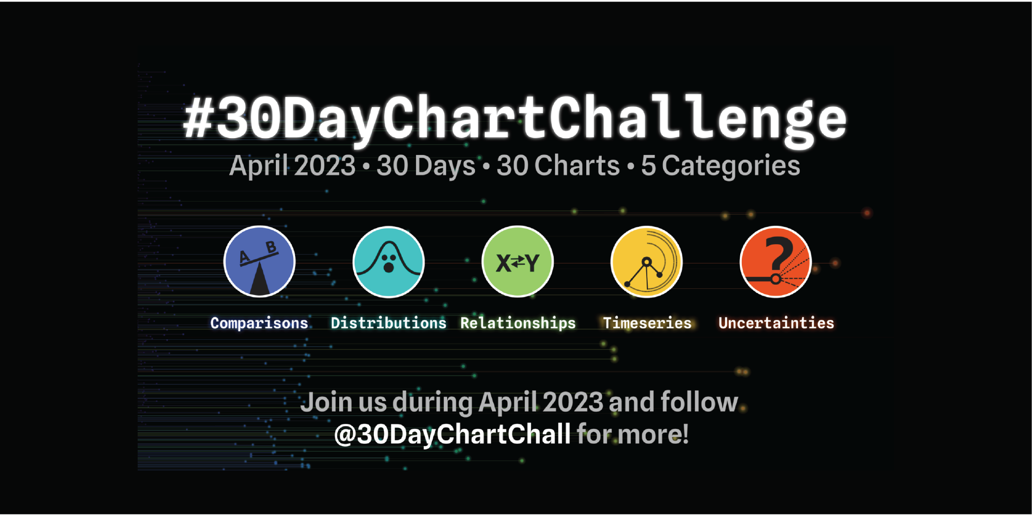
At the beginning of 2021, Dominic and I began to organize the event and brainstorm the daily themes. We went back and forth on how to select the themes. One idea we had was to use only chart types as prompts; we also considered restricting the challenge to a single data set. In the end, we decided to allow for a lot of freedom, hoping to see a variety of interpretations by participants. We ended up grouping the prompts into five data visualization types, loosely following “The Graphic Continuum” by Jonathan Schwabish and Severino Ribecca.

The 2021 challenge proved to be popular, with almost 2,000 data visualizations shared on Twitter with the hashtag #30DayChartChallenge. The daily, monthlong format is definitely demanding and time-consuming, so we did see a drop in contributions as the challenge progressed. Nevertheless, a number of participants showed incredible persistence and contributed all 30 days!

The challenge matures
For the 2022 challenge, we adjusted the prompts a bit but stayed with the five main categories. We replaced some prompts for the sake of variety, especially for people who were participating for the second time. We also introduced two new types of prompts—“data days” and “theme days”—which provided specific data source and design theme prompts. The goal of “data days” and “theme days” was to make it easier for people to participate by reducing the need to come up with their own data and visualization styles every day.
We also liked the idea of being able to compare submissions that all used the same data source or design aesthetic. Our two theme days in 2022 prompted participants to create charts in two distinctive newsroom styles—a distribution chart styled as in The Economist, and a time series styled as in the Financial Times.
The third edition is happening now!
The third edition of the #30DayChartChallenge will begin on April 1. This year’s challenge follows the same approach as in 2022, with some new topics and dedicated data and theme days.

The data days cover the fantastic open-data portals by OurWorldInData, EuroStat, and the World Bank. The theme days feature the popular BBC News and UN Women.

The value and challenge of challenges
After two years of organizing the #30DayChartChallenge, we can confidently say that challenges like this one are a great way to practice and experiment with data visualization design, test new tools and data sources, build a portfolio, share work publicly and receive feedback, interact with like-minded people, and most importantly be creative and have fun. The feedback from both contributors and spectators in previous years has been largely positive. We saw many supportive conversations happening around participants’ data visualizations, chart types, suitability of tools for a certain task, and design choices.

Nevertheless, some critical voices also spoke up and made me think about the trade-off between the benefits of challenges like this one and their potential harms. For example, one comment read:
“I don’t want to criticise the challenge, a lot of people will learn a ton from participating and seeing the output. But it does bother me that the daily pressure can easily lead to false claims or misleading charts. In my view, if you put a chart out there, you have a responsibility of being truthful, or at least as truthful as possible. And that takes time, as any data journalist will tell you. So I feel there is a mismatch between the format of a challenge and the craft of making dataviz.”
Creating a visualization in a short time, especially if you are working on it outside of a regular job and family or other duties, is definitely hard; it’s true that the time available to spend on data exploration, research, and validation is limited. However, we experienced that participants in general seemed very open and honest about the potential limitations of their data sources and visualizations. When something was unintentionally wrong in their first iteration, they often shared an updated version later.
Nevertheless, this is a valid criticism and we, Dominic and I as organizers, but also we as a community, have to keep this in mind. Most importantly, we need to be careful when creating and sharing our own visualizations and chime in if we spot something potentially misleading or suspicious.
However, we are convinced that the value of these challenges are manifold, from education to building future interest in your work. Problems of sloppy chart design and data sources used to support false claims are broader issues not unique to challenges like the #30DayMapChallenge, though they certainly warrant continued discussion and consideration.
Highlights from the previous editions
We saw a ton of visualizations shared through the challenge, many of them quite well executed and creative. While the number of great visualizations is too many to feature in this article, I want to highlight a few that stuck with me. (You can check out more using the hashtag #30DayChartChallenge on social media.)
Join us for the 2023 Challenge, and let’s see what you can create!

Acknowledgements
First of all I want to thank Dominic who came up with the idea and invited me to join him as a co-founder. Also, thanks to Wendy Shijia, Marco Sciaini and Paula Casado for your support with organizing the challenge. A special shout-out to Topi Tjukanov for creating the #30DayMapChallenge, which served as the template for our challenge. Thank you for this fun project that allowed me to strengthen my spatial data visualization skills and was and remains a steady source of inspiration! And of course, a big thank you to everyone participating in the challenge, watching and sharing the contributions, and providing feedback and praise!

Cédric Scherer
Dr. Cédric Scherer (he/him) is a graduated computational ecologist with a passion for design. After his PhD, he combined his expertise in analyzing and visualizing large data sets in R with his passion to become an independent data visualization designer, consultant, and instructor. Cédric has created graphics across all disciplines, purposes, and styles applying a code–first approach. Furthermore, Cédric regularly gives talks about data visualization design and teaches fundamental and advanced R coding and ggplot2 techniques.
- Cédric Scherer


