
For my wonderful and wonderfully particular boyfriend, buying a birthday gift can be hard. He knows what he likes, what he doesn’t like, and though he’ll always smile at what I get him, I can tell when my gift is just…alright. So this year, instead of endlessly browsing for a gift online, I decided to make him a gift of my own: one that was personal, unique, and totally in my wheelhouse.
And what better gift than a data viz made just for him! Over the past year I’ve found personal data viz projects to be incredibly rewarding and meaningful. From contemplating life’s chapters at the Eras tour to creatively charting my career path, data viz has gone hand in hand with personal reflection. All of these thoughts, plus the milestone of first meeting my boyfriend exactly 10 years ago this August, made me want to visualize our relationship somehow.
I had a few stipulations for the design of this viz:
- The data had to be both meaningful to our relationship and relatively easy to compile.
- The visualization had to be a graphic that’s aesthetically pleasing from afar—you shouldn’t have to understand it to appreciate it…
- And at the same time, it should be easy to explain the underlying meaning.
I decided to print my graphic on a t-shirt for him. Not only would this make my gift tangible, but it would also serve a practical purpose. (Let’s just say my boyfriend has a talent for wearing his tees down to their very last tattered threads.)
The creative process
1. Gathering meaningful data
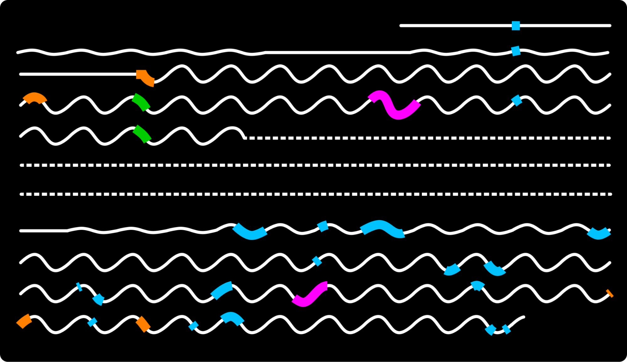
He may be my boyfriend now, but over the past 10 years, we’ve been lots of things to each other: friends, lovers, and even exes. This would make a relationship timeline pretty dynamic. To break up those long swaths of time, I decided to chart the trips we’ve taken together. These dates, easily plucked from my photo collection, became not only data points but also meaningful stops down memory lane—an unexpected quality of the data collection process.
2. Sketching out ideas
My initial sketches were simple–made with just colorful pens and paper, a surprisingly popular tool in the data viz world. When I settled on the final design, I recreated it in Figma.


I loved how, from a distance, the final graphic resembled a whimsical, scribbled note–a nod to my boyfriend’s vocation as a writer. The minimal design and limited color scheme also complemented his understated fashion preferences.
3. Interpreting the design
The inevitable question, ‘Hey, what’s that awesome design on your shirt??’ comes with an easy explanation.
Each line marks a year of our journey, the pattern indicates our relationship status, and the thicker blocks represent our shared adventures, each color-coded by location.


His and Hers reactions
Looking at the final design gave me a newfound perspective. I saw patterns and made connections that I wouldn’t have otherwise discovered. For example, longer trips taken at the same time in consecutive years evolved from spring breaks to spring weddings! And as for our three-year break—which had seemed insurmountable when we began dating again in 2020—it now appeared like a blip, a short pause in a long and rich history. And with each passing year it will only represent a smaller fraction in an expanding timeline.
Equally telling was what was missing: In most of 2021, we barely took any trips. During this period I was in school getting my masters and living the frugal life of a student, while my boyfriend worked unpredictable hours at a restaurant. Financially, these were tight times, but I remember them now with a certain fondness.
Another realization was that we haven’t been to South America or Asia together (yet!).


My boyfriend’s reaction upon receiving the t-shirt was priceless. When I told him I’d designed it, he connected the dots in record time! He guessed that it was a visualization of our relationship and deduced almost everything except the specific color coding of the trips. As I walked him through my process, his appreciation and his smile grew. By the end, he was deeply moved and proudly put on the shirt for our evening out together.
The data that keeps on giving
When I first embarked on this project, I didn’t realize that the final product would end up being a living, evolving chronicle of our time together. I see it as a ‘data album’ of sorts—a place where memories are not only stored, but also showcased and updated. I’ve already added forgotten trips to the initial design and can’t wait to update this snapshot of our lives as time goes on. The best part? I can keep showcasing our story in various forms!

As the holiday season approaches, I invite you to explore the idea of a personal, data-driven gift, maybe even one co-created with loved ones. Categorizing and contextualizing old memories can be a touching journey. Let data visualization transcend the realms of dashboards and scrollytelling; let it be a unique medium to encapsulate personal stories and ignite powerful emotions. Because if you’re a regular reader of Nightingale like I am, chances are that your love language is data, too.

Kelsey Nanan
Kelsey Nananis a data visualization developer from Trinidad and Tobago. She is currently freelancing and was previously part of McKinsey and Company’s Data Visualization Lab. She became passionate about data viz and open data while receiving her M.S. in Urban Science at New York University. In addition to listening to Taylor Swift and creating interfaces that are fun and intuitive to explore, Kelsey loves yoga, baking and Shaking It Off.
- Kelsey Nanan

- Kelsey Nanan
- Kelsey Nanan

- Kelsey Nanan


