
You may have heard, “data visualisation should tell a story” – but this is not always true. Data visuals are created for many reasons: from uncovering insights, to sharing key metrics, or communicating a specific message. So, when should you tell a story with data, or let it stand alone?
Why visualise data?
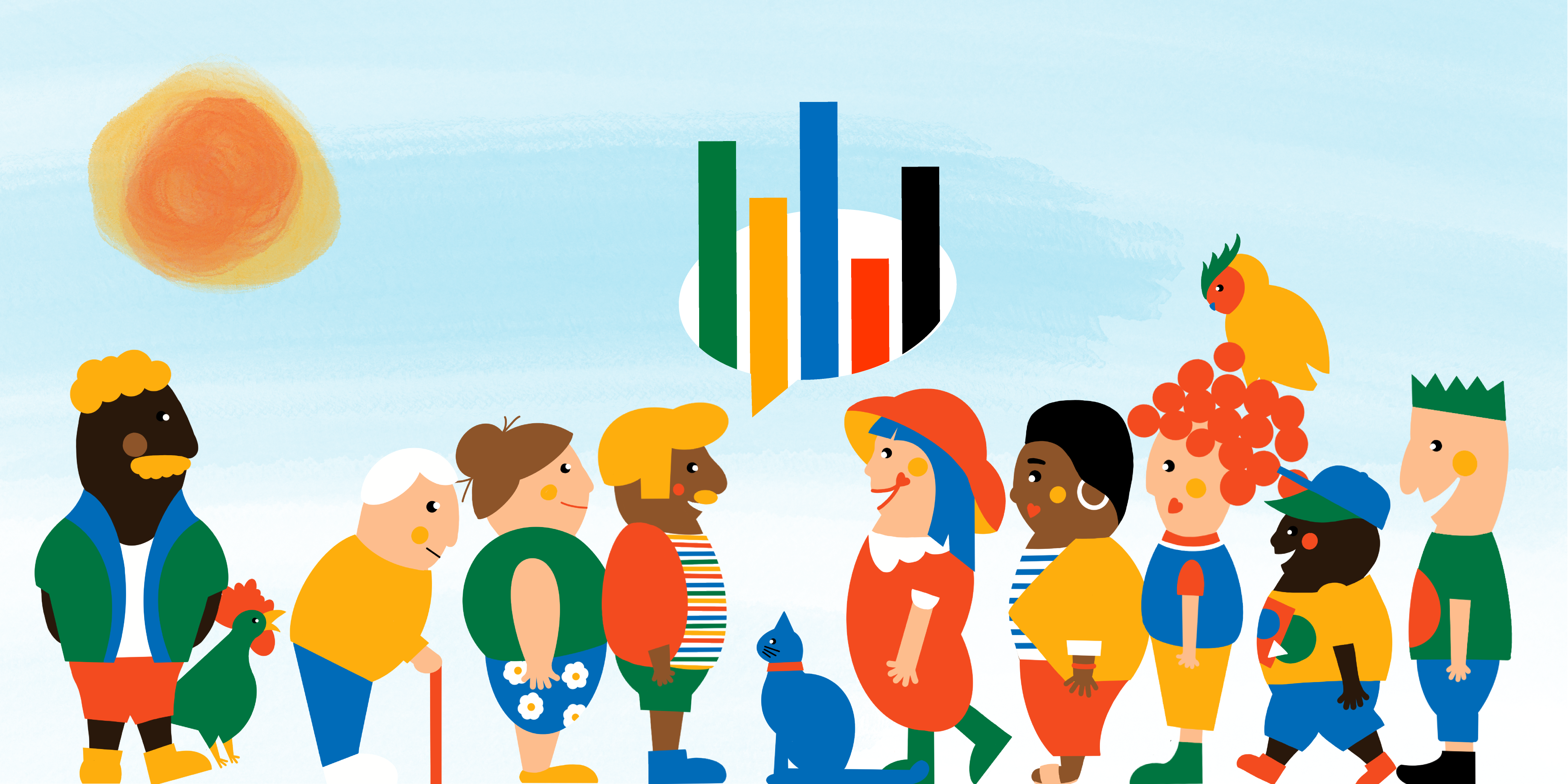
To quote Andy Kirk, “we can look at data, but we cannot really see it. To see data, we need to represent it in a different, visual form.” So, in an attempt to make data more accessible, you may create more visual representations – dots, lines, shapes, and colours. These building blocks combine to create all sorts of charts and pictures helping readers understand numbers.
Although the purpose of visualising data is clear (and universal), the reasons can be different. The reason you visualise data, will help you determine the appropriate visual.
What’s your reason for visualising data?
In business, data is visualised to:
- Discover insight through data analysis
- Inform about specific data
- Educate about specific data
The reason you visualise data largely depends on your audience, so understanding more about who the visual is for will help you to design it.
How to determine your reason for visualising data

Designing a data visual for yourself is easy
Sometimes, you will be the audience for a visual you design. When designing for yourself, there are no rules. The visual can look how you like, because it’s only you who needs to understand it. Despite this, be clear on your visual’s intent; will it be used to analyse or track data? A visual used for analysis (to discover) may have a shorter lifecycle – and therefore not need to be built as robustly – as a visual used for tracking data (to inform).
Designing a data visual for others is harder
Outside the analysis process, visuals you design will likely be for someone else. In this case, how much the audience already knows about a subject determines your reason for visualising the data. If the audience understands the implication of a high or low metric, it is a distraction to show anything else. Alternatively, if the audience has little subject knowledge, they will struggle to understand a data visual without context.
Your reason will influence your design
When visualising data to discover insights, you can design to your own liking. From experience, this is a messy, unordered, colourful process. But as long as the visual is acting as an analytics tool (rather than a communication tool), it doesn’t matter what it looks like… with one exception – if you share it. Sharing a discovery visual changes its reason for visualising data, and therefore your design is likely to require changes, too.
When sharing a data visual, you need to consider the preferences, knowledge, and data literacy of an audience other than yourself. The idea that a visual can be used by an audience to either explore or explain data is widely understood. But this design choice is not binary; your visual can sit anywhere on the explore/explain spectrum. The reason you’re visualising data helps determine how exploratory or explanatory your design needs to be.
Data visualisation reasons on the explore/explain spectrum

The same data can be visualised (differently) for multiple reasons before enabling a data-driven decision
Using one design to discover, inform, and educate, will most likely not succeed for all reasons. For example, visuals created to analyse data often fail to communicate it. Being clear on why you’re visualising data will result in more fit-for-purpose design.
So, before designing your next data visual, try and clarify the reason you need it. Will analysing a series of charts help you to discover insight? Will a dashboard inform you (or your audience) of changing metrics? Will a data story educate your audience about the data’s significance?
Don’t be surprised if you need to visualise the same data (differently) for these three reasons. This understanding shows the progress you’re making on the pathway to a data-driven decision.
Data visualisation reasons within the data insight pathway


Kat Greenbrook is the founder of Rogue Penguin, a data story and visualisation company in New Zealand. After years of working as an analytical modeler, she now focuses on how to make insight more accessible through better data communication. Kat retrained in digital design and uses visualisation as a tool to help businesses tell their data stories.
- Kat Greenbrookhttps://nightingaledvs.com/author/kat-greenbrook/


