
We measure and collect data on things we want to understand. In understanding the numbers, we hope to learn more about the world we live in. But, often in the translation to ones and zeros, we lose our empathy for the reality data represents. Tables and charts make numbers easy to visualise, but harder to relate back to the real world they measure. A challenge facing data visualisation today is how to create empathy for what the numbers represent in the way they are communicated.
The My Plastic Footprint project
My Plastic Footprint began in an attempt to understand my own plastic use and plastic waste. Before starting this project, I didn’t know much about plastics and recycling. I had a bin for plastic recycling and, as far as I was aware, everything I put in there was recycled.
Further examination revealed that while some plastic could be recycled, most was destined for a landfill.

Even if none of my plastic waste made it to the ocean, it still ended up in a landfill, so I wanted to quantify the plastic waste for which I was personally responsible.
Working in the data space, I know that what you choose to measure is important. If an issue is measured using data, you hold yourself more accountable to improve it. Much of what gets measured is not because the issue is important, but because the measurement is easy. In a world increasingly governed by data-driven decisions, you need to be intentional about the data you’re measuring. And, sometimes this measurement will be hard.
I challenged myself to measure my annual plastic footprint in order to illustrate this point. In 2019, I kept and recorded every piece of plastic I would normally have thrown away.
My Plastic Footprint is a project measuring and visualising a year’s worth of my single-use plastic.

My plastic waste data
My household (of two adults and one child) throws away more than 24 kg of plastic in a year. On average, this amount varies by household and country. The average person living in America or Europe discards 100 kgs of plastic every year, compared to 20 kg for those living in Asia. In my country (New Zealand), the average person discards 31 kg of plastic waste per year. It’s a scary number, but some of this can be recycled.
There are many types of plastic, each classified by their unique chemical structure. Because different plastic types melt at varying temperatures (with some emitting harmful fumes in the process), they need to be sorted by type before recycling.

Unfortunately, not all plastic types are recycled everywhere. Some are commonly rejected because they are harder to recycle into new products. My local council accepts types 1, 2, and 5 for recycling. This leaves 12 kg of my plastic waste destined for landfill.

A graph succeeds in visualising data, but fails to elicit care
It became easier to make sense of My Plastic Footprint data after graphing it. But, while graphs can enhance your understanding of data, they can also fail to connect you emotionally with the real world from which that data came.
There are actions a designer can take to elicit an emotional connection from readers. Design choices (such as colour, language, annotations, and imagery) all help influence how you feel about the data visualised.
In this case, I saw the numbers visualised, but had lost empathy for their meaning. I no longer felt the emotions I felt while processing the plastic waste when viewing the graph.
Therefore, I needed a different way to visualise this information.
Visualising data using the reality of what it represents
I remember seeing Amy Cesal’s #DayDohViz for the first time. This project challenged what it meant to visualise data — creating graphs using Play-Doh instead of a computer… creative genius! The idea of taking data visualisation out of a digital world and into a physical one was something I wanted to explore further.
Displaying data in a tactile way — even if the output is captured and shared digitally — can help engage viewers with the reality behind the numbers. In incorporating the plastic (what was measured) in the visualisation (what was communicated), it became easier to connect the two.
But, for an emotive response, I had to show more than plastic waste. In this case, I had to show the consequence of it — the marine lives lost. This is what people care about.
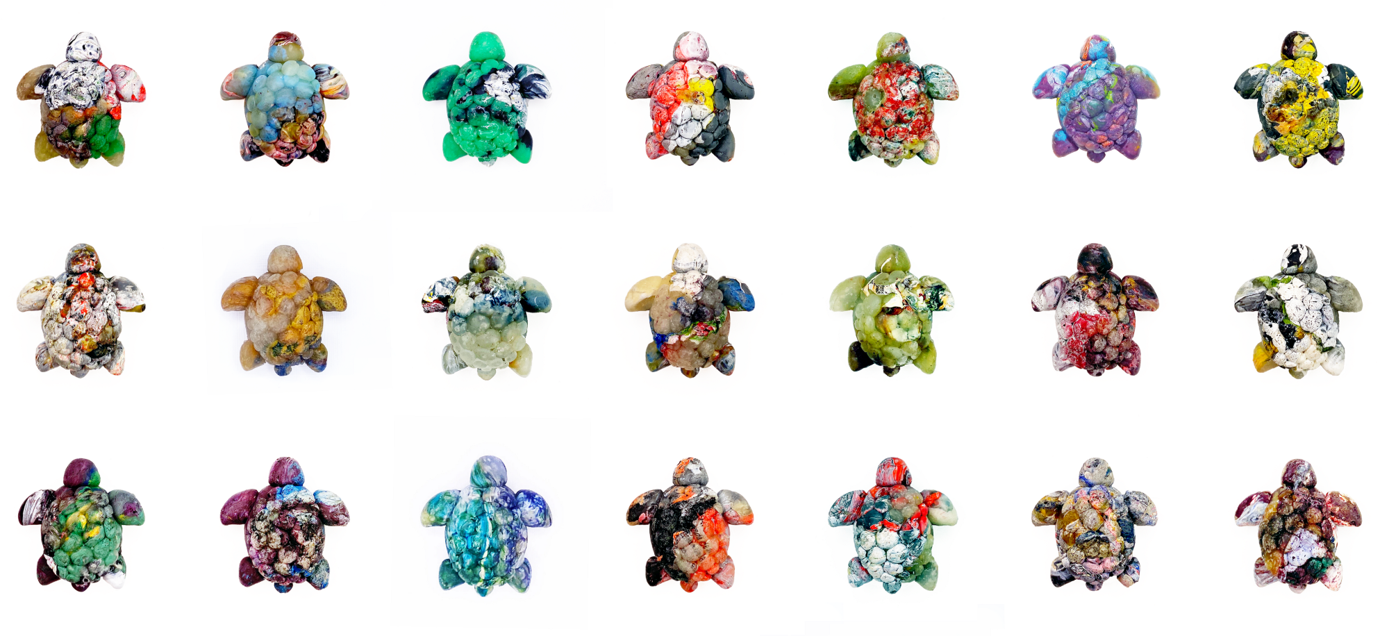
A sea of plastic turtles
When heated, plastic softens and can be reshaped. Using a silicone mould, I created small turtles from plastic waste.

Each turtle is made from 2.7 grams of single-use plastic waste and visualises one hour of my plastic footprint (24 kg plastic waste per year / 8,760 hours in a year = 2.7 g plastic per hour). In order to visually represent my annual plastic footprint, I need around 9,000 plastic turtles.

The turtles not only give this data a physical presence, but they also introduce an emotive element through their representation of animals lost due to plastic pollution.
My Plastic Footprint: a physical data visualisation
Ideally, the My Plastic Footprint project will be shared as a physical exhibition of the turtles. Currently, turtles can be viewed on digital channels: myplasticfootprint.co.nz and Instagram.
My HOURLY Plastic Footprint

My DAILY Plastic Footprint

My WEEKLY Plastic Footprint

My learnings from the My Plastic Footprint project
I engaged deeply with the data through this process. This is a personal data project, so I had a pretty strong connection to the data before creating the physical visualisation. But this connection grew stronger, the more turtles I made. I could see how moments of my life that year were visible in the materials I sourced to create the physical dataset.
Experimentation is essential. The plastic (data) collection and graph visualisation were relatively easy, but when it came to creating a physical visual using plastic, I experimented a lot. What plastic-type is the best to try and mould? What temperature is optimal? What mould material produces the best finish? What mould size will represent my data best? I made many mistakes seeking answers to these questions.

Physical data visualisations still need to be shared digitally. Just because data visualisation is created in a physical space, doesn’t mean its value is constrained to that physical space. The real-world connection (and any added emotive elements) can be captured and shared digitally. For me, there were just as many lessons learned from photographing this project as there were in its physical creation.

It takes time. My Plastic Footprint is a passion project. I typically spend more time on passion projects because, in most cases, they have no deadlines. Regardless, this project remains my most time-consuming data visualisation to date (and it’s not over yet!). From a year of data collection to months experimenting with potential visualisations…and a future creating many more plastic turtles. It’s my hope this project will be exhibited in both physical and digital spaces, and shine new light on what it means to visualise data.
My Plastic Footprint started in an attempt to understand my plastic use. The process challenged my thinking on the role data visualisation has when communicating — should it make us care more about the things we measure? I hope this physical representation of data helps expand the idea of what a ‘data visualisation’ can be.

Kat Greenbrook is the founder of Rogue Penguin, a data story and visualisation company in New Zealand. After years of working as an analytical modeler, she now focuses on how to make insight more accessible through better data communication. Kat retrained in digital design and uses visualisation as a tool to help businesses tell their data stories.
- Kat Greenbrook

- Kat Greenbrook


