This content originally appeared as part of The ‘Gale newsletter.
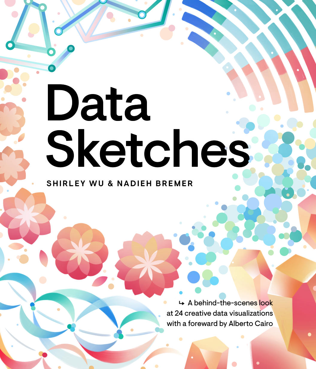
Perfectly timed to align with Nightingale’s Data Sensification Week, we have some exciting, tactile news: dataviz designers and long-time collaborators Nadieh Bremer and Shirley Wu announced the publication of their ‘Data Sketches’ book! Ahead of the announcement, we had the opportunity to sit down and ask them our Three Questions… but to keep things interesting and to see how well they really know each other, we asked Nadieh and Shirley to answer for each other, Newlywed Game-style.
1. If you could be any type of chart, what would you be?
Nadieh answering for Shirley: I know Shirley wouldn’t be a standard chart that you could make with any old library that lets you do dataviz. She would be some sort of beeswarm, but one that uses natural shapes with many complex components.
Shirley answering for Nadieh: There are two parts to this question. First, what’s Nadieh’s favorite chart form? I keep thinking hex maps. Hexagons are Nadieh’s favorite shape. She’s never really used a hexagon in her projects, but her logo is like a hexagon map. Then the second part of this question is, what is Nadieh in chart form? She’d be a remixed chord diagram. Her very first Data Sketches on the Lord of the Ringsreminds me of a remixed version of a chord diagram. It’s beautifully curved and has beautiful colors, but it’s a remix. It’s not standard.
2. If you were stuck on a desert island, what viz would you want to create and what would you use to make it?
Nadieh for Shirley: Shirley would want to create something that exists in the physical space. A data art installation. Maybe she’d use the coconuts laying around with the palm leaves. But, she would want to be able to use her laptop to do part of it because she loves coding. It’s part of her flow. She would need a powerful battery! She’s always creative. She’s doing stuff with resin right now, making these very cute earrings. Hers would not be a visualization as much as an experimentation with the materials available to her.
Shirley for Nadieh: Neither of us starts by thinking about a chart and then making it. We start with the data and the message we want to convey visually. I think that Nadieh would do something about the animals on the desert island, or maybe the stars.
3. What is one visualization that has inspired you?
Nadieh for Shirley: Shirley’s inspired by things that are not dataviz, like the cherry blossoms in Japan and art.
Shirley: Yeah, Nadieh did a good job answering that. What’s on my wall is a lot of art. There’s Harry Potter Fantastic Beasts. I love the color usage. Then, there’s Ghibli. My inspirations are always changing, depending on what I’m trying to do. Currently, I’m really inspired by Mona Chalabi and the way that she tells such short, bite-sized stories on Instagram. She’s really figured out how to present a story and capture people’s attention — not just from an aesthetic perspective, but she’s figured out Instagram as a storytelling tool; the way that she does pacing is very good. And there’s a TED Talk from Aaron Koblin. That was my first dataviz inspiration, where I thought, “Oh, I didn’t know you could do that with code and data.”

Shirley for Nadieh: Nadieh takes inspiration from astronomy, like her Figures in the Sky sky map. She gets a lot of inspiration from the sky.
Nadieh: For me, there’s not one chart that really stands out. There are several that I admire, that I turn back to for different projects. There’s one that’s a little more special because it was the first one where I saw that dataviz could be more than bar charts and line charts. It was done by Jan Willem Tulp, who coincidentally happens to be another Dutch data visualization designer — he had a visualization called “Ghost Counties” that he made for a competition co-hosted with the Eyeo Festival. He won that competition and, I don’t know how, but I stumbled upon his visualization. It was so eerily beautiful and well done. It was so different from other visualizations that I’d seen before. It really stuck with me. It was an eye-opener for me.

Claire Santoro is an information designer with a passion for energy and sustainability. For 10 years, Claire has worked with governmental agencies, non-profit organizations, and higher education to accelerate climate action by communicating complex information in an engaging, approachable way. Claire holds an M.S. in environmental science from the University of Michigan.


