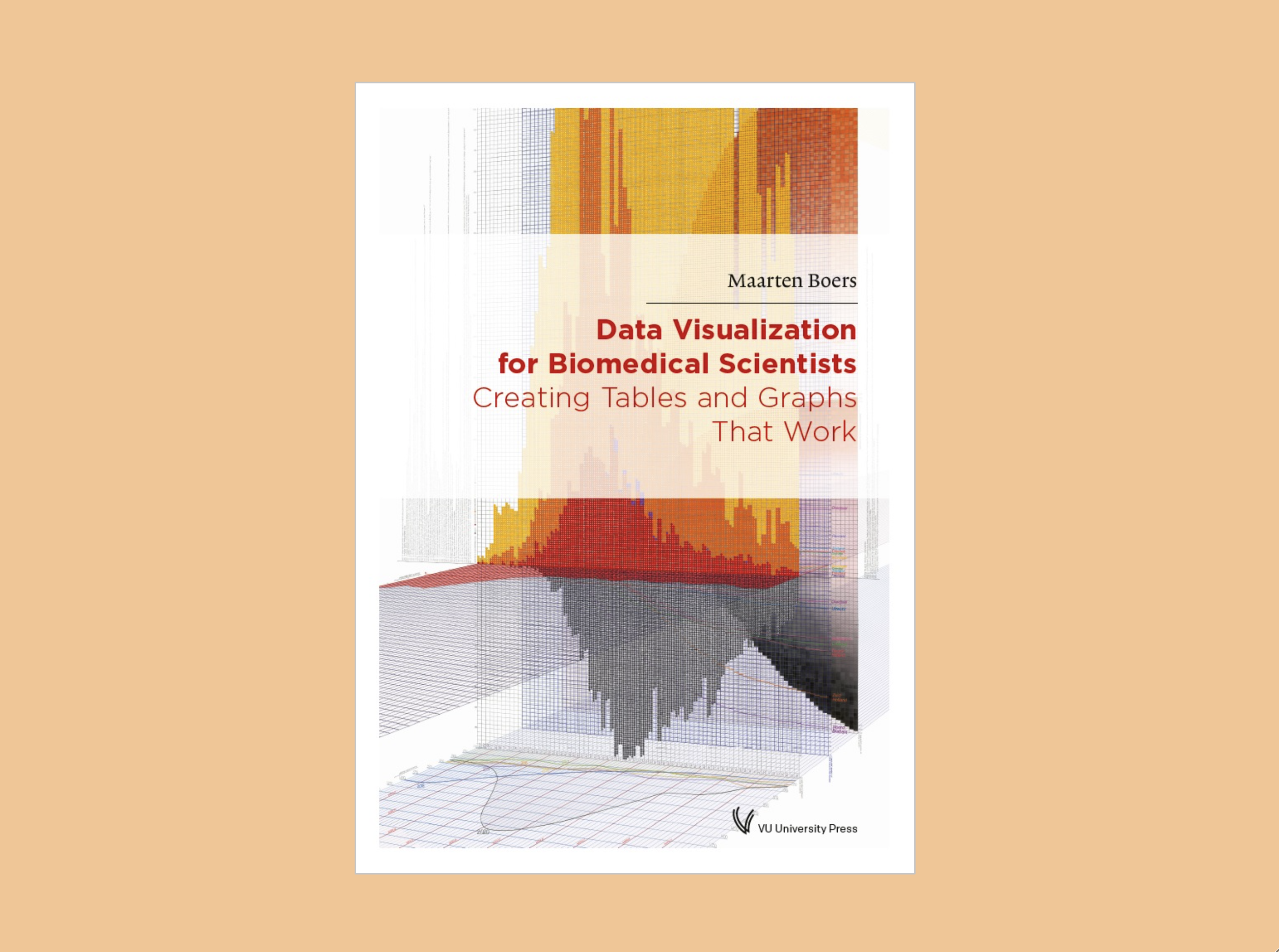
When I was an undergraduate student, my journey into data visualization began with my interest in biostatistics, especially the inner workings of biomedical research. Ultimately, I decided that a career in the biomedical sciences wasn’t right for me because I wanted to focus on communicating scientific and health topics to the public through journalism rather than researching them myself. Unfortunately, there were very few resources available to teach me how to build bridges between scientists and laypeople at the time, but Maarten Boers’s Data Visualization for Biomedical Scientists: Creating Tables and Graphs That Work is exactly the kind of book I was seeking.
The book is organized like a manual, with sections for tables, graphs, matrix graphs, and publishing and presenting. Boers himself even suggests in the introduction that some may find it most useful to skip around the book instead of reading it straight through in order to absorb the information that is most relevant to them. I chose to read it from cover to cover and was impressed by how well each of the six chapters stood alone while still maintaining a steady flow from one to the next.
Data Visualization for Biomedical Scientists is packed with practical examples about how to make research visualizations more reader-friendly. There are numerous figures of graphs from his and other research papers before Boers edited them and after he used his method to optimize them for readability and comprehension, or “clear vision and clear understanding.” In addition, the book is accompanied by a website, which contains the code (written in prism) used to create the majority of the graphs and tables contained in the print volume in addition to a range of video tutorials. I found that both of these elements greatly enhanced the utility and readability of the book, especially as someone who is not a practicing scientist.

Beginning in the first line of the preface and continuing throughout the book, Boers consistently references the work of the data visualization “giants” from whom he draws inspiration. These people include Edward Tufte, William Cleveland, and Stephen Few. But it’s Boers’s analysis and synthesis of their data visualization philosophies combined with his own opinions and best practices that make this book a must-read alongside publications by Tufte, Cleveland, and Few.
Boers starts with an introduction, which lays out his general data visualization philosophy and some of the key questions he hopes to answer with the book. Following the introduction are three chapters that discuss the proper use and design of tables, graphs, and matrix graphs, respectively. The fifth chapter is more tailored to Boers’s scientific audience and discusses best practices for publishing and presenting biomedical visualizations. Lastly, Boers ends the book with a section titled “The Bottom Line,” which contains a single succinct paragraph describing the main takeaways of the book as a whole.
I particularly appreciated how Boers balanced the need to remove as much “ink” as possible, as Tufte instructs, with the desire to have indicators (headlines, arrows, captions, highlighted elements, etc.) that guide the viewer through a data visualization or table. In pursuit of this end, as well as the need to lower the bar for prerequisite knowledge about scientific research, Boers developed a new way to visualize error, which he calls the “null zone.” This mark is a gray bar that runs across a graph showing the measurements for two different groups. Where the lines fall outside the null zone, the difference between the groups is statistically significant. When the lines fall within the null zone, there is not a statistically significant difference. I find this method of visualization much more readable than trying to estimate whether error bars for adjacent marks overlap and hope that Boers’s method of visualizing error will be more widely employed.

Though Boers is an accomplished scientist and academic, he writes as if he is sitting across from you at a coffee shop and explaining concepts in real time. He employs carefully presented logic paired with plain language, exclamations, and jokes that make Data Visualization for Biomedical Scientists an incredibly approachable book even for someone who was not trained as a scientist.
Boers covers a range of concepts that I consider in my everyday work as a data journalist, including accessibility, formatting for print and digital, reader (un)familiarity with complex concepts, and constructing a cohesive narrative. I wholeheartedly recommend this book, especially for scientists interested in communicating their research beyond their collaborators and journalists and other communicators who want to hone their science visualization skills.
Disclaimer: Some of the links in this post are Amazon Affiliate links. This means that if you click on the link and make a purchase, we may receive a small commission at no extra cost to you. Thank you for your support!
Emilia Ruzicka is a data journalist, researcher, and editor who recently completed their M.A. in Media, Culture, and Technology at University of Virginia. They are currently pursuing freelance projects, including a blog and travel newsletter, while they search for their next full-time position. Outside of data viz, Emilia loves to visit museums, make art, and talk about the USPS. If you have a project proposal, story tips, or want to find out more, visit emiliaruzicka.com.


