
After decades of dancing between a natural affinity for engineering and an insatiable obsession with visual aesthetics, I’ve recently landed in the professional field of data visualization. If there’s one proficiency I’m missing in the array of skills needed to work as a data visualizer, it is most certainly storytelling. I received the opportunity to take the online course Data Visualization: Storytelling with delight, and I wasn’t disappointed.
What it is
Data Visualization: Storytelling is a 1.5 hour course on LinkedIn’s smart education platform, which delivers content previously found on Lynda.com. If you decide to take it, you’ll be guided through the why’s and how’s of data storytelling by data visualization expert Bill Shander.
As you’d hope, the story arc of this course is elegantly structured, demonstrating in itself many of the methodologies presented in its content. The course videos, which are the primary mode of delivery, accompany the instructor’s voice with relevant, quality visual material and interactive transcripts. I hadn’t used LinkedIn Learning before, and I was pleasantly surprised by the user experience. There are a few nice additional features such as sections for personal notes, discussions with the course leader and other attendees, and a list of recommended courses to aid you in continuing your learning journey. Most importantly, the primary functions (video and transcripts) worked flawlessly for me across all my devices, allowing me to digest the course content with ease.
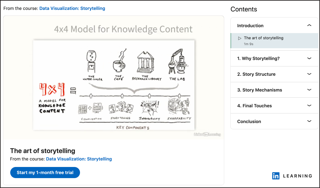
The first of the four main sections of the course – “Why Storytelling?” – makes a compelling argument for why we, as data communicators, should care about storytelling, as well as defining situations when it isn’t needed (for example, when the content is “reader driven,” as in a dashboard). The following two sections, full of case studies, progressively reveal the theory and application of “Story Structure” and “Story Mechanisms.” I found this to be very well paced. The “Final Touches” delivered in section four effectively wrap up the ideas and include many tips for data visualization best practices.

Who it’s for
“This course is intended for anyone who works with data and has to communicate it to others.”
course description on LinkedIn Learning
The course is designated as intermediate, but I wouldn’t hesitate to recommend it to anyone with an interest in the topic. I believe that the content is structured in such a way that beginners could gain an insightful overview from it. Taking the course doesn’t require any technical knowledge or skill. I encourage you to give it a listen even if it would be your first encounter with data communication.
That said, those who are actively working in data communication would probably benefit most from the course, because they would be able to apply the techniques to real life problems. This is not a beginner course offering in-depth training on data analysis or visualization. It’s a guide to the specific practice of data storytelling, which encompasses a number of related but often separate professions. As a designer and engineer of data visualizations, I found it gave me insights into the thought processes an analyst might undertake, and I recognized many that I undertake in my work. It was useful for me to see them knitted together through the overarching framework of storytelling. Moreover, I was left convinced that I should invest more energy into refining this essential craft.
What it costs
The time investment, at 93 minutes, is nothing short of a bargain. Of course, there are likely to be sections you’ll want to re-listen to and times you’ll want to pause to read the transcript, make notes, or dig deeper into specific topics and case studies. All in all, I spent around three hours with the material, and I expect I’ll go back to it again in the future.
I also feel that the LinkedIn Learning platform is well worth its financial investment. Many organizations offer it to their students and employees free of charge, but if you find yourself needing to pay, it is included in the LinkedIn premium subscription, which offers a one-month free trial and both monthly and annual plans. Membership gives you access to thousands of on-demand courses “taught by real world professionals,” like Bill. You can get more information, or subscribe, at www.linkedin.com/learning.
What it delivers
This course is a valuable resource for establishing or refining the craft of data storytelling. It is high-level and wide-reaching in application, yet absolutely not superficial.
“Short and unbelievably insightful course which does not give you a set of Do’s and Don’ts but gets you thinking”
Course participant Saloni Yadav, via LinkedIn
I came away having learned a bunch of new terminology and methodologies, as well as with much food for thought. For such a short and pleasant course, I was very impressed with how much rich material it covered. If I can harness the material, I am confident that my data communication work will be more effective as a result.
Bill Shander is not only an expert in data visualization and data storytelling, but a highly experienced teacher and speaker. If, like me, you’re keen to develop or refresh your professional skills in these areas, you can check out his other offerings at www.billshander.com.

- Marianne


