
Wait, what? Spaghetti?
You may have thought this was an excerpt from a cookbook, but it’s actually a data visualization article! It seems like a prank, right? But no.
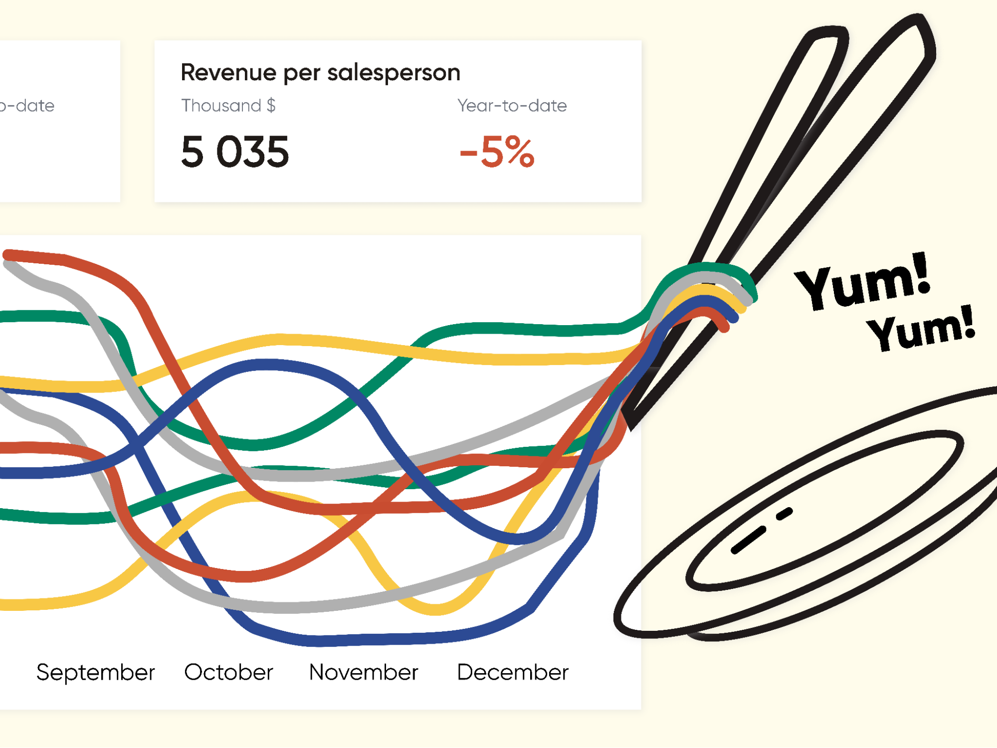
Sometimes, spaghetti sneaks onto a dashboard and creates total chaos—splattering everything in tomato sauce, popping up from everywhere, and interfering with data!
How did we end up in this situation? Let me explain from the beginning.
We had a fantastic client—incredibly wonderful—who fulfilled all commitments without delay, proactively negotiated everything, and was open to constructive discussions. The project progressed rapidly, the dashboards shined brightly, and the payments were made on time! A true gem of a client! I was ready to introduce him to my mother.
But then we faced the challenge. “Can you display the dynamics for all my parameters on this line-chart? There might be up to 10 parameters! It’s crucial!” he said.
We designed layouts according to the agreed-upon requirements, and the result was a series of charts that looked like a plate of spaghetti.

The dashboard was a tangled heap of lines and numbers that looked delicious to eat, but impossible to mentally untangle.
The client firmly refused to change the visualization type; spaghetti suited him perfectly. “And, by the way, add trends for each parameter!” he requested. The dashboard started to resemble a sticky, stringy Japanese dish called “natto,” as the addition of more lines created an even greater gastronomical tangle.
But why is this visualization type problematic, you may ask?
Too many elements prevent a person from focusing on data. Our brain can’t handle more than 5 to 7 items at once. Such a colorful display distracts readers from data analysis. So, if you search for advice on working with line charts, you’ll likely come across some strict rules: “Don’t include more than 3 to 5 lines!” and “Avoid cluttering the graph and increasing cognitive load!” However, those advisors don’t tell you what to do when the “spaghetti” has already attacked and the number of lines can’t be reduced.
Let me tell you about the options (or recipes) that we, as a team, discussed and considered for improving this case.
Recipe 1: Highlighted Spaghetti
Here’s a simple tip to reduce color diversity: Emphasize the main element and dim the rest. This is easy to do with a static graph.
For a dynamic dashboard you also could click on a specific data line, the other’s colors are dimmed, and only the selected one is highlighted. Easy and powerful option.

Recipe 2: Untangled Spaghetti
Instead of one tangled diagram, present multiple small ones where each noodle is represented individually. This way, you could still conveniently compare the data and examine them separately. This useful method is called “sparkline.”
Edward Tufte, who popularized this method, wrote about it here: Sparkline theory and practice.
One of the drawbacks is that the number of diagrams required to show all the data may not fit on the dashboard, and it’s not always convenient to compare them if they are not placed in a single row.

Recipe 3: Average Noodles
The compromising method involves showing several main lines while aggregating the rest of the data into an “average” representation. Additionally, we can outline a “range” of maximum and minimum values. This approach is interesting, but we still need to choose one main line.
A downside is that we may miss out on other data points beyond the primary one and potentially overlook anomalies or correlations.

Recipe 4: Filter, not stir!
When we have the option to filter the lines in various ways, it can improve the situation. For instance, we can showcase the “Top 5” or “Bottom 5” lines. Alternatively, we can allow users to manually filter parameters to reduce the number of elements as needed.
This method can be combined with the highlighted spaghetti recipe, where we either hide the unselected data or dim it (turning it into shades of gray).

When we tried to implement this recipe, we came up with several layout options, including the one below:

Recipe 5: Lazy Noodles
This recipe is a subtype of the filtered spaghetti recipe, with a dash of human psychology. (Spoiler: We ultimately chose this method.)
We couldn’t convince the client to abandon the idea of displaying multiple lines on the chart, but we set an acceptable number by default. Now, if the client really, really needed more lines, he could add them easily.
However, he would only do so in case of a real need because the human brain is quite lazy by nature. That’s why default values represent the most popular and commonly used ones!

And here’s the latest iteration!
This is the solution we settled on with the client when we transitioned from prototypes to working in the BI package. However, we made a more compact default version, considering that the client can add more lines if desired, and it should still work effectively.
The interesting thing is that the client changed his mind about viewing trendlines. Nevertheless, the dashboard still allowed for displaying not just two but up to ten lines! We’re still waiting for feedback from the client to see how often he uses the full-plate-of-pasta functionality!

Let’s add some ingredients to the spaghetti!
What other techniques and tricks can be used to improve the taste? We used a few to make the spaghetti more yummy while dealing with a large number of lines, because we couldn’t get rid of them entirely.
First sauce — with olives, er, labels!
Add category labels to data points at the beginning and/or at the end of the chart lines; this way, you won’t have to spend time referring to the legend. If the lines overlap and the labels do too, place one label at the beginning of the line and another one at the end.

Second sauce — with persistence!
Make filters compelling for action so that users don’t forget to filter the chart appropriately before working with it and trying to analyze it! To achieve this, put the filter names in an imperative mood and highlight them with bright colors, bold fonts, and a larger font size.

Third sauce — with explanation!
To ensure users fully understand how to navigate through this complex visualization, you can add interactive pop-up instructions. Explain and demonstrate the importance of filtering and highlighting what is shown on the dashboard. This way, users can easily orient themselves in this tangled story (yes, it’s a reference to Rapunzel!).

Every client and every task is different, and sometimes it’s worth working within the rigid frameworks that exist and doing everything possible to improve the client’s user experience!
Sometimes, to defeat the ‘spaghetti,’ you have to think like a chef!
Surprisingly, even the ‘spaghetti diagram’ (which visualizes how systems flow) finds its application in the field of lean manufacturing. You can read about spaghetti diagrams here and here.
So, this is our story! Even a small task can lead to numerous unconventional reflections and experiments because we can’t always simply abandon the complex path – in our case, we couldn’t change the visualization type or reduce the number of lines.
I believe it’s not worth prohibiting certain visualizations (like the universal disdain for pie charts, just because they are often misused) or rejecting a visual if it has some limitations. It’s essential to think and carefully assess all possibilities! I think that in such reflections, breakthrough ideas and interesting concepts can emerge! So, I wish everyone challenging data visualization tasks and intriguing solutions!
And, of course, don’t hesitate to share your data visualization struggles, along with your solutions, amid the conflicting demands of clients. Real-life cases teach us much more than theoretical recommendations.
How did you overcome the ‘spaghetti,’ and what interesting dishes did you create based on it?

Alex Kolokolov
Alex Kolokolov has been working in the business intelligence industry for the last 15 years. His passion is dashboard design and development. He is the founder of Data2Speak Inc., an agency that provides BI services and trainings. Alex is also the author of three books: Dashboards for Executives (2019), Make your Data Speak (2023) and Data Visualization with Microsoft Power BI (2024). He organized the international dataviz conference and the “Make Your Data Speak“ award.
- Alex Kolokolov

- Alex Kolokolov

- Alex Kolokolov

- Alex Kolokolov


