
2022 has just started and I’m taking stock of the last year, of achievements, loved ones, and things to work on. Have I lived at my best last year? Have I done everything I could to be happy? What actually happened in 2021?
Relying on memory, I feel like I mostly wasted my time or I didn’t have enough events where I could say, “Yeah, great year. I really enjoyed it!” That’s mostly because I’m forgetful, but data (almost) never lies! In fact, researchers found that when we try to recall past events, those memories can get changed, reflecting inaccurate details or told from different points of view. This “audience-turning effect” phenomenon refers to our tendency to adapt the story for our audience and it can permanently alter our memory.
That’s the reason why I started this visualization, to bring with me in 2022 a better and real perception of my memories. In anticipation of this year-end accounting, I decided to evaluate 2021 based on tangible and clear data about how I felt, tracking what made me happy over one hundred days. The period of time I considered was from the 1st of June to the 8th of September, 2021.
I collected data every day for one hundred consecutive days. How many times had I felt happy? Who was I with? Where was I? Were there any discernible patterns? Every time I felt happy about something, I wrote it down in my phone notes, describing the date, what made me happy, where I was, and who was with me or what prompted that happiness. For example: according to my data, on the 26th of July I felt happy about my workout at home, alone. Sometimes I recorded data points immediately. Sometimes I collected every happy moment I still had in my mind at the end of the day.
When the collecting and tracking process ended, I converted the notes into a dataset on Google Sheets, to make the filtering process easier. Selecting and grouping similar events or categorising patterns of people I was with was essential to make data more compact and to avoid repetition. Because of the dataset’s size, I needed to group similar elements and to create general categories to be able to visualize the data clearly.
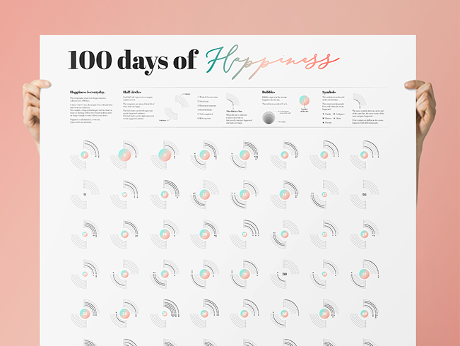
The creation step on a new project is always my favourite and the most involved. I typically start looking for references and projects that can inspire me. The only thing I already knew was that I wanted to visually prioritize the happiness trend. This objective guided me to assign a value as the average of the happiness and to create a graph for each day. I decided to visualize the happiness average as a colored, eye-catching circle and the other data based on a neutral grid. I created two opposite half circles as the grid to distinguish indoor and outdoor events and the categories they belonged to. I chose symbols to identify people’s categories.

I also wanted to express happiness through colors so I selected a light pastel gradient, on a light grey background. I realized that I associate happiness with brightness, something that makes me feel relaxed.

When the elements and the legend were set, it was time to combine them and create. The end result turned out to be a solid infographic, composed of one hundred graphs–one for each day.

The visualization revealed how many times I felt happy, which was considerable! I can clearly see that I spent many beautiful moments with my fiancé, friends, and family. I felt really bad for only three days out of one hundred and I noticed that many times my perception of an entire day improved based on a single event or a person, bumping the average from a three to a five.
Completing this project helped me realize that sometimes we just need some visual notes to remind us how lucky we are. In fact, my personal findings validated studies that show that exercising via daily positive activity “homework” may help improve feelings of wellness. This infographic helped me to appreciate this complex COVID-ful year, illuminating all the people and events made me actually happy. It turns out that happiness is all around us, everyday. Sometimes we just need to pay attention.

Martina Zunica is a visual and information designer. She works both in a company and as a freelancer, challenging herself in complex infographics. She has just started her first bullet journal where she tracks daily data. In her free time she cooks, travels and collects pictures of beautiful doors around the world. You can connect with her on Instagram.
- Martina Zunica

- Martina Zunica


