
I thought a lot about labor and care in the winter and spring of 2021. Like many other people, I spent most of that time in my house, and like many, I needed an outlet for generalized stress and anxiety. One of the ways I coped with lockdown and endless Zoom was cleaning: washing dishes, wiping down counters, scrubbing the grout in the shower, sweeping the hallway and stairs, folding laundry, you name it.

Improving my space and making order out of mess makes me feel grounded and happy, and after more than a year of the pandemic, I was definitely chasing that feeling wherever I could. Each morning before I started working, for example, I’d spend between five and 45 minutes making the kitchen pristine, until I could sit down with my cup of tea and my laptop with a feeling of real, if short-lived, contentment.
If that scene sounds a little too Cinderella-and-her-rodent-helpers to be sustainable, that’s because I’m a human and it was. While cleaning my space brought me a mundane sense of peace, it brought other feelings as well. Sometimes I had the Sisyphean sense that each morning I returned to a space that everyone else in the five-person household was determined to un-clean while I slept. (This was a valid feeling, but not true.) At worst, I would stare at my computer and, instead of working (even instead of cleaning), I’d think about how much time I spent cleaning, or thinking about cleaning. If that scene sounds like a useless spiral and a waste of my time… well, you can take a look at my project and judge for yourself.

What felt some days like a gift I could give myself and my roommates – actually enjoying cleaning (as an activity AND for its byproduct) – felt other days like a burden that I assigned myself. My majority-male roommates certainly cleaned as well, but for whatever reasons (my personality and my socialization as a woman are top of mind), I cleaned more than the people around me without generally needing or asking for their help.* Our house fell into a natural rhythm of expecting certain cleaning tasks to get done by me, and all of a sudden I began to feel a nebulous dread that I was squandering the opportunity of being in school again. Instead of spending more time doing my readings or sketching UI ideas or optimizing my project website for mobile or applying to jobs, I was semi-autonomously scrubbing behind my bathroom sink with a cleaning toothbrush while deadlines loomed closer.

As a data person, what I fixated on was the sense of immeasurability of my situation. Measuring cleaning and other forms of unpaid labor is one thing–in the United States, the Bureau of Labor Statistics does this to a pretty impressive level of detail. (Unpaid and underpaid care work is, after all, the absolutely essential foundation of our economy.) But I was struck by the thought that not only would I never know how many hours I’ve spent cleaning, I’d never know how many of those hours I spent cleaning instead of coding or studying or writing. And beyond that, I’d certainly never parse out which cleaning hours were spent in general contentment – showing care for myself, my space, and my lockdown-mates through the act of tidying up – and which hours contributed to the dark cloud of “I should be investing in my own future” opportunity cost. (A future which, as a woman in tech, already feels to me like it can’t afford many compromises on my end.)
The data points in this situation felt very “squishy.” Identical actions produced totally different emotional results, often because of external responses: a warm glow accompanied care actions done and received with love, a needling undercurrent prickled alongside unvalued labor. Think about how different it feels to wash your partner’s dishes because you know they’re busy and they’ll appreciate the help, versus washing their dishes because you can’t take the mess anymore and you know they won’t even notice. It could be the same single plate washed. One feels like an act of care that makes us more human, the other an act of labor that makes us passive-aggressive. To categorize them as the same action feels somehow incomplete.

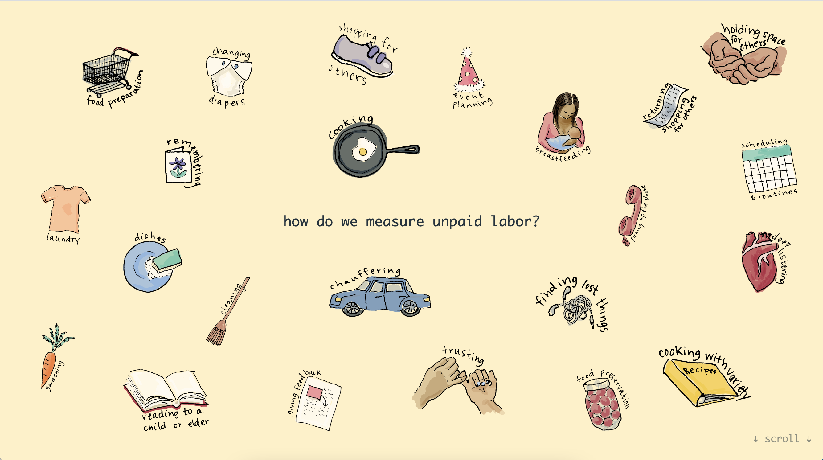
And indeed, the sense of immeasurability was only reinforced for me when I finally decided to visualize some data on unpaid labor as part of my coursework. I made charts using global labor data from the Organisation for Economic Co-operation and Development (OECD), and felt with each iteration that the graphs didn’t show what I wanted to communicate. The dots on my scatterplot were so vague, so impersonal. They showed a stark trend – globally by country, women’s daily unpaid labor starts at a minimum of three hours and men’s daily unpaid labor tops out at three hours – but failed to relate what actually drew me to the topic. I couldn’t imagine that the visualizations would prompt anyone to walk away with a new thought or feeling about unpaid labor and care in their own lives.

So I abandoned my graphs and began drawing instead. I drew a dish and sponge, a broom, a frying pan, a shopping cart – the objects that made me think about unpaid labor in the first place. I drew a book of recipes, a pair of lost (and found) headphones, a pinky promise – the things that made me think of care. All of these actions/objects can be forms of labor and forms of care, and I realized suddenly that those were my axes. Sixteen more drawings joined this initial group, ink drawings became SVGs, and the labor and care axes became an interactive d3 graph – a radically personal one. The visualization sacrificed any notion of universality or data-drivenness in favor of a private truth. The axes span simply from “more abstract/obscure” to “more concrete/obvious,” each side prompting the user to evaluate actions as forms of labor and forms of care. In the web version, users can drag and change the position of the icons to reflect their own experiences. If breastfeeding feels more like labor than care today, the graph can show that.

There is so much more to “unpaid labor” than we can ever hope to quantify in data, and unpaid labor is so much more than simply a counterpart to economic productivity. And that’s okay! My initial scatterplots expressed a clean mathematical relationship between men’s hours of unpaid labor and women’s hours, but this “cutting through the noise” didn’t feel like the right approach at all when it came to recognizing unpaid labor and care work. So often, that “noise” is the care. Care doesn’t come pre-packaged in data units. It’s messy and entangled and sometimes we don’t even realize we’re doing it. “Clean data” in relation to care means scrubbing off parts of what makes us human. That’s a necessary evil when it comes to data, but it’s worth pausing to reflect on what’s lost as well as what’s gained.

My graph shows, essentially, my opinion on the day I made it. It has a sample size of one, so it’s lost any semblance of statistical truth. But the project was inspired by the idea that inherently “messy,” ambiguous, or uncertain data can, and sometimes should, be visualized in a way that upholds and centers the uncertainty, rather than trying to hide, smooth over, or “fix” it. Categorical data, in particular, is always subject to the context in which it is created, and I prefer the Donna Haraway strategy of acknowledging that situatedness rather than trying to ignore it. The visualization takes an inherently messy concept and responds not with an attempted solution, a universal truth, or even a simplification, but with attention to the clarity that can come from considering one individual experience and inviting the experiences of others.
That’s a lot of words to say: this visualization is for each individual viewer to consider and change as they want to. It recognizes the impossibility of predicting every care action, and instead simply invites the audience to submit a request for icons that I missed.** (This is where I see a potential future of the project, too: I’d love to build out my data collection pipeline so that users can request new actions and opt in to share the final coordinates of their personal graphs if they moved the icons.) The project is hand-drawn because I hope that will prompt somebody to spend an extra minute of thinking and feeling with it. It’s hand-drawn because handmade dataviz helps remind us that people are always the ones making data, and that this data is about people. It’s okay – in fact it’s an essential tenet of our humanity – that the human experience is imperfectly represented in the data. We can always make the dataviz about that, too.
See the interactive page here: https://esibinga.github.io/capstone
*I want to interject here to say that this is not a classic story of me resenting my roommates because I clean more than they do. I love my roommates! This is the story of me examining why I cleaned more, and of what I created when I really listened to the way it made me feel – the good and the bad.
**If you’d like to submit an icon request, please do – seeing and drawing what people submit is by far my favorite part of this project!

Eva is a freelance web developer, designer, and writer. She’s curious about basically everything, but especially the way diverging experiences lead people to different perceptions of the world. With a background in English and visual art, and an M.S. in Data Analysis & Visualization from The Graduate Center at CUNY, Eva brings a multimedia humanist lens to data-driven questions.
- Eva Sibinga

- Eva Sibinga


