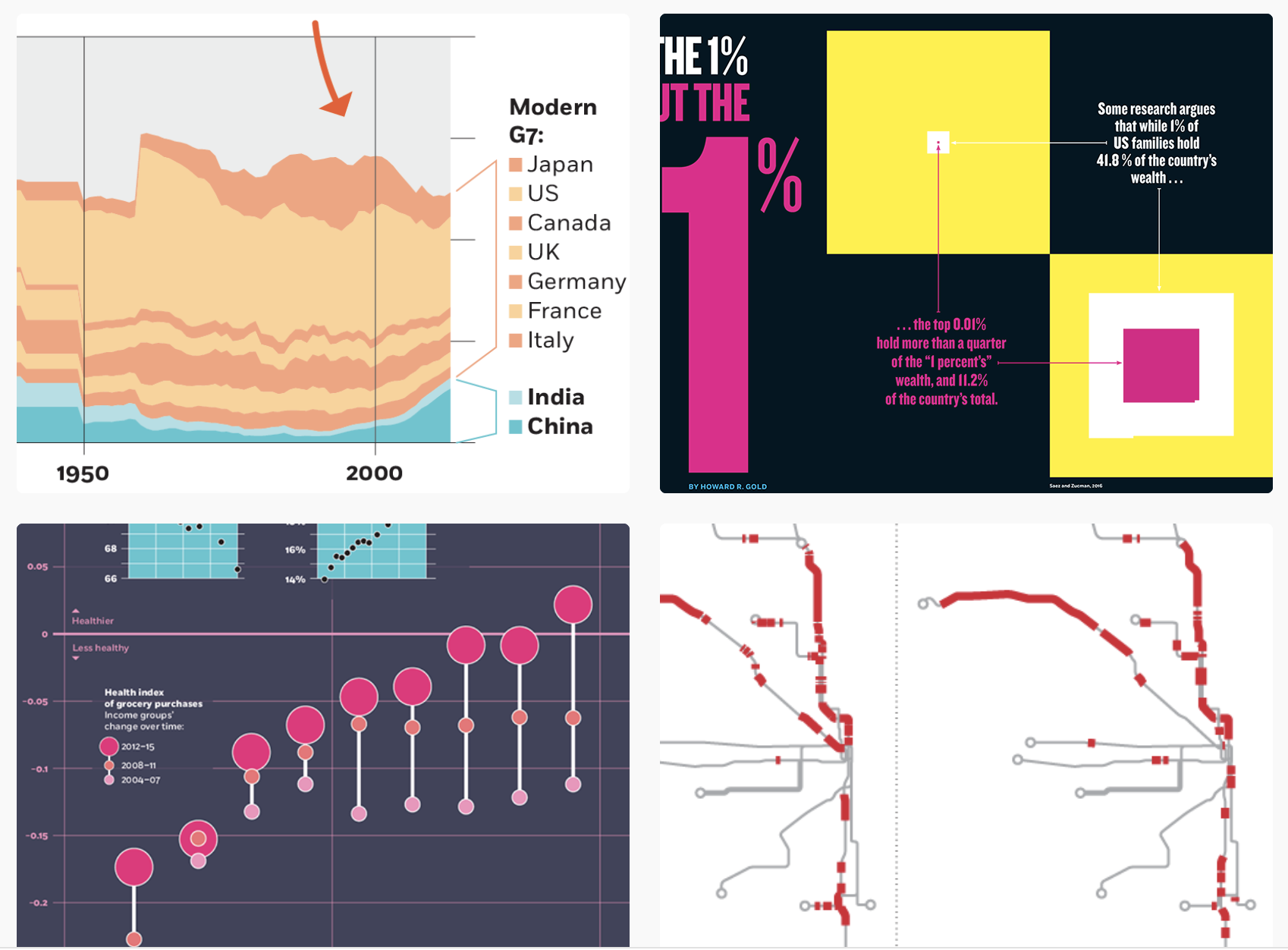
This content originally appeared as part of The ‘Gale, Nightingale’s biweekly newsletter.
Chuck Burke is a multidisciplinary information designer with a background in explanatory journalism and academic publishing; a healthy obsession with typography; and a body of data visualization work that caters to nerds who read the charts first and the accompanying article second. At Nightingale, he plays the role of Operations Editor, helping to keep our web presence up and running.
1. All of your visualizations from now on have to follow the aesthetic of a certain decade (1930s, 1970s, etc.). What decade would you pick and why?
I would pick the 2000s, when I feel like we saw the initial maturation of computers as designers’ primary design tools, a time when digital visualization became an aesthetic in itself that *incorporated* pre-digital illustration approaches rather than trying to merely replicate them. My favorite examples of this are the large newspaper infographics of the day, particularly the Malofiej award-winning superstars in Spain and Argentina, along with those they inspired in the US, Sweden, Canada, and many other places: http://www.snd-e.com/
2. Your mission, should you choose to accept it, is to make a chart expressing something about your life using only objects currently around you (computers and pen/paper not allowed). Look around you—what would you use to make your chart, and what data would it reflect?
This one was actually my six-year-old’s idea. As I write this, it’s the week after Halloween, and we have piles of candy all over the place. He started sorting pieces of candy that were the same brand but different sizes, and now there is a stacked column bar chart on my dining room table, exploring “how many little ones make a big one.”

3. What is one visualization that has inspired you?
This is a clean and powerful infographic that has stuck with me for 20 years, produced by The New York Times in the wake of the 9/11 attacks, a piece I stared at and revisited quite a few times. The visceral visual journalism from this time — the photography, the video, the art, and design — was overflowing with dread and anger, and even in that context, the NYT’s graphics report from that period was beyond stellar. Dynamic yet measured, and a huge influence on a new generation of information designers.

Claire Santoro is an information designer with a passion for energy and sustainability. For 10 years, Claire has worked with governmental agencies, non-profit organizations, and higher education to accelerate climate action by communicating complex information in an engaging, approachable way. Claire holds an M.S. in environmental science from the University of Michigan.


