
What do data visualization and comics have in common? One of these is used to communicate in science and journalism, and the other appears in fine art and the entertainment media, but both combine text and image to tell stories. And both these media are relatively new, having made rapid progress only in the past few centuries, despite requiring little in the way of raw material to produce. We connect this history to a combination of abstraction and accessibility in both these forms of visual expression: comic strips and scatterplots both now seem intuitive but represent the development of abstract conventions. We also discuss differences between these two methods of visual storytelling in their goals and in how they are experienced by the reader.
As the saying goes, a picture plus a thousand words is better than two pictures or two thousand words. Here we consider two ways that words and pictures are combined on the page: statistical graphics (also called data graphics or information visualization) and comics (also called sequential art or bande dessinée). These forms of visual representation typically have different purposes—to inform or to entertain—and show up in different contexts, ranging from government reports to the comic books that formed the basis of Hollywood blockbusters.
In our work in statistics and social science, we have used data graphics for several decades in applied research and have also contributed to theory and methods linking graphical communication to statistical modeling. When it comes to cartoons, we are merely readers and fans, not creators. In learning about their history, we were struck by parallels to the history of data visualization (see Figure 1), and we also see some convergence between these two forms of narrative, now that information visualizations have become more prominent in advertisement and communication, and comics have come to be viewed not merely as a pop culture phenomenon but as a branch of literature.


Figures 1a and 1b. In one of the most famous political cartoons in history, James Gilray’s The Plumb-Pudding in Danger from 1805, William Pitt and Napoleon Bonaparte are portrayed slicing up the world (left). Florence Nightingale sliced up units of time in her compelling, although easily misinterpreted, 1858 statistical graph depicting the causes of avoidable deaths during the Crimean War (right).
Surprisingly recent histories
Cartoons and data graphics require nothing apart from ink and paper, yet only during the past two centuries did scientists and artists go beyond the basics to develop now-routine visual techniques for displaying data and stories on the page. The slow development of these media is interesting, especially considering that, unlike with cinema, for example, the basic technologies have always been accessible. Scientists, mathematicians, and accountants in earlier eras could have been understanding patterns in their data using scatterplots–but they weren’t. Artists and authors could have been combining words and drawings to vividly convey speech and action-–but they weren’t.
Time series and scatterplots seem ordinary to us, but as visual representations of information, they are highly abstract compared to such centuries-old schematic illustrations as geographical maps or anatomical drawings. Depictions of data have existed for thousands of years, whether pressed into Babylonian clay tablets or inked onto bamboo slips during China’s Qin dynasty, more than 200 years before paper was invented. Illustrations of data and mathematical concepts evolved over the centuries to exploit each historic advance in visual media—inks, papers, brushes, pens, printing, computers—as well as building on the diagramming innovations of other scientific disciplines. Michael Friendly and Daniel Denis trace the development of general-purpose data graphics in the 1700s and 1800s to earlier uses of quantitative displays in astronomy, where the positions of stars and planets in the sky can be directly mapped onto a two-dimensional space, as well as to depictions in mathematical physics.


Figures 2a and 2b. Engravings exploded in popularity in the 15th century, but were superseded by the newer technology of etchings in the 16th to 17th centuries. Jacques Callot was a master printmaker who invented techniques so that etchings looked cleaner, more elegant, and more precise , as seen in his depiction of Envy (left) in his Deadly Sins series from 1620. The intaglio printing of astronomer and mathematician Edmund Halley’s drawing of what may be the first bivariate plot from his 1686 book Philosophical Transactions (right; the vertical axis is barometric pressure and the horizontal axis is altitude) reflects the delicate and meticulous style of contemporaneous illustrations.
The connection between time series, scatterplots, and mathematical functions can be seen in graphs in which a curve is fit to go through data (see Figure 2b). It seems to have taken centuries for people to go beyond this to plot data that did not fall exactly on or close to a smooth curve; indeed, this happened at roughly the same time that Fourier and others generalized the mathematical concept of function to represent arbitrary mappings between spaces. In the later 1800s, innovators such as Charles Minard, William Playfair, and Francis Galton (Figure 3b) demonstrated the open-ended possibilities of revealing patterns in data through novel visual conceptions; since then, data graphics have been increasingly important in the natural and physical sciences. In the past twenty years or so, information visualizations have colonized popular communication as well, from New Yorker cartoons of worried executives staring at charts of declining stock prices, to time series of global warming and the flatten-the-curve graphs during the pandemic. Data graphics have followed a steady increase in abstraction of conceit and presentation, which has paradoxically allowed them to be accessible to a wider range of purposes and audiences.


Figures 3a and 3b. In Thomas Rowlandson’s 1808 cartoon The Corsican Spider in His Web (left), the geometric pattern vividly and accessibly conveys a political point. Francis Galton’s 1886 correlational diagram of the heights of parents and children (right) has a similar visual appeal but requires the reader to put in much more effort to understand the data and statistical relationship being shown. The increasing abstraction of statistical graphics allows more information to be conveyed; the subsequent establishment of graphical conventions has allowed readers to more quickly interpret the content of scatterplots and fitted distributions.
Humorous caricatures and satiric cultural commentary in simplified visual form have been found to have existed at least as far back as the ancient Romans. In the supposed Dark Ages, lively drawings that lampooned society lined the margins of illuminated manuscripts, while the first known bar graphs, drawn by Nicole Oresme in 1486, seemed to have gone largely unnoticed. Playfair reinvented them, along with conceiving the pie chart, a few hundred years later, at around the same time the concept of the cartoon was taking shape. Scholars trace modern cartoons and comics as an outgrowth of printmaking, with political humor drawn by Thomas Rowlandson, James Gillray (see Figure 4a), and George Cruikshank inspired by the French Revolution and packed with visual analogy. According to French-American cartoon historian Maurice Horn, perhaps the first to formally study the art form, “It was the universal acceptance of prints that led to the phased transition from caricature to what would later be called ‘cartoons,’ a form no longer devoted simply to cataloging external human idiosyncrasies, but one with an enlarged field of vision encompassing the whole political, social and cultural scene—indeed, the human condition itself.” These became staples of periodicals for the general reader at the tail-end of the eighteenth century and on into the nineteenth. It took a while during the first hundred years for the medium to evolve beyond successions of static images to the more fluid visual storytelling associated with turn-of-the-20th-century newspaper comics and then the longer-form stories appearing in the comic books, manga, and bandes dessinées that flourished in the mid-1900s.


Figures 4a and 4b. James Gilray’s 1793 political cartoon The Blood of the Murdered Crying for Vengeance (left) was a bestselling print in its time, as the public developed a taste for this genre; hundreds of cartoons were created during the French Revolution. William Playfair, once a spy for the French government who helped storm the Bastille, eventually settled into more sanguine vocations. He is credited with inventing the bar chart, Oresme having been long forgotten. Many of the foundations of statistical graphs were laid with Playfair’s line graphs, pie charts, and time series plots. Above, we see his graph of England’s trade balance with Denmark and Norway (right; from 1786), its artistry and annotations echoing the style of Gilray and his contemporaries.
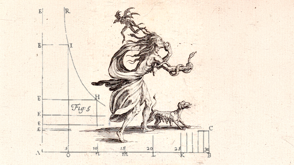
Many consider school principal Rodolphe Töpffer to be the originator of the comic strip, having drawn cartoon-stories told in chronological series for the amusement of his students as early as the 1820s, later to be published to much acclaim. This artform was codified into box-shaped panels by Georges Columb (see Figure 5c), better known as Christoph. Töpffer and Columb were the forefathers of bande dessinée and of comic strips in general, along with other French innovators such as Emmanuel Poiré, a.k.a. Caran D’Ache (see Figure 5b) and Gaspard-Félix Tournachon, a.k.a. Nadar, as well as the German Wilhelm Busch and the American A. B. Frost. The realism and refinement that developed with those genres matured into the albums and graphic novels of today.


Figures 5a, 5b, and 5c. The Swiss-French polymath Johann Heinrich Lambert called his surprisingly modern-looking diagrams figuren, and seems to have been the first to create lines of best fit, as seen in this graph of temperatures at varying latitudes from 1779 (left). The elegance of his rendering heralds the whimsical clean lines of the pioneers of bandes dessinée, such as French satirist and illustrator Emmanuel Poiré, better known by his pseudonym Caran D’Ache. His Le Rêve de M. Emile Zola (center) was published in Le Figaro in 1889. Georges Columb, known as the children’s magazine illustrator Christophe, packed rectangles with painstaking detail, creating multiple-panel stories and establishing the visual grammar of comic strips. This image from 1893 (right) was part of a recurring series called L’Idée fixe du savant Cosinus published in Le Petit Français illustré.
As with statistical graphics, we are struck by how recently some of these developments arose: just as the capacity for scatterplots was available long before they were regularly made, so there is no reason why Tintin-style storytelling with rapid transitions and speech balloons could not have been done hundreds of years earlier.
Heinz Pagels tells the story of “a stranger, who, recognizing Picasso, asked him why he didn’t paint people ‘the way they really are.’ Picasso asked the man what he meant by ‘the way they really are,’ and the man pulled out of his wallet a snapshot of his wife and said, ‘That’s my wife.’ Picasso responded, ‘Isn’t she rather small and flat?’” The relevance to our discussion here is that scatterplots, time series, speech balloons, and other tropes of statistical graphics and comics are so familiar that readers can see through the abstractions, as it were, in the same way that the husband on the train saw the photo not as a flat artifact but as a representation of a three-dimensional person. The story dramatizes that the difference between a cubist collage and a photorealist painting is not so much the level of abstraction as the familiarity of its conventions, and indeed it can take a generation for abstractions to enter the mainstream sufficiently that they can be built upon by new creators.
Statistical graphics came to maturity as a result of the mathematical use of Cartesian coordinates to represent dimensions other than physical space (see Figure 6b), along with probability distribution for variation that allowed real-world data to be represented by non-deterministic models. The rise of sequential comics coincided with the advent of film as a popular and artistic medium. Graphs and cartoons exist for entirely separate purposes, and so there may be no direct parallel here except a recognition that in science, policy, or entertainment, developments in different media feed off each other. The effectiveness of film opened the door to dynamic forms of visual storytelling on the page and in animation. Technologies of reproduction affect the forms of popular art, from printmaking in the 1700s to mass-circulation magazines and newspapers in the 1800s and 1900s, to movies and television today. Similarly, advances in mathematics and computing have turned statistical graphics from craft work into a set of routine tools in science and communication.


Figures 6a and 6b. Winsor McCay experimented with the form of the full-page newspaper comic strip with Little Nemo in Slumberland from 1905 until 1927 (left; this example from 1905). With exquisite draftsmanship, he frequently subverted the constraints of the strip’s panels. Within the same historic time frame, our understanding of atomic numbers was usurped in Henry Moseley’s graph of High Frequency Spectra of the Elements from 1913 (right). This visualization made clear that increases in atomic mass correspond to a physical property, correctly supposed by Moseley to be the number of electrons. Its lines foretold three then-unknown elements and that electrons hold a mysterious property, later discovered to be spin.
But even as they historically evolve at what seems like a yawning parallel distance, we may notice reflections of method and design between data-oriented graphs and cartoons (and the related illustrations that preceded their inventions) depending on the era and trends in artistry, as may be observed in the comparisons in our appendix. This points not only to contemporaneous conventions, but to the similar constraints required to deliver such abstractions as mathematical concepts and humor. That which is more comfortably communicated in written or spoken form (sentences or equations) is conscripted into a visual format built from the media available at the time.
Outsiders entering the mainstream
Statistical graphics and cartoons both have the feeling of “outsider art,” with an uneasy relation to more accepted forms of data analysis or storytelling. This may perhaps be most apparent when considering the visual outputs of such outsiders to the mainstream as sociologist W. E. B. Du Bois (see Figure 7A) and the Creole artist George Herriman (see Figure 7b), with his aslant artistry and humor that featured a genderfluid cat.

Figures 7a and 7b. W. E.B. Du Bois, who established the first American school of sociology at Atlanta University, created a series of boldly colorful and geometric graphs depicting a social study of Black life in the U.S., exhibited in 1900. The above example (left) depicts the “proportion of almshouse paupers in every 100,000” Black citizens. George Herriman’s Krazy Kat (right), which ran from 1913 to 1944 (this example is from 1942), was groundbreaking not only in its audacious design and narrative, but also in that Herriman was a Creole artist of national importance, and that his character Krazy was unequivocally genderfluid.
The meat of a scientific analysis or policy report will typically involve some mathematical modeling, with graphics being used for exploration or communication. There is a general recognition that exploration is a crucial component of learning from data, and communication is necessary in all areas of science, technology, and decision making—but graphics have traditionally been seen as less of a science and, at best, a form of practical art. Only recently have exploratory data analysis and visualization been formalized as part of statistical workflow; this has come during a period in which statistics has combined with data science and machine learning into a field in which computing is as important as mathematics. Visualization has moved closer to the mainstream of science.
Meanwhile, the role of comics in popular and literary culture has changed several times since 1900, moving from disposable newspaper strips, to wildly popular entertainment for children in the form of comic-book and television animations, to become a form of genre literature and, more recently, source material for popular movies. Commercially this has been a series of ups and downs, but from a cultural perspective, comics have followed the paths of crime fiction and science fiction into literary respectability. As with these other genres, comics retains its own insular culture along with some outlaw mentality.
In their modern forms, comics and statistical graphics both lean on conventions, some of which have become so familiar that they feel nearly invisible. For example, we take it for granted in Western culture that a time series runs from left to right, that comics run from left to right and from top to bottom of the page (except when they don’t), that the horizontal axis on a scatterplot represents a predictor and the vertical axis represents the outcome, that the wedges in a pie chart add up to 100%, that a “pow!” exploding with stars conveys a painful punch in the face and that overlapping speech balloons convey interruption, and so on (see Figures 8a and 8b). These conventions can sometimes overwhelm legibility, as with the popular but notoriously difficult-to-read parallel-y-axis plot or baroquely hyperkinetic superhero fight scenes. As with genre literature, reliance on conventions facilitates new developments for insiders that can baffle readers who are unfamiliar with the form, which in turn motivates the sorts of swings between sophistication and simplicity that are characteristic of the history of popular music.


Figures 8a and 8b. We understand the motion and pain of the frog from the conventions of simple lines, swirls, and stars in this 1945 edition of Ernie Bushmiller’s comic strip Nancy (left). Likewise, the spare, unadorned presentation of points and lines conveys the covariation in the 1958 plot by Alban William Phillips (right), which efficiently depicts a historical relationship between inflation and unemployment in a now-familiar format of data and fitted curve, while at the same time arguably being misleading due to the convention that a scatterplot represents a causal relationship.
Mathematics, too, has advanced through the use of conventions, such as Leibiniz’s notation in differential calculus, or even more basic ideas such as the expression of mathematical reasoning in equations rather than words. Just as we can read an English sentence without needing to be aware of the individual letters in the words, and we can follow basic algebraic expressions without needing to puzzle over the meaning of the equals sign, we are accustomed to time series plots and sequential panels speech balloons and can see through these forms directly to the stories and data being conveyed.
Differences between these two modes of visual storytelling
Comics have been used to teach statistics, and data graphics have been used within comic strips; quantitative visualizations can be beautiful and comics can be informative. But these two forms of expression are generally used in different places and with different goals: explanation and mathematical understanding in one case, art and entertainment in the other. And yet, both have in common a mission of delivering an abstract concept efficiently within the constraints of their inherent structures, requiring such conventions as economy of line and messaging that registers intuitively for the reader.
Different goals lead to different visual priorities: clarity in data graphics is absolutely necessary if any useful information is to be conveyed, whereas ambiguity in comics can help create suspense, point of view, and other dramatic effects. Comics, as with purely literary stories, typically follow a narrative structure—or, if not, are consciously operating in opposition to conventional narrative. In contrast, statistical graphics on the page are often static, taking the form of a single display rather than a sequence.
The content of single-panel cartoons and statistical graphs require a short but concentrated effort by the reader, while the sequentiality of comics leads to a much different reading experience. Most comics, like most films and works of literature, offer a guided reading experience, a sort of theme park ride in which the reader follows a story through a sequence of panels: in addition to providing the words and images, the authors dictate the structure and pace of the narrative. In contrast, when reading a time series or scatterplot, we perceive a general pattern and then can then focus on individual segments or points. When a graph is constructed as a trellis, or grid of small multiples, this just adds one more level for the reader, who can now slide up and down between individual points, subgraphs, and the entire picture. Indeed, we would argue that the sequentiality of comics and the all-at-onceness of statistical graphs are fundamental characteristics of these forms.
An early example of a small-multiples graph is Francis Amasa Walker’s state-by-state “gainful occupations” grid of 1874 (see Figure 9a), which appeared a century after William Hogarth’s groundbreaking series of prints of the Rake’s Progress. To the extent that each of Hogarth’s scenes is itself a detailed storyboard, the sequence as a whole feels less like a comic strip or bande dessinée and more like a sequence of static images.


Figures 9a and 9b. Francis Amasa Walker’s 1874 small-multiples graph lays out the ratios of those above the age of 10 who were employed or in school in the U.S., with each box representing a state (left). Hergé’s 1932 Tintin en Amérique (right) is similarly divided into discrete panels but, unlike the statistical graph, is intended to be read in order so that it forms a narrative..
A modern comic can be drawn beautifully, but its individual panels are directly read as part of a story rather than as individual tableaus. With statistical graphics, it is the opposite. News organizations now sometimes construct interactive data visualizations that explicitly guide the viewer, but to the extent that graphics support exploratory data analysis, it is often essential that the reading experience be open-ended and not directed by the creator of the graph.
Somewhere in between are dynamic scatterplots such as those developed and popularized by Hans Rosling, in which each circle represents a country and the graph refreshes for each year, with movement of the circles showing changes over time (see Figure 10a). From the audience’s perspective, this sort of “movie” is more of a guided tour than an open-ended exploration. It becomes an exploratory tool when the user is given the power to stop the motion of the image and look around, and to select what variables to display. The creation of animated graphs in open-source software such as R or Python facilitates both analysis and presentation when it comes to machine learning and is becoming standard with the younger generation of data-crunchers, and flowing geometries can be beautiful.
As discussed earlier, data visualization and comics both rely on conventions that serve as shortcuts to legibility. The establishment of conventions also gives the opportunity to push back against expectations, whether it be poems that don’t rhyme, machine-made art, neo-noir film, countercultural science fiction, or comic books and bandes dessinées such as Maus, Watchmen, and the Spirou of Émile Bravo that use traditionally genre materials to tell more serious stories. We see less of this sort of reaction in statistical graphics (setting aside jokes such as pie charts representing actual slices of pie or gimmick graphs such as bar plots showing the heights of buildings).


Figures 10a and 10b. The Swedish physician Hans Rosling developed and popularized the Trendalyzer software system that facilitates dynamic scatterplots that animate sequentially across time (left). Since the late 20th century, Chris Ware has been innovating comic strips and graphic storytelling with designs that sometimes resemble charts or technical drafting, as in this example from 2010 (right). He often bucks the conventions of temporal order with narratives that are chronologically shattered.
The arrow of time
A detective story will typically involve two time sequences: the forward sequence of (a) the motivation for the crime, (b) the planning of the crime, (c) the crime itself, (d) the aftermath, (e) the arrival of the detective, (f) the collection of clues, (g) the discovery of the solution of the crime, and (h) the unmasking and punishment or escape of the criminal. But this is not quite the sequence given in the story, which will typically follow an order such as d, e, f, c, g, b, a, h. These two different sequences roughly correspond to the processes of data generation and inference in statistics. Data generation goes forward in chronological time, while inference starts in the middle and goes back and forth in time.
The strict ordering that is typical of comics (setting aside experimental work such as that of Chris Ware; see Figure 10b) implies that some decisions need to be made about the sequence by which the story is experienced by the reader. In contrast, a static graph that appears all at once can imply different stories, depending on the order with which it is read. The title and caption of a graph can thus have a strong effect on its meaning, in the same way that point of view is important in storytelling.
Looking forward
It took a while for the methods of data visualization to detach from their original sources in mapping, astronomy, and economic and demographic time series; similarly, sequential art was slow to move into new domains beyond reportage and humor.
Both fields feature a series of technical developments that have facilitated communication through juxtaposition. A time-series plot contains no more information than a series of numbers, and a scatterplot is just a way of displaying a two-column table—but graphics allow visual comparisons in a way that the numbers do not. Similarly, a political cartoon or a single-panel gag employs a discrete, often uncomplicated tableau of squiggly ink lines and perhaps a splash of color to communicate the many layers of meaning that make up a joke or a sharp commentary. A sequential cartoon, in contrast, can be thought of as an annotated series of images or as illustrated prose, but it is more than either of these. In a graphic narrative, the forward progress of the story is governed by the architecture of the content flowing panel to panel. Advances in statistical graphics and comics have come from ever-evolving conventions such as grids of scatterplots and strips of panels, which represent conceptual leaps and in turn open the door to further developments.
At the same time, historical contingencies and the imperatives of commerce can lead to developments that are inherently unpredictable. To think of comics as a set of variations on the superhero form would be as limiting as to consider pie charts and histograms as the building blocks of statistical graphics. Superheroes, pie charts, and the cozy detective story are examples of subgenres that have taken up too large a space of their genres in the popular imagination, motivating strong reactions against these forms among authors and designers. When the goal is communication–whether to convey information or to tell a story-–there is a tension between the convenience of existing popular forms and the need to innovate to shake readers out of existing modes of thinking.
It has taken applied researchers a long time to realize that graphical visualizations of data and models are not just decorations to be added to make statistical results more accessible to lay readers; rather, they are a necessary part of any serious quantitative analysis. Similarly, the techniques and conventions of cartoons and comics are not just a way to make jokes or stories more accessible to children, any more than movies are just filmed books. In the famous words of Marshall McLuhan, the medium is the message.
Recognizing these historical parallels can point to potential future developments. We are in no position to say where comics and bandes dessinées, or literary or visual art more generally, could or should go next. But we can comment on something that statistical graphics can learn from comics, which is how to add some structure to the viewing experience. It should be possible to design graphs to support discovery of the unexpected without entirely leaving readers on their own during the process. This is especially a concern with big data: when the dataset is large and complicated enough, even an attempt to visualize all the data at once will require some choices. One way to approach this is to construct a sequence of graphs, starting with the big picture and then focusing on details. It can also help to accompany a graph with text suggesting how it is to be read, perhaps with further explanation using a sequence of images or a video. Shneiderman offers similar suggestions for computer-user interfaces, which is what data graphics are nowadays. A certain amount of storytelling or imposed structure can be necessary in the interpretation of data, just as we often need to embed real-world events into narratives in order to understand them.

Andrew Gelman
Andrew Gelman is a professor of statistics and political science at Columbia University. His books include Bayesian Data Analysis (with John Carlin, Hal Stern, David Dunson, Aki Vehtari, and Donald Rubin), Red State, Blue State, Rich State, Poor State: Why Americans Vote the Way They Do (with David Park, Boris Shor, and Jeronimo Cortina), Regression and Other Stories (with Jennifer Hill and Aki Vehtari), Active Statistics (with Aki Vehatri), and the forthcoming Bayesian Workflow (with many collaborators). He has done research on applications ranging from elections and public opinion to laboratory assays and toxicology; on the theory and practice of Bayesian statistical methods, from design and data collection through modeling, analysis, and model evaluation; and on statistical computing, graphics, and communication.

Susan Kruglinski
Susan Kruglinski is a mid-career doctoral student at The University of Texas at Austin. She has a master's degree in developmental psychology from Teachers College, Columbia University and has worked in mental healthcare and journalism. She was a senior editor at Discover Magazine and has been published in The New York Times, Slate, and Salon, among other publications. Her research interests include the effects of the digital age on the development of young people, digital communities, and mental health issues related to internet use. She has been a lifelong fan and sometime collector of comics and cartoons.


