
Data visualization is wonderful in-part because it can be done with everything from crayons to advanced, research-focused software. My design preferences have been Excel, Tableau, and Figma, with most of my work from 2012 to now being with Tableau. During that 12-year window, I have heard stories, seen pictures, and watched videos about Tableau’s yearly conference.
This year, thanks to the alignment of 2024 event content with our current strategic needs and the considerate support of The DeBruce Foundation, I was able to book an in-person ticket to this influential, data visualization event. What unfolded over the course of three days included deeply helpful insights, some awkward inaccessibility, and the event’s EMT staff. But I am getting ahead of myself.
Should you even go to a conference?
The classic purposes of a conference are gaining insights on industry news, networking, and skill development that aligns with the immediate, strategic needs of the funding organization or the individual. These sorts of events have been around since the middle ages.
The subtle implication is that conferences host access to unique resources that are most easily found on-site. This is made all the more important by the fact that we work in a niche and growing industry. Awareness of resources and individuals is key to long term success of both you as an individual and us as a group. Yes, please consider attending a data visualization conference.
Options range from software specific (Tableau Conference, PowerBI Summit, Qlik Connect, R), to industry specific (Outlier Conference, IEEE Vis), to more data-focused (Data Careers Summit, Data Innovation Summit, NCES STATS-DC, DDA-C). Tableau made the most sense for my place of business with lots of mapping content and held the most immediate applicability for me on the visualization front. Strong arguments can be made for the Outlier conference held by the Data Visualization Society.

What work happened beforehand?
Tableau Conference has been in Las Vegas in the past, but was moved to San Diego for 2024 and on. Every year it draws a lot of people and generates a massive amount of content. For example, the conference was located in the same building that Comic-Con is held in and there were over 250 sessions to choose from in a three day period. Understanding this, I worked with my team to outline session approval in advance and was able to review all various event subject matter with them to look for opportunities. Having someone review this content was incredibly helpful. We boiled the list of 250+ sessions into our 44 favorites, all of which could be directly linked to strategic needs.
We ended up grouping sessions by must haves, nice to haves, and okay to haves. Having this listing of backups helped when some classes filled 30 minutes before their start time and every session was not able to be recorded. Having session details a month in advance helped a great deal. Having the times, locations, and which sessions will be recorded would have been even more helpful that far in advance. Turns out the San Diego Conference is larger than it looks and I am no longer as fast as I thought I was (#VizingAt41).

What happened when you got there?
I was caught off guard by the diversity of the content. The amount of activity available at this conference rivals that of a family vacation at a national amusement park. There is no way to do all of it. Here’s how I viewed the content provided.
- There were individual connection points with industry peers and or sponsors via networking sessions in the dedicated sponsors area (“Data Village”) and schedulable time with Tableau experts in, “Tableau Doctor.”
- The quality and amount of the networking interactions depended on the sponsoring organization. There are at least five by my count. “Tableau Doctor,” I have heard is quite good consistently, although I did not have time to book a session myself.
- There were breakout sessions which focus on learning one component, one implementation, or a series of tips from experts, clients, or a panel. These sessions could be small with only 50–100 people or large enough to generate an overflow stage; those last ones took place on the main stage area.
- I found attending some of these sessions to be an excellent break from hands-on training work. It is important to vary the kinds of learning when in an intense conference like this. Also some smaller scale events fit here like a live version of Workout Wednesday.
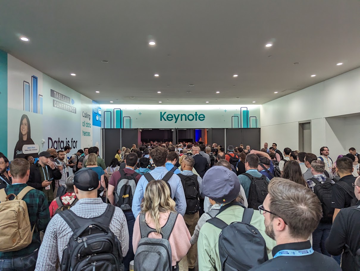
- There were large scale events that invited all 9k attendees to attend at once. These included the Keynote, Iron Viz, and Data Night Out. Each event strove for a festive, upbeat atmosphere. For example, Iron Viz was pitched as an esports event with confetti, audience noise makers, and well dressed judges.
- As a semi-introvert, these events were difficult. They were beautiful, large, but also felt intense. Not every person is a right fit for each activity at a conference like this. It is okay to watch the live stream of these from your hotel room or even quietly leave a presentation if you do not feel comfortable.
- There were hands-on training sessions and these were MAGICAL. Imagine a room with 200 people all on laptops being walked through a series of activities by experts crafted to teach new skills like geospatial analysis, advanced functions, or interdashboard interactivity. You walk away with before and after documentation as well as slides. Everything you need to replicate these new skills in a single 90 minute session.
- In line waiting for lunch, I said to a person who came from the same hands-on training as I did, that these were my favorite. Their response, “ha, yeah, they’re everyone’s favorite.” There is a reason every single one of these, that I attended, was completely full. Some sessions even had people sitting cross legged on the floor trying to learn.

What did you learn?
For someone to attend Tableau Conference 2024 and not learn anything would require a great deal of effort. I mean I was learning things in the hallway from passing conversations, let alone in the 90-minute sessions. The largest categorization of these learnings centered on the best practices of this software program. In short, Tableau Conference made me better at using Tableau.
My specific skills adopted center on the advanced hands-on-training sessions that aligned with my team’s needs. Largest was getting comfortable with geospatial analysis or quantifying and demonstrating how close or far apart items are on the earth. There was a lot to learn from advanced actions, specifically Set Actions, Parameter Actions, and Dynamic Zone Visibility, all of which allow designers to more strongly customize the data consumption experience for users. And I loved the advanced calculations class that did well to revisit how Tableau uses date functions. Most of the reports I run are within a time frame, rarely am I looking at a “lifetime report”, so understanding how syntax behind DATETRUNC() helps.
The industry knowledge was helpful too. Tableau did a great job reviewing that content here, so I will not go over each note. Huge was that the free version of Tableau can now save locally rather than storing every workbook in the Tableau Public. The rise of Tableau Pulse and its ability to integrate auto generated charts, let alone auto generated insights, is as impressive as it is needed. A product like this could change the way business occurs by lowering the time to insight, however this product also requires a baseline level of data understanding that I am not sure every organization has uniformly.

What did you learn about the Tableau conference?
Without a doubt this conference is an absolute boon for those looking to learn about Tableau. There was a wealth of information at each level and all the classes I went to felt appropriately weighted. That is, the advanced classes felt challenging and the introductory ones felt accessible. The photo above was another success–the silent session. By using high grade headphones for the hundreds of people in one large area, the conference was able to have four or five simultaneous sessions in the same large space and have no one’s experience interrupted. Brilliant!
The strength of this conference is the content and the ability to communicate that content to an audience of users that range the spectrum of data literacy. This is not surprising coming from a company whose competitive value comes from the communication of data. These two items alone are reason enough to attend this conference.
The weakness of this conference was its occasional awkwardness. Tableau made an effort to celebrate the brand ambassadors, hall of fame visualization developers, and other statuses of note. Photos of these select few were everywhere—super sized wall decals, digital signs, and even ads for the conference. It was a genuine measure of user support, but it does have a drawback.
If you do not know these people, or are new to the conference, it is hard to identify with them. In fact, this awkwardness could be viewed as exclusionary. A prime example was the keynote. At some point all these people were asked to stand up in a room with 5,000+. All 100 or so people were in a tight circle around the center stage and nowhere else. The visual of a tight knit circle gave off an exclusionary feeling and this was during a presentation that, at times, struggled with authenticity. A trend that would appear at other times as well.

What about the EMT?
On the last day of the conference, I decided to take the stairs to the ground floor. Maybe 10 steps down I lost my footing and sprained my right ankle. Thankfully I held the railing well and did not tumble down. It took maybe two minutes before Tableau’s net of event support staff helped me limp to the onsite EMT. The EMT then iced and taped my right foot as Aaron Silverman, the safety lead, coordinated my newly updated travel plans with great kindness. Whereas I cannot say that the trip home was easy, I can say the Tableau team gave me a great deal of intentional care. I hope you never have to use onsite medical services, but if you do, may they be led by someone like Aaron.
As for my final words on this conference, it is worth it. Plan for the lines, prioritize hands-on training, get solid insoles and avoid the stairs. It is my hope to go back next year and learn more.


Christopher Laubenthal focuses on better data use with visualizations in an organizational setting. He has experience in both for-profit and not-for-profit sectors where he increases literacy, grows culture, and builds data visualizations. Christopher is the Data Design Manager at The DeBruce Foundation, a national foundation whose mission is to expand pathways to economic growth and opportunity. Current projects include his public viz and The DeBruce Foundation’s Career Explorer Tools.
- Christopher Laubenthal

- Christopher Laubenthal

- Christopher Laubenthal

- Christopher Laubenthal


