
In the early 1420s, Fra Angelico, a Dominican friar and painter, completed his first large-scale work for the newly built monastery at San Domenico. The San Domenico Altarpiece is one of the Early Renaissance’s defining works and adorns the high altar where the friars once sang their hymns during the Divine Office. Last year, the altarpiece was removed for restoration and featured in a major exhibition across Florence. On the front, the polyptych depicts four haloed saints in a single unified space, each attentive to the Virgin and Child. The Virgin and Child are themselves surrounded by angels with vibrant multi-coloured wings, their feathers shifting though a prismatic palette that is particularly iconic of Fra Angelico’s work.

To look at the back of the high altarpiece, however, is to see an intricate collage of wood from various centuries. It serves as a physical record of how the work has been altered as tastes have changed over time. In the seventeenth century, carpenters recut the original panels and added new wood to force the piece into a rectangle. Beechwood inserts, shaped like butterflies, and crossbeams cover the surface, running against the natural grain. Poplar meets beechwood, intersecting in different directions. Each species moving discordantly with humidity and the passage of years.
Roberto Buda, a conservator who specialises in wooden panel paintings, spent close to nine months stabilising the altarpiece’s structure. Working with his team, he removed the existing crossbeams and butterfly-shaped inserts, replacing them with carefully matched old poplar wood infills aligned parallel to the wood’s grain. A new frame was added with conical springs that allow the wood to move naturally. “It’s a house,” Buda told the Financial Times during the restoration. “If you don’t have a good foundation, it doesn’t hold up. The painting will never look good if the support is not right.”
Months later, as I sat at my laptop placing an axis in the centre of the page, I thought again about this quote.
A deliberate transition in my career was marked in 2025. During my PhD in experimental neuroscience, I learned to do many things at once. I built hardware and software. I designed experiments. I ran those experiments, analysed the data, visualised the results, wrote papers, and taught students. Academia rewards this kind of breadth and a range of technical skills accumulates quickly. Yet, I found myself most engaged at the very end of the workflow, sitting with a dataset that had not yet been interpreted. I wanted to slow down and to look for the narrative in the data. To focus not only on results but on how those results are communicated—clearly, honestly, beautifully. In academic research, figures are often produced in haste, appended at the end of the pipeline. There is a script, a deadline, a familiar plotting function. In Python, with the visualisation library Matplotlib, you can call plt.bar(), and a chart appears. Microsoft Excel goes further still, delivering a fully formed graphic with colours and proportions chosen on your behalf. I wanted to build visualisations with greater intention and technical freedom, and this is what led me to the open source JavaScript library, D3.js.
D3 stands for Data-Driven Documents and is a low-level library which uses the full capabilities of web standards such as CSS, HTML, and SVG to build sophisticated and interactive data visualisations. While other visualisation tools hand you a bar chart or a scatterplot, to represent data in D3 you must manually calculate the scales, define the coordinate system, and bind the data to a graphical element. You must decide exactly where an axis sits and how a margin breathes, what a data point is—a circle, a path, a mark—and how it behaves when the data changes. Nothing appears unless you build it. D3 is a workshop full of raw timber and hand saws.
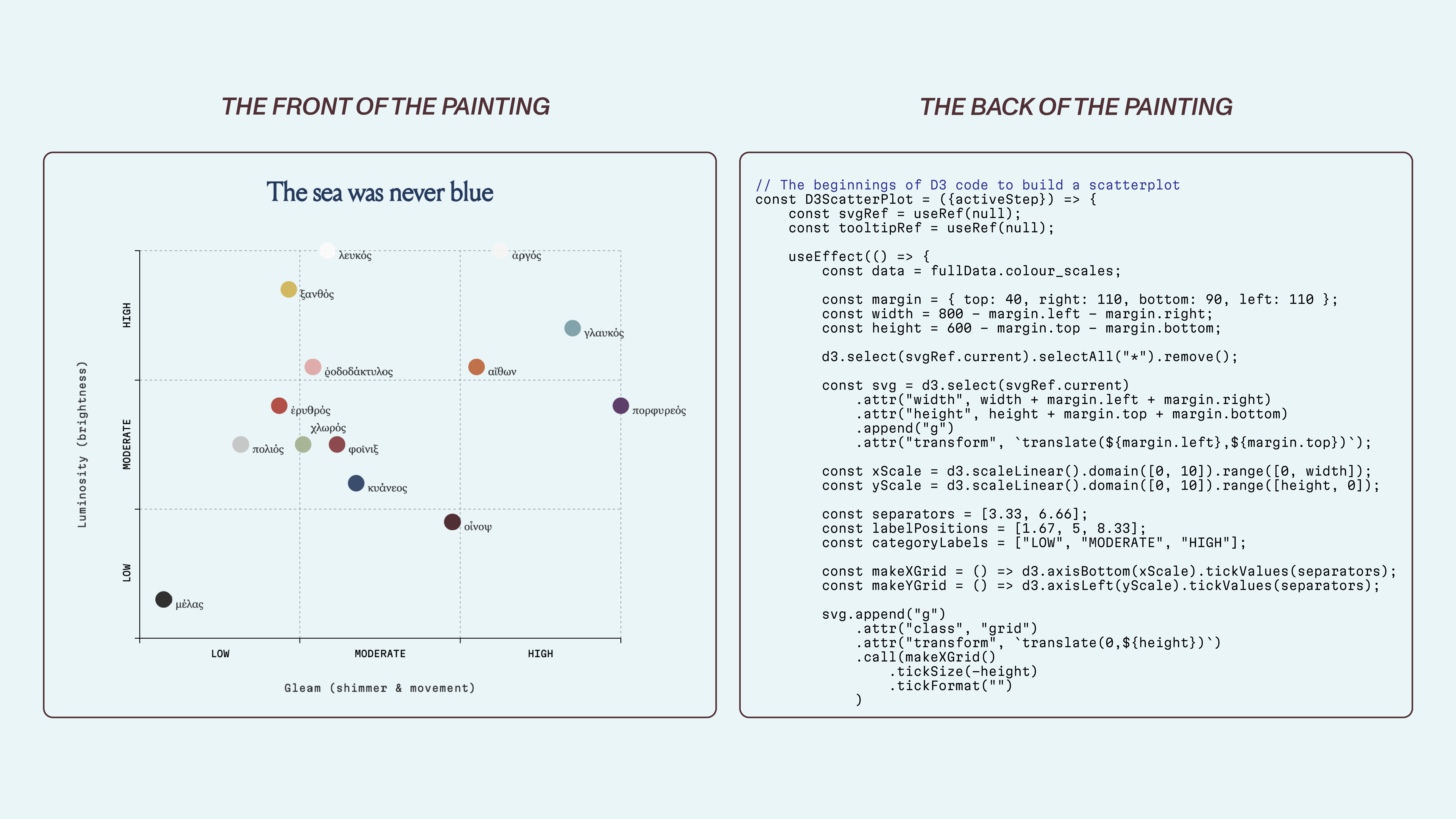
With this in mind, I applied to the Data Visualisation Society’s mentorship program, intent on learning D3. Under the guidance of my brilliant mentor, Sam Bloom, I spent ten weeks at the end of 2025 working through the library’s fundamentals and building an interactive visualisation. We focused on first principles before developing an interactive scatterplot to explore Ancient Greek colour perception. Progress was slow at first because the learning curve was steep, but as I learned to build in D3 and perform this kind of digital carpentry, visualisation began to resemble construction. Every line of code was doing structural work. Figures included in this essay show examples of the interactive scatterplot, which examines the sensory dimensions of Ancient Greek colour by focusing on the major colour adjectives used by Homer in the Iliad. The Ancient Greek experience of colour was inseparable from motion and shimmer. Colour was a basic unit of information which reflected the natural world—encoding brightness and darkness as fundamental dimensions. Greek colour terms not only prioritised luminosity but the play of light across surfaces, the texture of materials, even the social standing implied by a sheen or shade. It was a colour vocabulary rooted in their lived perception, rather than the modern hue-based categories we use today. Selected excerpts from my D3 code illustrate how each visual element is constructed, for example, the multiple lines of code required to precisely position and size tick marks along each axis. The full project can be viewed here.

When a reader encounters a clean scatterplot, they see only the front of the painting. They don’t see the scaffolding: the decisions about scale domains or the choices about what not to encode. While the interactive scatterplot I built at the end of the ten weeks was modest, I could explain why each element existed and how it related to the data. Each decision—scale, colour, interaction—could be justified. Good data visualisations often look deceptively simple. But this clarity is the result of many intentional decisions about the data and the visual design.
For example, ~90% of the charts the Financial Times publishes are bar charts or line graphs, yet because these charts adhere to a defined set of design principles, down to the very placement of the title and the subtitle, it makes the FT’s graphics some of the most recognisable in newsroom data visualisation. This coherence is maintained through meticulous style guides, which dictate everything from the weight of an axis line to the specific hex code of a categorical blue. These guides function as a visual vocabulary or grammar. Alan Smith, the FT’s Head of Visual and Data Journalism and who led the design of the FT’s visual vocabulary, has previously championed the idea that a chart should be as readable as a sentence. Alberto Cairo, a professor of visual journalism at The University of Miami, has often argued that the most important part of a visualisation is the “reasoning” that happens before the first pixel is placed. In his book, The Art of Insight, he argues that there are really no rules of data visualisation, there’s just reason. Every design choice must be a defensible, rational response to the data and the intended audience.
These ideas are not confined to style guides or theory; they are persuasive when also used for animation and interactivity in visualisation. When such principles are applied with narrative intent, even complex data can be immediately comprehensible to an audience. A widely cited example of the power of a simple but intentional use of data visualisation is Hans Rosling’s 2006 TED talk. Rosling revealed patterns in a complex dataset through an animated scatterplot in which countries appeared as circles, mapped by measures such as life expectancy (on the x-axis), countries’ GDP (on the y-axis), and population (the size of the circle). As the animation unfolds, these circles shift across the axes allowing long-term trends to emerge gradually rather than all at once. Rosling paired this animation with carefully selected narration and emphatic gestures to guide his audience to the most meaningful changes as they occurred. The result was a complex global health story made easy to understand through intentional narrative decisions and clear visual structure.

The painted surface of Fra Angelico’s altarpiece is inseparable from its support. The relationship between the painted surface, the underlying preparation, and the wooden support beneath, makes the altarpiece a three-dimensional object rather than a flat image viewed only from the front. The butterfly-shaped beechwood inserts, which were set against the direction of the grain, introduced stresses that increased the risk of cracking, jeopardising the paint layer.
A data visualisation is a three-dimensional object of logic. If the underlying structure is weak, if scales are arbitrary or axes misleading, the surface won’t stand up to scrutiny. The narrative ‘paint’ (the colour palette, the interactivity, etc) will eventually crack. For example, decisions relating to the axes scale depend on what counts as meaningful in a given context. Although it is often suggested that a y-axis should begin at zero to preserve proportional accuracy, this convention can obscure important variation when the relevant changes are small, as is often the case with climate data. A review by Steven Franconeri, professor of psychology at Northwestern University, illustrates this clearly: a temperature chart anchored at zero degrees Fahrenheit flattens visible change, while a version scaled to the relevant temperature range makes trends legible without distorting the data. A widely criticised, since-removed National Review article employed a temperature chart with a lower bound of –10 degrees Fahrenheit, a choice that made recent increases in global temperature appear negligible.
Wood is a living thing and it needs to move. Buda and his team’s addition of a new, more encompassing frame made of chestnut wood and conical springs allowed the altarpiece painting to breathe through the natural movement of the wood in different directions. I developed my D3 visualisation in tandem with the JavaScript library React. In modern web development, React acts as the frame of chestnut wood. It is often described as a library for building user interfaces, but at its core it is a way of thinking about state and change. You describe what the interface should be given certain conditions, and React takes responsibility for updating it when those conditions shift. React holds the structure and lifecycle of my visualisation and D3 handles the math: scales, layouts, transitions that respond to data.
This article is not about JavaScript, or frameworks, or even data. It is about integrity in design. It is the realisation that the most important work we do as data visualisation developers is often the work that the reader will never see. When the San Domenico Altarpiece returns to the walls of the monastery, the public will only see the Virgin and Child, resplendent and serene. They do not see the new poplar inserts running parallel to the grain or the conical springs hidden within the frame. When we design good visualisations, we are doing something similar, we are building the foundations so that the story can stand on its own. We are building houses for data. Every axis, every scale, every line of code is a poplar insert aligned to the grain.


