
Within the history of data visualisation, there have been written numerous books with rules on how to properly visualise data. When I started off in the field of data visualisation, I read many of those books to have some guidelines I could follow. At the same time, I started to dislike the rigid interpretation of some writers (and their followers). They made it seem like following the rules was the only path to proper data visualisation.
Rules for a joyless world
Goof van Winkel recently wondered:
If everyone uses the same rules, do we risk a joyless world of boring, homogeneous visualisations? — Goof van Winkel
Goof concluded that rules, because everyone interprets them differently, leave enough room for creativity. However, I’m not sure if Tufte would agree. Edward Tufte has had a major influence in data visualisation and, for that alone, he is a must-read author. However, some of his rules leave little room for interpretation. In Envisioning Information,Edward Tufte describes a couple of principles. One of those principles is ‘chartjunk:’ every chart should be stripped down to the minimum, to show just the data and nothing else. One of the chartjunk examples in his book is a well-known graphic by Nigel Holmes from Time Magazine in 1982.

Tufte proposes a corrected, stripped-down version where only the data is shown. Here is my version of what a stripped-down version could look like:

Tufte writes:
Chartjunk promoters imagine that numbers and details are boring, dull, and tedious, requiring ornament to enliven. — Edward Tufte, Envisioning Information
That probably makes me a chartjunk promoter because that looks like a joyless graph to me, even though it is easier to read the data. From a readability point of view, Tufte is right, but the original chart is a lot more memorable than the stripped-down version. Some charts do need some form of ‘ornament’ to engage an audience, especially when the audience lacks data literacy. It’s this target audience that I often miss in the equation. The rules you follow and how rigid your interpretation, really depend on who you are designing for and for what reason.
Paradoxical rules
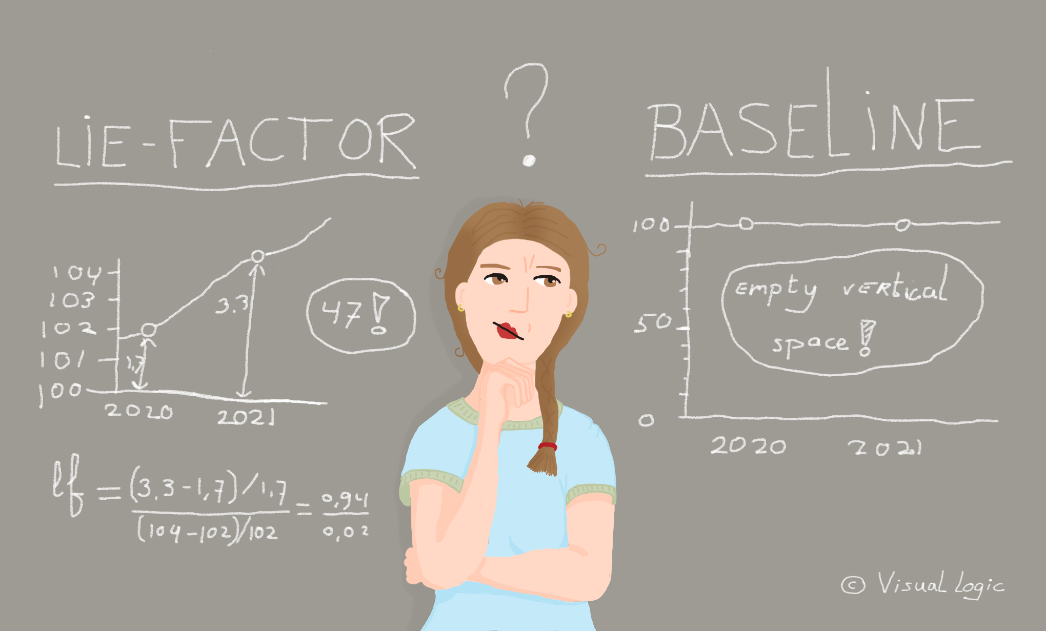
As if being devoid of joy and leaving your audience behind aren’t reasons enough, sometimes it’s even impossible to strictly follow the rules. In fact, some rules, like Tufte’s Lie Factor and Baseline Principle, are contradictory.
The Lie Factor
A more elaborate account on the Lie Factor can be found here. In a nutshell, the Lie Factor is a formula with which you can calculate if a chart is misleading:

The recommended Lie Factor should be around 1. It’s an interesting concept with useful applications. Take a look at this example from USA Today:

Most people who know their dataviz rules see that this chart has a truncated y-axis, which is known to exaggerate change. The amount of welfare people have received seems to have increased enormously. The Lie Factor supplies us with an objective measure to show that, in reality, this change is much less dramatic. Consider the images below: the chart on the left contains a corrected version with a Lie Factor of 1, while the chart on the right reflects the original version with a Lie Factor of 16.08.

Now that I have measured the ‘lie,’ I can conclude that the demonstrated increase in received federal welfare is grossly overestimated in this chart.
But, what if I turned this viz into a line chart, a common representation for time series?

The Lie Factor is the same, but somehow the corrected version on the left seems a bit off. That’s where the Baseline Principle comes in.
The Baseline Principle
How should you visualise a change in the data that is relevant, but barely visible when you visualise it? If you rigidly stick to the Lie Factor rule, you are not allowed to show this change by truncating your y-axis. Luckily, Tufte addresses this on his website:
In general, in a time series, use a baseline that shows the data, not the zero point. […] don’t spend a lot of empty vertical space trying to reach down to the zero point at the cost of hiding what is going on in the data line itself.— Edward Tufte
Let’s look at another example to show why this Baseline Principle is important, using this line chart of the average annual global temperature:

This chart has a Lie Factor of around 110, while it should be around 1. This chart ‘lies’ according to Tufte’s Lie Factor. Is this line chart really that misleading? According to Steven Hayward, it is. Hayward is an American author and political commentator. In 2015 he criticised these types of global temperature line charts for not starting at zero. He published a corrected version, accompanied by his view that global warming is a hoax:

If you calculate the Lie Factor for both charts you can see that Steven Hayward is under representing the change a little as well, but compared to the Lie Factor of the original graph, his version is a lot closer to the desired 1.

Following Tufte’s Lie Factor, Steven Hayward is right for criticising the line chart. His flat corrected chart, where global warming is barely visible, should be preferred. Still, I dare to say, the graph on the left shows the data more appropriately than the corrected version. Although it’s a small change of just a couple of degrees, it’s an extremely relevant change considering the subject matter. This change should be visible, not hidden because of a rigid rule that a vertical axis should start at zero. Furthermore, there are cases where the zero point is somewhat arbitrary, like temperature. A graph with the same data in Celsius or Fahrenheit would look different just because the zero points of these measuring systems differ. Sometimes it just doesn’t make sense to start at zero.
But wait, what about the Lie Factor that was sky high? You now have a Baseline Principle and a Lie Factor that can’t both be right for this chart. Is there’s a way to reconcile the two? Or maybe the Lie Factor does not apply for time series? There was a time when I tried to solve this paradox by allowing it for line charts, but not for bar charts or area charts. For the latter two, you fill the area below and with that, you visually imply a baseline at the bottom, where the fill ends. In those cases a zero baseline seems necessary. In the Federal Welfare example, although the Lie Factor is off for both charts, for the line chart that would be okay, while for the bar chart it would be misleading:

However, what both charts show is still quite similar: there was a sizable increase in the amount of federal welfare that was received. In other words, is the bar chart really more misleading than the line chart? Some argue that line chart should have a zero baseline when there is a ratio scale (where 0 means that there is a total absence of the variable you are measuring). However, that could still lead to the undesirable situation where relevant change is hidden because of these rigid rules.
Another solution I came up with is to treat it like a spectrum with the Lie Factor in one hand and the Baseline in the other hand. Every designer should decide how much they can deviate from the Lie Factor to justify a Baseline not starting at zero and the other way around.
But maybe I shouldn’t try to solve this paradox at all. It exists in the first place because I am trying to follow these rules to the letter. Rules are only useful when you use them with the applications for which they were invented. The Lie Factor was developed to show data in proportion and to prevent distortion by manipulating axes. The idea behind the Baseline Principle is that relevant change should be visible, when you are showing change over time, for instance. Look at the data, the context of the data, and your target audience to determine what rules might be most relevant. And feel free to ignore rules altogether if you find a better way to represent the story in the data.
Unfortunately this won’t help you in a discussion with Steven Hayward, because he can argue he followed Tufte’s rule. Fair warning: if you break the rules yourself, it might lead to criticism. However, it will help you to become a better designer, consider the rules, and be able to justify or defend your choices. It is our job as data visualisation designers to tell the stories that are in the data, show them in context, and engage our audiences. In fact, I encourage you to use a pie-chart once in a while, add some chartjunk if that helps to engage your audience, and even truncate a y-axis to show relevant change if you dare.
- Hilje de Boer


