
tl;dr: After teaching many data professionals about bullet graphs and using them in many dashboards, I started to notice that they had a fair number of downsides. A few years ago, I started using an alternative called “action dots” that, I believe, are more informative, easier to understand, faster to visually scan, more compact, easier to implement, and don’t have any of the downsides of bullet graphs.
Since you decided to read this article, you probably already know what a bullet graph is, but, if you don’t, here’s a good introduction and a simple diagram of how one works:

The main purpose of a bullet graph is to help dashboard users figure out how they should feel about a given value on a dashboard. Should they be pleased with that value or concerned about it? Or is it in a normal range, requiring no attention? By comparing the end of the central bar with the Poor, Satisfactory, and Good shaded areas behind the bar, users can answer those basic questions for all the metrics on a dashboard:

Adding this contextual information to metrics on a dashboard is important—perhaps even essential—because, for most metrics, users don’t have enough background knowledge to know whether they should consider the metric’s current value to be good or bad. A user might have enough background knowledge to evaluate some of the metrics on a dashboard, but the others will be largely meaningless numbers without the context that bullet graphs provide.
Bullet graphs were invented by Stephen Few in 2005 and I clearly remember the first time I saw one in one of Steve’s workshops in 2013. It blew me away. So much information… in such a small space! Unsurprisingly, they’ve become quite popular since.
I ended up being fortunate enough to teach Steve’s courses from 2014 until Steve retired from teaching in 2019, at which point I started developing my own courses. While teaching Steve’s Information Dashboard Design course, I taught many data professionals about bullet graphs. After a while, though, both workshop participants and I started to notice that they had a fair number of downsides (bullet graphs, not workshop participants 🙂 ). When I sat down and listed them all, I realized that bullet graphs had at least 11 significant downsides (see list below), and I began to wonder if there might be an alternative.
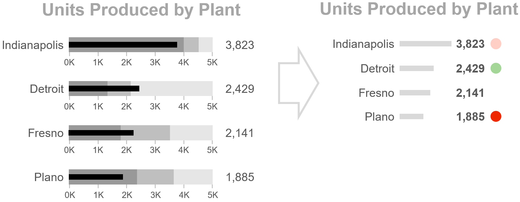
After futzing around with a variety of concepts, I ended up with an alternative that I call “action dots” that, I think, doesn’t have any of the downsides of bullet graphs. Here’s the same sample CEO dashboard using action dots instead of bullet graphs:

The color of each action dot is determined based on four threshold values that must be set for each metric on the dashboard:

The four thresholds are probably self-explanatory, but here’s a more detailed description if you want to know more.
What, exactly, are the 11 downsides of bullet graphs that I think action dots avoid? You can probably spot several already based on the sample dashboards above, but let’s step through them one at a time, beginning with the fact that…
1. Bullet graphs don’t make problematic metrics “pop out” so they can be easy to miss.
Have a look at the bullet graph version of the CEO dashboard above and try to quickly spot which metrics require attention (i.e., are in the Poor range). Sure, you can do it, but it probably felt slow and effortful.
The underlying problem is that a bullet graph with a current value that’s in the Satisfactory range still has a lot going on visually, since it always shows all three background shaded areas, even though that metric requires no attention. This makes it hard for metrics that actually do require attention to stand out in the crowd, increasing the risk that dashboard users will fail to notice those problematic metrics. This is why dashboard designers often feel the need to add alert icons to bullet graphs with values that are in the “Poor” range, i.e., to make sure that dashboard users actually notice those problematic values:
Now, try to spot the metrics that require attention in the action dot version of the same dashboard:

On dashboards with action dots, problematic metrics “pop out” because metrics that don’t require attention don’t have any alert indicator graphics at all (no shaded areas, no dots, etc.), so they don’t visually compete with metrics that do require attention. Action dots essentially are alert icons, just a much more informative version than simple “flag if poor” icons.
2. Bullet graphs don’t show crises.
Have a look at the two bullet graphs below. Which one looks like it requires attention more urgently?

While both metrics are performing poorly, it looks like Net Burn Rate requires attention more urgently because its central bar is deeper in the “Poor” range. As it turns out, though, we don’t consider Net Burn Rate to be in crisis unless it drops below four months, so its current value of eight months requires some kind of action, but it’s certainly not a crisis. For Working Capital, though, anything below $4M is a crisis, so its current value of $3.7M is a massive problem that requires immediate action. The bullet graphs, however, made it look like Net Burn Rate required attention more urgently than Working Capital. The underlying problem here is that the “crisis” point for a metric can be anywhere in the “Poor” range, but, in a bullet graph, the crisis point isn’t shown.
In a bullet graph, then, it’s difficult or impossible to tell the difference between a metric that’s “a little worse than Satisfactory” and a metric that’s an all-hands-on-deck crisis that requires immediate action. Ultimately, this makes it difficult or impossible for dashboard users to figure out which metrics to focus on first when multiple metrics are in the “Poor” range on a dashboard of bullet graphs.
Similarly, bullet graphs make it difficult or impossible to tell the difference between metrics that are doing “a little better than Satisfactory” and metrics that are knocking it completely out of the park because the “knocking it out of the park” point could be anywhere in the “Good” range.
Action dots, on the other hand, make crises very noticeable (dark red dots), and crises are visually distinct from metrics that are just bad enough to require some kind of action (light red dots). Metrics that are doing just well enough to require action (light green dots) also look different from those that are knocking it out of the park (dark green dots). Ultimately, this allows users to zero in on the metrics on a dashboard that require attention most urgently much more quickly and reliably.
3. Bullet graphs have a bit of a learning curve.
Most audiences won’t immediately grasp how to read a bullet graph and will require some training. That certainly isn’t a dealbreaker and there are plenty of other useful chart types that also require training to read (scatter plots, histograms, etc.), but, as a general rule, the less training that a chart type requires, the better.
Action dots, on the other hand, require essentially zero training. When presented with a dashboard with action dots, most audiences will (correctly) guess that red dots are bad, dark red dots are worse, green dots are good, dark green dots are better, and metrics with no dot probably don’t require attention. They may have questions about how the dot colors were determined, but users won’t require much training to learn how to read them, if any.
4. Dashboards of bullet graphs are a bit slow to visually scan.
Even when the user knows how to read a bullet graph, the central bar in each bullet graph must be compared with its three background shaded areas, one bullet graph at a time, to determine how much attention that metric requires. Yes, this only takes about a second for each bullet graph, but those seconds add up on dashboards with many bullet graphs, especially when each bullet graph has different “Good/Satisfactory/Poor” ranges, which is the case for the second and third columns in my sample CEO dashboard:

Reading the color of an action dot requires considerably less time than comparing a bar with three shaded background ranges, allowing an entire dashboard of action dots to be scanned in as little as one second.
5. Dashboards of bullet graphs can be visually busy.
There are a lot of graphical elements in a bullet graph: The three shaded areas, the quantitative scale, and maybe a “target” or “previous period” marker or two. On a dashboard with many bullet graphs on it, that many graphical elements can be a bit overwhelming.
Dashboards with action dots contain far fewer graphical elements and so they aren’t as visually overwhelming. This also means that more metrics can be included on a dashboard before it starts to look like “too much.”
6. Bullet graphs don’t work well with sets of metrics that aren’t directly comparable.
A stack of bullet graphs is basically an enhanced bar chart, allowing the user to quickly compare the current values of a set of metrics by comparing the lengths of their bars:

This works fine as long as the metrics in a stack of bullet graphs are all directly comparable. That’s the case for the first two columns of bullet graphs on my sample CEO dashboard, but have a closer look at the third column of bullet graphs. That column consists of a variety of different KPIs that should not be directly compared with one another, e.g., the value for Defect Rate should not be directly compared with the value for Return Rate:

The whole point of a bar chart is to allow values to be compared with one another based on bar lengths, though, so using a bar chart (i.e., a stack of bullet graphs) to show a set of values that should not be directly compared can be confusing and may even cause dashboard users to come to nonsensical conclusions about the data.
The obvious solution would be to not show bars for sets of values that aren’t directly comparable and just show those values as a list. We can’t do that with bullet graphs, though, since the bars must be shown in order to show the background range in which the current value falls.
Action dots, on the other hand, don’t require bars to be shown for sets of metrics that aren’t directly comparable:

7. Bullet graphs get more complicated when higher numbers are LESS desirable.
For many metrics, higher numbers are more desirable (Revenue, Employee Satisfaction, etc.), but, for some metrics, lower numbers are more desirable (Accident Rate, Expenses, etc.). The standard bullet graph design doesn’t work for these metrics, because, if the metric’s value increases, it would look like it’s improving when it’s actually getting worse. The standard bullet graph design must be adapted, then, when showing these “lower is better” metrics, and there are two ways to do this:

Both of these design variants force users to a) notice that the bullet graph in question is different than a standard one, b) figure out what that different design means, and c) “change perceptual gears” when they encounter a flipped bullet graph within a column of standard (non-flipped) bullet graphs. Dashboard users can certainly do these things, but they’re cognitively cumbersome.
When showing action dots for a “lower is better” metric such as Expenses, the order of the four thresholds must also be flipped:

Unlike bullet graphs, though, this flipping is transparent to dashboard users; it happens behind the scenes. From the user’s perspective, all metrics still just get redder as they become more problematic, regardless of whether they’re “higher is better” or “lower is better”. The user doesn’t need to learn a new graph variant or change perceptual gears when they encounter a “lower is better” metric on a dashboard with action dots; they can still just scan for red and green dots.
8. Bullet graphs get more complicated with “Goldilocks” metrics.
Some metrics have an ideal range and drifting either above or below that ideal range is undesirable. For example, we always want “Employee Headcount % Deviation from Plan” to be as close to 0 percent as possible, i.e., we don’t want our organization to have too few employees or too many. I call these kinds of metrics “Goldilocks” metrics since we want the current value to be not too hot and not too cold, juuust right 🙂
The standard bullet graph design doesn’t work for Goldilocks metrics, so yet another design variant is needed:

Again, users can read a bullet graph like this, but they have to notice that it’s different, learn how to read it, and change perceptual gears when they encounter it in a stack of standard bullet graphs.
On a dashboard with action dots, the way to determine the dot color for Goldilocks metrics must also be adapted, but, again, this adaptation happens behind the scenes and is transparent to users:

Users can still just scan for red and green dots on the dashboard and don’t need to worry about whether metrics are “higher is better,” “lower is better,” or “Goldilocks.”
9. Bullet graphs get more complicated for “narrow Satisfactory range” metrics.
For some metrics, the Satisfactory range can be very narrow, which can make it difficult to see in which range the end of the central bar falls:

In these situations, yet another bullet graph variant is needed. This variant replaces the bar with a marker symbol, allowing the quantitative scale to start at something other than zero and allowing the Satisfactory range to be wide enough to be clearly visible:

So, users need to learn yet another graph variant and change perceptual gears when they encounter that variant in a stack of standard bullet graphs.
For action dots, the four thresholds can be set very narrowly without requiring a new chart variant:

As usual, users just scan for red and green dots on the dashboard and don’t need to worry about different types of metrics.
The preceding three differences between bullet graphs and action dots explain why the third column in the CEO dashboard is so much easier to read as action dots than as bullet graphs:

In practice, of course, most dashboards contain a mix of different types of metrics, so having a mix of different bullet graph variants on the same dashboard isn’t unusual.
10. Bullet graphs get more complicated when there are several reasons why a metric may require attention.
Say we’re a public company and we want to show our current revenue in a bullet graph on a dashboard. Our current revenue is above our internal target (which is good), but below Wall Street’s expectations (which is bad), and above the previous quarter (which is good). To show all this contextual information in a bullet graph, we’d need to use different marker symbols:

Especially on a dashboard with lots of different measures, having multiple marker symbols could get visually complicated.
With action dots, however, multiple dots can be “stacked” to indicate metrics that require attention for multiple reasons:

Not only is this visually simpler than showing multiple marker symbols, but it also has the added benefit of drawing more visual attention to metrics that require attention for multiple reasons (i.e., that have multiple action dots), which is what we want to happen.
11. The three ranges in bullet graphs are ambiguous.
In bullet graphs, the three shaded areas usually represent “Good,” “Satisfactory,” and “Poor.” You probably haven’t devoted much thought to what these terms actually mean, but it’s worth thinking about them for a moment.
Everyone generally agrees that Good is better than Satisfactory, which, in turn, is better than Poor. At what point, exactly, does a metric cease to be “Satisfactory” and become “Good,” though? Similarly, what, exactly, does “Poor” mean? A minor problem? A crisis? The point at which I lose my bonus? Different people can—and usually will—interpret these terms differently, which can cause obvious problems when it comes to interpreting bullet graphs on a dashboard.
The four thresholds on which action dots are based have specific, unambiguous definitions, which avoid the ambiguity of Good, Satisfactory, and Poor:
- Crisis: The point at which improving this metric would become the user’s top and possibly only priority
- Actionably Bad: Just bad enough that the user would actually do something about this metric
- Actionably Good: Just good enough that the user would actually do something about this metric
- Best Case: The best the user thinks this metric could realistically get
Now, different users may disagree on the point at which a given metric becomes, for example, “Actionably Bad,” but at least they won’t disagree on what “Actionably Bad” actually means, which is an improvement over an ambiguous term like “Poor.”
Do action dots have any DISadvantages compared with bullet graphs?
There are few concerns that people occasionally raise when they see action dots for the first time in my Practical Dashboards course. While I don’t think that these are disadvantages relative to bullet graphs, you can, of course, decide for yourself:
“Action dots don’t communicate as much information as bullet graphs.”
While bullet graphs certainly look more information dense than action dots, I think they actually communicate less information. As we saw earlier, bullet graphs don’t communicate the difference between “a bit worse than satisfactory” and “crisis,” or between “a bit better than satisfactory,” and “knocking it out of the park,” but action dots do communicate that crucial information.
Now, it is true that action dots don’t allow dashboard users to see where the individual thresholds for a metric are, but the question is, does that matter? The main reason to have thresholds in the first place is to determine when to flag metrics that require attention, so users probably won’t need to know exactly what those thresholds are very often. If, for some reason, they do need to see exactly where the thresholds are, they could be shown in an on-demand tooltip, something like this:

Since the actual threshold values probably won’t be needed very often by users, it doesn’t really make sense to clutter up a dashboard by showing them for all metrics all the time, and probably makes more sense to only show them on demand, i.e., as tooltips.
“Action dots don’t show where a metric’s value is within its ‘Satisfactory’ or ‘No action required’ range.”
That’s true, but, again, does that matter? If a metric requires no action, does it really matter where, exactly, it falls within its “No action required” range? If that did matter to a user, it suggests that the “Actionably Bad” and “Actionably Good” thresholds for the metric in question are too far apart and should be narrowed a bit.
If the tooltip solution mentioned above were implemented on a dashboard, users would be able to see where a metric’s current value falls within its “No action required” range by hovering their cursor over it to see a line chart of that metric.
“It’s hard to distinguish between dots with subtly different shades of red or green.”
That’s true, but users don’t need to do that in order for action dots to be useful. The reason why action dots have different shades of red is to allow users to distinguish between minor problems, major problems, and crises. Users don’t need to distinguish between many subtly different shades of red to do that; indeed, action dots work just fine if they only use three or four shades of red and three or four shades of green. In fact, that’s what I recommend in my workshops since additional intermediate color shades add virtually no value.
“Action dots don’t work for users with colorblindness.”
It’s true that people with the most common forms of color vision deficiency (CVD) may have trouble telling red and green apart, which would obviously be a problem for any dashboard that uses red and green indicators. Switching to a CVD-friendly color palette such as orange-blue solves this problem, though, and is generally pretty easy to implement as an optional dashboard setting that can be selected by users with CVD:

“Action dots require four thresholds to be set for each metric, instead of just two for bullet graphs.”
That’s also true, but the four thresholds have specific, unambiguous definitions and more closely resemble how people think about metrics in the real world. That’s probably why, in my experience, users find it easier to choose “Crisis/Actionably Bad/Actionably Good/Best Case” thresholds than to choose “Good/Satisfactory/Poor” ranges.
If you can spot any disadvantages of action dots that I didn’t mention, though, let me know! (Please!) I’m easy to find on Twitter or LinkedIn.
Believe it or not, I think there are still…
A few other advantages of action dots over bullet graphs
Action dots are more compact than bullet graphs, so more metrics can be shown in the same space.
In the sample CEO dashboards above, the “metrics section” (everything except the dashboard title and column headings) of the bullet graph dashboard requires over twice as much space as the metrics section of the action dot version of the same dashboard. This means that, with action dots, roughly twice as many metrics can be shown in the same space without resorting to smaller text sizes.
Action dots are easier to implement.
While tutorials are available for creating bullet graphs in most dashboard software products, they can require some “hacking.” On the other hand, virtually all dashboard software products can be easily configured to conditionally show different colored dots.
Action dots are more versatile.
Action dots can be used with virtually any chart type, not just bar charts:

Using dots for all charts on a dashboard also makes it easy to scan for problems on dashboards that contain different chart types.
Features that bullet graphs and action dots both support
There are some features that both bullet graphs and action dots support equally well and so aren’t advantages for one design or the other:
Showing marker symbols for targets, previous periods, etc.
Both bullet graphs and action dots support adding marker symbols for indicating comparison values like targets, previous periods, etc.:

Now, I should mention that I don’t think that single-value targets are a good idea, and I also think that comparing the current value to a previous period is often misleading. You can, however, include these as marker symbols on either bullet graphs or action dots if you choose to do so.
Showing trends
Both bullet graphs and action dots can be paired with sparklines to show the historical trend of a metric leading up to its current value:

Switching to vertical
Both bullet graphs and action dots can be arranged vertically or horizontally:

Final thoughts
I want to be clear that I’m not suggesting that bullet graphs are a bad chart type or that they’re not useful. They were a huge step forward when Steve invented them. The question that I’ve set out to answer in this article is whether bullet graphs are ever more useful than action dots. I think it’s also important to mention that action dots would never have occurred to me if Steve hadn’t come up with bullet graphs first. The idea of including context for a metric within a small visualization is Steve’s, not mine, and the thinking behind action dots is similar to bullet graphs.
Finally, please pipe up if anything in this article doesn’t jibe with you! Are there any advantages of bullet graphs or disadvantages of action dots that I didn’t mention? Ping me on Twitter or LinkedIn! I’d love to hear any questions or concerns about anything that I’ve written here.

As an independent educator and author, Nick Desbarats has taught data visualization and information dashboard design to thousands of professionals in over a dozen countries at organizations such as NASA, Bloomberg, The Central Bank of Tanzania, Visa, The United Nations, Yale University, Shopify, and the IRS, among many others. Nick is the first and only educator to be authorized by Stephen Few to teach his foundational data visualization and dashboard design courses, which he taught from 2014 until launching his own courses in 2019. His first book, Practical Charts, was published in 2023 and is an Amazon #1 Top New Release.
Information on Nick's upcoming training workshops and books can be found at https://www.practicalreporting.com/
- Nick Desbarats

- Nick Desbarats

- Nick Desbarats

- Nick Desbarats


