
We don’t know whether you have noticed, but there are many phrases we casually let loose that cry out for visualisation. Or, at least, an experience of some kind. The phrase “winds of change”—re-injected into our collective consciousness by the rock band Scorpions at the fall of the Berlin Wall—could be an example. “In a nutshell” could be another; “chain of thoughts,” another still. We admit these are meant to be metaphorical, but our obsession with the literal ensures a visualisation itch never fully dissipates. Even the most incurious of us could query: could we feel that “wind” against our face? Or see that “nut” whose “shell” does the covering? Or touch the “chain” that binds the thought pieces? With a little effort, we can conjure up tools that address these examples, and, as it does frequently, nature supplies inspiration.


Figure 1: (a) left: a solitary tree standing erect on a sunny day, (b) middle: a solitary tree swayed on a windy day, (c) right: a collection of trees on the same windy day
On our way to the university, we go past trees shown in Figures 1b and 1c. The other—featured in Figure 1a—was one one of us found while hiking in the high Himalayas. What differences do you spot? It is these differences—the way they stand (some ramrod straight, some swayed; some on their own, some along with friends) or the backdrops against which they are set (one was a bright, sunny day, the other gloomier in contrast) that could, if we are willing to notice, point to memorable peculiarities in more serious settings, such as creating a time plot. Tasked with depicting the evolution of variables, modern analysts’ default gravitation is towards line diagrams shown in Figure 2. The (fractal) trees we propose, by winning you out of that culture-based addiction which becomes tedious far too quickly, help you focus on the contrasts between two phases—adjoining or not—of the evolution, and retain that observation far more solidly.
Winds that whisper degrees of change
What are we offering? A platform on which the interaction between two phases in a time series may be staged through a tree. This tree is made using properties of both phases. The extent to which one phase is different from the other is shown by the way the tree sways. And the force that is doing the swaying—possibly a gust of wind—is suggested through the amount of leaves that get torn away. The backdrop expresses the storm that triggers this wind. And all this, collectively, showcasing action, lets readers feel the amount of difference between the two phases examined and the “winds of change” that are responsible, against their faces.

Figure 2: Time series showing usage of common idioms over the years. Structural breaks are marked by vertical separators. A tree is planted (in Fig. 3 below) at a “present”: a place where one phase ends and another begins. In general, these phases need not be separated by change-points.
To underscore a comic and impish possibility, we choose to demonstrate all this through n-grams made out of idioms involving “winds” or “change”. Please see Figure 2, but the methods apply just as well to any other time series. These are (scaled) numbers of times these phrases were deployed in books and media over the years. The task at hand could be comparing how the usage has changed over two sections of history. Some structural breaks are expected, that is, some upticks can be explained: the rise in “the winds of change” around 1990 correspond to Scorpions’ release of the song commemorating the fall of the Berlin Wall, the one in “blowing in the wind” to Bob Dylan’s one around 1963, the one in “candle the wind” to Elton John’s 1997 rendition, in loving memory of Princess Diana. There are weird people—and you are in the clutches of two of them—who nitpick endlessly on where these break points should be. We will spare you the technical details for now, but there is mathematical backing behind the vertical separators you see on Figure 2. Although the phases to compare need not be defined by change points, we choose two such phases to bring out the differences most glaringly. So, for us, the pre-change phase is 1975 – 1988 and the post-change one 1989 – 2000.


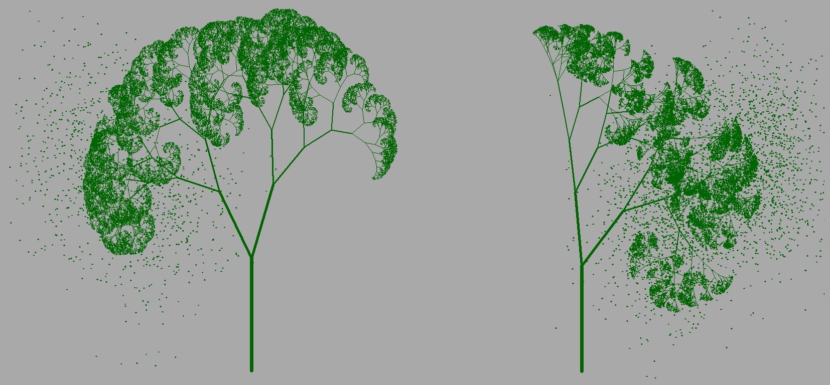
Figure 3: trees showing how the pre-change phase (1975-1988, on the left) clashes with the post-change phase (1989-2000, on the right) for (a) left: “winds of change” and (b) right: “blowing in the wind”.
The intent is to construct a tree that, through its very presence, would narrate both the extent and the type of shift a time series went through as it transitioned from the pre-change to the post-change phase. The placement of the tree would point out an imaginary present that would create a past-future split. Every shift in the ongoing intensity of idiom-usage may be thought to be caused by a breeze flowing from the region of higher intensity to the region of lower intensity, making the tree sway in the direction of its movement. How much the tree would sway depends on how strong the wind.
A look at the first natural tree (Figure 1a), for instance, would suggest the absence of a wind, making the past and the future this tree was trying to separate, more or less equal, in properties. In contrast, the second natural tree (Figure 1b) would suggest a strong wind blowing from its left, or the past, implying a higher intensity on the pre-change phase as opposed to the post-change one. In our n-gram examples, the average usage of an idiom over a period may serve as its intensity. These are marked for “winds of change” and “blowing in the wind” on Figure 2. For both those cases, if we focus on 1988, the post-change intensity was more dominant. This is why both the resulting trees in Figure 3 sway to the left under the influence of winds blowing from the right. The post/pre-change intensity ratio guides the way the trees grow. If this ratio is more than one, the twigs twist to the left, giving off the impression of a breeze blowing from the right. If the ratio is extremely more than one, the twigs twist quite a lot. Similarly, they twist to the right in case the ratio is less than one. For instance, for “winds of change,” this ratio is 2782/1764 = 1.577 while for “blowing in the wind”, it is 999/618 = 1.616. “Blowing in the wind”, therefore, endured the bigger change, as shown by tree 3b, through its stronger tilt to the left, in comparison to 3a. Regardless of the type of wind blowing, the trees, through their structures, can reveal fluctuations among the numbers in each phase. In case the fluctuations are similar—such as for “winds of change”: 361/249 = 1.449, Figure 3a—a twig, at each point of split, will not deviate too much from its sibling, suggesting an overall solidity, condensing the similarity of variation among the pre- and post-change values. In case the fluctuations are different—such as for “blowing in the wind”: 237/109 = 2.174, Figure 3b, the deviations will be more, suggesting a structural instability, or a flexibility, representing the unsureness the tree has, in deciding how to sway.
These trees, and their positioning, therefore, arrest drifts over non-participatory or uncontrollable time domains, freezing temporal flows (Figure 2) to geographical invariables: the past fixed to their left, the future, to their right (Figure 3), making obvious, through repetitions (next section) small shifts that may go unnoticed in ordinary line diagrams.
Repetitions, refinements and absurdities
A tree could, therefore, be an apt instrument to witness first-hand both the extent and nature of turmoil phases of a time series tolerate. Once a simple tree is erected, principles of good visualisation may be deployed to better its potency. One such is the principle of repetition. The breaking up of twigs may be done many times—each time following the same rule of tilt and spread (outlined in the previous section)—to stress the large-scale or eventual impact (through the leaves at the top that these subdivisions trigger) of even small differences between two phases. Here, they lead to fractal-type self-similar structures, but in our earlier essays, we have used the same principle of repetition to amplify or make blatant minor dissimilarities unearthing non-fractal settings. Robert Fathauer, a renowned sculptor based in Mesa, Arizona, is alleged to have quipped “Humans have a huge ability to get better at complex tasks with repetition”. We have paid heed. Those interested may bring in further tweaks or other modifications. The number of repetitions may be employed to suggest the difference in the lengths of the pre- and post-change phases.


Figure 4: Tighter (i.e., slender or narrower) trees result when the pre- and post-change volatilities are similar. Even against the same background, it is possible to think of trees of varying spreads.
We can exploit the background to incorporate another piece of detail. It could be something endogenous or internal such as the extent of change (the absolute or relative differences in the pre- and post-change intensities, instead of the ratios shown in the previous section, in case the extent of tilt is not revealing enough) or something exogenous or external such as the average number of times similar phrases were used in non-English texts, providing a context or reference, in a way. The darker the background, that is, the more ominous the sky, the stronger could be the breeze blowing. Much like the gloomier day shown in Figures 1b and 1c. We have sampled, in Figure 4, situations that show how different trees can sway in different ways on days that are equally sunny or gloomy. The difference between the background sky and the foreground tree-wind combination can be highlighted through the number of leaves being torn away. The higher the friction, the more the number.


Figure 5: On absurdity. Adjacent trees are expected to experience the same environment and consequently, sway similarly, in unison. This, however, may change when one tree condenses a specific change environment for one time series, the other, for another, with the two series sharing some underlying commonality (such as a grand average magnitude of change) shown through the common background or sky.
Absurdity is valued in many ways. Edward Tufte, in his work Visual Explanation, makes reference to Mark Tansey’s 1984 painting The Myth of Depth, which shows many characters on a boat adrift amidst an ocean, while one, Jackson Pollock, walking, as if miraculously, on water, and, as if, stressing the title or the purpose behind the painting. In our context, once a sufficient definition of a background is worked out, similar phases from many different time series can be placed next to each other (much like the collection of trees in Figure 1c) against a common background triggering visual absurdities shown in Figure 5: neighbouring trees, though of potentially differing spreads or canopies, are expected to sway in the same direction much like they did on iFgure 3. This is contradicted when, even against a common backdrop (representing a pooled average change), the trees are employed to show not just differences between phases of the same series, but between pairs of corresponding phases of many.
When it comes to graphing time series, we believe it is not a failure of execution but a collapse of taste that brings an art to eclipse. The dashboards we offer showcase many alternatives, combinations and many ways of creating a tree. Each, through expressing motion, engineers a sense of reality. The backdrop changes. The sky brightens or darkens. A weak or a strong wind billows. The tree, swayed at times, however, stands resolute overall—a silent sentinel observing the switching of moods. And, faithfully, the foreground-background combination chronicles the unending skirmish between the fixed and the fugitive.
Acknowledgements
This work was supported, in part, by the Research Enhancement Grant awarded to the second author by the American Mathematical Society and the Simons Foundation for the 2024 – 2027 cycle. Bentley University’s summer research grant is also gratefully acknowledged.

Bahareh Zahirodini, MSBA, (bzahirodini@falcon.bentley.edu, zahirodiny@gmail.com is set to work as a research assistant alongside Dr. Moinak Bhaduri at the Department of Mathematical Sciences, Bentley University in Massachusetts. Her research interests lie in financial modelling with an emphasis on social issues. Bahareh served as a research and teaching assistant and as a trading room analyst at the Hughey Center for Financial Services at Bentley. Bahareh recently won the second place at the Annual NABA X Bentley Business Bowl and was chosen to join the Beta Gamma Sigma, an international business honor society (for business major students who are in the top 20% of graduates).

Moinak Bhaduri (mbhaduri@bentley.edu) is currently a tenure-line Assistant Professor at the Department of Mathematical Sciences, Bentley University in Massachusetts. His faculty page is https://faculty.bentley.edu/profile/mbhaduri Rooted in applied probability, he studies spatio-temporal Poisson processes and others such as the self-exciting Hawkes or log-Gaussian Cox processes that are natural generalisations. His primary interests include developing change-detection algorithms in systems modeled by these stochastic processes, especially through trend permutations. Moinak heads the editorial board of the NextGen column of the New England Journal of Statistics in Data Science.
-
Moinak Bhaduri

-
Moinak Bhaduri

-
Moinak Bhaduri

-
Moinak Bhaduri


