
Many Nightingale Magazine readers have expressed appreciation for our first issue cover. We’re delighted with this reception — we love it, too — but, our creative director, Julie Brunet (a.k.a. datacitron), also worked up several wonderful cover concepts that we thought you’d get a kick out of seeing!

If you happened to tune into our Fireside Chat you might remember hearing our publications director, Jason Forrest, mention that we saved cover design until the rest of the magazine was complete. We started out thinking that we wanted to use the cover as a collage of the wonderful visualizations within. As it turned out, that was harder than we thought. Our central challenge was how to select from among all the amazing work inside. We decided that making that kind of choice was in opposition to our desire to celebrate the community as a whole. Luckily, Julie had some other tricks up her sleeve!


Here, Julie tried out some treatments for our initial vision: showcasing sneak peaks of the viz inside.
The entire magazine is chock full of fun fonts. For one alternate cover concept, Julie showcased one of the coolest fonts alongside a list of all the magazine’s contributors. In this concept, she also tried out a range of masthead treatments. Initially, we were partial to the vertical treatment, but once we saw the option on the right (below), we changed our minds.


This design continues the magazine’s homage to fun fonts and highlights the list of contributors.
The next series of designs prioritized both the launch messaging and the issue’s editorial theme of “culture.” By now, we were all drawn in the direction of a clever illustration. Note the subtle, but significant, difference in the two horizontal masthead treatments. The one in the middle is just a little bit cleaner—that’s what we preferred.


In these designs, Julie focused on the magazine’s theme: culture. The idea for this approach was a fun take on Rodin’s The Thinker–the Nightingale Reader (and a cool, sci-fi font treatment)! She also introduced the “first issue” messaging.
We knew we wanted to produce a visualization of the magazine itself (a meta viz!), but due to time and resource constraints, we didn’t collect data systematically throughout the publication process. The egg chart was meant to represent the magazine’s launch, but the hard-boiled version didn’t quite land. And, eventually, Julie designed three different visualizations for inside the magazine, so we didn’t need the cover to fulfill that function.


Julie tried to address our desire for a lead viz in this treatment, as well as expressing of a new beginning with the metaphor of the egg.
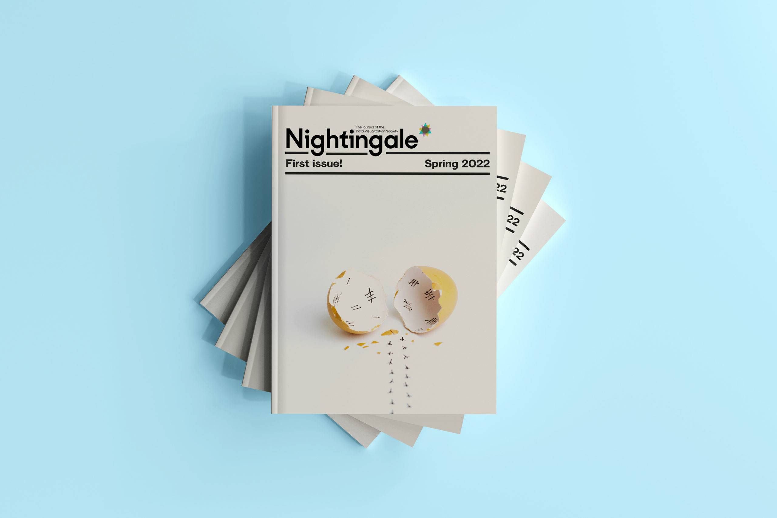
When we saw the last concept, we all knew it was the one. It perfectly communicated hatching and dataviz in a simple and clever way that made us all smile; plus, Julie was able to tie in the chick reference with a small image on the magazine’s spine. We conducted several quick surveys with folks in our immediate circles and the results were unanimous: this was the one!

During the many months of magazine production, the editorial team met every Wednesday morning (for Jason, Mary, and Claire) and evening (for Julie) to review the page designs that Julie had completed that week. These meetings were our absolute favorite part of the publication process, and we look forward to them in anticipation of Issue 2! Hopefully, this article gave you a little peak into what fun we had whenever we got to review Julie’s delightful interpretations!
And, if you haven’t ordered your copy of Issue 1 yet, you can still get yours while supplies last.

For 20 years, Mary Aviles has stewarded projects driving strategy and content, human experience, concept development, and systems change. A graduate of the University of Michigan, her work has spanned the business-to-business, health care, and nonprofit sectors. Mary is a mixed-method UX researcher at Detroit Labs and the managing editor of Nightingale. She writes about dataviz in real life (IRL) in an effort to help practitioners and "non-data" people enjoy better understanding and experiences in their shared ecosystems.
Datacitron (aka Julie Brunet) is an independent data & information designer as well as the Creative Director of Nightingale, the journal of Datavisualization Society. She believes in the accessibility of information through design and storytelling, and the virtuous role data designers can play in our society

Jason Forrest is a data visualization designer and writer living in New York City. He is the director of the Data Visualization Lab for McKinsey and Company. In addition to being on the board of directors of the Data Visualization Society, he is also the editor-in-chief of Nightingale: The Journal of the Data Visualization Society. He writes about the intersection of culture and information design and is currently working on a book about pictorial statistics.
Claire Santoro is an information designer with a passion for energy and sustainability. For 10 years, Claire has worked with governmental agencies, non-profit organizations, and higher education to accelerate climate action by communicating complex information in an engaging, approachable way. Claire holds an M.S. in environmental science from the University of Michigan.
-
Claire Santoro

-
Claire Santoro

-
Claire Santoro

-
Claire Santoro


