
This is the fifth installment of a year-long data visualization journey. If you want to read the fourth part before jumping in, here’s the article about my entertainment-themed data collection!
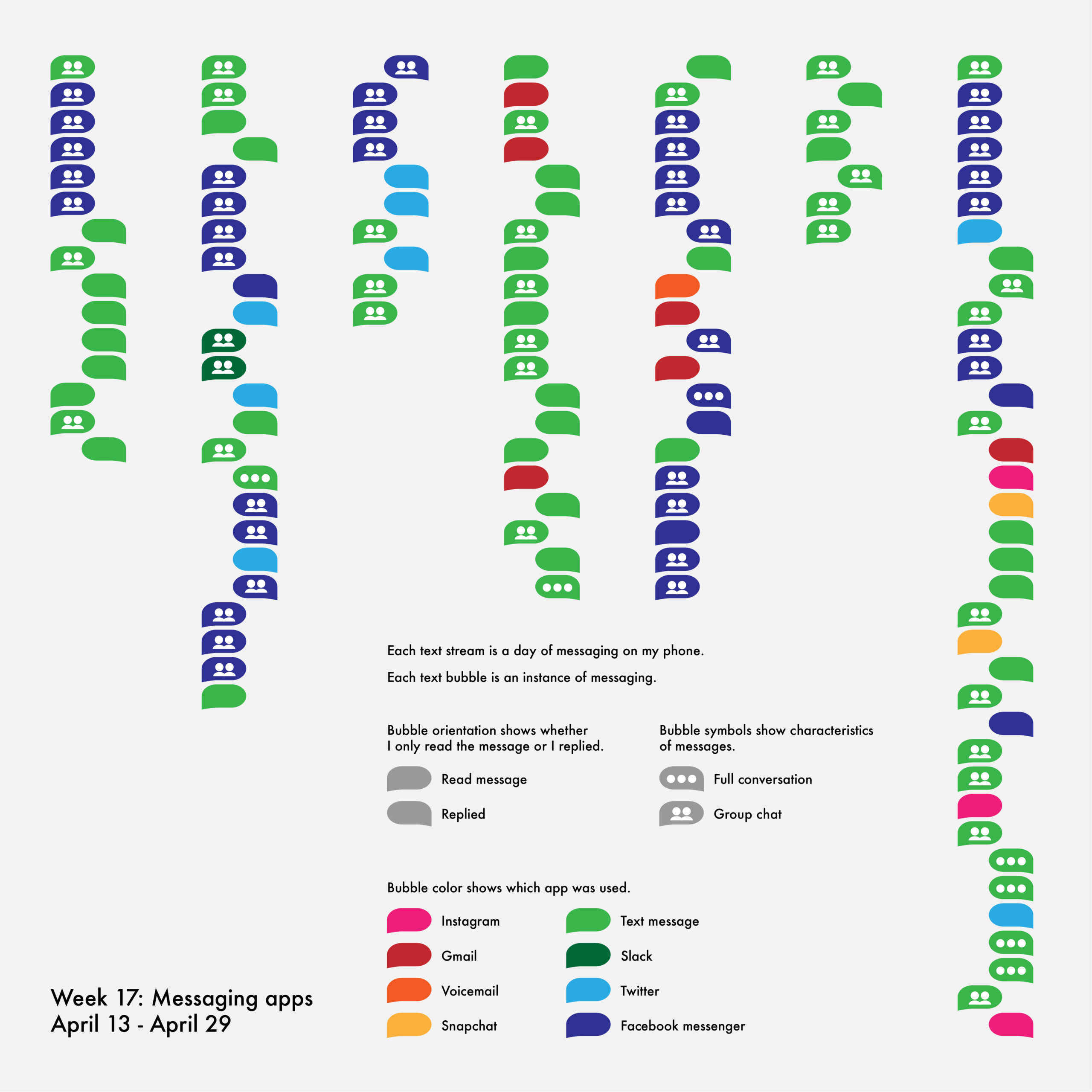
Following my entertainment data collection, I was inspired by week fifteen’s data, which tracked each time I shared entertainment media with someone else. The idea of connecting my data to my interactions with others intrigued me, so I decided to make my next four weeks communication-themed. To begin, I wanted to know how I messaged people by tracking each instance of using a messaging app.
Just looking at the visualization above, it’s immediately obvious that I do most of my messaging through texts and Facebook Messenger. This didn’t surprise me, as most of my friends communicate with me through those platforms and all of the group chats I’m in use one or the other. However, I was surprised by two other trends.
First, I respond to group chats consistently, but infrequently. Most days, I send at least one group message, but the messages I read from those groups far outnumber those that I send. Second, I seldom hold conversations via written message. This is in part because I prefer to schedule a phone or video call with people to have more in-depth discussions and shy away from doing much more than plan a time to talk via text or chat.
After collecting data connected to my phone for a week, I was eager to explore other methods of communication. For my second week of messages data, I decided to pivot to tracking my emails.

I often find myself overwhelmed by the number of emails I receive, so I expected this visualization to contain a large quantity of data. In order to show the continuous nature of emails, I decided to let each day run into the next in a snakelike form. This revealed that emails truly do not sleep; however, they do tend to be concentrated in the middle of the day, with many messages being sent and received around the lunch hour.
An unexpected revelation I had was the overall lack of email chains that I participated in throughout the week. These are shown in the visualization by the solid connecting arcs between dots. During the entire week, I only sent or received emails in nine different email chains across all three of my email accounts.
Now that I had a good idea of how and when I sent and received different types of messages from my previous two weeks of data, I was curious about the content of my messages. It seemed that there was a treasure trove of discoveries waiting to happen, but I knew I couldn’t track the content of every message. Instead, I decided to focus on one theme: gratitude.

I had no idea what to expect from this data, as I had never thought about how often I thank people before. Something that immediately jumped out at me was that I most often thank individuals instead of groups, demonstrated by the abundance of teal triangles as opposed to orange triangles. I also didn’t predict that I would need to include handwritten cards as one of the types of thank you messages I sent. Though I don’t write thank you cards often, I did send a few during this particular week because some friends and family members had sent me congratulations for my college graduation!
Despite tracking messages of gratitude for a week, I still found myself looking at the emails data I had collected. I noticed that the amount of time between responses to email chains varied widely and I was curious whether that was true for all types of messages. As a result, I decided the final week of messages data would be dedicated to tracking my response time.

When I finished this visualization, the divide in the data jumped out at me immediately. The vast majority of messages I sent were texts and I responded to nearly all of them within ten minutes. On the other hand, all but three of the emails I received took me more than an hour. This is in part because many of the emails I write have to do with professional matters, so I take my time reading and responding to them. In addition, emails sometimes include instructions to complete tasks or send documents, so that accounts for the additional response time.
All in all, during these four weeks of data collection I learned that my messaging habits are consistent, but sometimes surprising. Though I try not to enter my data collection with too many preconceived notions about the outcome, I found that my methods of communications were far different from what I had expected, with less variety and more skew toward dominant platforms and practices. I became more aware of how and how often I communicate with others and got the chance to think more deeply about what I send. I was also able to experiment with new visualization techniques, like playing with how time is represented and simplifying complicated data.
After wrapping up my exploration of messages, I’ve started collecting data for the next theme: plans. If you’re anxious for more personal data viz content, I’m updating my data collection journey weekly on my Twitter, Instagram, and TikTok, so find me there if you don’t want to wait for the articles! While I keep track of my own data for the next installment, I invite you to follow along or even try some data collection of your own and share it with someone. Until next time, stay tuned!

Emilia Ruzicka is a data journalist, researcher, and editor who recently completed their M.A. in Media, Culture, and Technology at University of Virginia. They are currently pursuing freelance projects, including a blog and travel newsletter, while they search for their next full-time position. Outside of data viz, Emilia loves to visit museums, make art, and talk about the USPS. If you have a project proposal, story tips, or want to find out more, visit emiliaruzicka.com.
- Emilia Ruzicka

- Emilia Ruzicka

- Emilia Ruzicka

- Emilia Ruzicka


