
This is the sixth installment of a year-long data visualization journey. If you want to read the fifth part before jumping in, here’s the article about my message-themed data collection!
After graduating from college at the beginning of May, there was just one thing on my mind: what I was going to do now that I was no longer a student. Because of this mindset, it seemed fitting that I collect my next set of data about plans as I tried to make sense of all the potential options ahead of me. I started with a simple prompt, writing down every time I made a plan for that day or the future that was occupying so much of my mental space as a recent graduate.
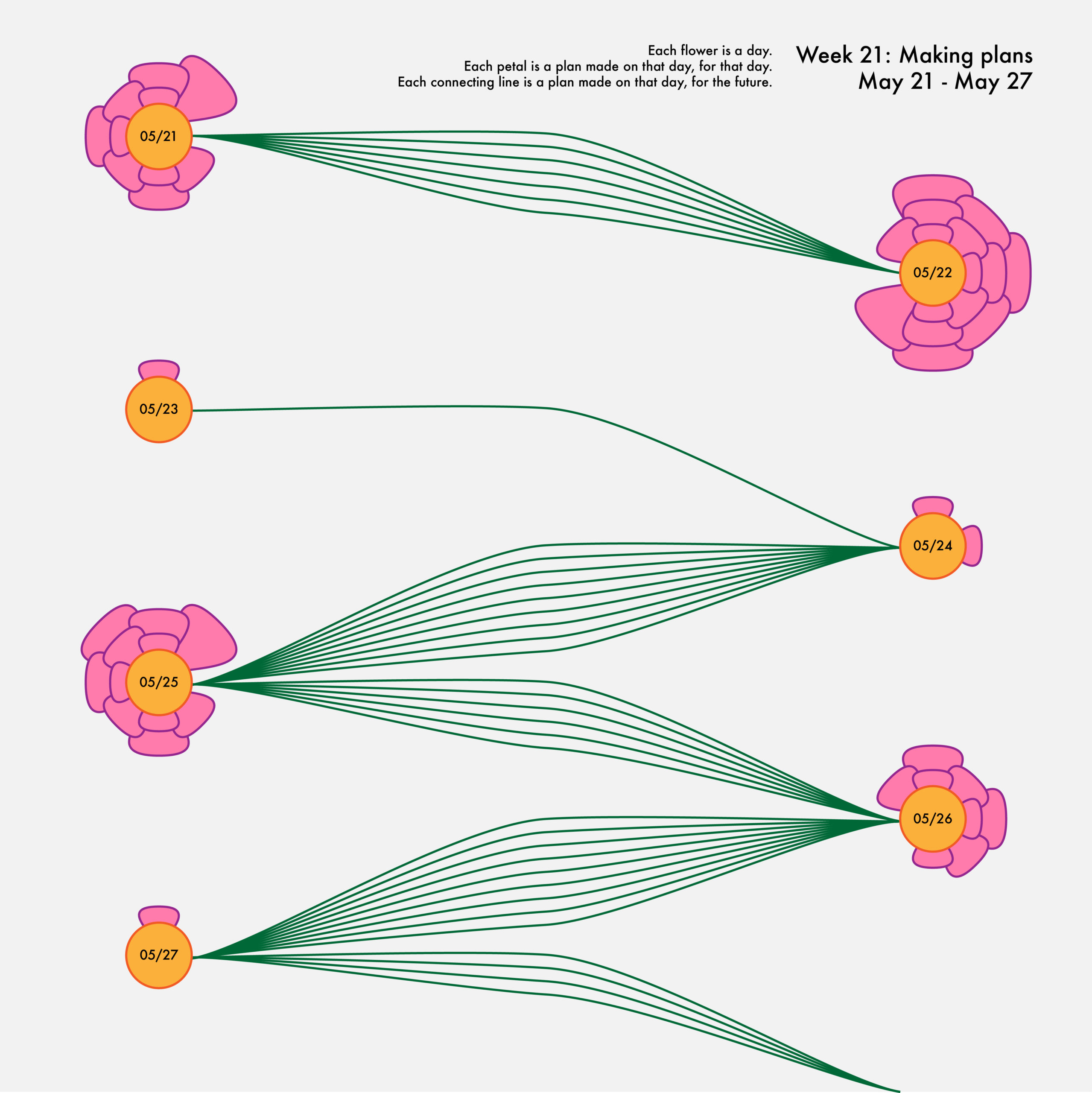
With this week 21 visualization (above), I wanted to show how plans blossom during the day as well as the flow of plans from one day to the next. As a result, I decided to create a flower-inspired design, with each bloom sprouting petals and leaves depending on the plans I made. The first trend that struck me when I finished this visualization was how many plans I actually make, especially ones that are made and executed on the same day. I anticipated having flowers with five or even eight petals, but the largest one has fifteen!
I was also surprised by how much variance there was in the number of plans I made each day. I consider my routine to be relatively consistent, so realizing that there are some days when I make fifteen plans and others when I only make one gives me a new appreciation for how much my life changes from one day to the next. However, that variance made me wonder: how many of these plans are broad in scope and how many are just day-to-day decisions?

Tracking conversations is always a challenge, but I was prepared to determine exactly what kinds of plans I was formulating throughout my week. About a month after graduation, it was no surprise that I had many discussions about important topics like finding a job, moving to a new city, and continuing to pursue personal projects. But despite the importance of those conversations, there were still many more chats about small plans, such as what to eat for dinner, which game to play with my siblings, and what movie my family should watch.
Together, these conversations made a constellation of plans, distilled into a scattered, yet beautiful dataviz. But after two weeks of seeing my planning laid out before me, I was curious about what I was doing with my less structured time.

Not surprisingly, my unplanned time was sparse; however, I was shocked at the variety of activities I did when I didn’t have a specific plan. In most spans of unplanned time I was doing four or more separate activities! These ranged from completing tasks and chores to watching a movie and hanging out with family and friends.
Although I was first struck by the number of different things I did in each chunk of unplanned time, after reflecting more I recognized that they all had something in common—nearly every one of these activities helped me relax or attend to my own needs. Because of my busy schedule, I don’t often build self care into my calendar, so it was comforting to see that I still prioritized those pursuits subconsciously.

For the final week of plans data, I decided to take a more abstract approach. Instead of documenting activities or concrete actions, I tracked how I was feeling about plans for different aspects of my life. I was encouraged to see that I ended the week equally or more optimistic about most of my plans than I was when I started the week. But I also noticed that my emotions tended to move together: if I became discouraged with one plan, I was often discouraged about all of them.
Beyond the data, I experimented with a new treatment variable in this visualization. I had never considered using opacity to show the overlap of different categories before, but demonstrating the inherent layering of my emotions made a uniquely fitting choice.
As this installment of my personal data project concludes, I’m leaving with a fresh perspective about how I organize and execute my life. It’s easy to get caught up in day-to-day doings, but seeing the broader picture and all the possibilities ahead is more important than ever as I transition into life after college. I can’t wait to see what’s in store!
Now that my plans data is officially in the books, my next set of data and visualizations about color is on the way. If you’re ready for more personal dataviz content right now, I’m updating my data collection journey weekly on my Twitter, Instagram, and TikTok, so check it out for a sneak peek before the articles! I invite you to follow along with me or even try some data collection of your own and share it with someone. Until next time, stay tuned!

Emilia Ruzicka is a data journalist, researcher, and editor who recently completed their M.A. in Media, Culture, and Technology at University of Virginia. They are currently pursuing freelance projects, including a blog and travel newsletter, while they search for their next full-time position. Outside of data viz, Emilia loves to visit museums, make art, and talk about the USPS. If you have a project proposal, story tips, or want to find out more, visit emiliaruzicka.com.
- Emilia Ruzicka

- Emilia Ruzicka

- Emilia Ruzicka

- Emilia Ruzicka


