
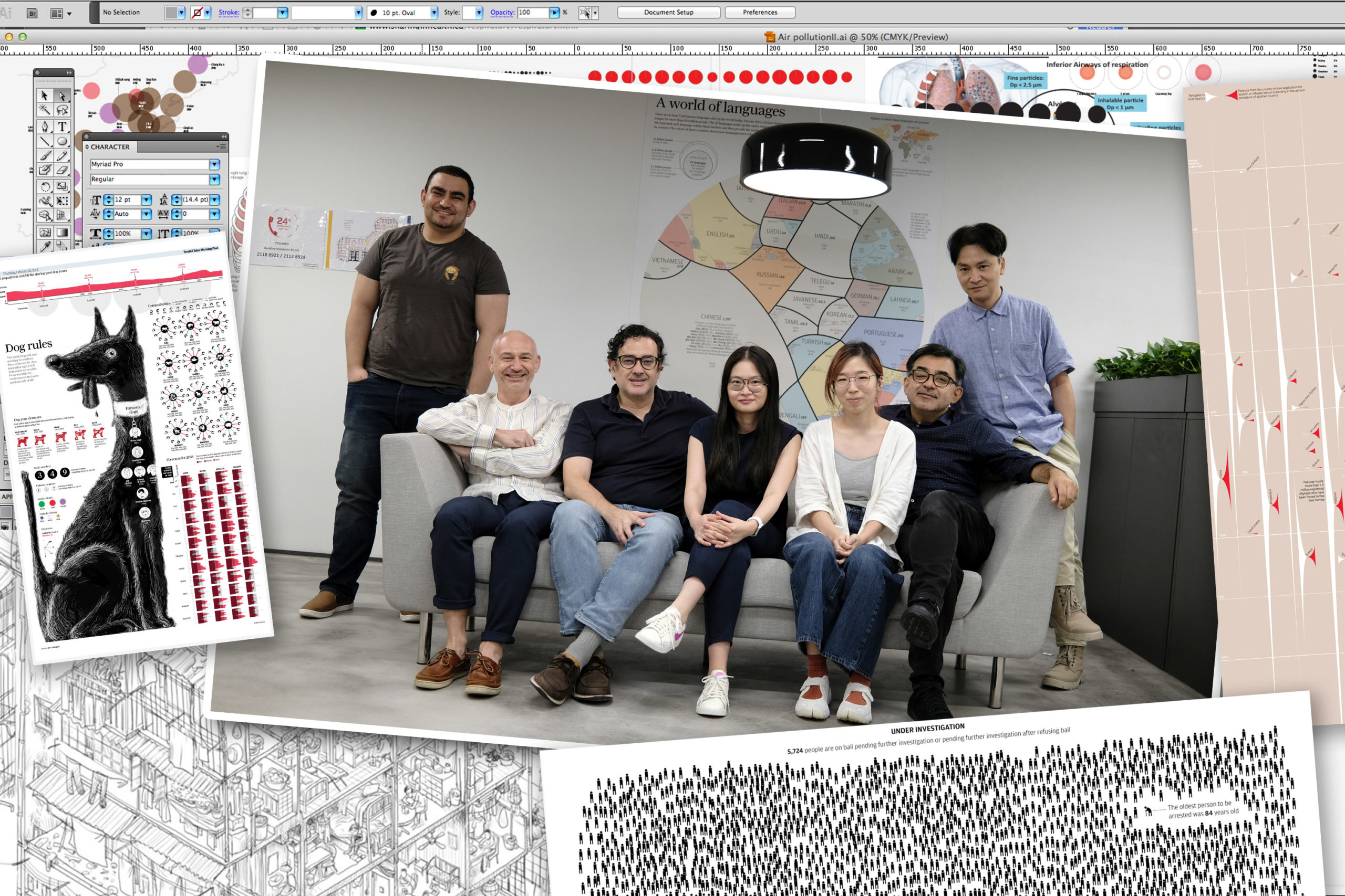
One of the most interesting teams in the world has to be the Infographics team of the South China Morning Post. Based in Hong Kong, this small team has forged a unique path in visual journalism, explanatory graphics, and information design that has earned them scores of awards and the respect of newsrooms around the world. Their work blends illustration, journalism, and data visualization in a way that makes complex issues understandable and deeply interesting.
The Nightingale team had the opportunity to connect with Darren Long, Marcelo Duhalde, and Adolfo Arranz to discuss their unique approach to visual journalism. The following interview has been lightly edited.
Jason Forrest: Would you all like to do a quick introduction?
Marcelo Duhalde: I have been working in newsrooms since 1996 and based in Hong Kong since 2016. My progression to online infographics actually started here in Hong Kong. Before, I specialized in print graphics and visualizations, providing solutions for other people’s content. I started to produce infographics from my own reporting and research around 2010.
I have developed different kinds of skills to deliver my investigations and I’m still exploring new ways to visualize data. We strive to produce diverse and interesting output with the infographics team.
Adolfo Arranz: I’ve been in Hong Kong since 2011, before that I was working for a long time with El Mundo newspaper in Spain, first with regional issues then national editions. Here in Hong Kong, I learned a lot and discovered new ways to make stories visual. I had the opportunity to develop standalone graphics, which we refer to as the “back page.” These past years have been a big evolution, very similar to what Marcelo said, since I also came from print. For me, the jump from print to developing online projects was very challenging.
Darren Long: I’m the creative director at SCMP. This is my second stint in Hong Kong and also my second time at SCMP. I first came to Hong Kong in 1990 before moving to Malaysia in 1997 just before the UK transferred the sovereignty of Hong Kong back to China. Back then, everyone was worried about political and social changes that didn’t happen, followed by an almost 20-30 year hiatus where things sort of stood still. But recently, the changes that we thought would take place in ‘97 are happening rapidly now instead.
In terms of my career, I work mostly as an art director, bringing together the visuals and text and making sure they all work together. I have experience in a variety of spaces: news, luxury, lifestyle, even branding, consultancies, and airlines. But my first love has always been news. I’m a news junkie, so coming back to SCMP and working with the likes of Adolfo and Marcelo is like a dream come true.


Raeedah Wahid: Before diving into the work, what is it like being in Hong Kong right now? I know that there have been a few things involving economic downfalls due to COVID-19 and, in addition, the ongoing protests. How does all of this affect your ability to work, your outlook, and the purpose of the work that you do?
Darren: The diversity is really useful for our team. On this call, you’ve got a Brit, Spaniard, and Chilean. In the rest of the graphics department, we have mainland Chinese, Hongkongers, an Egyptian and we used to have two designers from Costa Rica. The fact that we all have unique viewpoints of what’s going on in Hong Kong and elsewhere makes for an interesting environment. We have, sometimes, quite heated debates — never in anger, but robust.
Marcelo: Being here for four years, I have experienced many changes and have been witness to a big departmental evolution.
When I arrived, the prestige of the infographics department was well established because of Alberto Lucas Lopez [currently Senior Artist, National Geographic] and Adolfo, who started with full-page infographics in print. We always had a lot of respect from within the newsroom, but the big challenge at that time was turning our visual pieces into digital experiences.
When I started here, the nature of our topics was not always hard news. Many subjects were more general-interest and not always directly related to Hong Kong or China. But since readers are demanding more refreshing and original news stories from a China perspective using different platforms, we have developed into a visual journalism department closely following the news.
Hong Kong has been through many different events: the protests, the coronavirus, and other things. This city is in continuous evolution and change is omnipresent. We are a reflection of that. We have to follow that pace. Hong Kong is an amazing city and this is my favorite place. It’s always a pleasure to deliver stories that people here appreciate.
Adolfo: Well, what can I say after Darren and Marcelo — I agree with them!
We have a lucky graphics department. The most important thing, for example, is that almost 90 percent of our projects are our own. They’re not requests from the newsroom. The projects we offer are mainly our own stories based on hard work and research from our team. We’ve seen that SCMP Infographics are appreciated worldwide. We feel a certain recognition from the industry — from the SND, Malofiej… That is a wonderful experience.
We focused on the protests for the majority of last year. That was the news. We had many projects scheduled for 2019, but the news was the protests and we were absolutely focused on protest topics and stories. In some ways, it was easy because we were witnesses to these protests. When you leave the office, you might find yourself in the middle of a protest. On your way home from work, you were in the middle of some protest or you could not reach the subway because of the protests. We were in the middle of the storm. So, it was easy to understand how to develop and deliver the stories based on our own feelings.
Marcelo: We are really enjoying this moment. Our group is only six people. We enjoy each other’s company. We are having a great time doing these long-term infographics projects. For most of us, it’s not like a regular job. We enjoy producing infographics. We’re kind of infographic nerds. We’re always talking about how to visualize things. That shared mindset is a kind of ingredient that we are lucky to experience.


Raeedah: I know that the SCMP follows a clear mission to “lead the global conversation about China.” Are you feeling any sort of pressure or anxiety related to China’s increasing attention towards your coverage then?
Darren: No. I can honestly — hand-on-heart — say there is no pressure from outside sources as to how and what we should report.
The only thing I have taken slight umbrage to is if a sub-editor inserts a word like “radical” in front of “protesters,” in certain contexts. For instance, when some arrests during the protests were made, we said they were radical protesters, but some were just regular protesters and bystanders caught up in the melee. But you know, that’s a natural process. There are always going to be disagreements between the writer and the sub, and to the exact nuance of each word. But in terms of pressure from Jack Ma or Alibaba or Beijing, we’re completely unaware of any pressure whatsoever.
I mean, it might be different for the editor-in-chief, I don’t know. She never puts any pressure on us. I think it’s very well-established that SCMP believes in and agrees with the “one country, two systems” policy. I think as long as we report in the most unbiased manner, we’re able to say whatever we want — as long as we offer both sides of an argument.

Raeedah: Darren, you said at your DataFest Tbilisi 2020 talk (“Translating data into journalism”), that visuals are also data. It’s interesting to think about how illustrations and photography can also be considered information. So maybe, Marcelo and Adolfo, you can speak to this, but how do you bridge the gap between these mediums and data visualization?
[long pause…]
Darren: Good question — you stumped them both!
Adolfo: When I came to the SCMP in 2011, Simon Scarr [currently deputy head of Reuters Graphics] was here and we started to develop the standalone back page. The idea was to produce big infographics, honest stories, and mix visual data and powerful illustrations, or dramatic graphics with big explanations and text. I came for that because my best skill is mixing illustrations with the story and graphics.
From that point on, we evolved enormously. Right now—because it’s not only print — we are focusing on online projects, we are exploring animation. I think our identity flag from SCMP is the use of illustrations. We want to use many illustrations because we see that not many newsrooms do that. For me, huge visual data is nice, but if you combine that with illustrations, photos, or videos, you’re adding valuable visual interest. It can be less boring for the reader. The best example is Marcelo’s work.

Marcelo: For me, the move from print has been difficult. These kinds of languages, coding Javascript for example, stuff like that — the tools used to make an interactive project — are always evolving. I’m 50 already, if I want to go into code and learn something new about code, when I finish learning, the rules have totally changed and I have to learn again.
So for me, the main skill that I have developed is telling visual stories. Someone will always support your ideas, coding, or developing your ideas into art — interactive or standalone — but the most important thing is to recognize and manage stories and the resources to tell those stories. That’s really important if you choose animation or illustration or data visualization. It’s more important to be accurate in the data, in terms of deep research, and to be responsible with well-supported information, and then transform that data through compelling and interesting storytelling. Data visualization has been something interesting to discover.
I’m not an expert. I’m just trying to experiment, sometimes with data and portraying it in some visual way, but there are many trends . I’ve seen many graphics trends, working for 25 years in infographics. Data visualization is one of those things that came into the newsroom and suddenly many places were producing these kinds of pieces. It’s useful when the audience feels that the story can be told in a smart way — like artists made these artistic and super attractive visuals and geometric shapes. But, we always try to be careful with data visualization because when you manage the data in that way, you have limits.
When you go deep into data visualization, it can be understood. When data visualization is hard for us to understand, it means for the audience, it will be impossible to understand. Sometimes a complex data visualization is less understandable than a simple table or a simple bar chart. We have to stay focused. We’re delivering information, rather than trying to show our skills to the world, so we have to be careful.
Darren: For me, the beauty of what Marcelo and Adolfo do is, they’re able to get to the essence of whatever story they’re telling. They’re able to really cut it right back to the very, very single most important ingredient.
I think that’s partly because they’re not data experts, so they have to understand it themselves first and really analyze it, and then communicate it. That’s what we do with the hard data, but I think other aspects that are unique to SCMP are the visualizations and the illustrations that you alluded to.
Because while the data is hard facts, we can balance that with the warmth and humanity of illustrations and rely on the ambiance and mood. Those elements can communicate in a more nuanced way than the facts. So with the data and storytelling, you’ve got the best of both worlds. You’ve got the one that’s ephemeral and open to interpretation and you’ve got the one that’s facts-based, which you can’t debate or argue over. That helps us avoid any sort of censorship within the newsroom as well. You can’t argue with the facts and the illustrations are left open to interpretation. You can’t police the way people think. Well, hopefully, you can’t.

Raeedah: How do you go about conceptualizing these illustrated pieces and then deciding how to visually and creatively package such data-heavy content. Where do you draw your design principles from and the artistic vision ? How has that evolved over the years?
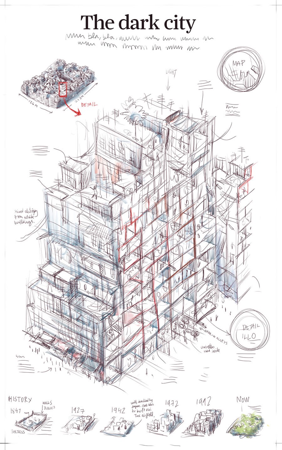
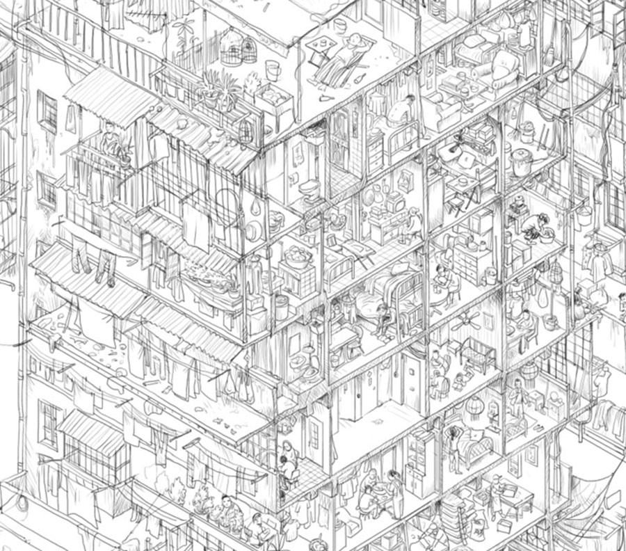
Adolfo: It varies depending on the subject and project. I start developing my projects by doing a rough sketch using sketch paper, then preparing a final draft. I used this often for the back page and because it was effective in selling the story to editors.
Sometimes time constraints require that you abandon the complicated ideas and use only charts or simpler graphics. You have to try to be smart and do something quick, but still powerful. Sometimes it’s like a lottery. You have some idea in your mind, but the result is absolutely different from what you had in mind.

“Arrested development“, Adolfo Arranz, June 11, 2020

Marcelo: The ideas come from our group. We always discuss ideas with Darren, what is the relevance of the story that we’re about to tell? But we don’t have unlimited resources. We don’t have satellite images. We don’t have a full network of photographers around the world. So, we need to be smart about what we want to deliver. The other thing is, we try not to follow all the other newsrooms. We’re always trying to go a different way or from a different angle with our subjects.
For example, we are not in a good position to cover the U.S. elections compared to an American newsroom. So we prefer to find a new angle, a counter-intuitive approach. The way that we start to develop a project is always conceptualized through teamwork. When we’re trying to cover a big event like the coronavirus. We always act as a team so we can cover more ground efficiently.

The style that we choose for the illustrations or graphics and the way that the story develops is something that we have to figure out in the moment. We test and make mistakes and try different solutions. The combination of our ingredients — the people in the department—is so diverse that every one of us has different kinds of visual memory, different resources to have an influence. We are always open to new ideas and new expressions. We’re always trying to put the most innovative ways to tell stories at the front. That’s why, in some projects that have been developed with the group, the illustrations or the diagrams to explain something scientific are not in the same style. Sometimes our solutions are more expressive or more consistent with the style of the entire piece that we are developing.
We are trying to put that sort of difference in our assets and in the standalones because there are many hands working. Of course, we try to follow a style. We have a sort of style to apply in all our projects. But, project to project, you can find very different expression colors and ways to explain data.
Darren: As someone who’s sort of in an almost observational position, the way I see the visuals come about, is through the research. I don’t know how unique it is, but basically, we build the graphics and the story from the beginning right through to the very end.
So we will do our own research, our own writing, our own reporting, and our own editing. We’re part of that whole process. Whenever we have a new topic, I see the guys immersing themselves in each topic, just headlong diving in, finding loads of stuff. It’s almost like they’re sort of grabbing things from all over the place and putting it all on the table, then sifting it out. And then gradually removing things too, until they get to the essence. Without wanting to simplify the process too much, it’s almost as if the visuals design themselves through the research.
To reiterate what Marcelo was saying with the different styles: there’s a strong visual identity with SCMP infographics. But that has more to do with the philosophy behind the graphics, rather than the visual—the handwriting. We have a singular way of thinking about these things and that’s about research and simplifying it so that anyone without expert knowledge can understand what the story is and come away very well-informed.


Raeedah: You’ve spoken about collaboration across your team. How many people are usually involved in each story? What are their roles and how long does it usually take for the team to craft the work?
Adolfo: When we released our COVID project, we finished the standalone in one day. That was because we worked together and we were all focused. It was an incredibly intense day, but we delivered on time. It felt amazing when we finished.
I think there are two kinds of different projects: 1) Those where we all work together, like on COVID, the protests, or when it’s something like breaking news or something for which we need more resources. 2) Other projects that are very personal. Those projects tend to be long-term. You need to do the research, but it’s your own project. Of course, you’ll need help from all the other members of the team, but that’s your project to finish. It’s quite different from working at other places. There’s a more personal credit system. And they can be opinion projects.
Marcelo: Yeah, true. It depends on the subject. As Adolfo said, I remember some months ago, we developed a product about Shenzhen 40 years made by Dennis Wong and myself.
We spent one week on the entire process — from the research to delivery in creating all the assets, and putting them all in the standalone. It took us only one week because the data was available. It was easy to research and the solutions, in terms of interactivity or the assets, were easy to produce.


Sketches for “Cantonese performing art” by Marcelo Duhalde, Yan Jing Tian, and Dennis Wong
Some time ago, we had to cover the Thailand cave when the kids were trapped. There, we worked incredibly fast. We organized quickly to deliver in two days, something interesting because in most cases, our standalones can and should have a print version too, for the newspaper. We always try to combine skills to deliver something online and something distinct for print because sometimes the research allows us to have many different pieces and graphics. The processes sometimes depend on the subject and the types of projects. For especially personal projects, the way that we develop them can also occur in between our other daily duties.


Sketches for “How the Thai cave rescue mission unfolded” by SCMP Graphics team, July 8, 2018
Darren: One of the strengths of this team, is its flexibility and its ability to learn on the run . I’m thinking specifically about how Adolfo just referred to the COVID or coronavirus story, which we put out extremely quickly.
Part of the reason we did that was that we’d learned from the protests. One of the most popular of our protest stories was supposed to be ready in two or three days and ended up taking two or three months because the news kept evolving and we kept playing catch up. There was a new protest and a new news peg every day so we had to keep going on and on.
When COVID first broke out in China we realized “Hey, look, this is going to be the biggest story in the world. We’re living right on top of it and it’s going to keep developing rapidly.” If you remember when it broke in Wuhan, the rest of the world assumed it would be a China issue, at most, an Asia issue. But having lived through SARS, we kind of predicted that it was going to go global. We realized we really needed to get that story out fast, to be the first newsroom to do that.
So learning from the protest story, we focused on one specific angle and got that story up and running so we could then keep re-nosing it over the next two or three weeks. The first iteration was purely about Wuhan, where the virus was discovered and why and how it could spread so quickly. Wuhan being a hub city is connected to the whole of China but also has many international connections with the likes of Hong Kong, Thailand, etc. And then we updated the story over the next few days, adding how the virus spread physically through sneezing or through the air.
So we had to respond and react constantly and keep changing the narrative after it was initially published, which, I think, is something of a breakthrough for us. We know we can do that now. So that adds yet another weapon to our armory.


Raeedah: I know that you talked about collaboration within your six-person team. Do you ever collaborate with other desks outside of Infographics using similar approaches?
Darren: Yes, we do. We do to varying degrees — the issue with that is, other desks tend to come to us with a conclusion and no data to back it up saying, “Okay, we want a visual to explain this.”
Our way of working is, “Well, no, actually we need to get all the information, analyze that, and then come to a conclusion.” So, we’ve had some very successful collaborations, but each time it’s sort of like an educational process with the other desk to explain, “Hey yeah, great idea, but we’re not sure if that’s the correct conclusion. So you need to go back with us through the data.” That can be a little… How to say it diplomatically? It can get a little frustrating for both sides. But as we’re learning and progressing, we hope to do more and more of those types of stories.
I’m thinking about one in particular. Adolfo did a lovely piece about the number of arrests that were made in Hong Kong during the protests. That was done with the City desk. Another one recently with the City desk, was the Hong Kong COVID-19 testing that Kaliz Lee—a newish member of the infographics team—[worked on].
She worked directly with the City desk, who got her the data, and then she interpreted it. We’re collaborating more and more across the newsroom, and I hope it’s something we can continue.

Adolfo: As Darren mentioned, now there are different stories. I don’t think it’s related to SCMP though. All my life I’ve had the same issues that sometimes, a writer or editor comes to you with some idea, some data, or some information and they think that this information or this data is enough to do some important graphic, some important project, but finally, you realize that there is nothing to it. Sometimes there are frustrations, but I think this is more related to the newsrooms, and was more typical years ago. Right now, the editors know the data and the visualizations and the infographics well. They have learned.
And it’s not the same as it was 10 years ago, where sometimes the editors came in with confused ideas that they wanted to do. It’s easier right now. For example, the recent project about COVID with Kaliz or another about the arrested development that I did with the Hong Kong local desk — it was easy and they were useful and cooperated with us. The project was finished in a couple of days, in an easy way, and was wonderfully successful.
Marcelo: For me, it’s easier when the editors announce that they will need a project about something in particular, rather than providing us the data and saying, “Okay, this is the data. You will do something with that.” It’s better when they can say; for example, some years ago, the entire group got into a project called China, 2025 and we split different subjects. In my case, it was 5G and semiconductors. But at that time, I preferred to understand what 5G was first. And they offered help if we needed some other information. So my process was to first read and understand a little how to explain 5G. Then I was able to collaborate with a person from the China desk who provided me with solid information. I was able to ask her precise questions about what I wanted to include in the project. That was a smooth and easy process because we were able to finally show what we wanted to explain.
I think the newsroom now trusts us when they say, “We want something about this and you will be the one who will lead the development and production of this piece,” rather than giving us a summary of what that project should include. In that way, we can feel ownership over the subject, even when the suggestion is coming from other desks.

Raeedah: Yeah, a lot more agency. The last question I have, and hopefully, since our hour is almost up, it’s a lighthearted and fun one! For each of you, what has been your favorite piece to work on so far, and why?
Marcelo: Wow. Well, sometimes my favorite pieces are not the most successful pieces. They’re about feelings, about your own story, or about your life. My favorite pieces are more related to problems that people have to face all the time, every day, or the people who are forgotten. Sometimes, those have not been successful in terms of clicks or visits. One of my favorites, something that I did some time ago, was about refugees during coronavirus—about the asylum seekers and refugees during the pandemic — what is happening to them?
I really enjoyed doing this. I found very interesting data. I prefer complex situations that you can explain visually. I developed an online standalone and double page spread in the newspaper, and I was really happy delivering this kind of subject. Maybe it was not really successful in terms of clicks, but I had a good time developing it.
Adolfo: My favorite piece — I think there are a few—the Kowloon Walled City, but it’s not an online project. It’s an old project, but it was enjoyable. After all these years, some pieces start as my favorite, but then after the years, you change your mind. You notice there is something that is not okay and if you could do it again, maybe you would do it another way. My favorites are Kowloon Walled City and also Safe Skies. That was another back page that had an online version about safety in aviation. I used a full page with a thousand dots to represent the number of flights and the number of accidents. It was prepared like breaking news—in a couple of days.
My favorite pieces are all those projects where I can enjoy drawing. For example, I like a project that I did a few years ago about the bad behavior of football players. This was not related to visual data nor is it considered an infographic. It’s more like storytelling. It’s a companion to a piece about the bad behavior of soccer players and it was done with animation. It’s like a comic. I enjoyed this project because it was my first animation project.


Darren: Yeah, just hearing Adolfo reminded me of a couple of things. The safe skies story, the safest year on record, and Adolfo visualized how few flights ended up in fatal accidents.
There are two things that stick in my memory about this project. When he first thought of his visual solution, it was like that eureka moment. I remember him jumping up out of his desk, “I’ve got it. I’ve got it!” And running around and then doing all these dots, which was quite a magical moment.
And then with the same project, it was really funny. I handed it over to the news editor for the print version to say, “Hey, yep. This is what we’re going with on the back page tomorrow.” And he looked up to me and said, “You’re completely mad. This is crazy. It makes no sense whatsoever. It’s a page of static.”
Then we explained to him what it was and he was like, “Oh, okay. Yeah, yeah, that works.” Then, of course, Adolfo won every award going with that. So, I was able to email that particular editor back and say, “Hey, who’s crazy now?” So that’s one of my favorites, but the stuff I’m proudest of is the protest stuff that we did recently. The reason for that is because it was recognized for its journalism, inasmuch as for the visuals. That makes me extraordinarily proud that we’re now taken seriously as visual journalists and not just designers.

Jason Forrest is a data visualization designer and writer living in New York City. He is the director of the Data Visualization Lab for McKinsey and Company. In addition to being on the board of directors of the Data Visualization Society, he is also the editor-in-chief of Nightingale: The Journal of the Data Visualization Society. He writes about the intersection of culture and information design and is currently working on a book about pictorial statistics.

Raeedah is currently a senior at Barnard College. She is a Vision & Graphics-track Computer Science-Human Rights major. She created the Graphics desk and served as Graphics Editor of the Columbia Daily Spectator in 2020. She previously served as an editor of Nightingale: the journal of the Data Visualization Society. Raeedah will work as a reporter at Bloomberg News post-graduation.
-
Raeedah Wahid


