
Marcelo Duhalde, Associate Creative Director of South China Morning Post, talks in depth about all the aspects of infographics in an exclusive chat with tksajeev. Duhalde has won more than 100 Society for News Design awards, 17 Malofiej medals, one Peter Sullivan’s Best of Show (2015), and four gold medals at the World Association of Newspapers and News Publishers Awards. Recently, his team won the Best in Show and two gold medals among other medals and recognitions in the latest version of the Society for News Design awards.
AI is the new sensation. Will it be helpful in creating infographics? What are the dos and don’ts?
I think that AI as an aid to design is very useful to save time in tedious processes. But something very different is to expect a totally original result or to achieve something that accurately emulates what we have in mind.
Infographics is an informative need that is built on existing information, data processing, and representation of elements. Infographics must be understood by different audiences, with different levels of complexity and meeting different needs.
Infographics must be a user-centered design that reflect a creative process. Visual explanations must “understand” the audience, that is, they must efficiently show what the user is willing and interested in exploring in less than 20 seconds.
When an infographic department evolves in the ways of creating visual explanations, it is much more difficult to standardize the working methods. Artificial intelligence would need many references to achieve a fresh result, with a stamp of originality.
AI can be expected to cooperate in refining certain contents or to support us in specific processes. What cannot be expected, at least these days, is to achieve a brilliant, original, functional and instantaneous result. Besides, human information design still has an irreplaceable emotional richness, it is generated from experience and comes close to what the reader expects to see.
“What cannot be expected [ from AI], at least these days, is to achieve a brilliant, original, functional and instantaneous result…Human information design still has an irreplaceable emotional richness, it is generated from experience and comes close to what the reader expects to see.
There is another aspect that I would like to mention. The authors of infographics have the intention of expressing and sharing their own ideas when creating a visual piece. And the result can be stimulating when we notice a good reception from the audience and our peers, or it can be frustrating when it is not. It’s all about the ego of the creator. When finishing a graphic, the expectation is to achieve something as close as possible to what we have conceived in our mind. Automating that journey through AI doesn’t seem to be an option that many of us seriously consider.
South China Morning Post is one of those publications that promotes infographics. Can you explain how the print readers and web viewers have responded to them?
Our printed infographics have a good reputation among our audience. Our newsroom is always open to give us the space to publish our material, and that is a privilege. There is also something we have noticed, on the day of the publishing of a printed infographic, we always post our printed page on social media (Twitter or Instagram), which gives us good traffic and great feedback. That tells us that people still appreciate seeing all the information in one static frame. This encourages us to continue publishing full page infographics and to continue exploring the many possibilities that paper offers.

For our online pieces, we have a very solid post-production system connected to multiple areas of the newsroom, which allows our work to be promoted on the web. Obviously the exposure time [to infographics] is limited, since the publication’s offerings are massive and there are many other articles to highlight on our front page, but when the numbers (visits) are good, and they often are, the permanence of our work extends for a few days.
It is a way to understand the audience as well, by reviewing the number of page views and the behaviour of a visual story over time.
There are stories, which are the result of a long working process, involving resources, time, discussions and planning, finally receiving satisfactory results.
On other occasions, we create very simple stories that have required little effort and production time, which achieve surprising numbers and which maintain a very acceptable level of visits over time.
Which work thrills you more—print or web? And how different are they?
I have a strong background in print, however, I think the online platform offers many more possibilities and obviously has a wider reach. That said, I can’t lean towards one in particular. Making infographics for print has a charm from start to finish (because obviously there is an end point to the process of infographics for print, not so for online), and it always connects me to the beginnings of my career in visual information.
The exciting thing about print is that time, space, and resources are limited so it demands more creativity and practical thinking.
Online infographics, on the other hand, allow the development of topics in different dimensions, it imposes a wide range of skills as in content, form and functionality, but it does not limit the expressions and creativity, on the contrary, it expands them.
Online pieces require a permanent tracking and solid testing processes to ensure the good performance of the information for all users, all the time.
Even though print infographics are more permanent and tangible than online infographics, I like the immediacy and the capacity for permanent editing and expansion that online work allows when it comes to sharing my work with the audience.
Can you explain how you or your team visualised the project “Fly at your own risk: Nepal’s poor air safety record”?
After the plane crash in Pokhara, multiple videos and images of the catastrophe emerged, our idea at first was to explain the accident in a breaking news format, but after doing some research, we realized that it was more important to explain the reasons for the increasing number of accidents in the skies of Nepal. The infographic was published three weeks after the accident. And it includes mainly general statistics on Nepalese civil aviation, the existing standards, and the complexity of the conditions imposed by the geography on the most experienced pilots.
We started the project by understanding how the accident happened and explaining the characteristics of the crash site.
We include a detail of the ATR72-500 model, in those days a theory of the cause of the accident arose, based on the observation of some videos made from the cockpit, where you can see that the flaps were not properly deployed at the time of the approach, causing the speed of the aircraft to not decrease. This point is explained in the diagram.

An interior layout of the aircraft and dimensional references were also included.


In civil aeronautics there is fortunately a lot of information available, which helped us to define a series of visualizations, we only included in the project the most relevant ones.
An example is a graph that shows which are the most critical phases during a flight in Nepal, we realized that accidents occur towards the end of the trip, practically in 50% of the occurrences, as shown in the following diagram:


In all our projects, the usual thing is to create an image that opens the piece, this image is also used for the promotion of the infographics in social networks. It is part of our process, and I can affirm that it is one of the tasks we enjoy the most.
Do you work on a template or approach every graphic independently?
That depends on the type of graph we are working on. For the simplest and daily coverage we use templates, for those projects in which we can invest more time and resources, we always look for an original and different approach. Each topic represents an expectation to accomplish, as well as each artist has a particular vision of how to tell a story and we respect that before anything else.
What are the most important considerations for infographic designers?
Nowadays the word “infographics” is not enough to describe what we information designers or visual journalists are currently developing. Visual storytelling is too broad, and stories can be told in multiple ways. In that sense, infographics departments have evolved towards more dynamic results, but essentially connected to a creative way of captivating the audience using unique visual narratives, and originating from direct experience (field reporting, first-person research) rather than relying on more common formulas such as isometric representation of a space, or the use of a set of graphs and diagrams. It has been a long time since it required some expertise to create this type of element, now there are many tools available that deliver quite acceptable results.
You also have to consider what the audience is willing to explore. My suspicion is that more than some readers when seeing an isometric drawing (just as an example of a widely used method of representing a space in an infographic) may feel some aversion because it tends to be an overly recurrent and technical representation of reality, and to put any minor obstacle between the information and the reader these days is always a risk.
For me, the most important consideration to keep at the top of the list, is to enhance the ability to discover stories that deserve to be told visually. The technical aspects, interactivity and virtuosity are very important but without the first ability it will be hard to produce interesting visual explainers.
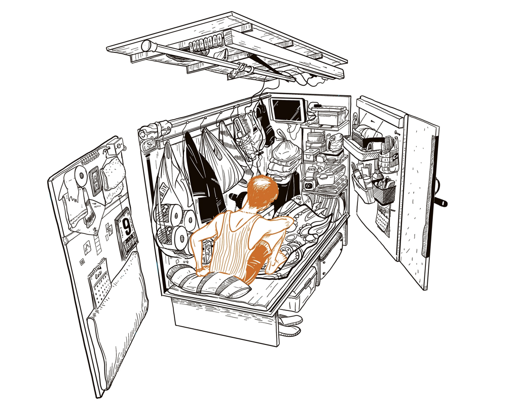
Can you explain how you visualised the award-winning project “Life in a Shoe Box”?

Hong Kong is a vibrant and cosmopolitan city, full of attractions and contrasts, one of them is represented by the great difference in the living conditions of its inhabitants. It is considered one of the most expensive cities in the world, which is partially true in my experience. What is really expensive here is housing. The monthly rent for half of the apartments is at least US$2,250, while Hong Kong households’ monthly median income is US$3,600.
This problem is exacerbated for those living below the poverty line (20% of the population, or 1.65 million people), who face serious difficulties in finding decent housing.
A practice among many landlords is to subdivide an apartment into modules, it can be three or four modules in one flat, but there are also cases where the situation is extreme and the space is forced to accommodate up to 20 small modules (which sometimes means having 20 sq.ft. spaces for one person). Obviously the conditions offered are deplorable.
In general, these types of configurations are found in old buildings, with low maintenance, poor thermal insulation and non-existent security measures. The inhabitants are generally older men with very low incomes and no family to help them.
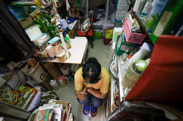
This is one of the aspects that has been widely covered previously by the media, in the form of reports and documentaries, but the challenge we had as a team was to provide more direct spatial references and represent in a more vivid way (without using photographs) this reality, to put the reader in a new perspective in front of this situation.
From this starting point we proposed to consider any detail that would help to understand the limitations in space and comfort of the residents of these cubicles.
We planned several interviews and a round of visits to apartments where the landlords maintained inhabited cubicles.

With the help of a local NGO that was visiting many of these places to distribute medicine, food or some legal assistance, we were able to enter the flats for field research, in order to cover technical aspects such as materiality, dimensions, lighting, ventilation, use of common and private spaces, etc., and human aspects such as coexistence, urgent needs, sanitation problems, daily routines, experiences and opinions of the tenants.
During each visit the team was equipped with cameras, notebooks, measuring instruments, etc. in order to capture the maximum information, we knew that the chance to visit the places again in the short term was very hard.

The team decided to use mainly illustrations; this was a decision discussed in the planning stage. We completely ruled out the use of photographs or videos in our piece because we didn’t want to expose real homes, and the intention was to respect people’s privacy. In addition, the attractiveness of an illustration, based on analysis and made from videos, images, quick sketches, and 3D modelling tools helped to visualise the elements, and to show more accurately the composition and structure of the small rooms.
Here’s the sketching from original idea to final visual analysis:

A 3D model allowed us to displace-rotate the walls of the cubicle in order to avoid hidden objects and angles and see how every surface of the limited space is used by the resident.


By combining digital and traditional drawing techniques, the final product enriches the user experience and delivers a more immersive result. Animations were included in the beginning to contextualise the location of these houses. Various illustrative styles were combined to accurately depict the critical living situations of these people as witnessed by each artist.


Official figures or data reports from local universities were the complement of the field investigation, in order to show a complete panorama of housing solutions in Hong Kong at all levels. This information allowed us to add references of area and cost per square foot.
Pencil sketches at each location were followed by 3D models and animations. These served only as a base to build the final appearance of the piece, which preserves well-differentiated illustrative styles and follows defined functions. An informative animation at the top gives a very close idea of the real appearance of the places, another line-drawing style done in Procreate helps to explain the cubicles, and a few larger, more generic, illustrations were used to separate and represent the following explanation of each housing type.


After the production of the assets and writing the story, it took us several weeks to make the online piece fully operational for all platforms. We had several rounds of revision, correction and polishing of visual details. The published piece gives readers an updated and realistic portrayal of many Hongkongers’ living conditions.
The full research process and the round of interviews helped us to build one big infographic and three long read stories with illustrations and charts. The active role of our reporter Fiona Sun in all the process of gathering information combined with our field work and research, helped us to have original content and an unique approach to a well-known issue of this city.
As an infographic expert, how do you visualise the growth of infographics and the new platforms on which it can spread?
The growth and [unification] of infographics on the new platforms will necessarily depend on the degree of functionality they offer. It does not mean that complex infographics or those that are a very personal expression of the author will disappear. All kinds of infographics will continue to exist; Just as today it is possible to find a wide range of them, from the unreadable one to a super-efficient piece. At the end of the day, the audiences will always be very diverse and there will continue to be products for specific groups of people.
But the visual journalist, which seeks to inform well and quickly, will need to put the user at the centre of his or her priorities.
If we ask ourselves, “What is a successful infographic?”, today we can have multiple opinions, according to our principles, aesthetic beliefs, experiences, or needs. Maybe in the future, we will say something totally different. But my feeling is that the answer related to the number of visits or clicks will be the one at the top of the list.
European, American, and Spanish approaches to infographics look very different. How do you differentiate them?
It is well known that information graphics departments around the world are very different in their nature, functions, and origin.
There are some teams with 30 talented people ready to cover different needs, and others with only four designers trying to give their best, and in many cases achieve amazing results. What determines the approach to infographics of each team is the relevance they have in the newsroom, the autonomy and support they receive, the resources they are provided with, and the topics they are allowed to cover, among other factors
I don’t think there is a big difference in how topics are explained, the visualization formulas or explanatory techniques used in Europe or America are similar—what obviously changes is the story they want to tell, but the most relevant factor to make a huge difference is the resources available backing the infographic work.
Infographics or data visualisation. Which one do you love most? And why?
Today and during the past, the term infographics has been widely used to describe products that are not infographics, when searching in Google, practically 100% of the results are wrong, and then it is necessary to refine the search to find a real one.
Both disciplines are in my heart, but my love is much greater for infographics (which also include clear and clean data visualizations, useful for a big audience).
Since my childhood I was intrigued and captivated by the brilliant way that diagrams, thematic maps, scientific illustrations, and later, infographics explain complex phenomena, structures, places, and situations.
I started in infographics in 1996, back then it was a different scenario, different urges and concerns, different skills to learn, different things to feel proud of, and different motivations. And the constant evolution that infographics experienced along all these years keeps me amazed. I would say, the Malofiej Awards made our beloved profession grow and change to reach unexpected limits. I really miss that event, same as many other colleagues
Infographics is something that wraps you from the beginning and shows you multiple paths; it can be kind but it also can be harsh. It can show you all the fields of knowledge, it gives you the chance to learn, it can take you to many places if you want, and it can introduce you to plenty of interesting people.
At this point, I think it is a kind of unconditional love.

TK Sajeev Kumar
- TK Sajeev Kumar

- TK Sajeev Kumar

- TK Sajeev Kumar

- TK Sajeev Kumar


