
Before smartphones, digital cameras, and orbiting satellites, the international scientific community recruited volunteer observers across the globe to record and report aurora borealis activity as a first step into the new frontier of space weather. These volunteers transcribed what they saw in the night sky using cleverly designed sketch pads that leveraged human strengths in pattern recognition and anomaly detection, making data visualization an input to research.
International collaboration
The International Geophysical Year (IGY) of 1957-1958 was a meticulously planned global campaign to understand the Earth through simultaneous, coordinated observations from pole to pole and from the ocean depths to the almost unexplored near-space environment.
The IGY brought Earth science into the modern era with international collaboration and precise coordination of data collection and processing. Thousands of researchers and volunteers from sixty-seven countries participated in the 20-month campaign to build a big picture view of how the Earth worked as a complex system, from atmosphere to oceans, ice flows to magnetic fields. The quality and scope of the dataset fueled years of analysis and discovery.
Space weather’s fingerprint: the aurora
A key goal of the IGY was to understand the effect of space weather, which is the continuous and constantly changing flow of solar wind plasma from the sun. This stream of particles interacts with Earth’s magnetic field, like a river flowing around a rock, but more intricate and powerful. The energy involved is on the scale of all simultaneous human electricity production. Solar storms can disrupt our technology from GPS to power grids. They have caused blackouts affecting millions and necessitated storm shelter areas on the International Space Station for astronauts. Even now there are many open questions about Earth’s interactions with space weather, and new discoveries are made by researchers in cooperation with amateur observers.
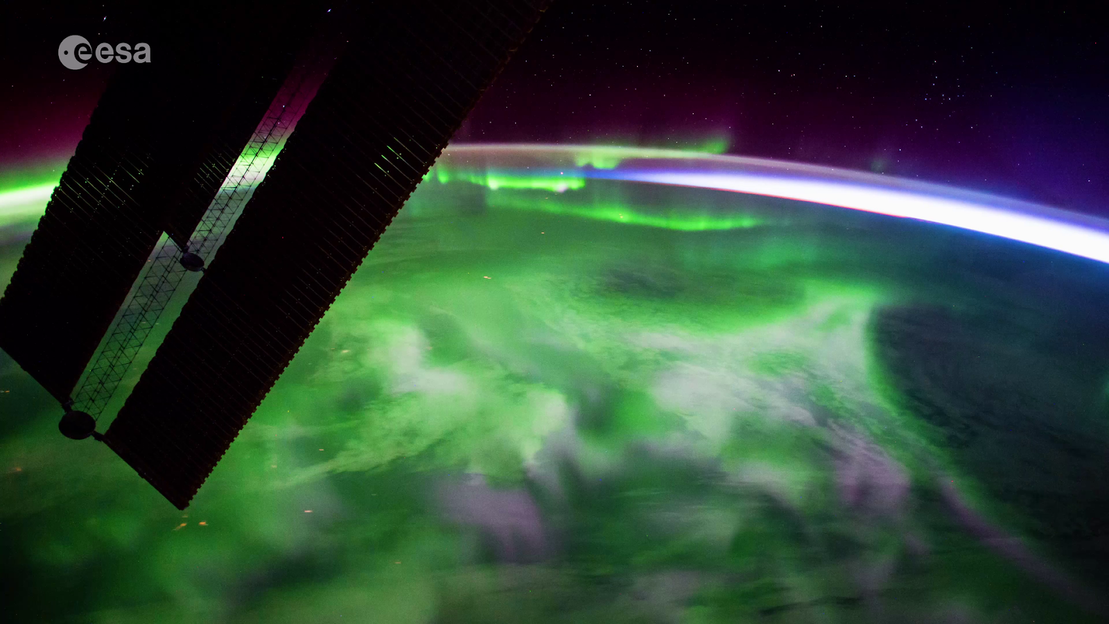
We can see the fingerprint of space weather as the northern and southern lights, or aurorae. This glow of Earth’s thin upper atmosphere is similar to a neon sign glowing in the presence of electric energy flow. Aurorae are a continuously evolving three-dimensional structure extending upwards from about ten times the cruising altitude of an airliner to the orbital altitude of the International Space Station, from about 80km to 400km.
The Visual Auroral Program
Understanding space weather meant getting snapshots of its auroral fingerprint across the Earth, but the observation of global aurorae was not trivial. There were not enough scientists and instruments to gather near-simultaneous data snapshots across the entire planet. Sydney Chapman, one of the architects of the IGY data collection program, suggested that volunteer observers could provide the extra eyes needed to fill in the gaps. An observer on the ground could see and record auroral activity in a 500km radius, but the IGY researchers needed a way to make these amateur observations simple, scientifically useful, consistent, and flexible.
Using data visualization as a method of data capture
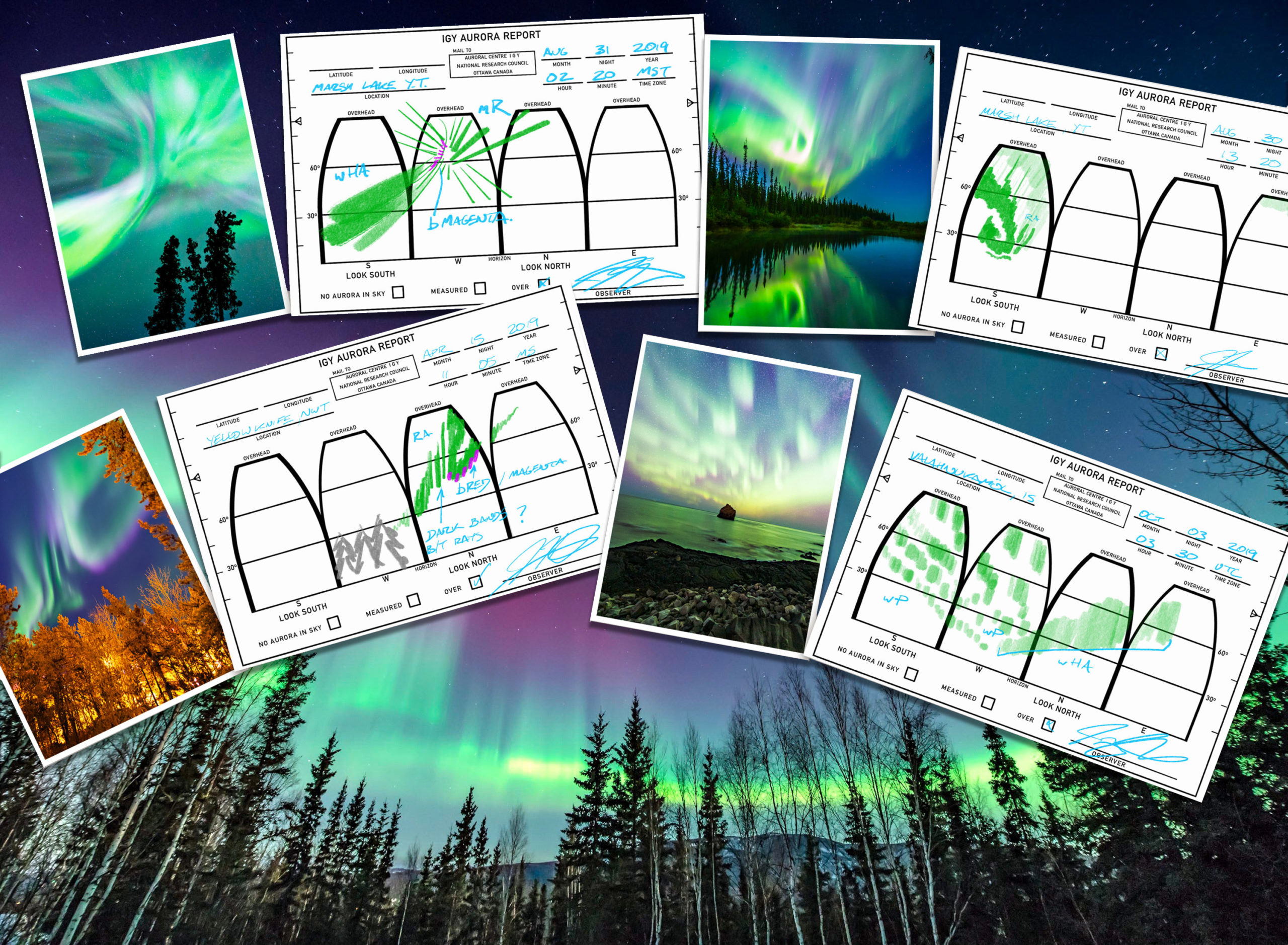
The approach chosen was to supply observers in Canada and the United States with paper pads resembling postcards or speeding tickets. Each sheet of the pad could be completed with a single moment’s observation and later mailed to a collection centre. More than 30,000 would be sent in during the IGY.

These forms were designed around a space representing the sky in four compass directions, like a carefully flattened orange peel. The observer could sketch what they were seeing in 360 degrees around them, and from the horizon to overhead. But what should they sketch and how could this be standardized enough to aggregate and analyze, while still being flexible enough to capture unknown phenomena?
The answer was a consistent and flexible symbology. Like a coach’s playbook, the symbols could be easily parsed by experts, while leaving room for the unexpected. Auroral types were divided into broad categories of shape and internal structure by sketches; their brightness, color, and behavior could be specified with abbreviations.
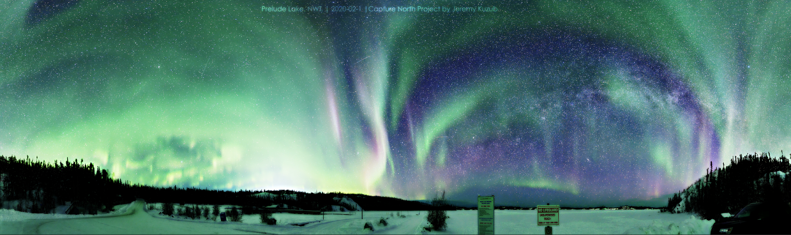
These categories were meaningful – each correlated with different particle velocities, densities, and behaviours in Earth’s upper atmosphere. Green aurorae are the most common, varying from smooth featureless arcs to maelstroms and rays of high-speed motion. More energy results in more intricate structure and motion. Red aurora above the green indicates a denser rain of lower energy particles; dancing stabs of magenta below the green indicate fast-moving, energetic particles penetrating deeper into the atmosphere. Pulsing patches of aurora are a signature of the ‘auroral chorus,’ natural radio waves that energize particles.
The shapes can also hint at the observer’s relative position under the aurora, as seen in the ray examples – rays emerging from overhead in all directions indicate aurora directly above the observer, key to determining the latitude of the auroral activity.
Choosing categories and symbols that separated these phenomena, while allowing the observer to add nuance and the unexpected, was key to gathering a rich dataset that was still easily aggregated.
Aggregation into synoptic maps
Thousands of observer forms were filled out by volunteers, many of whom were astronomers, pilots, meteorologists, and other disciplines trained in observation and reporting. This ensured that observers had a background likely to produce high-quality observations.
Forms were encoded into a standard format using paper cards with punched patterns of holes defining data such as date, longitude, and latitude. Punch cards trace their ancestry back to the first automated programmable machines in the 19th century and were still used at the time as an input to computers. This was enough to plot each sighting location and type on a map. The sketched data and annotations were used to connect these dots of observer positions with auroral arcs, glows, and other forms, creating a more continuous, big picture view of the aurora.
Closing the loop with observers was an important part of the campaign. A newsletter and synoptic maps were published regularly so observers could see the results of their work – each mark was one of their reports. This practice kept the observers engaged over the course of the 20-month observation campaign.

Experiment: sketching aurora sightings using the 1957 reporting forms
Today, digital photos submitted to data collection websites like Aurorasaurus.org have replaced paper forms. I wanted to try filling in a few observation forms using my aurora photos to better understand the challenges and advantages of the original IGY approach.

In this photo, the auroral arc stretches away to the horizon like a curving highway. The first challenge I found was that I was tending to draw all the detail in a single quadrant of the reporting form since it splits the compass directions into four columns. I had to consciously turn to each direction to make a more accurate sketch of true sky coverage, for example, aurora that spanned the South-East.

This photo has two unique features – strongly contrasting dark bands separating the bands of light, and fast-moving, magenta detail at the bottom of the auroral curtain. The camera could not capture this rapid motion, so I annotated it in the form along with the strong dark bands separating the light, which had no label convention. Without the ability to add my own notes to the sketch, that extra detail and data may have been lost when many forms are aggregated later on.

This photo shows that the auroral curtains can break up into ragged pieces as midnight moves into the early morning. Each stab of auroral light was pulsating in rhythm a few times a second. The Auroral reporting notation standard includes the “P” label for pulsing or flickering forms, an example of having an effective set of standard notations for expected categories of data.

This photo shows the view of the aurora when directly overhead – a giveaway is the central vanishing point at which all light rays converge. The form includes a checkbox for overhead aurora, which is key to determining where they would be located on a synoptic map. Although I did not know the exact longitude and latitude, I did know the lake’s name – having multiple ways to specify key data can prevent observations from being spoiled by missing information.
Understanding where human observation can be inaccurate
I often misjudged the angle where aurorae were seen, which is key to estimating their distance from the observer. The creators of the forms understood the importance of this measurement and designed the back of each form to act as a simple instrument to measure the altitude angle where the feature was seen.

Challenges of using human observation data
This method of citizen science data collection requires that observers have two skills at once:
Reliable pattern recognition and transcription – This is the same skill that data visualization leverages for presenting data visually through shape, form, and pattern. But drawing is a skill subject to many errors of perspective and memory. A telling example is an experiment that asked subjects to draw a bicycle as best they could from memory. Many people could get the key parts right – two wheels, a seat, and handlebars – but failed to accurately draw the frame, pedals, and chain.
Consistent data encoding – Humans are adept at adapting, and what may be recorded as novel and new may later be ignored as obvious or even subconsciously filtered. An observer must overcome this to reliably and repeatedly encode data in some set of categories or some numeric scale, “Rate your pain on a scale of 1-10”, “How satisfied were you with your experience today?”, “How likely are you to get a vaccine if there was a risk of side effects?”, “How bright was that aurora?”. Encoding is hard – it assumes that the designer of the encoding system understands what every observer will experience, and that they will encode it the same way. As anyone who has taken a personality test has seen, your results may vary from day to day or even before and after lunch.
Lessons for data collection
This was a mobilization of volunteer skywatchers, amateurs, students, professionals, and hobbyists who were provided with effective tools to contribute their individual piece to the data puzzle. An intuitive and robust pipeline had to be built from the observers’ eyes to the global maps of auroral activity. This may seem commonplace now, with data aggregation from smartphones enabling real time maps of traffic flow, or sentiment analysis on social media networks. Even though the IGY effort is almost 70 years old, data visualization practitioners can learn critical lessons from their solutions:
- Effective data visualization techniques are not just an effective output from a data source, but can also be an effective input. it is worth letting your users input data as sketches or other freeform methods, especially if your data is difficult to precisely encode numerically or categorically. Visual data encoding directly taps our ability to see patterns, trends, correlations, especially for observed data.
- By allowing your data to be captured visually, you do not inadvertently filter out unexpected information. The aurora observing community has benefitted several times from this serendipity and open-mindedness, when entirely new types of visual reports turned out not to be aurora at all, but a different phenomena which led to a new understanding of Earth’s interaction with space weather.
- Plan for the expected: provide a set of standards to allow consistent encoding. Provide standard colours, shapes, and convenient notations along with examples of good encoding against which observers can calibrate their own transcriptions.
- Plan for the unexpected: allow flexibility in the encoding. The most interesting findings may be the unexpected ones, so allow flexibility in the encoding so that data collection does not turn into accidental data filtering.
- Provide feedback to your observers on how the data is being used – in a long campaign with expectation that data collectors will be submitting multiple reports, their enthusiasm and data quality may lessen over time. Provide feedback on how their data is being used and aggregated, showing them they are contributing in a meaningful way.
Aurora citizen science today
Aurora observing, chasing, and photography has grown dramatically with technology and travel. Millions of photos and timelapse videos are captured annually. An entirely new aurora-like phenomena was recently discovered and named by amateur photographers, who were confident this ‘STEVE’ phenomena (as they called it) was something novel. The research community combined these reports with careful measurement of the photos relative to starfields to build a three-dimensional picture of the light structures, much like a medical CAT scan.
Citizen scientists can follow in the footsteps of the original IGY auroral observers and upload their photos and sighting reports to Aurorasaurus.org, a web application that aggregates and displays a map of photos and reports.
If you want to explore nights of auroral activity yourself, you can learn more about a data visualization called keograms and see aurorae from a first-person view at Keogramist.com. You can print a re-creation of the observer form at jufaintermedia.com/observerform.pdf and try sketching what you see in Keogramist’s first-person view- there are hundreds of aurora-filled nights to explore.
References
Millman, Peter M. A Visual Auroral Programme for the I.G.Y., Journal of the Royal Astronomical Society of Canada, Vol. 51, p.186, June 1957, https://ui.adsabs.harvard.edu/abs/1957JRASC..51..186M
Gartlein, C. W.; Millman, P. M. Visual Auroral Observing for North America in the I.Q.S.Y., Journal of the Royal Astronomical Society of Canada, Vol. 58, p.1, February 1964, https://ui.adsabs.harvard.edu/abs/1964JRASC..58….1G
Schröder, W. (2007). “Amateur observations of atmospheric phenomena during the IGY”, Eos Trans. AGU, 88( 12), 141– 143, doi:10.1029/2007EO120002.
Material from Geoff Gaherty, IGY Visual Aurora Program – observations and correspondence. , RASC Montreal Centre. Volume PB1. https://www.rasc.ca/programs-binder-aurora-igy
National Research Council. (1965). Report on the U.S. Program for the International Geophysical Year: July 1, 1957 – December 31, 1958, https://doi.org/10.17226/26118
Rebecca Lawson, The Science of Cycology, accessed July 1, 2021. https://www.liverpool.ac.uk/~rlawson/cycleweb.html

Jeremy Kuzub is an interactive developer for science and data outreach. In 2019 he founded the CaptureNorth Project to share the science, data, and history of aurora research through data visualization projects. He is a member of the Royal Astronomical Society of Canada and a Citizen Science Ambassador at Aurorasaurus.org


