
Like inventors, explorers, and philosophers, data visualizers have honed their craft through experimentation, abject failure, breakthrough moments, pushing boundaries, and by standing on the shoulders of their predecessors. Data visualization has long been a vehicle used to popularize complex ideas and broaden understanding. The virtual exhibit, Data Visualization and the Modern Imagination, exemplifies what can happen when a cartographer and a data visualizer, both infovores and students of history, strike up a friendship.
On September 25, 2020, I attended the virtual opening of this exhibit, guest-curated by award-winning data storyteller, RJ Andrews, in collaboration with the David Rumsey Map Center and the Stanford Libraries. I also had the chance to Zoom with RJ for a preview of the exhibit. Here’s a sneak peek of what you can expect when you attend.
The goal of the exhibit was to feature David Rumsey’s extensive collection of historic data visualization, which resides in the David Rumsey Map Center at the Stanford Library. Rumsey is a digital publisher, online library builder, and software entrepreneur. He has amassed more than 150,000 maps, one of the largest private collections in the United States. This was RJ’s first such exhibition and it involved some curatorial constraints. First, to do justice to the collection required channeling the works in a specific direction, finding a narrative arc. For example, using only the Rumsey collection, it wouldn’t be possible to tell a comprehensive story about timelines, as no single institution houses all of the important works. Additionally, the prestigious university setting necessitated maintaining certain standards. Stanford wanted to avoid works that might still be in copyright, ruling out pieces published after 1924 or so.
But, as RJ learned through this process, library museums also favor a little bit of narrative “cross-contamination,” that is the infusion of some outside perspective or influences. Art historian and PhD Andrea Renner was a huge help navigating these considerations. And, while RJ anticipated a virtual launch, he designed for an eventual physical exhibition. That entailed a “fun, Tetris jigsaw”-like process with postage stamp-sized mock ups of the exhibit space to scale.
Ultimately, RJ had the latitude to tell the story he wanted to tell, that, throughout history, data visualization, “a new quantitative art,” buoyed scientific discoveries, social movements, and emerging philosophies. To meet both the design AND the storytelling challenges, RJ set out to mash up his desired narrative with what was possible within the collection. He designed for an audience who had never heard the words ‘data visualization’ before.
However, as he was writing for a university map center, he felt a bit more freedom to use map terms and “ten-dollar” words, like ‘consanguinity diagrams’ and ‘analemma.’ While RJ is an avid fan of history, he is not a historian, but rather a designer. Visitors will notice his use of “discs” throughout the exhibit to help focus attention on little features of each work that RJ finds special — flourishes that reveal design decisions made by their creators.
You really need to spend time with each of these works — to remake it. That’s the only way you can really understand it is if you try to remake it. Oh, they did this. When you try to remake it, you realize how genius it is. Because you realize how difficult it was that they did that.
— RJ Andrews
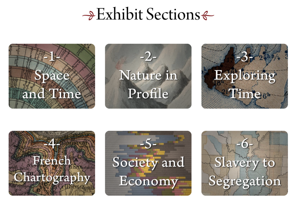
The exhibit is organized into six sections that deal with three themes: examining time, considering nature, and exploring people. The visualizations span the years 1760–1900, roughly chronologically, the latter part of which reflects a period considered by some as the Golden Age of Data Visualization, characterized by sizable investment and enviable aesthetic. At this time, data visualization popularized the idea of understanding a person’s place in the world. Interestingly, RJ illustrates a linkage among these pieces, a through line that demonstrates how the practitioners built upon each other’s techniques, advancing the craft.
Over this 150-year time period, you can see that dataviz really changes how people see the world and themselves in it. Dataviz helped to provide a more universal view of time — a more universal view of space.
— RJ Andrews
Sections one and three cover the same topic: visualizing time. At this point in history, cartography was about visualizing space. RJ explained to me that, “there is evidence of a giant geography education boom in the 19th century and it’s these maps that give people this global view of space.” Dataviz emerged from the need to fill in this other dimension of time.

As one of the exhibit opening attendees pointed out, the 19th century saw a “maniacal focus on science.” RJ dedicated section two to the then-newly emerging concept of nature; the idea that nature was distinct from mankind. Heavily influenced by geology, Darwinism, and all the discovery that raged through the 19th century, the information graphics in this section reflect the need to study, name, catalog, and understand the natural world.
In section four, RJ borrowed early 20th century textbook author Frank Wallace’s term ‘chartography’ to pay homage to the Golden Age of Data Visualization (1850–1900) — to highlight the unique artistry and craftsmanship that ceased in the early 1900s, coinciding with the beginning of World War I. It was during this time period, RJ told me, that “governments ploughed massive investments into dataviz. Teams of people worked on the visualizations. Some of their creators made small fortunes.” But, after WWI, as corporations began producing them, the works were more mechanized and the “aesthetics just get sucked out.”

The data visualizations within section five reflect what RJ referred to as “an explosion of people who think they can use dataviz to try to figure out God’s laws and march society toward a better version of itself.” Florence Nightingale was herself such a practitioner concerning research-based public health. This corresponded with the rise of social science and the philosophical concept of positivism, a philosophical system, according to the Oxford Dictionary, whereby every rationally-justifiable assertion can be scientifically verified or is capable of logical or mathematical proof, and that therefore rejects metaphysics and theism.

RJ considers section six as a response to the Black Lives Matter movement. In the exhibit launch event, he reminded visitors that data visualization was about power. Earlier in the exhibit there are examples of statecraft and governments wielding power through visualization. Here, abolitionists used dataviz to demonstrate the scale of slavery’s impact.
We wanted to do something through a social justice lens, but in such a way so as to look at the work honestly. I decided to focus on an African American story in a very particular time period, because you can see there’s a nifty through-line of handoffs from one creator to another with a half a century of census data fueling this work.
— RJ Andrews
The images depict what RJ dubs, “the handoffs in the work, they’re either collaborating in the handoffs or they’re directly influenced by each other.” He views a direct handoff from Francis Amasa Walker to Henry Gannett and from Henry Gannett to W. E. B. Du Bois, where they built upon each other’s creative techniques and subsequently, the craft evolved. In the ‘Amalgamation of the White and Black Elements,” Du Bois mimicked Gannett’s chart form in ‘Growth of the Elements of the Population,’ but Du Bois flipped the horizontal axis and blurred the boundaries of color to show his focus on the Black population. (Consider these charts set against the political backdrop of the 1850 census where the ‘mulatto’ category was added and the 1890 census where the categories of ‘quadroon’ and ‘octoaroon’ appeared, reflective of a time of national obsession with racial purity.) In considering Du Bois’s work, RJ explained to me that “the Philadelphia Negro is a technical dataviz book, a masterclass. In it, Du Bois shows that he knows all the rules — dataviz is fraught with rules—and that he can play within them. But, within a year, he goes to the Paris Expo and breaks all the rules. He went with an agenda, but I don’t believe he was trying to break the culture. I think he was trying to move it forward.”
When I asked him to pick a favorite chart from the exhibit, RJ was torn. Ultimately, he selected ‘Profiles of the Seine’ from section one. The visualization is an overlapping bar chart, published 16 years before the acknowledgement of the invention of the bar chart. It depicts a physical representation of reality, where the bars represent columns of water and the axis scale mimics the actual stick put into the water, used to measure river height.

When you study history like this you can see the antecedents to the breakthroughs. My favorites are the ones that are aesthetically perfect. You can see a confidence in their design. It’s just very impressive.
— RJ Andrews
My favorite take away from this exhibit is the notion that not only can studying history can give us creative ideas upon which to build, but it can also provide connection to a community of people motivated by a common purpose: to make sense of complexities and to inform and advance a better version of the world. In his opening presentation, RJ talked about the fact that dataviz designers are a relatively small group and largely open source. I like the idea that this sense of community can transcend time, advancing to meet the societal challenges of present and future ages.
What to Read After Your Visit to Data Visualization and the Modern Imagination:
These links are a sampling from the Q+A portion of RJ’s exhibit opening presentation sourced from among its attendees.
Historic Data Visualization: A discussion of data visualization and information design crafted before 1990.
Ben Gross’ Twitter thread containing nuggets from the exhibit launch.
The Missing Legacy of Marie Neurath: Recognizing the co-creator of the Isotype as a data visualization pioneer.
Exploring Isotype Charts: “Only An Ocean Between:” Discussing the charts in the Book Series “America & Britain” part one from the Lessons of Isotypes three-part series.
William Playfair’s “An Appeal to the Eye:” the preface to his book, Breviary.
Cruel Pies: The Inhumanity of Technical Illustrations from Applied Theory.
Nationalism and Imperialism from Bending Lines.
David Rumsey’s virtual collection.
Select reference websites and books to learn more about the history of data visualization, supplemental to the exhibit.
W.E.B. Du Bois’ Visionary Infographics Come Together for the First Time in Full Color: His pioneering team of black sociologists created data visualizations that explained institutionalized racism to the world from Smithsonian Magazine.

For 20 years, Mary Aviles has stewarded projects driving strategy and content, human experience, concept development, and systems change. A graduate of the University of Michigan, her work has spanned the business-to-business, health care, and nonprofit sectors. Mary is a mixed-method UX researcher at Detroit Labs and the managing editor of Nightingale. She writes about dataviz in real life (IRL) in an effort to help practitioners and "non-data" people enjoy better understanding and experiences in their shared ecosystems.
- Mary Aviles

- Mary Aviles

- Mary Aviles

- Mary Aviles


