
As we’re all trying to keep pace with the sweeping world events of today, I started to think back to an earlier time of volatility. The period between the world wars showed a similar complex reality in the US, eventually resulting in massive infrastructural changes created during the New Deal.
In 1929, the US Great Depression emphasized a series of structural weaknesses in the US economy (and social fabric). Herbert Hoover’s ineffectual political response resulted in one of the biggest landslide victories in US politics to Franklin Delano Roosevelt in the election of 1932. In Roosevelt’s first 100 days he outlined The New Deal which ultimately took the form of 69 independent agencies (many of which are still in place today) each with their own mission, staff, and budgets.

One of these agencies was the Resettlement Administration, which relocated struggling families to communities planned by the federal government and was headed by Rexford Tugwell. A remarkable man of influence and controversy, Tugwell was an economist, part of Roosevelt’s “brain trust” which helped to engineer the New Deal, and was committed throughout his life to anti-poverty experimentalism in government planning. But American dirty politics being what they are, Tugwell became a target of Congressional opponents of the New Deal, who saw him as a Communist and smeared him with the nickname “Rex the Red”.
But image-making is an important aspect of shaping public opinion and Tugwell was cognisant of his political reputation. He knew that in order to influence American attitudes towards accepting the New Deal, he would need to actually show people suffering from the effects of the Great Depression and then communicate their suffering to the public at large. He would need to give people a reason to care.
To do so, he appointed a former student of his, Roy Stryker, as “Chief of the Historical Section”. Stryker set off to document the Americans trapped in a devastated landscape without opportunity. To do this, he hired photographers such as Dorothea Lange, Walker Evans, Gordon Parks, and Ben Shahn to find and memorialize images that transcended their subject matter with artistic compositions and emotional appeal. To say the highly influential program was a success is an understatement. Many of these documentary photographs went on to become famous across the world and are now considered among the most important photographs in history.
The success of this project helped “the Historical Section” to be restructured into the new, larger Farm Securities Administration (FSA) in 1937. While the FSA was one of the smaller agencies, it provided many other Works Projects Administration (WPA) agencies with visual support throughout the period.
From documentary image to exhibition spectacle
Stryker’s leadership and ability to craft a marketing campaign was more than just a job, it was an act of idea evangelism. Photography was only one aspect of the work of the Historical Section and all types of designers and craftspeople were also employed for the common cause.
As Jennifer Stoots points out in her essay All things to all people: The aestheticization and commodification of Farm Security Administration documentary photographs, “The photographers working for Stryker were directed to photograph specific people, families and areas that would benefit from New Deal programs; they were to create photographic documents for government use… By 1936, and in addition to print materials, ads and images for press, the Resettlement Administration also organized major educational exhibits. These shows included oversized photo murals, photo collages and large text inserts.”
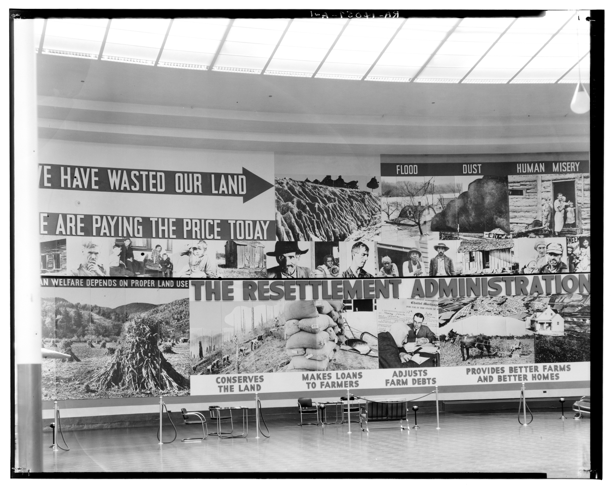
One of these exhibitions was in San Diego, created for the California Pacific International Exposition in May 1936 — as seen in the photograph at the top of this article. The exhibit was so physically large that no single photograph exists, so I have collaged additional images below to show the full scope of the exhibit:

San Diego was a perfect place for such an educational exhibit organized to support Southern California’s slowing economy. Crowds swarmed the Expo to view exhibits on history, the arts, industry, and science. But the Expo also provided some unusual displays such as a kitschy gold mine in Gold Gulch, an early robot called “The One Ton Mechanical Man” and the purely exploitive “Zoro Garden Nudist Colony”.

The connection to the New Deal also extended to the new buildings themselves, as the Expo was built in part by relief workers from the WPA. Roosevelt himself came to San Diego to seal the deal, delivering a stirring speech to vouch for New Deal programs. He addressed a crowd of 60,000 people inside and 15,000 outside the nearby San Diego Stadium, speaking about “the products of American artistic and mechanical genius” and “of what the nation can achieve on a broad scale.” It was a huge success with 7,220,000 visitors during its 377 days of operation.
Problem & progress: applying pictorial statistics for education
The New Deal era was as politically complex as any other moment in history. The confluence of social, technological, aesthetic, and political factors created a unique playground for artists, designers, and scientists to explore visual and ideological conventions.
Among the influx of ideas was Otto Neurath’s Isotype, which began to blow over from Vienna in the early 1930s, and featured most prominently in the socialist-leaning periodical Survey Graphic. The subject of a feature article called “Social Showman” published a few months after the exposition opens, Neurath’s theories are neatly outlined for the American audience, including this section on communication ideals: “To be sure, Neurath respects and draws upon advertising and propaganda experience. But the product he has to sell is enlightenment. Hence his charts, as was his museum, are not composed of competing parts, or messages, but aim toward visual cooperation.”
It might come as no surprise that flanking the larger photographic mural at the Resettlement Administration exhibit are two walls of hand-painted pictorial statistics. While these are not true Isotype charts, they both show a heavy Neurath influence in the design and ideology.


Pictorial statistics were steadily creeping into New Deal publications as well as an urgency to communicate using the language of advertising. Dori Griffin’s essay in Communication Design, Posters for public health: WPA posters and national dialogues about health care in the United States elaborates: “The relative age of the issuing agency influenced how likely that agency was to engage with visual messaging in a broad public context. Thus the WPA, as a young government agency, enthusiastically embraced public media campaigns. Where and how the posters appeared was a topic that received attention, as well. Professional journals advised public health officials as to which messages belonged in which locations. In general, posters were distributed primarily to [neighborhood] residents, but also to doctors and dentists, and to schools, welfare and health agencies, stores, industrial plants, banks, motion picture theaters, clubs, and restaurants.”

The flat, graphic style of Isotype also lent itself readily to the method of poster printing and design. Griffin notes “The use of Isotype-style icons and illustrations was generally hailed as an aesthetic advancement for government-sponsored design. Isotype-style posters received favorable reviews because of their graphic simplicity, their ability to intuitively communicate factual information and relationships, and their assumed (though, of course, not actual) universality.”
Griffin continues, “‘Under the Federal Emergency Relief Administration the Neurath pictograph technique [i.e., Isotype] was introduced in chart-making, and the Works Progress Administration is now carrying on that work,’ wrote the Assistant Director of Information for the Resettlement Administration, a short-lived New Deal agency, in 1937. However, he concluded that despite these advances, ‘[g]overnment poster work in many respects is inadequate and unimaginative and it is only in recent years that layout and design have made any measurable typographic advance,’ pointing toward the work of WPA poster artist Lester Beall as an exemplar of ‘excellent poster work.’”
LEFT: “Doctor, lawyer, merchant, chief agree…these books are too good to miss!” Federal Art Project 1936 | RIGHT: “Occupations related to industrial arts” by Blanche L. Anish, 1936

A closer look at the Resettlement Administration exhibit at the San Diego Exposition
Exploring the details of the exhibit design reveals some interesting norms both in the creation of pictorial statistics, but also in information design at the time.
The panel on the left side, which explores the statistical problems that the exhibit was trying to rectify, is the more pictogram focused of the two walls. Looking closer, it appears that it was painted in long strips, then tacked onto the wall. While the painting is flat and very consistent, the shading on the trees and the dots on the wife’s dress shows the hand of the unknown artist.

The design of the individual icons on the panel follows a sort of flat, modernist aesthetic. The organization of the pictograms is arranged from largest to smallest as the viewer scans down the wall from 10 units at the top to three units at the bottom.
Interestingly, the argument is focused on the minority unit of each pictogram, such as “one out of three homes in the US is below the standard.” On the far left, we see a foreclosed farm, a family at the relief bureau, and a dilapidated house, all situated in huge proportions to the total US. While the people show no emotion, they are highlighted by darker colors.
But this is just the introduction of a persuasive argument posed by the exhibit. By framing the problem (in this case literally in the title “Resettlement’s Problem” at the top of the wall) by using Isotype charts is a compelling way to orient the audience to the scale of the situation. This then naturally flows into the main section of the exhibit to further explain with high impact graphics and mural-sized photographs.

It only makes sense that the last portion of the exhibit, on the right, shows the potential results of this public investment through a series of charming hand-painted illustrations. These qualitative designs focus on the outcomes of government intervention. These designs are not isotypes at all, but rather icons situated in idealistic environments portraying the assumed outcome. These numbers are not statistics — they are goals.

The top panel shows the resplendent future that results in transforming unsuitable farmland into grazing land or even converting to parks. It’s a sort of Shangri-La for cows facing to the left.

The second panel pictures serene homesteads with abundant fields of wheat. The amber waves of grain flow to the right.

Half-a-million farm families are kept off the dole because of responsible farming practices or strategic interventions by the government. Notice the idealized pre-nuclear family leaning to the left again.

At the bottom, we see the biggest promise of all. Our wavering composition is resolved in a stable, prosperous landscape of houses and farms across a flat horizon. Clouds and mountains dance in the background.
Homeownership was far from omnipresent in 1936. Due to the depression, 25% of all mortgages were in default, which ultimately bottomed out in 1940 with only 44% of all Americans owning their homes — the lowest point in the 20th century. Homeownership is the actual outcome of the American dream—the anthesis of the plundered, weak landscape, and defeated population of the photographs to the left.
Leaving the audience with the promise of owning their own home if they cooperated with the Resettlement Administration would have been extremely enticing. It was all an act of idea evangelism.

Why would novelty matter?
As I started exploring this exhibit I started considering the concept of novelty. What’s the difference between using an Isotype versus a bunch of bar charts? Why would the designers create this on such a massive scale? While answers can be found in the information design of the overall exhibit (and those goals would be likely tied back to the highest-level communication needs of Roy Stryker and the Historical Section outlined at the beginning of the article) the ultimate answer is to try to make something that connects to people. To make something novel.

The definition of novelty is “the quality of being new, original, or unusual”. One can consider many of the greatest works of dataviz as being inherently novel, not only in their ability to give shape to data in a new form but also to capture the imagination of their audience. Because of their novelty, these unique data visualizations stand out, they look different; maybe even challenging the audience to explore the design more like a “game” to find the insight lurking within.
Isotypes create a special bond with your audience by replacing “hard numbers” with icons that your audience can identify with more easily. Isotype charts are suitable for communicating abstract ideas as well as quantitative facts equally. The charts in the exposition communicate abstract ideas (1-out-of-3 homes is sub-standard) and quantitative facts (Homes are being built for 100,000 people).
Certainly, the scale of this exhibit would also be novel. Creating any chart (or photograph, or text) on this kind of scale would separate it from our normal expectations and set it apart — and that is exactly the point. In an International Exposition such as this, with millions of viewers and a crushing amount of distracting content, novelty is ultimately the deciding factor to set apart an exhibit in the memory of the audience.

Jason Forrest is a data visualization designer and writer living in New York City. He is the director of the Data Visualization Lab for McKinsey and Company. In addition to being on the board of directors of the Data Visualization Society, he is also the editor-in-chief of Nightingale: The Journal of the Data Visualization Society. He writes about the intersection of culture and information design and is currently working on a book about pictorial statistics.
- Jason Forrest

- Jason Forrest

- Jason Forrest

- Jason Forrest


