
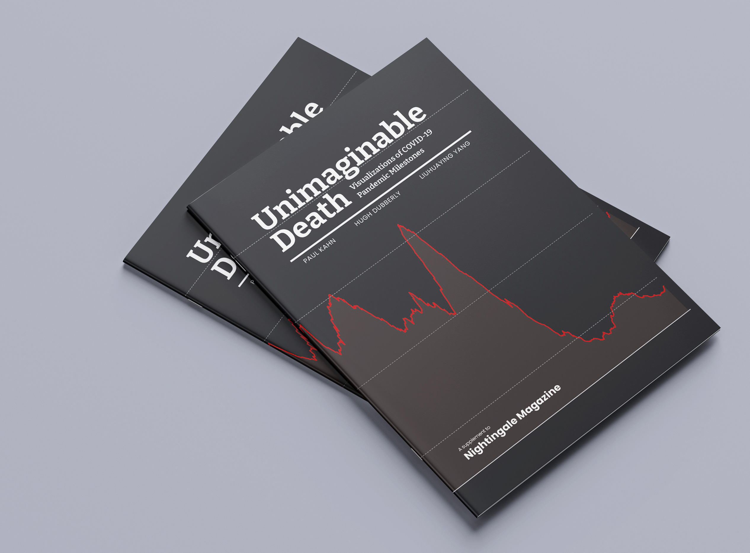
Below is an interview with the authors of “Unimaginable Death: Visualizations of COVID-19 Pandemic Milestones,” which appears this month as a supplement to Nightingale Magazine, Issue 2, the print journal of the Data Visualization Society.
I’m told by the authors that this project grew out of a loose collaboration over many years, its origins going back to 1995. At the time, Paul Kahn was running the Dynamic Diagrams agency and Hugh Dubberly was Design Director at Netscape where they collaborated on a series of celebrated maps of early web-based applications. Twenty years later, they both found themselves teaching in the Information Design and Data Visualization MFA program at Northeastern University where they met Liuhuaying Yang when she was a graduate student in that program.
We asked the authors to talk about what prompted them to write about these visualizations, their collaborative archive called the COVIC database, and what the data visualization community can learn from this kind of reflection.
JF: Why did the team write this essay?
Paul: I was looking regularly at The New York Times and The Washington Post and was impressed by the drama and ingenuity of the visualizations they published. The death milestones were, intentionally, the most dramatic. I started subscribing to the Financial Times at the start of the pandemic. The FT’s view of the world from The City in London was so entirely materialistic, it was a balance to reading the US news. That is how I discovered John Burn-Murdoch’s work and saw how influential his line charts became during the ‘flatten the curve’ phase. It was Liuhuaying’s contributions that really gave us a sense of the visualizations coming from Singapore and China. And Hugh was analyzing the way The New York Times was devoting blocks of front-page space to pandemic visualizations week after week. We were sending each other examples and commenting on them for many months.
I saw there were great examples coming from many different news organizations that focused on the quantity of loss. The emerging pattern of strategies to visualize death milestones struck me as something worth writing about. Once it started, it was natural for it to become a collaboration project. It was possible because the three of us had views, ideas, and experiences that complimented each other.

JF: What is a death milestone? Is this something unique to the COVID-19 pandemic?
Paul: In the essay, we say these milestones are visualizations of big numbers and points of reflection. In our initial email discussions, we were comparing the online visualizations to the physical COVID-19 memorials that were popping up in different countries, and comparing those to war memorials. Along with the online visualizations, we collected links to stories and videos about physical memorials. There was A World Remembers in New Zealand’s STUFF that described memorials in the US, England, Germany, Italy, Argentina, South Africa, Indonesia, India, and Russia. We learned from this and decided to limit the essay to comparisons of the online examples.
I do think the visualization of death milestones is unique to the COVID-19 pandemic because they appeared while the event was happening. The Oklahoma City National Memorial or Mamayev Kurgan Memorial to the Battle of Stalingrad or The Nanjing Massacre Memorial Wall is created to remember events that happened in the past. Some of the visualizations we present in the article were certainly reaching for closure, but closure wasn’t there.
Liuhuaying: I was inspired to search for examples of death memorials. How do we link to what visual representation? What do we think of death? I still remembered Paul’s comment on those physical representations: “a lot of flags, a lot of melting ice figures, a lot of nails, a lot of names, the wall of faces”. It seems that we have a kind of “convention” when we memorize deaths. Then how is it different in a pandemic context, particularly in COVID-19 one? Also, compared to physical representations, we master other kinds of techniques, such as data visualizations with interactive web pages and animations. How would this make things different?
JF: The introduction to Unimaginable Death mentions the COVID-19 Online Visualization Collection (COVIC). Can you explain that collection and how it relates to this project?
Paul: COVIC began in March 2020. That was a special moment for many people around the world. I participated in a Center for Design conversation with Dr. Isabelle Boutron from the University of Paris and this is when she started what became the Covid-19 – living NMA initiative to map all the COVID-19 clinical trials. Last week at a talk at the Rumsey Map Center, Jessica Martin from Bloomberg CityLab recounted how it was that moment when she and Laura Bliss came up with the idea to ask readers to submit homemade maps of their lives that became The Quarantine Atlas. It was a moment when everyone had to stop and look around for something to do. That gave birth to many projects.

From the beginning, COVIC was a collection of visualizations. Initially, it was a spreadsheet of articles that contained visualizations, with metadata about the publisher, language, country, date, and subject. I sent an email to a network of friends, colleagues, and former students in many countries asking them to send in links, which seeded the international nature of the collection. It was Hugh who looked at this and said: This is about the figures. It was at that point, when we had a few hundred articles, that we went back to record and classify each individual figure. We tried to brainstorm a way to automate this, to extract and clip the visualizations, but we did it ‘by hand’ so to speak. We had many undergraduate and graduate students from Northeastern helping with support from the Center for Design, along with volunteers who contacted us.
Liuhuaying: I gathered examples for COVIC whenever I saw them, especially those from the Chinese community. They are numerous and many are fantastic. It’s also interesting for us to see how different or similar the visual strategies can be by comparing it to the English-speaking community.
The first example I contributed to COVIC was my own project. In early Feb 2020, I created an interactive website titled “Dynamic tracking of COVID-19 in Singapore” for zaobao.sg, the digital platform of the Chinese dailies in Singapore. We visualized the daily situation reports released by the Ministry of Health to inform and communicate with local audiences about the COVID-19 situation in Singapore. As the situation evolved, we kept updating the data every day until June 2nd. The aim of the visualization is to help better picture the relationship between cases within a cluster, how these clusters are interrelated and activities-based, and how cases are disseminated to various hospitals.
I presented this project in the Summer school course and on other occasions to share my visual strategies, intentions, and challenges. A comment I heard most is how unique or uncommon it was that we visualized individuals. I thought it was attributed to data availability until I saw how other examples in COVIC managed to visualize the trees in the forest.
Paul: In May 2020, I taught remotely a summer school course about collecting visualizations during the pandemic. I was in France, my students were in their homes around the US, and my guest speakers were in many parts of the world. The discussion with students and presentations by Liuhuaying and others helped to solidify the ideas. We wanted to create something that could be used for teaching and research when the pandemic was no longer happening. We could see the pandemic was inspiring and challenging the data visualization community, it was changing data journalism, and it was producing elaborate yet ephemeral results. The data was changing, things were appearing and disappearing, paywalls were opening and closing, and vaccines, mutations, and social and political issues were morphing every few weeks. I thought then, and still think, it is important to gather with an open mind about the role visualization plays, then classify to support later search and filtering.
COVIC is an opportunistic collection. I am not a social scientist, so I had to learn that this is a ‘thing’ or at least a recognized method. We have collected what was presented to us, what people sent us, what we came across, and what was linked to what we read. COVIC is a large and organized sample from an infinite set.

Our version 1.0 was made with Google Sheets, an Amazon S3 server for storing images, and custom code to visualize the figures. That version worked but didn’t scale. We had no idea how big it would get. When we approached 10,000 figures we had to migrate to the current version 2.0, which is managed in Airtable bases and visualized with a custom Javascript SAP. The public COVIC Visualizer is available to everyone and documented on the COVIC website. The metadata can be shared on request in CSV format.
Hugh: Early discourse on design history tends to focus on individual artifacts, this poster, that book, or perhaps a particular subway signage system. But design practice explores ‘spaces of possibilities’ or ‘solution spaces’ with any designed artifact being just one of many possible choices considered. Design history, particularly as it relates to visualizations, is beginning to recognize this fact. Comparative histories (and critiques) require collections of related work; collections, however, require databases for managing and for accessing works.
So, in addition to recording a specific set of visualizations of COVID-19, we also saw the COVIC project as exploring an emerging approach to comparative design history. From that frame, the article on “Unimaginable Death” might be seen as an example of the sort of comparative histories that COVIC supports.
Paul: Exactly. “Unimaginable Death” is simply an example of the kind of analysis and reflection that can be built up from the collection. We came up with a subject – death milestones – and we found a rich set of examples to discuss and learn from. Now we’re thrilled that Nightingale is giving us the chance to present this work to your readers. We hope it will inspire not only discussion but more articles and projects that use this material and this methodology.
JF: One of the challenging aspects of the pandemic was our inability to control the spread of the virus and the resulting waves of infections which lead to inevitable milestones. Did your team have some kind of reaction to the nearing of the milestones? Were you following certain papers and search results or was it more anticipatory?
Paul: I don’t think milestones are inevitable. We mention examples of countries where one-hundred-thousand deaths, half-a-million deaths go by and no data visualization milestone appears online, as far as we can tell.
I went through my emails to Hugh and Liuhuaying and found that the first set we shared in December 2021 started “from Italy in March 2020 through Germany in November 2021”. Once we had that set I began to anticipate later milestones that would occur in the US and Spain the following year. Liuhuaying found the Chinese examples that were a response to the first surge of deaths. I did search for visualizations in the Spanish media when that country crossed the hundred-thousand mark. And like everyone in the world, we anticipated the one-million event in the US. We all anticipated that we could not complete the essay until after they appeared.
JF: The dataviz world isn’t that big, did your team have a direct dialogue with any of the journalists featured in the collection?
Paul: I know Liuhuaying and Irene de la Torres Arenas from teaching at the IDV program. They were both kind enough to speak to my class during the first pandemic summer. Irene was working at BBC doing COVID-19 visualizations, though now she is designing for FT. We didn’t talk about death milestones or the specific challenge of representing large numbers at that time. Six months later Irene led the team that produced the 1-year milestone that visualized COVID-19 data as flowers.
Liuhuaying: I had asked Spe Chen, a data visualization designer at The Straits Times who designed the floral icons for the example “Remembering the 5 million lives lost to Covid-19” about her inspirations, especially whether she was aware of the BBC “petal” design.
She was impressed by Poppy Field – Visualising War Fatalities and searching for visualizations representing the death toll. Inspired by Japanese altars, she decided to make flowers and tried many types of flowers. It was only in the middle of her flower ideation that she saw the BBC “petal” design.
Paul: We heard from several designers indirectly. We learned the backstory of The New York Times examples from the Times Insider series, The Project Behind a Front Page Full of Names and On the Front Page, a Wall of Grief. Later there was Clare Santoro’s Nightingale piece about Alyssa Fowers’ “Cut Short”, and the PolicyViz podcast interview with Aliza Aufrichtig about “Voices of a Grieving Nation.” I also learned about “1 million U.S. COVID-19 deaths” from another PolicyViz interview with Danielle Alberti, and it is also discussed in Behind the Scenes with Axios Data Visualization in Nightingale.

JF: After collecting so many charts about our inability to visualize such huge numbers of human loss, do you each have examples that you find effective?
Liuhuaying: It depends on how we define the effectiveness in this context. I love the three projects in flower examples because of their high emotional values. The flower element linked to funerals and memorials across cultures provides an extra function to the charts: compassion and consolation.
Those examples of dots also provide emotional values by triggering our awe of life: so many lives passed away, sorrow, life is vulnerable, and we need to be more serious about the situation. And aesthetically, both expressed the beauty of lives. However, as always expected in war memorials, we would like to send a bouquet of flowers, and may the deceased rest in peace.
Paul: When Hugh introduced the metaphor of the Forest and the Trees into the essay, it helped me see the fundamental design question that everyone had to face. The designs are not about death and loss, per se. They are about communicating quantities and what quantities are made from. This can be done by carefully labeling the axis of a line chart or area chart. That thought process disengages the visualizations from the emotional experience. And then I recognized that the ones that moved me personally were the designs that re-engaged my emotions by playing with expectations. The designs that ‘violated the grid’ either literally — the death spike on the US map that went through The New York Times masthead — or figuratively by shapeshifting from bars to dot swarms — both the NBC “Seeing the Scale” and The New York Times “How America Reached One Million” do this while engaging the user in parallax scrolling – or animating changing numbers to mimic organic growth – like the unfolding flower petals of the BBC and The Straits Times animations.
Hugh: Building on Paul’s comments, part of what intrigued me about this project — looking at the ways COVID-19 deaths are represented and the ways milestones were marked — was how this type of situation has been addressed before. The AIDS Memorial quilt is an amazing example. Also, the Vietnam War Memorial. And the Stolpersteine (stumbling stone) memorials in Germany, more than 90,000 small brass plaques place on or near the homes of victims of the Nazis. (See “How Germans Remember the Holocaust” in The Atlantic) These memorials make each individual uniquely visible while also placing the individuals (and the viewers) in the context of unimaginably large numbers. They evoke a mixed set of emotions: awe, wonder, horror, despair, guilt, and more.

JF: How do you want our community to use an essay like this? Did you have any design intentions as you were writing it?
Paul: We want designers to look at these examples and ask themselves hard questions. Should visualizations of death milestones afford mourning? Should they be vectors of social change? Should they impress us to behave in ways that reduce the spread of COVID-19 death? I think the examples in COVIC demonstrate that the data visualization community has collectively said ‘yes’ to all of these questions.
I watched a talk by Mushon Zer-Avi last night. Mushon gave this keynote, Friction & Flow — a Design Theory of Change, at the Better World x Design conference in Providence RI. He makes interesting use of ‘lessons from the pandemic’ in his talk and builds on the distinction between affordance and signifier.
As Mushon built the distinction between activism that focuses on signifiers (occupy wall street) vs activism that focuses on affordances (canceling debt), I thought we could apply something similar to the death milestones. The visualizations that are clearly assembled from individual stories, whether those stories are represented by a single sentence, or a phrase, identifying a ‘type’ of person, or presenting an audio portrait, are affording our personal confrontation with loss.
The visualizations that describe what ‘the country’ or ‘the world’ has lost as a quantity, compared to a line of buses or the population of a city, reaching this point on the Y-axis, spread across time, distributed in our collective geography, are generating signifiers. They signify the quantities they represent. They do not afford our engagement in the loss of life they are made from. Or maybe, as Liuhuaying says, they do when the signifier invokes an affordance that we understand, such as placing flowers on a grave.
We want people to recognize each other’s work and build on the patterns we observed.
JF: How can readers find the examples you discuss?
Printing the essay as a supplement to Nightingale Magazine, Issue 2, has many advantages. It affords everyone the opportunity to see these images side by side on the printed page. But a disadvantage is that we could not print the links to the original stories for each of the 41 examples. This online interview affords us that chance.
Let me offer everyone this table with the story titles linked. I hope people will use this to explore the examples in context and experience the interactivity, animation, and audio found in many of the pieces.
For more visualizations, please visit the COVID-19 Online Visualization Collection (COVIC).
Other articles by the authors:
- The Pandemic That Launched a Thousand Visualizations
- COVIC: Collecting Visualizations of Covid-19 to Outline a Space of Possibilities
- Trails, an interactive visual landscape in collaboration with Dario Rodighiero that combined the image collection into a 2-D space

Jason Forrest is a data visualization designer and writer living in New York City. He is the director of the Data Visualization Lab for McKinsey and Company. In addition to being on the board of directors of the Data Visualization Society, he is also the editor-in-chief of Nightingale: The Journal of the Data Visualization Society. He writes about the intersection of culture and information design and is currently working on a book about pictorial statistics.
- Jason Forrest

- Jason Forrest

- Jason Forrest

- Jason Forrest


