
While everyone loves data, it can be perceived by many as something ‘technical’ (if not outright ‘scary’) and at the very least as something a bit ‘magical’. While some data specialists are embedded within a team and understand its business context, many are on the periphery of their organizations — viewed as brilliant but mysterious wizards capable of transforming data into insights.
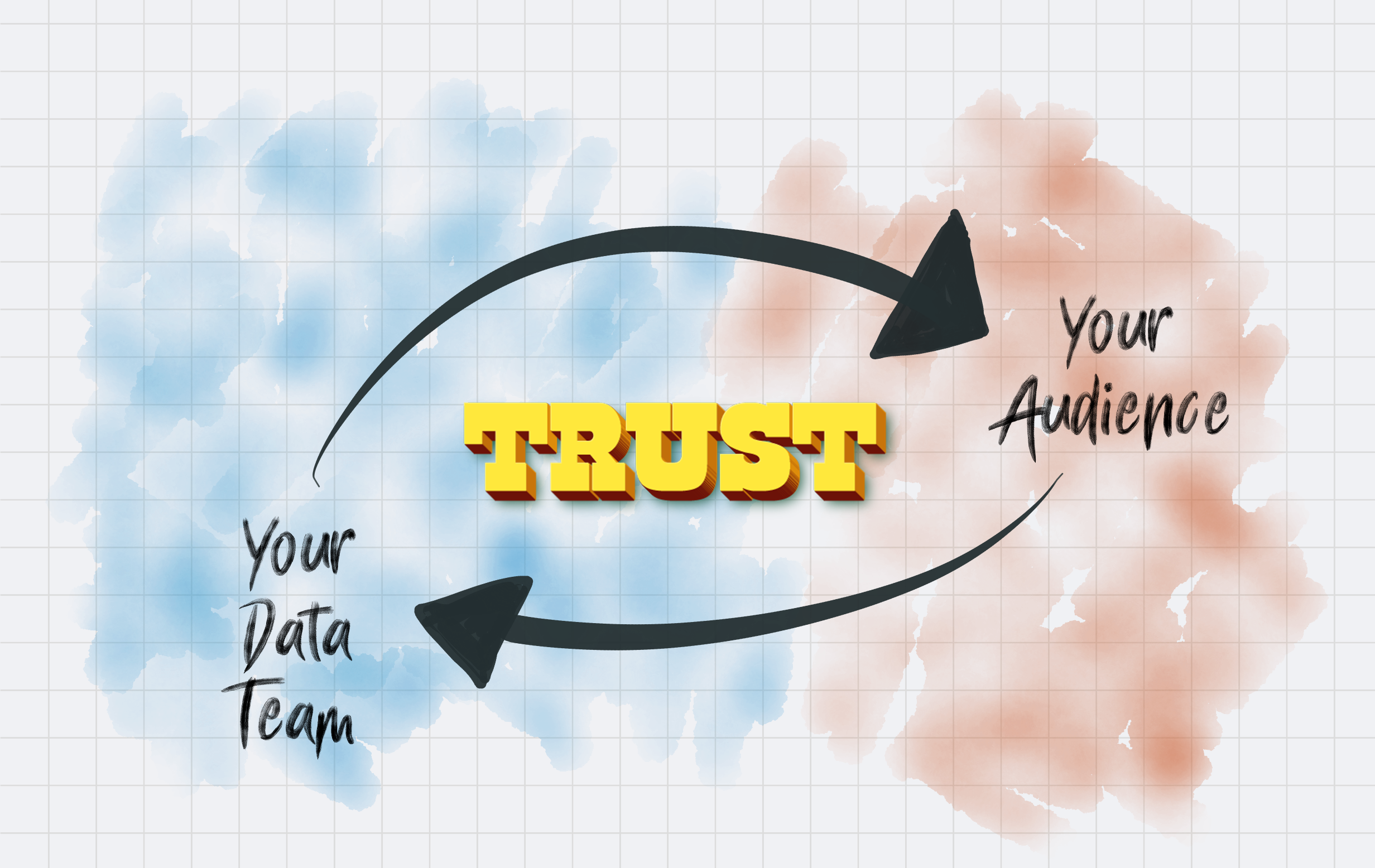
Despite how well-intentioned, the distance that forms between a data team and its audience can often be attributed to a lack of empathy. This can lead to a reactive relationship with your audience; simply responding to requests for information without any real idea why. Its likely that your colleagues think you just ‘don’t need to know’ why they need the data (or visualization) in the form that they expect. Maybe they think you don’t care why they need it. Regardless, if you’re trying to find new methods to explore data and visualize it in meaningful ways, you need to reposition your relationship with your audience so that they trust you enough to collaborate.
This article itself is a collaboration between myself and Elijah Meeks and it explores some methods to reposition your relationships in order to build more trust. His article outlines some concepts for exploring new types of data visualizations in collaboration with your audience once you have that trust foundation. It’s been fun to collaborate on this, so please let us know what you think in the comments!
You have to want to earn it
There are many ways to build trust with your audience, but the most important is that you want to earn it. It sounds minor, but the moment you decide that you want to earn your audience’s trust, you shift away from a reactive mindset and towards a collaborative one. Reactive relationships revolve around a request and a reaction to that request. Trust is also important in these relationships (and we all have them) but the requestor is likely coming to you because they know they will get what they want — it’s a transaction.
Collaboration is a bit more complex because it means that both parties work together to solve whatever issue is in focus. While collaboration may seem more difficult, the benefit from collaborating with your audience is usually greater than the individual contributors. Ideas are built in an inherently iterative manner, as everyone involved has to contribute ideas. There’s a dynamic flow of communication in collaboration and the moment anyone’s trust erodes, the collaboration usually ends.
Trust becomes the currency of your collaboration, so how do you earn it?

1. Empathy is curiosity
In order to collaborate, you need to know enough about what your audience needs so that you can tailor your approach to help them do it. It all starts with empathy, meaning, do you actually care about what they want and why they need it? Empathy is universal, it’s non-hierarchical, it’s free — and best of all — empathy creates more empathy.
One of the best ways to breed empathy is simply by talking to people. By becoming curious about what your audience is doing and why they need data for it, you begin to position yourself as a person that cares about your work and how you can be a good collaborator with them. You’ll be surprised at how infrequently your audience has been asked basic questions about what they do and who they are. Everyone likes to talk about themselves, so when you ask a question it signals their importance in your relationship. Just by showing curiosity, your audience will start to wonder why you care so much, and this usually forms the basis for more conversations. Before you know it — empathy creates more empathy.
A case study from Elijah Meeks:
“From a practical perspective, empathy has to be demonstrated in your work as well as your meetings. In most cases, when I’m asked to create an analytical product at Netflix, it already exists in some other form (a Tableau dashboard, an rShiny app, or a notebook). The first thing I do is re-create the data visualization in the form they expect (a bar chart, a cumulative density function, a table), and only then do I introduce other visual forms as context or prototypes for new approaches. With data visualization, audiences have strong associations with certain data taking certain forms — not just the charts but often the whole “dashboard”. Demonstrating empathy in these situations is accomplished by rendering the form they expect and then gently transitioning that form into something more effective. Hence the emphasis on semantic similarity in exploratory design.”

2. Talking to people helps everyone learn their roles
When you care enough to ask your audience how you can engage with them, you will likely learn how you can work together to get it done. This effectively activates your role in the relationship; and in doing so, helps to demystify your work and allows you the additional insight you’ve been looking for to create more impact for your audience.
Remember that data visualization is itself a form of communication. When building data visualizations we have to avoid the tendency to look at requirements as just a set of checkboxes to tick off. This isn’t going to be accomplished by waiting for your audience to suggest a different technique — they probably don’t know other data visualization techniques, or worse, they’ve been burned by a beautiful but useless chart before. Instead, by talking to them about their needs, you learn what your audience might want to see if they were more aware of advanced techniques.
Talking to people doesn’t just mean gathering their requirements and understanding their goals — you continue to collaborate with your audience through a dialogue built with charts. Your goal ultimately is to communicate the salient details of the data, but on the way, the charts you develop to help your audience understand the possibilities, as well as the visualizations they’ve already relied on, becomes a conversation of its own.
This kind of relationship changes the traditional, reactive relationship. “Show me the numbers” is therefore not a transaction any more but becomes a story told in concert with your audience. The data comes to life through your conversation and the collaboration is strengthened. Trust has been earned.

3. Create a shared understanding
But talking to people isn’t the whole story. In order to earn trust, you also have to ensure that everyone understands (and agrees) on the definitions of the data, what the terminology being used means, and where they can easily learn more if they do not. This is a 2-way street, as the terminology that your audience uses may likely differ from your own, so mutually understood terms become key to having a meaningful conversation.
While this seems absolutely commonplace, I’d argue that most teams do not share a common understanding of the terminology or even of the data itself, what the data is called or what it represents. Just take a quick poll of your colleagues and you’ll see.
A byproduct of crafting explicit definitions is that it exposes inconsistencies. Exposing the definition of the underlying assumptions often reveals when your audience thought they were using a shared definition but were not. Large-scale Business Intelligence applications (or even file-sharing platforms) can actively be leveraged to foster alignment to create these understood definitions and metrics. Since multiple colleagues/teams are all using the same platform, it allows for these common terms to radiate through an organization and call out discrepancies. Central, integrated systems serve a single source of truth that seeks to consolidate institutional domain knowledge and spread consensus.
What’s more, taking the steps to find, discuss, and agree upon those definitions requires the empathy to care about the importance of a shared language, and the time and focus it takes to explore this… builds more trust!
4. Data sources and quality
Even when you’re talking and agree on the terms, the actual data source and quality of the data is important to expose. If your audience doesn’t have confidence in that data source, it will undermine the validity of whatever it is you’re trying to show them, thus reducing their confidence in you and eroding the trust you’ve been working so hard to build.
If the data quality is bad, just point that out and expose the uncertainty. Exposing the source and expressing your confidence in the data will cause you to explain why it’s robust or crappy and will be just one more journey you’ll take with your audience. Everyone will walk away understanding the system and their roles a bit more. Definitions will be reinforced, empathy expanded and trust cemented.
How to cope with uncertainty is a different question, as many of the data visualization books just don’t give enough clear guidance. Maybe this is because our industry hasn’t established the go-to methods for visualizing these facets of the data. So you’ll need to discuss this uncertainty and how to visualize it with your audience. When visual methods don’t work, fall back to using callouts, titles, and other text to explain in short, easily digested sentences (preferably with links to detailed definitions).

The Trust Infrastructure
All this is just to prove that you want to collaborate with your audience. In doing so, it’s highly likely that your relationship with your audience (even if it’s hierarchal) will change. “You don’t need to know” will likely turn into a discussion about what happens next after the data is understood. As a result of all the trust currency, your methods of presenting data with an expanded data visualization literacy will likely change from simple reporting to a collaborative conversation on the insights inside of the data.
It’s at this point that we as data professionals become valuable thought partners. When everyone in a decision ecosystem understands their role, it allows for a more inclusive exchange of ideas. This fluid communication turns from earning trust into building respect and allows a team/organization to move from a siloed, reactive mindset towards an integrated, iteratively minded team focused on solving problems as they come in a fluid manner.
The trust infrastructure you build is an important strategic necessity to get the impact you seek in your work, and if you do it right, it will make your work more enjoyable too.

Jason Forrest is a data visualization designer and writer living in New York City. He is the director of the Data Visualization Lab for McKinsey and Company. In addition to being on the board of directors of the Data Visualization Society, he is also the editor-in-chief of Nightingale: The Journal of the Data Visualization Society. He writes about the intersection of culture and information design and is currently working on a book about pictorial statistics.
- Jason Forrest

- Jason Forrest

- Jason Forrest

- Jason Forrest


